Schierke Seinecke Gallery
Creating a design fit to hang in a gallery
Case Study
Overview
A new gallery at the heart of Frankfurt’s Bahnhofsviertel district
Focusing on works by young artists. This establishment gives up-and-coming international artists a public space in which to present their art. Schierke Seinecke is open to all disciplines, new techniques and creations that break away from familiar formats. With the gallery keen to get off to a good start and attract the right attention, its two founders commissioned us to develop the corporate design.
Less is more
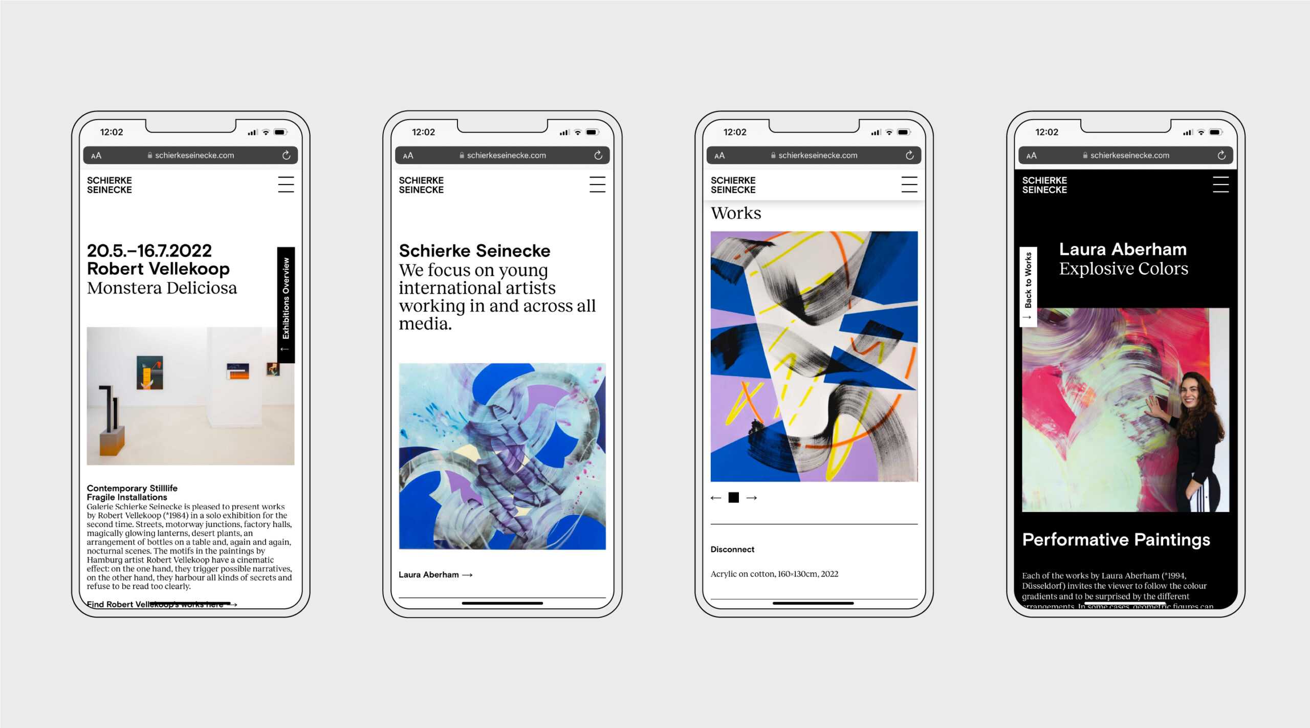
The magic word: reduction. We made a conscious decision to strip down the corporate design. That meant using black and white instead of colour and embracing clearly defined typographical hierarchies to create an arresting appearance. Restraint paired with clear structures makes this an original design that provides a neutral space in which to present the extremely distinct artworks.
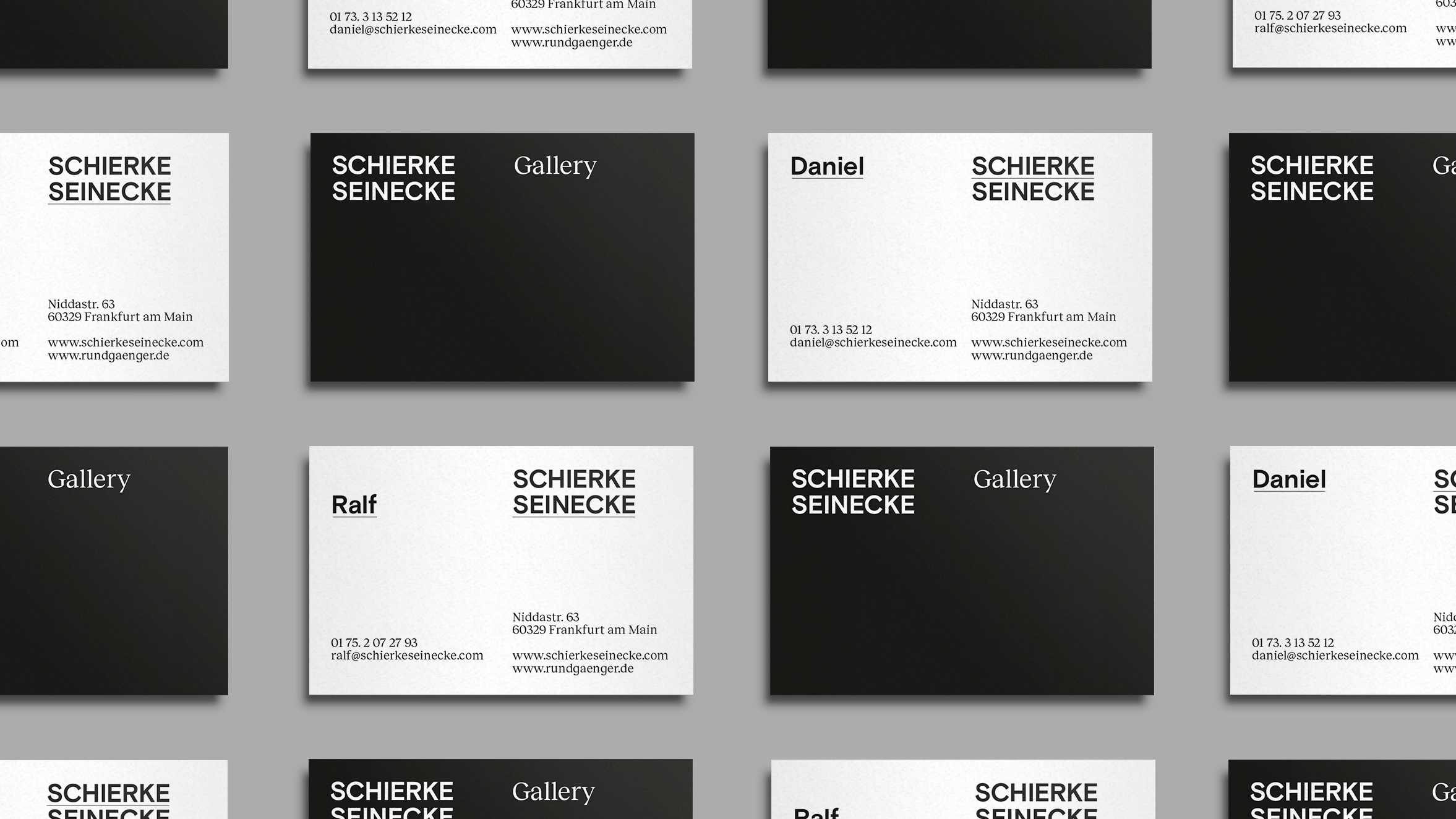
The design is based on a clear, straightforward grid. All elements are easy to move around within the fixed parameters. Simple techniques are used to create a high degree of variation, while the unerring design establishes a sense of visual unity.
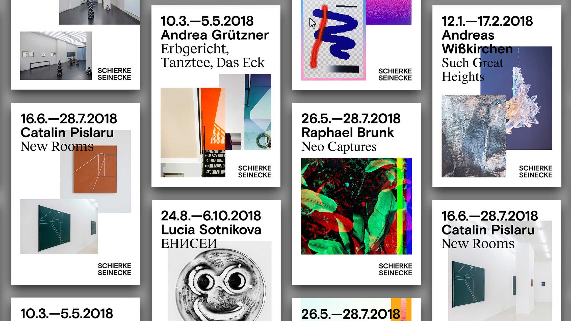
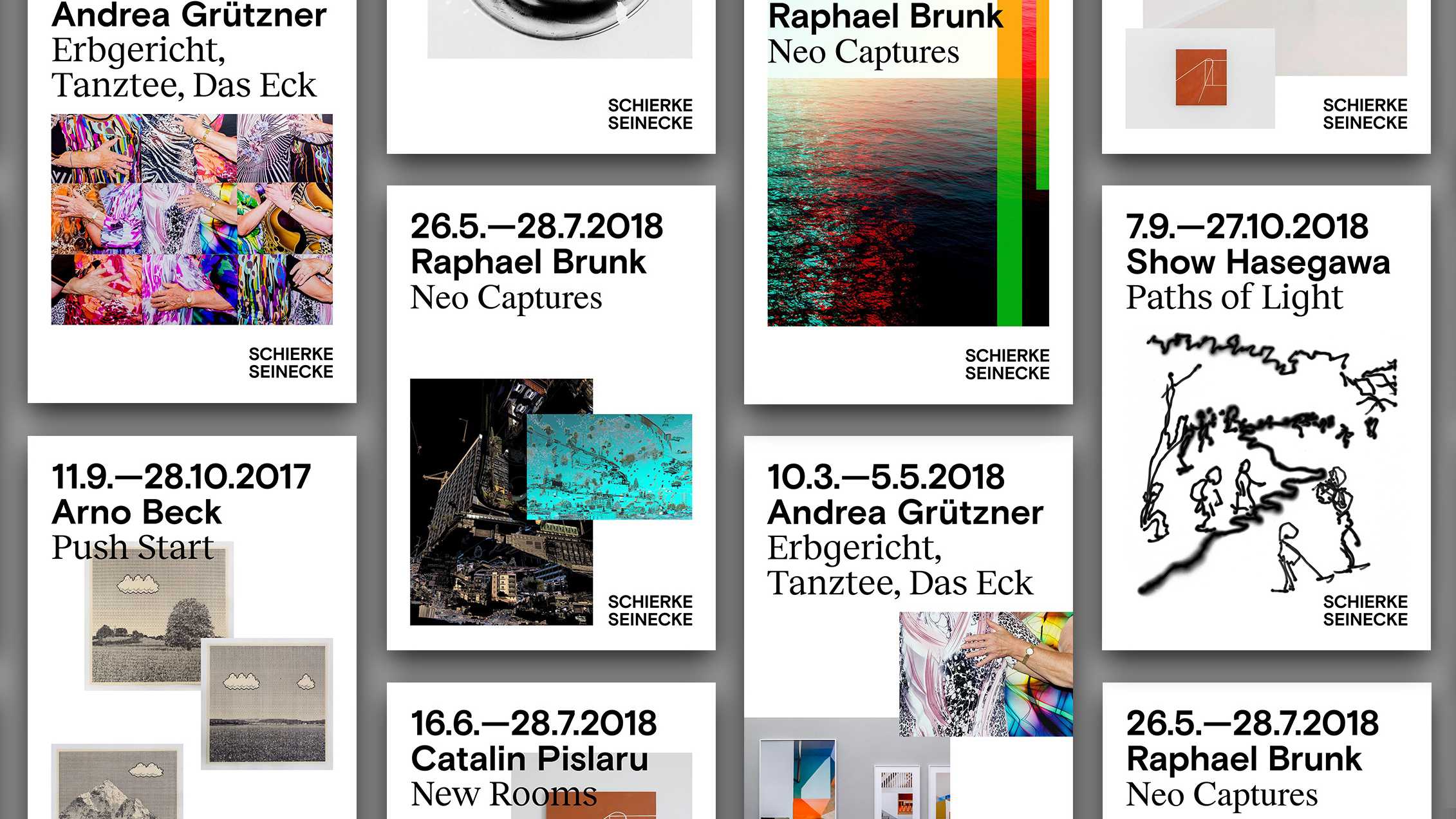
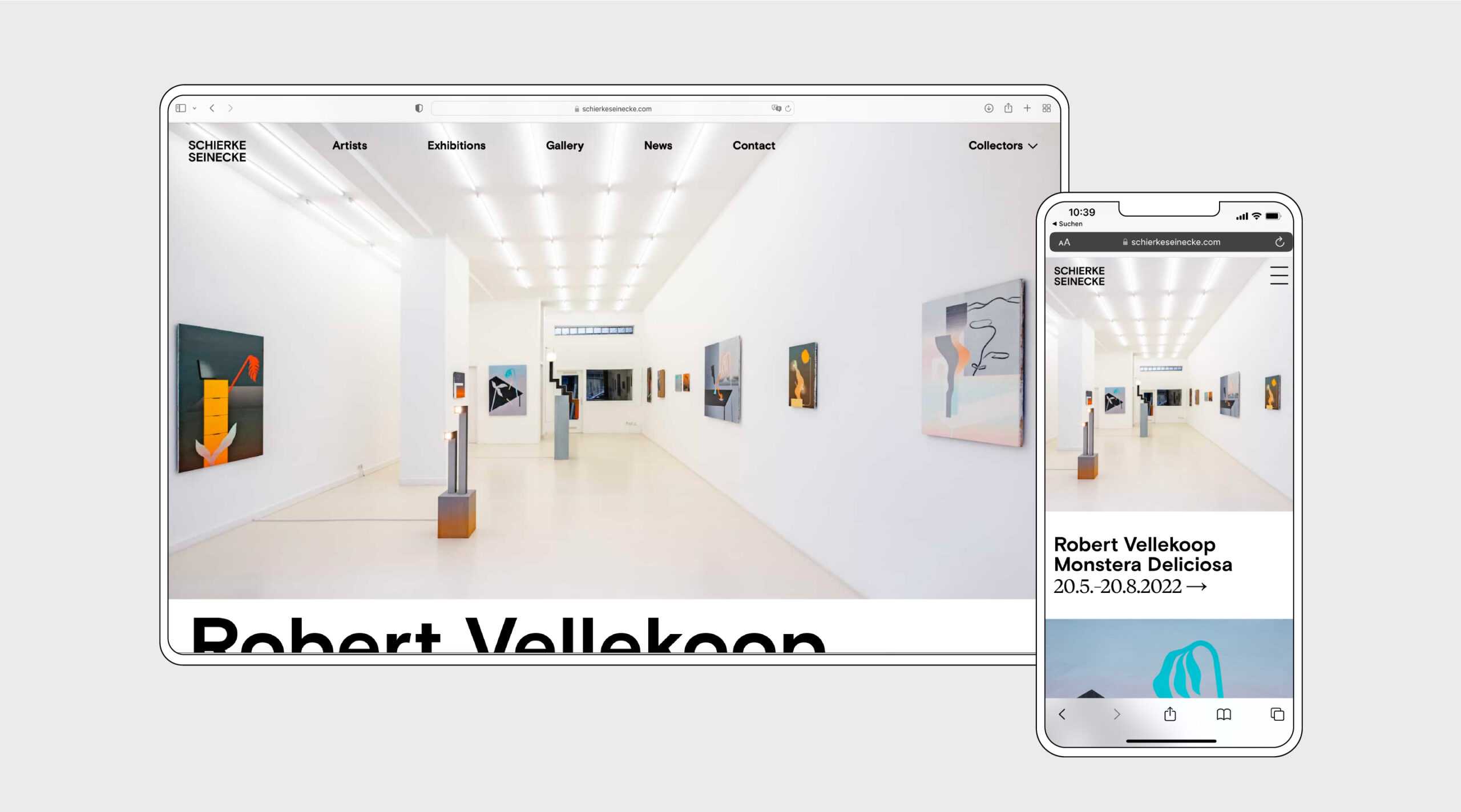
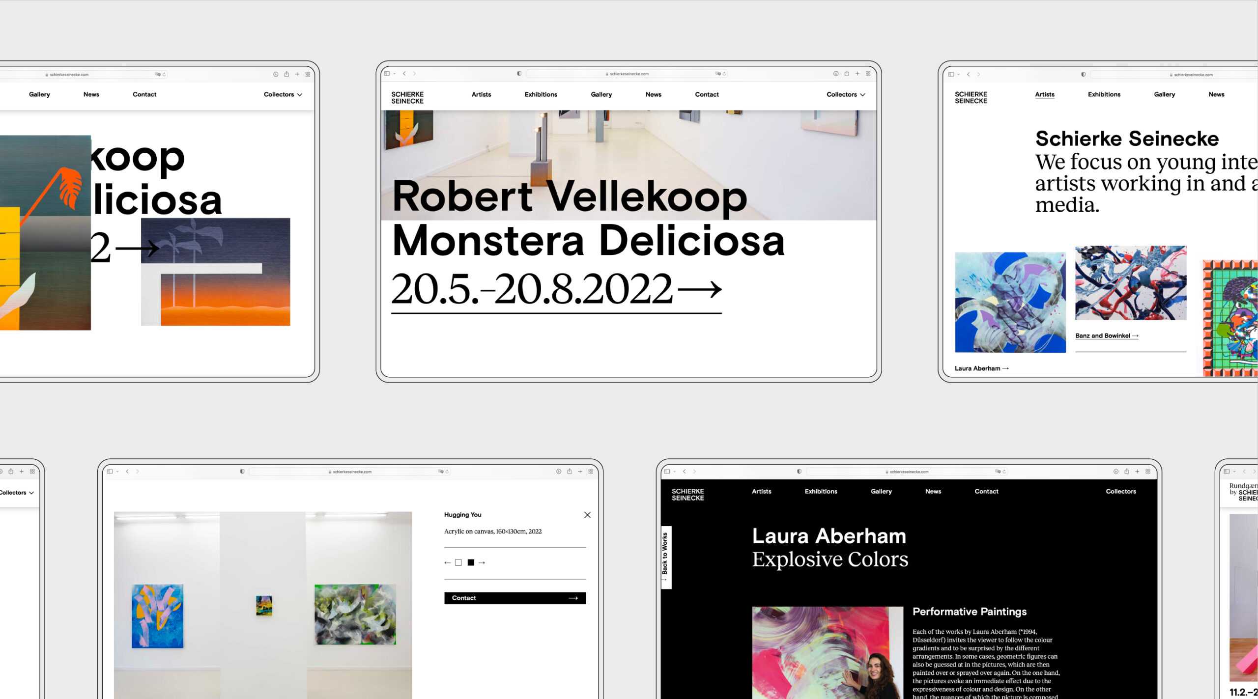
The gallery’s website is at the heart of the brand’s identity. It informs visitors about current and past exhibitions, presents works and artists, and offers news relating to the gallery. The website is uncluttered, yet varied in style, and gives each artist a suitable platform on which to present themselves. There is a password-protected area for buyers enabling them to view the prices of the individual works.
