Temptiv
Seamless security, stronger identity

Case Study
Overview
Our Client
The cool side of pharma logistics
Temptiv is a specialist in temperature-controlled logistics, catering to the highly sensitive needs of the pharmaceutical and biotech industries. With its headquarters in Luxembourg and a strategic packaging hub near Frankfurt, Temptiv offers a fully integrated service – from smart packaging and GDP-compliant warehousing to cross-docking and transport. The brand stands out for its modular, reusable systems that ensure temperature stability across a wide range of conditions, while emphasizing sustainability, safety, and seamless scalability. Temptiv’s offering is built to meet the highest industry standards – and to exceed them.
The Challenge
Clarity from the first degree
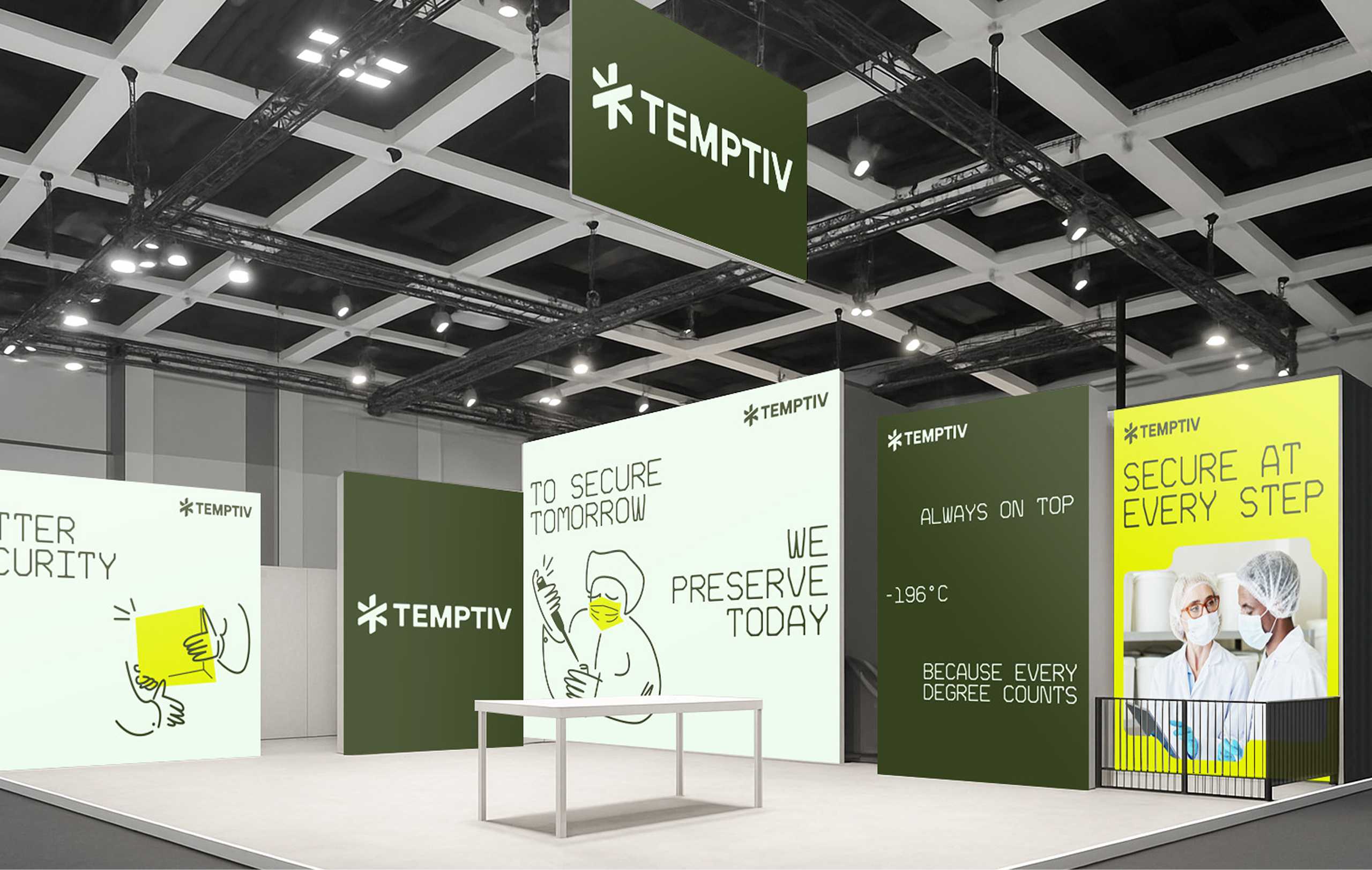
As a completely new company, Temptiv had to build trust and recognition from day one. The name, derived from “temperature” and “sensitive,” sets the tone: this is a brand built on precision, responsibility, and forward-thinking solutions. Our task was to translate these core values into a powerful identity system – ready to perform across every touchpoint, from web to warehouse. A fast and effective launch was critical, not only for the first trade fairs and online visibility, but also to support the company’s promise of an all-in-one service with modular solutions, seamless integration, and a clear commitment to sustainability.
Our Solution
A system that scales with precision
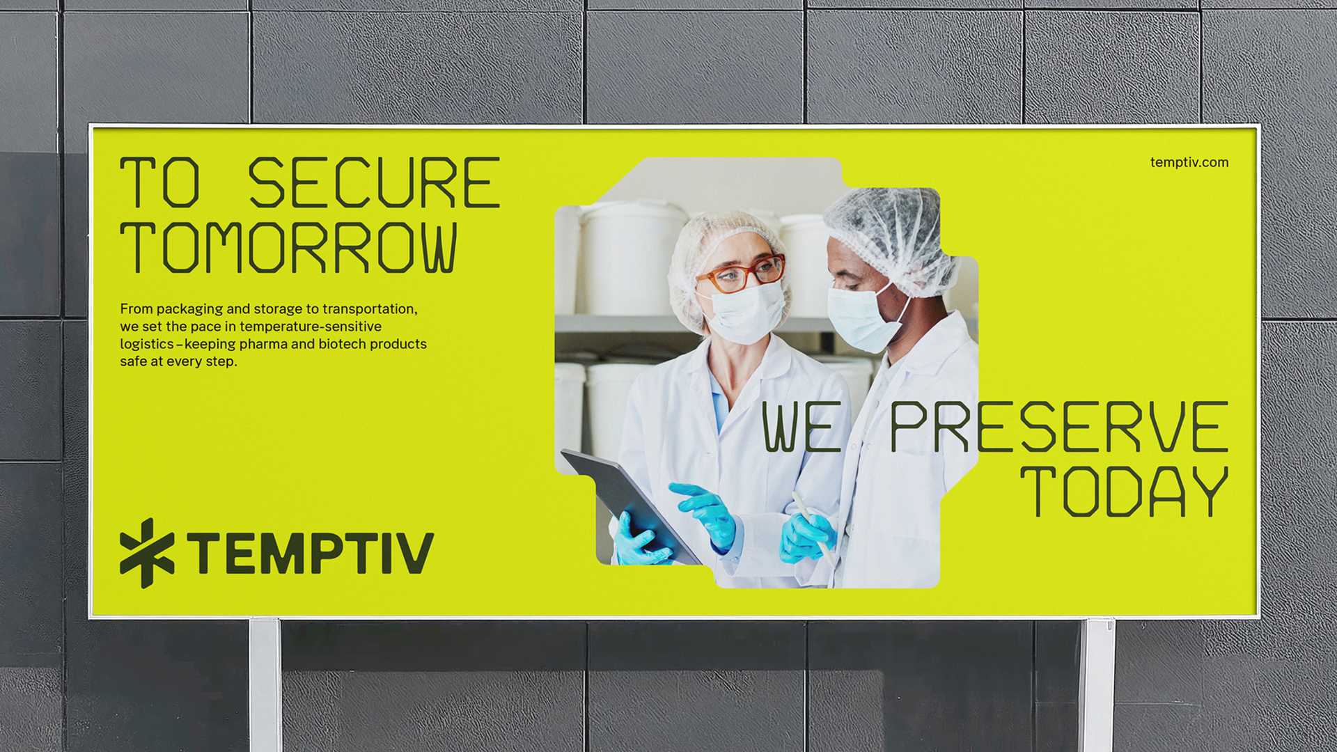
We took on the challenge of building the Temptiv brand from the ground up – starting with its positioning, character, and name. In a collaborative and strategically grounded process, we defined the brand’s identity and direction. Instead of relying on familiar tropes, we distilled what truly matters: To secure tomorrow, we preserve today. Always ahead, because every degree counts. With that in mind, we shaped one of the most vital themes of the future – pharma logistics – and translated it into a visual language that makes its purpose tangible.
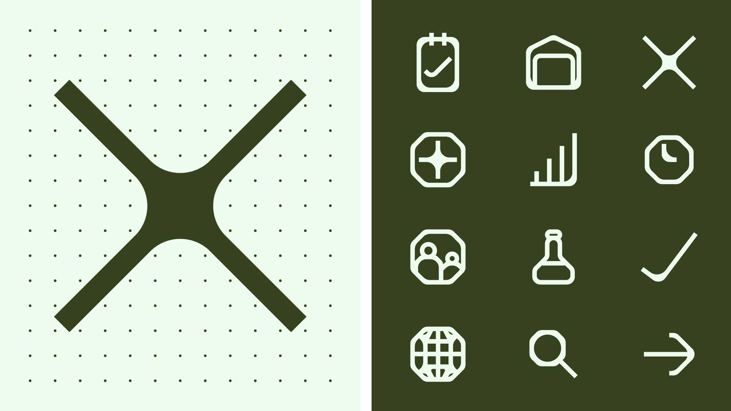
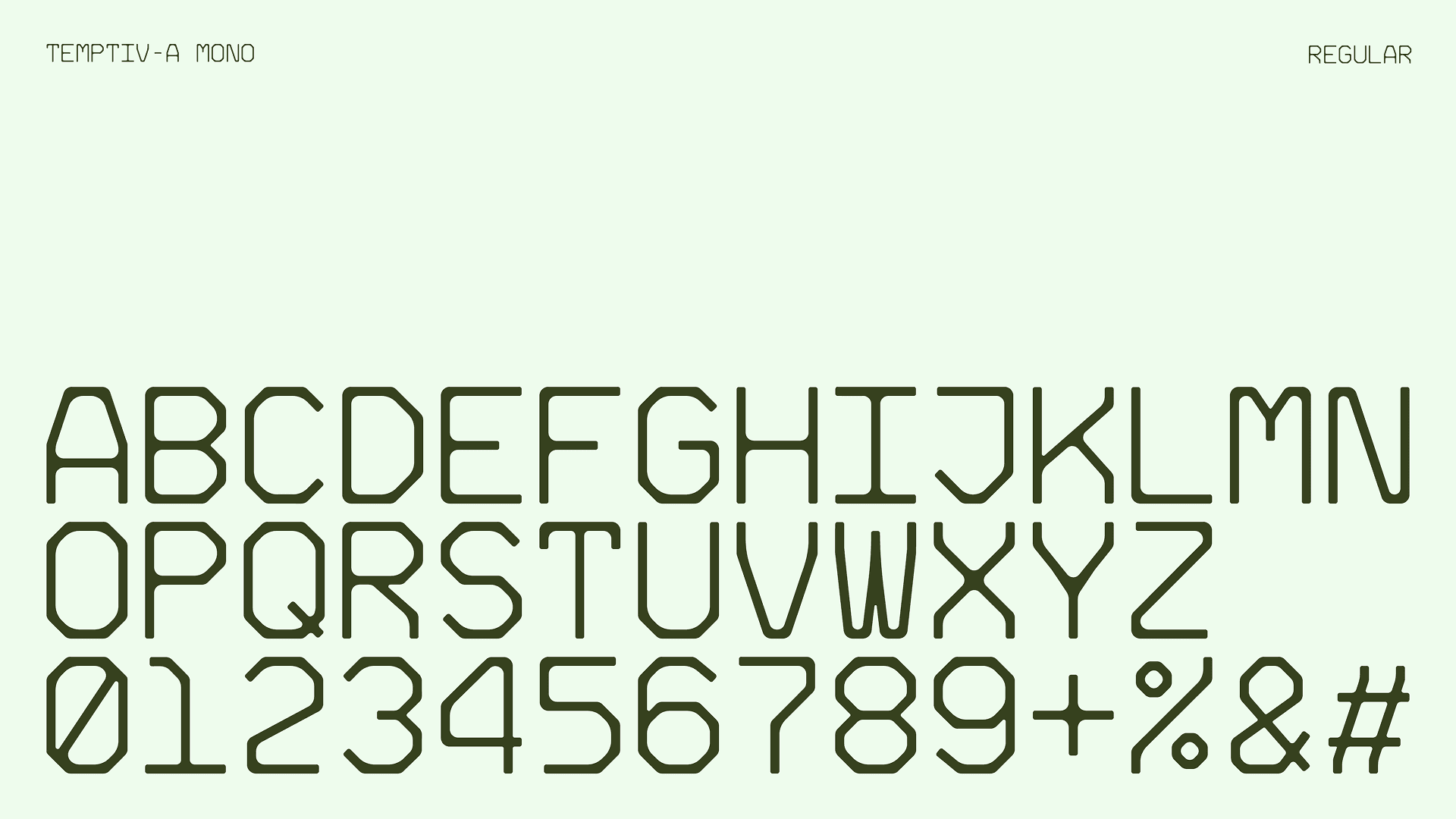
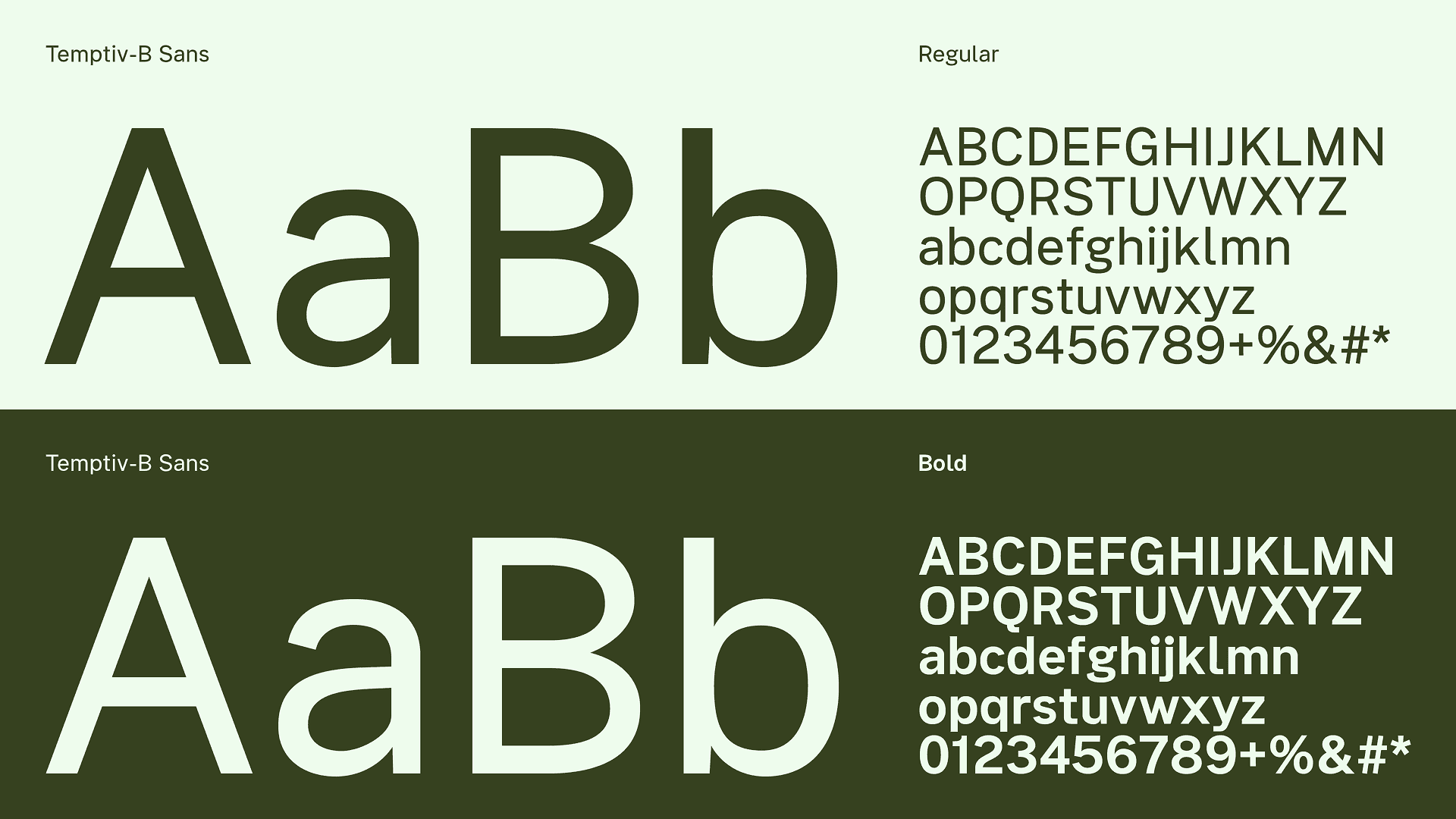
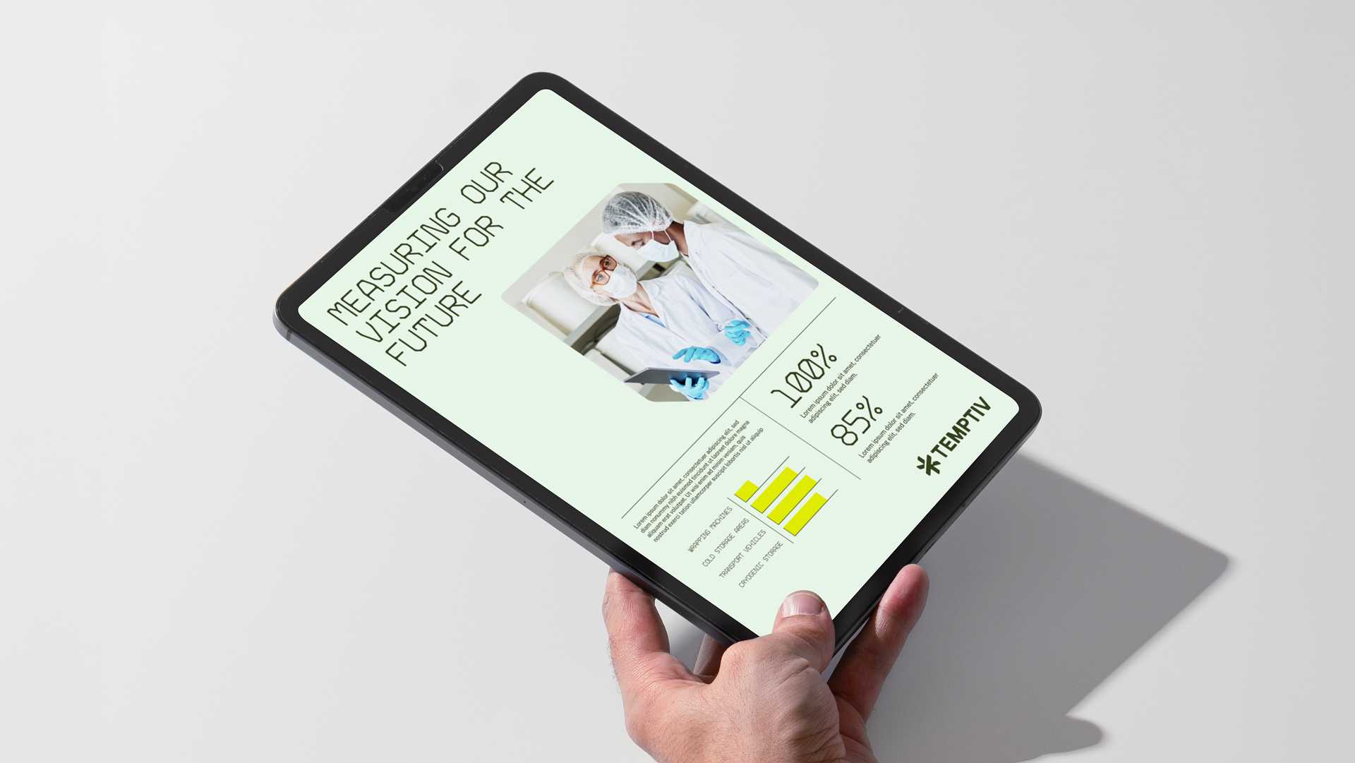
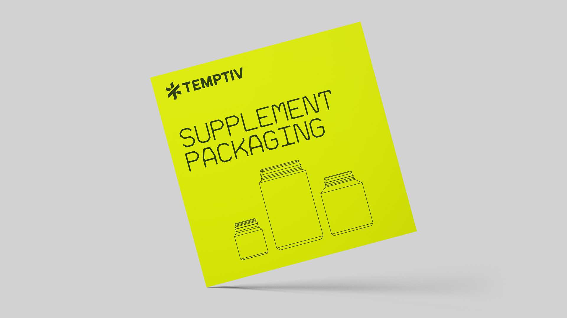
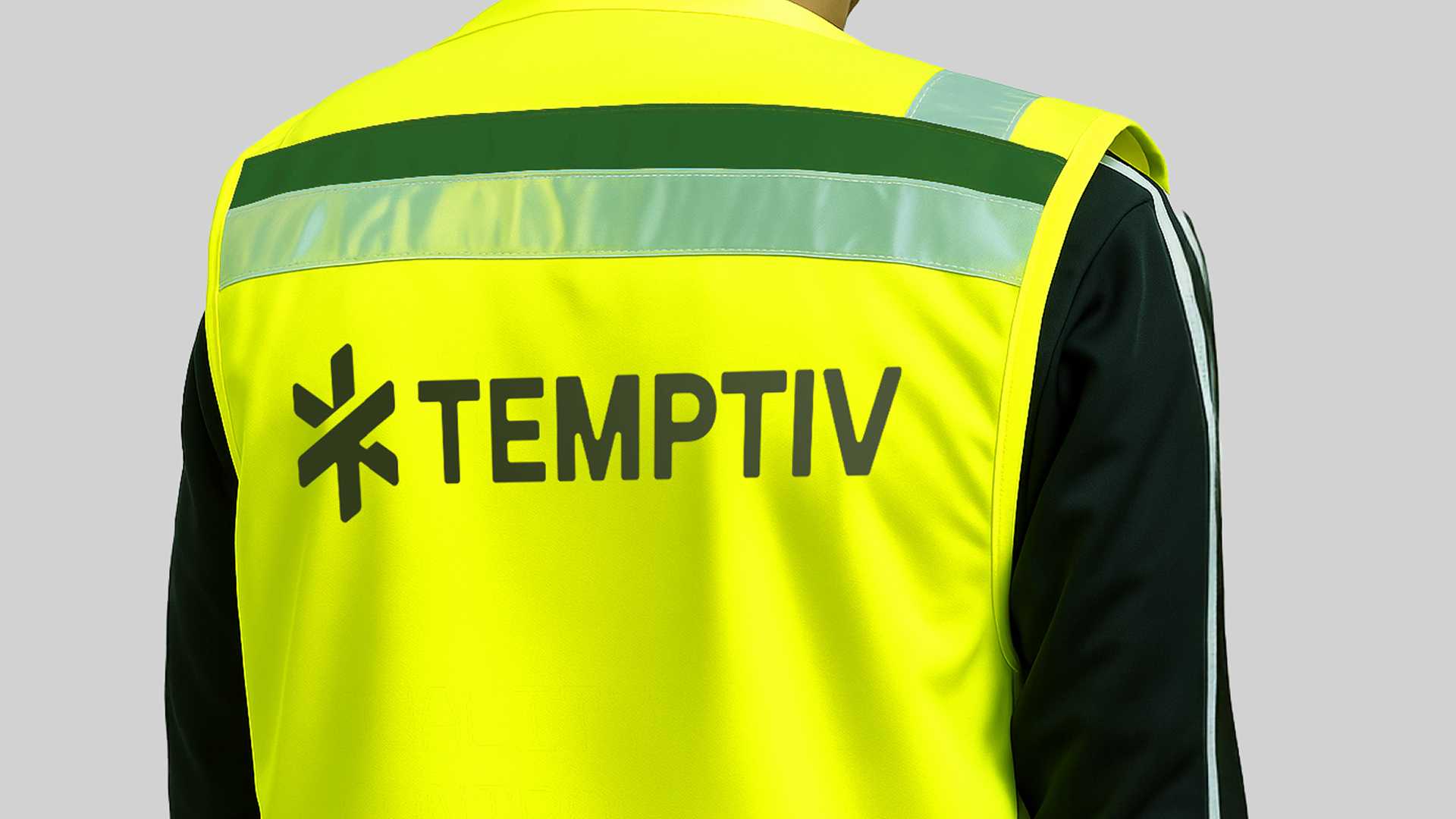
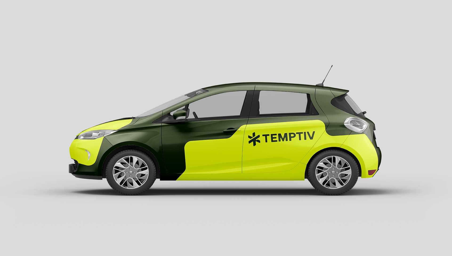
The foundation of the identity is a flexible dot grid, from which all elements emerge. Based on this system, we developed a modular design structure that reflects the brand’s DNA: scalable, reliable, and precise. The Temptiv logo, formed by two mirrored “T”s in the shape of a snowflake, speaks of cold-chain expertise and visual clarity. These same principles extend into the brand’s custom typefaces: Temptiv-A, a monospaced headline font built on fixed angles and sharp rhythm, and Temptiv-B, the body font designed for maximum readability across all touchpoints – digital, print, small-scale labels, and mobile displays. Together, they create a typographic voice that is both technical and approachable.
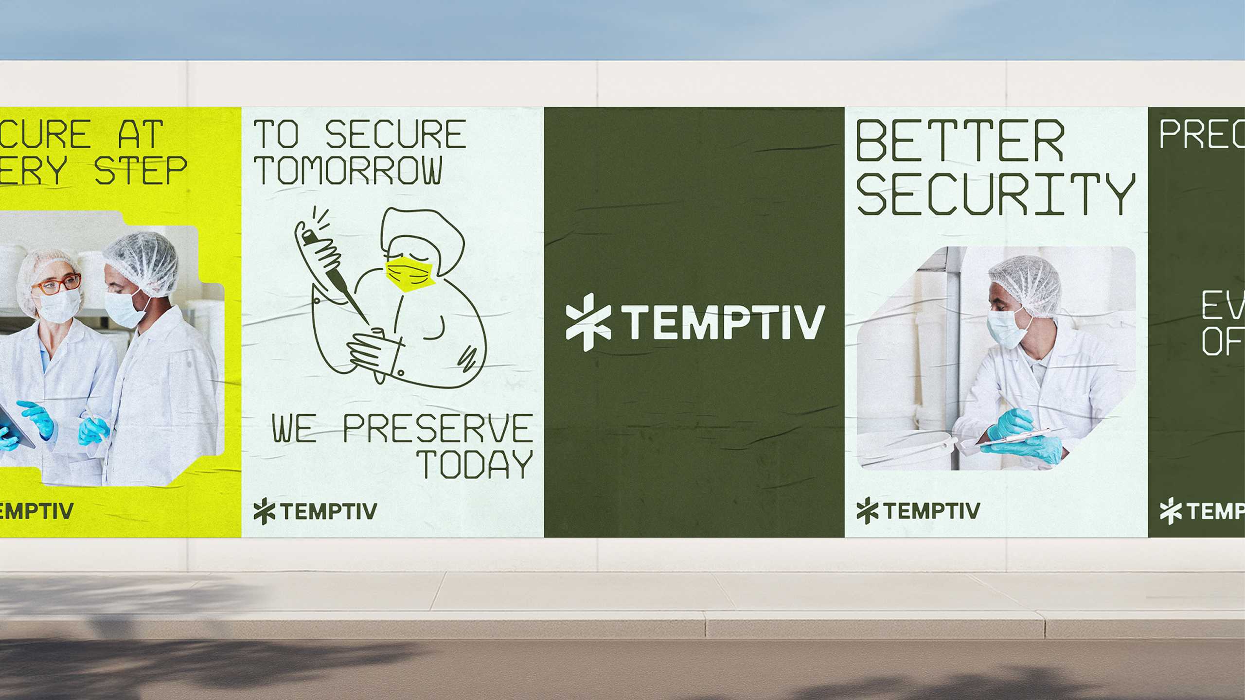
Forms, based on the dot grid and type geometry, bring structure and clarity to layouts – visually reinforcing modularity and system logic. They act as flexible containers for text, photos or illustrations and echo the angular elegance of the logo.
The illustrations bring a human, optimistic tone to the system – balancing the precision of the typography with emotional warmth. Their flat, doodle-like style visualizes care, safety and smooth workflows in an accessible, forward-looking way. More than decorative, they reflect Temptiv’s values and make complexity feel effortless and approachable. The photography complements this mood with real-world glimpses into packaging, warehousing and logistics. Desaturated yet warm, the images highlight care, adaptability and reliability. They align with the brand’s calibrated palette: deep pine green for trust and sustainability, fluorescent yellow for innovation and energy, and ice blue for its cold-chain core. Supporting tones like warm blues and a deeper ice provide contrast and flexibility – ensuring brand presence even in regulated, accessibility-sensitive environments.
With every detail derived from a shared system, Temptiv’s identity achieves what the brand itself promises: seamless integration, smart scalability, and a clear commitment to preserving what matters most.
