Arctiv
Raising the design temperature for a cold logistics specialist

Case Study
Overview
Our Client
Moving what keeps life going
Arctiv is in the pharma karma business: this cold-chain logistics specialist transports temperature-sensitive medicines, therapies and treatments all over the world to patients who rely on their life-saving properties. Sound like a huge responsibility? It’s exactly that, which is why Arctiv prioritises being reliable, precise and on time. With certified packaging systems able to cater to extreme temperatures, real-time tracking, direct pick-up and a 24/7 on-call team, the fledgling company is well positioned to carve out a solid niche in the logistics market.
The Challenge
Breaking the ice with a new customer base
With a name, network and narrative as a specialist already in place, the time was ripe to develop a complete brand identity from the ground up. The trick lay in capturing the company’s essence as a responsible and reliable player in the pharmaceutical logistics chain without leaving the human element inherent to Arctiv’s services out in the cold. Relying on an undercooked brand to attract customers wouldn’t cut it – the team needed a holistic voice that spoke the language of credibility, dynamism and accessibility.
Our Solution
Coolly calculated brand development
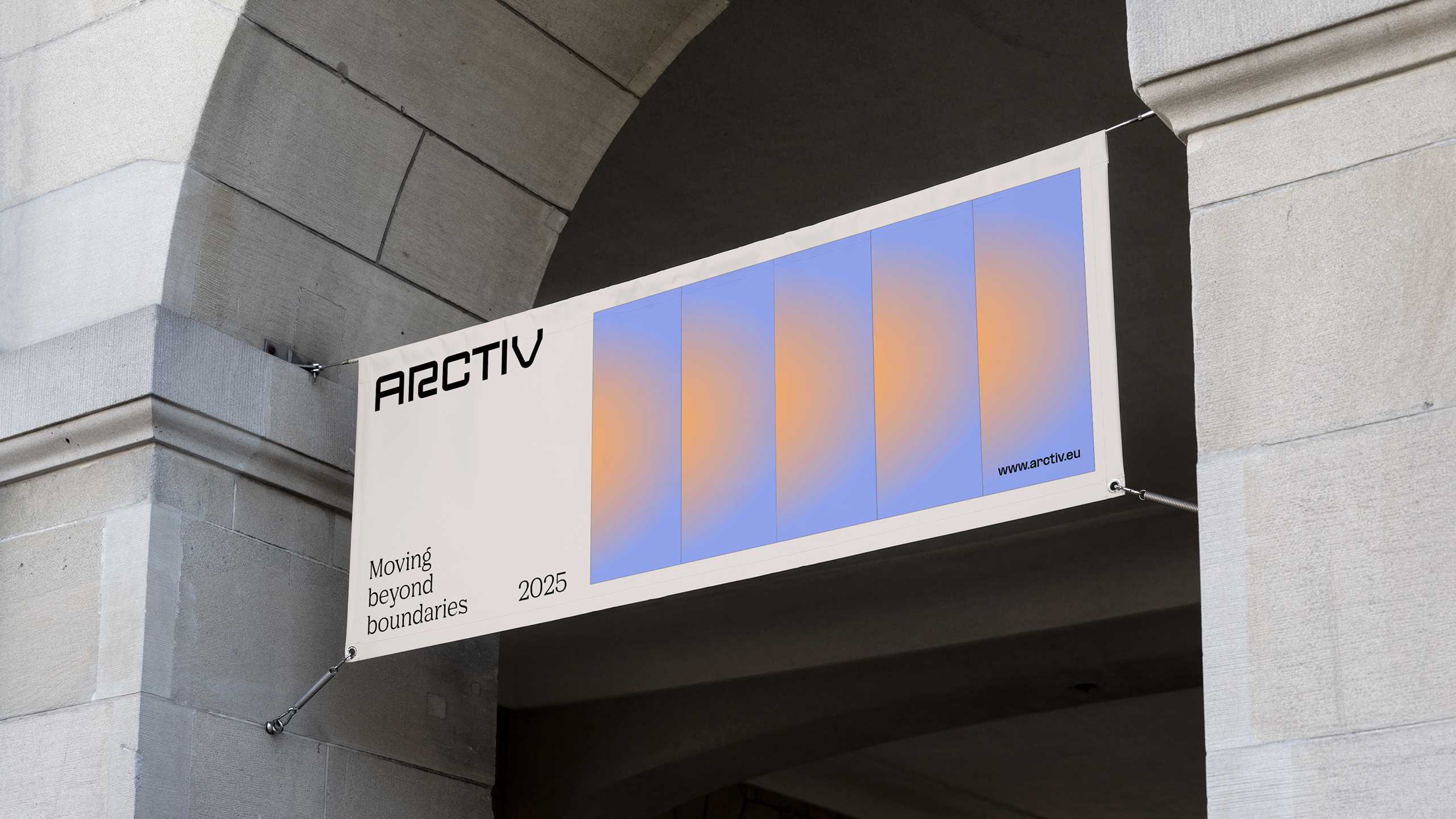
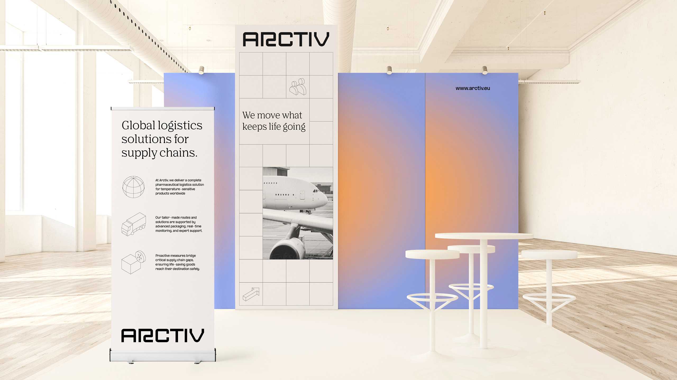
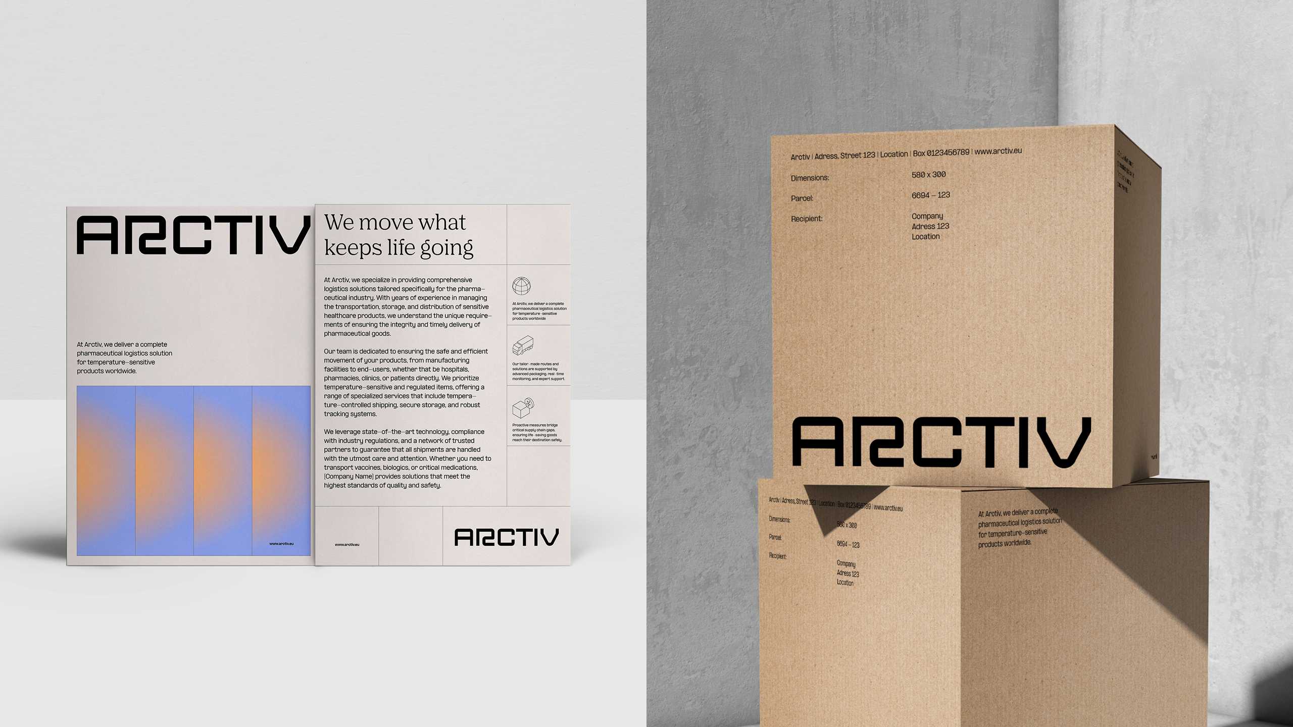
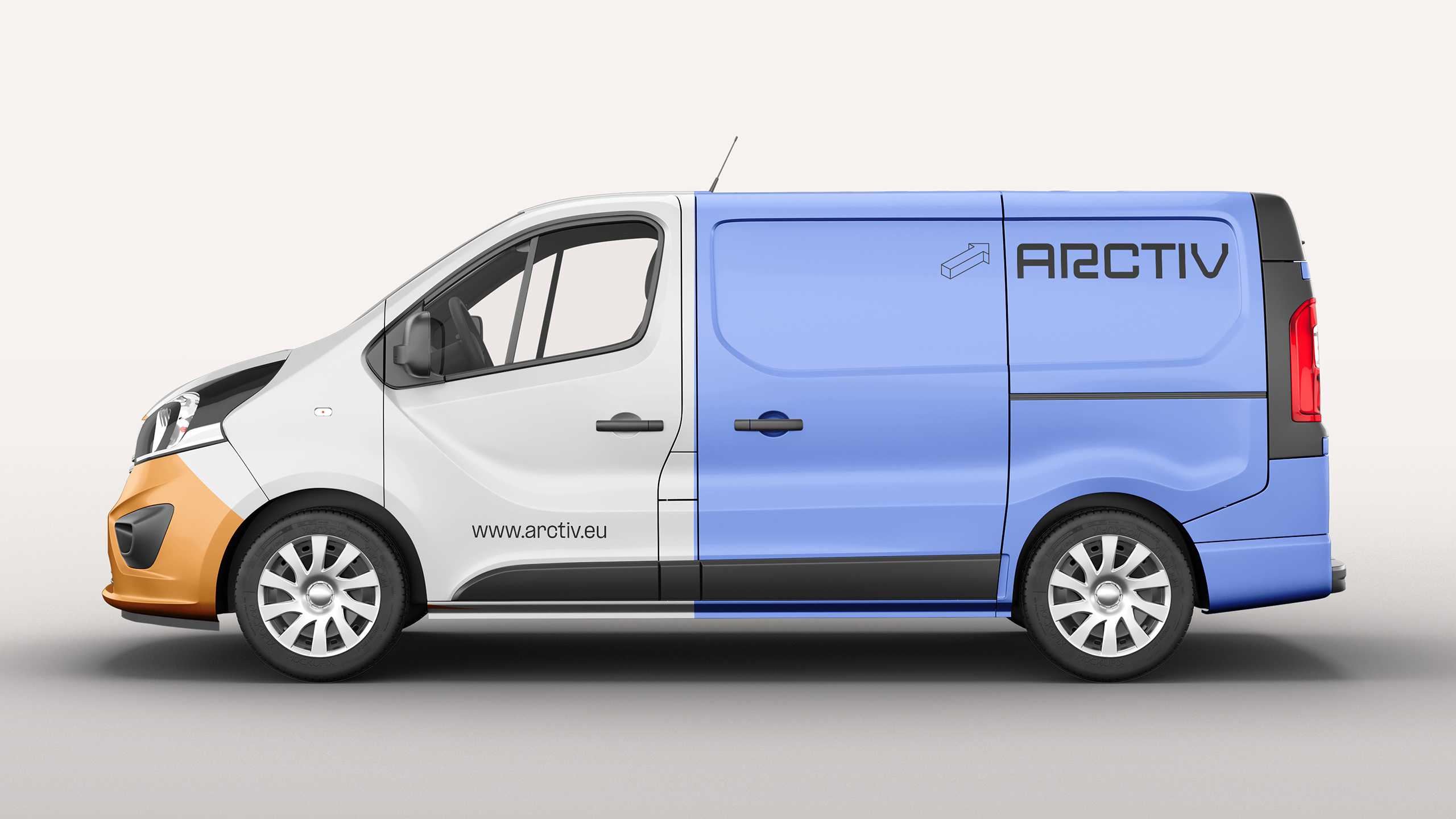
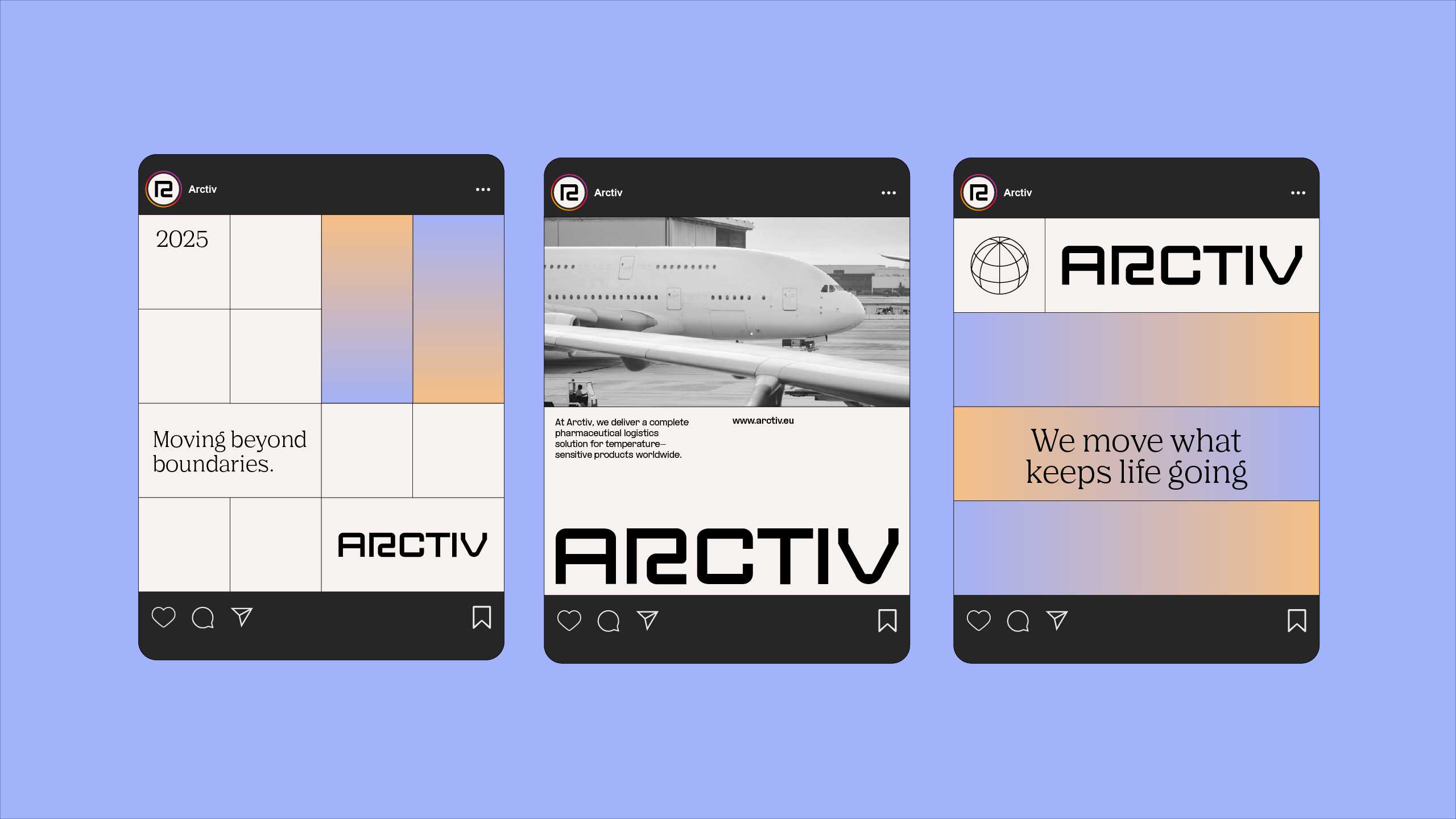
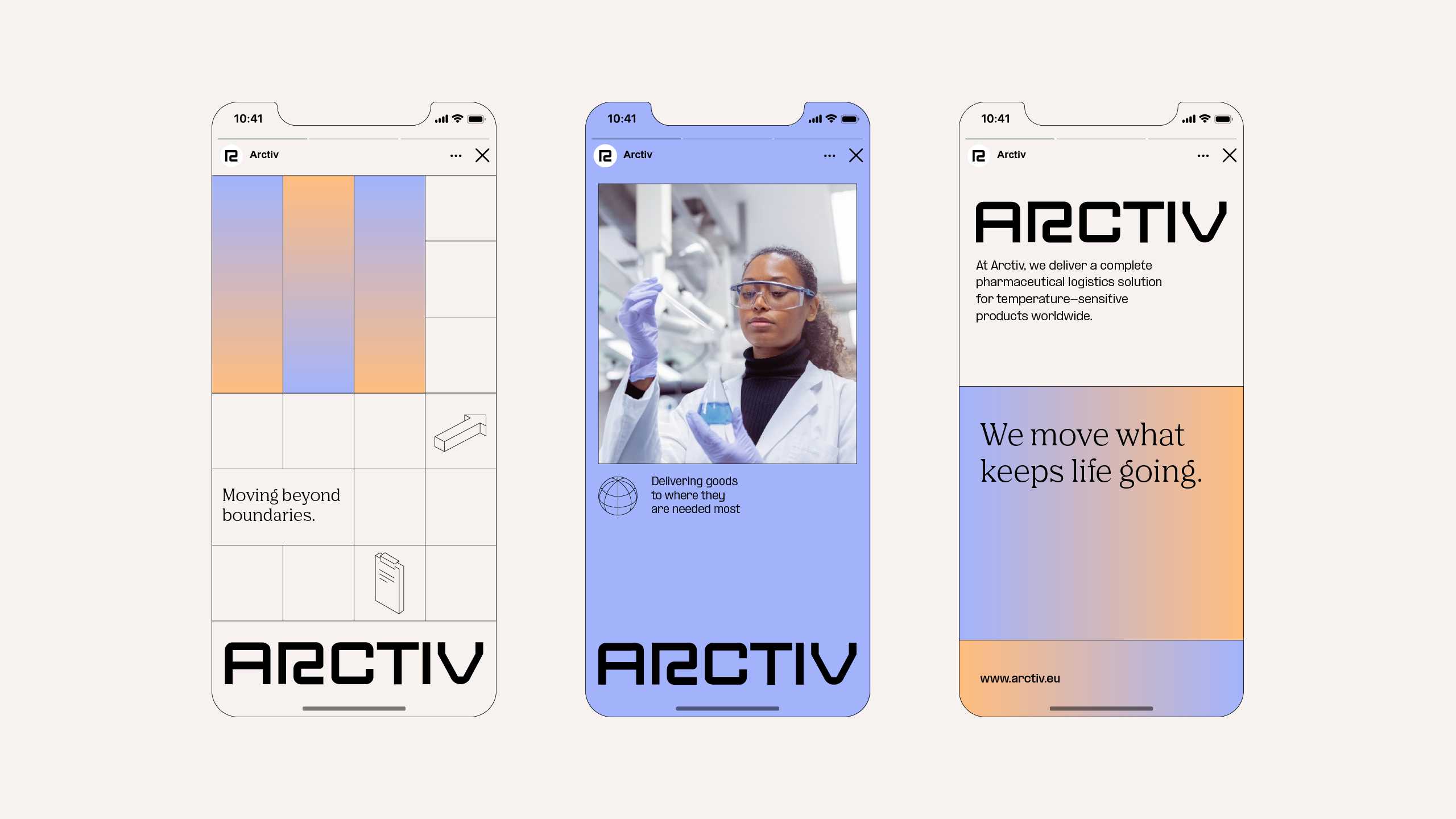
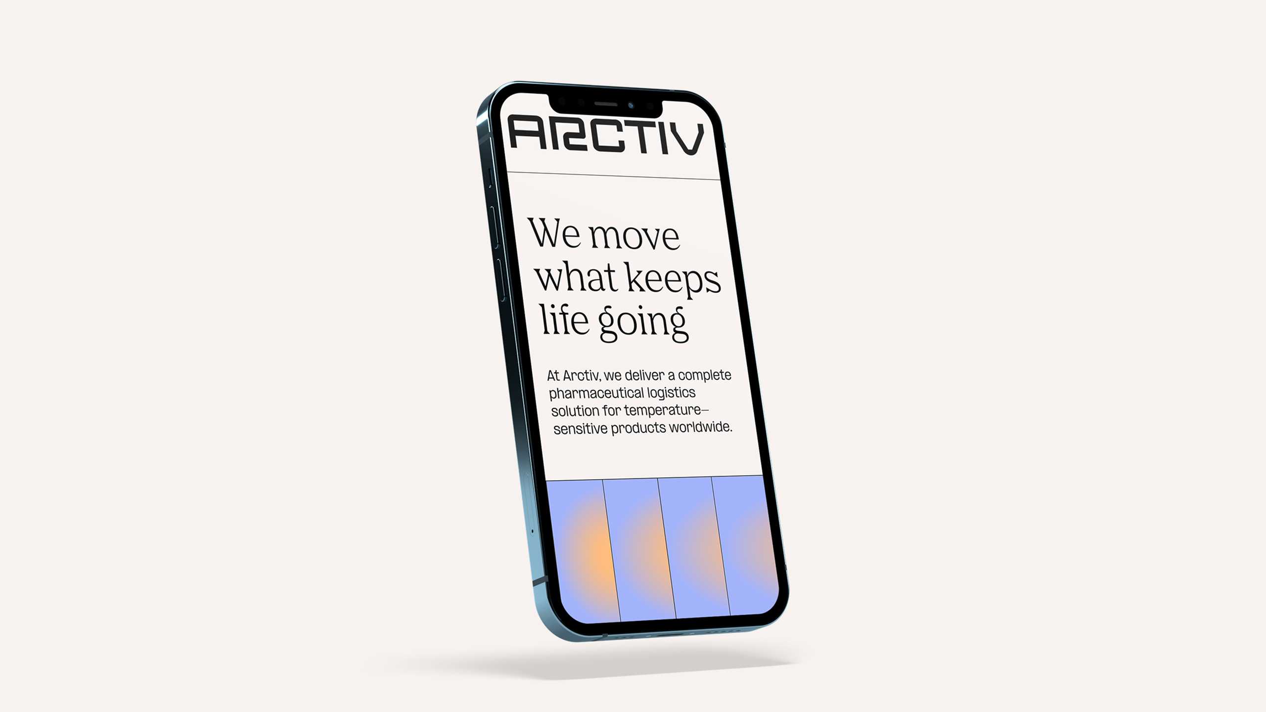
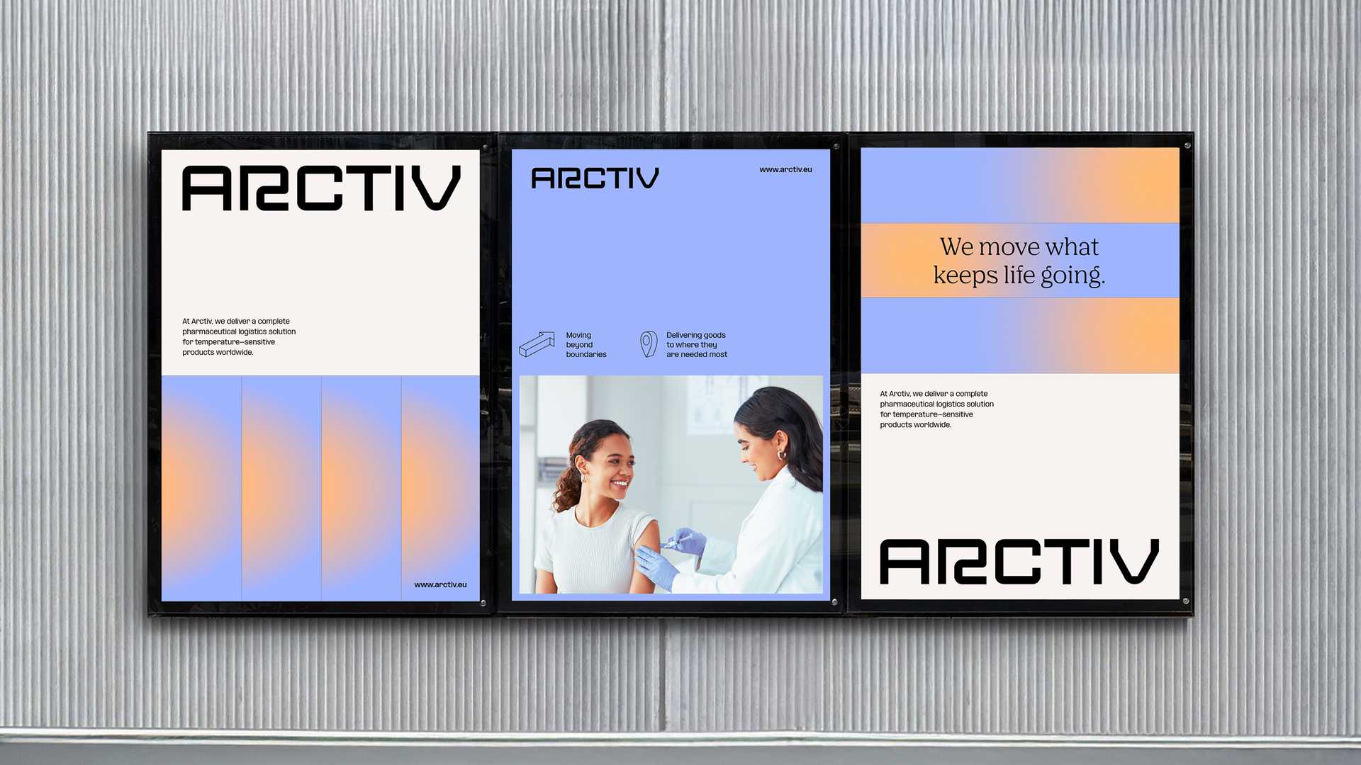
From finding the perfect name to crafting engaging visuals and positioning the brand to best effect in the market, we developed the Arctiv brand identity from top to toe. Arctiv’s mission is a critical one: its services are a catalyst for life itself to flourish. At one end is the specialist technology that brings these life-saving medicines quickly and safely to destinations all over the world; at the other are the patients and the experts who make it happen. To represent this dichotomy in full, we created a color palette comprising three tones: a cold, polar blue to signify technology and oversight; a warm, vibrant orange for emotional resonance and human connection; and a neutral beige for stability and composure. We complemented this with dual fonts: a sans serif typeface that radiates functional excellence and a clean serif font whose soft, curving style is all about empathy and emotion. As for imagery, we turned to genuine, engaging examples of transport in motion and therapeutic contexts to drive home the nature of the business. Capping it off is a modular layout system with a grid-like structure to underscore Arctiv’s penchant for organisation, control and reliable movement. Consistent and flexible, all design elements can be rolled out across online and offline media with ease, showcasing Arctiv’s identity in an instant: precise in action, emotional in outcome.
As we always say: design excellence – at least when it comes to temperature-controlled logistics – is a dish best served cold. Just call us the Godfathers of the brand world.
