KALO
Energising the image of a digital pioneer

Case Study
Overview
Our Client
Efficient ones + smart zeroes = better energy management
In today’s climate – economic and environmental – saving money and reducing carbon emissions are more important than ever. That’s where KALO comes in: the company is a full-service provider for all things energy management in residential buildings. From smart metering, intelligent thermostates and other IoT applications to automated heating bills, monthly consumption overviews and energy certificates, KALO turns data to the advantage of people and the planet by overcoming barriers between renewable energy, digital interfaces and cost-savings measures – and speeding up the energy transition in the process.
The Challenge
A brand overhaul fit for the digital age
An exciting, future-forward service portfolio deserves a public profile to match. KALO’s existing brand concept and visual identity could no longer keep pace with the pioneering energy management efforts of the digital leader. The core challenge was to upgrade all visual assets to best reflect the company’s focus on smart technologies, data and online touchpoints, while emphasising KALO’s extensive experience and key values.
Our Solution
Simple, innovative and personal
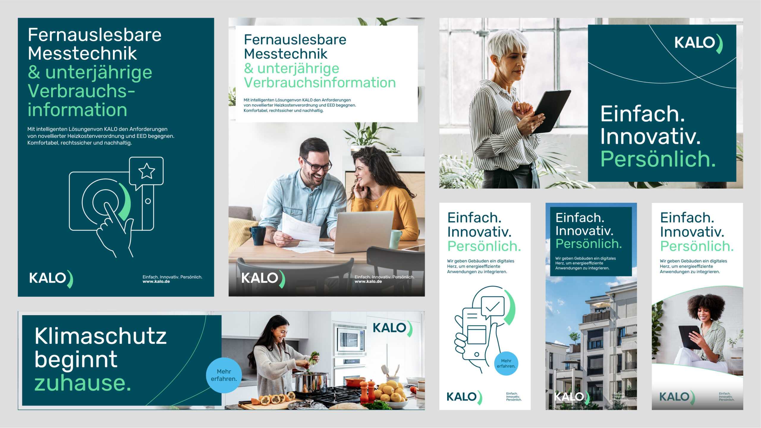
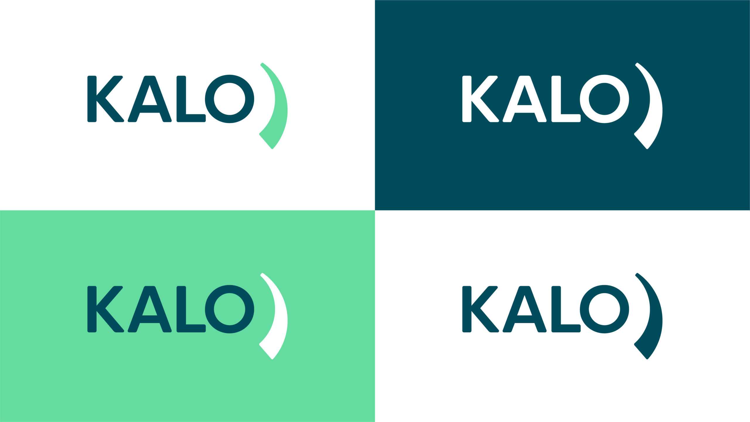
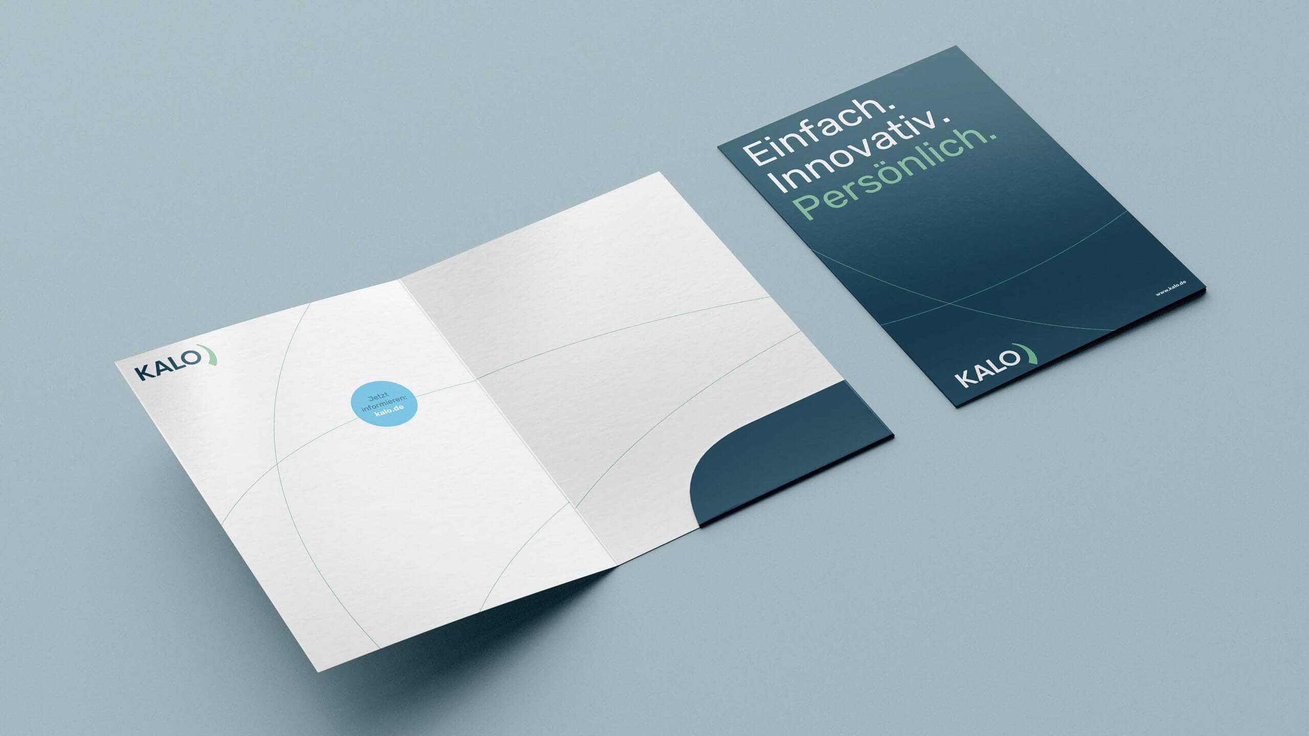
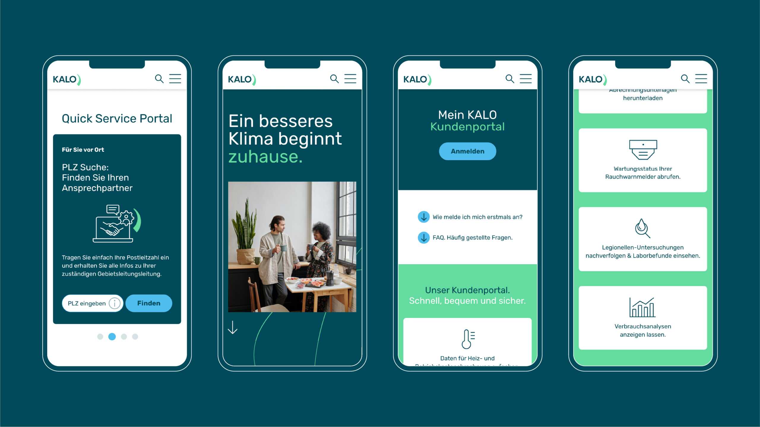
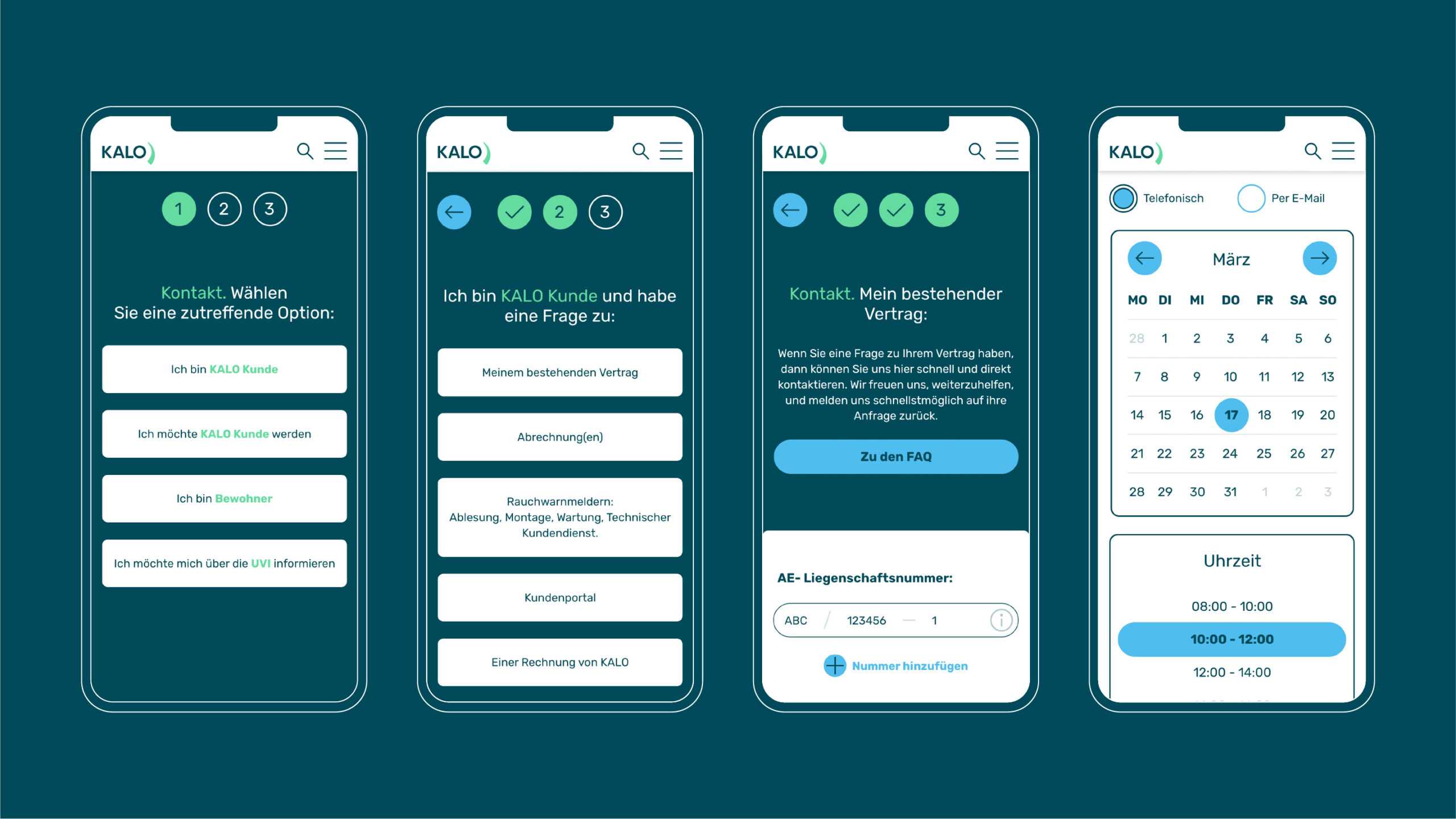
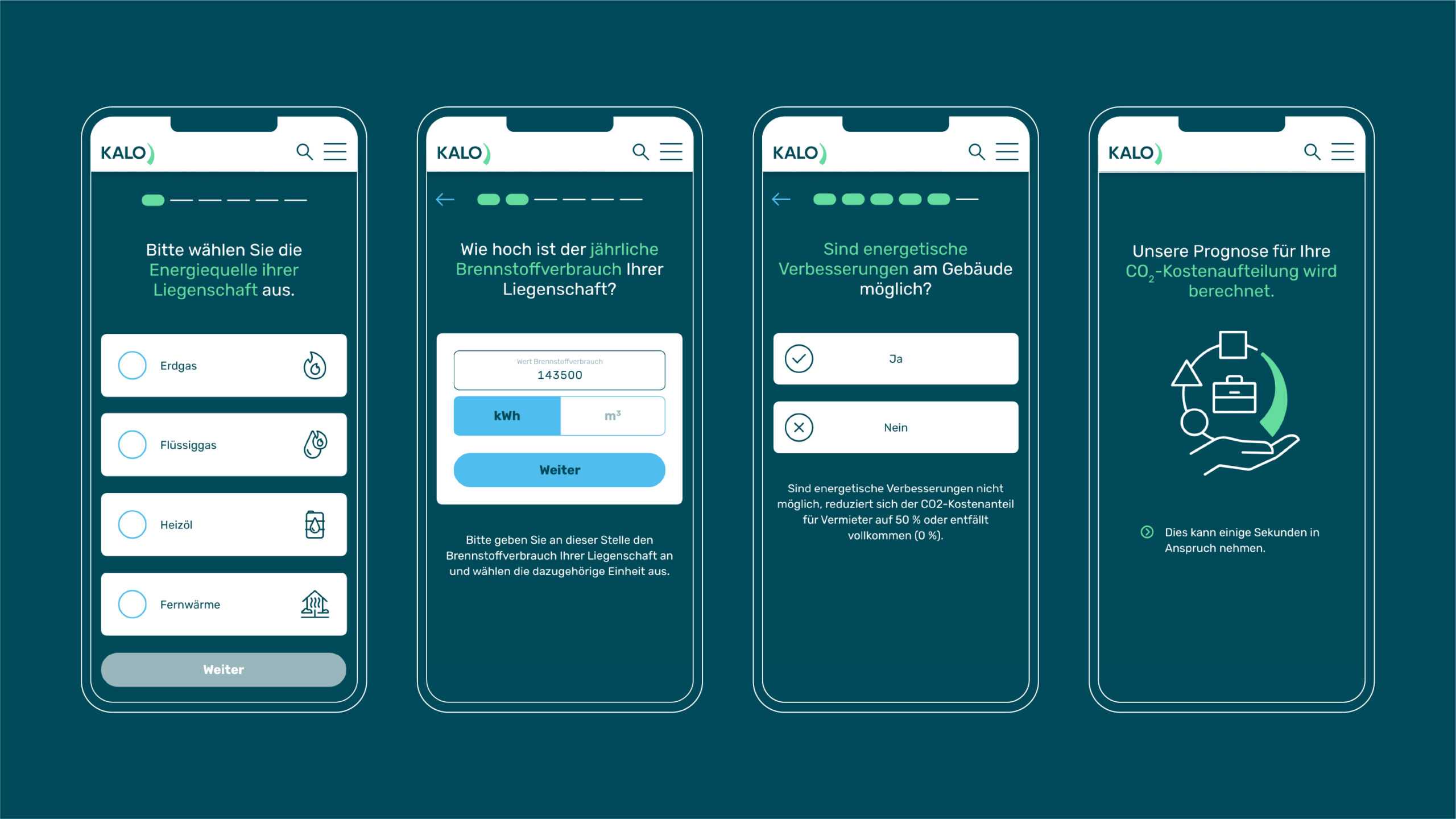
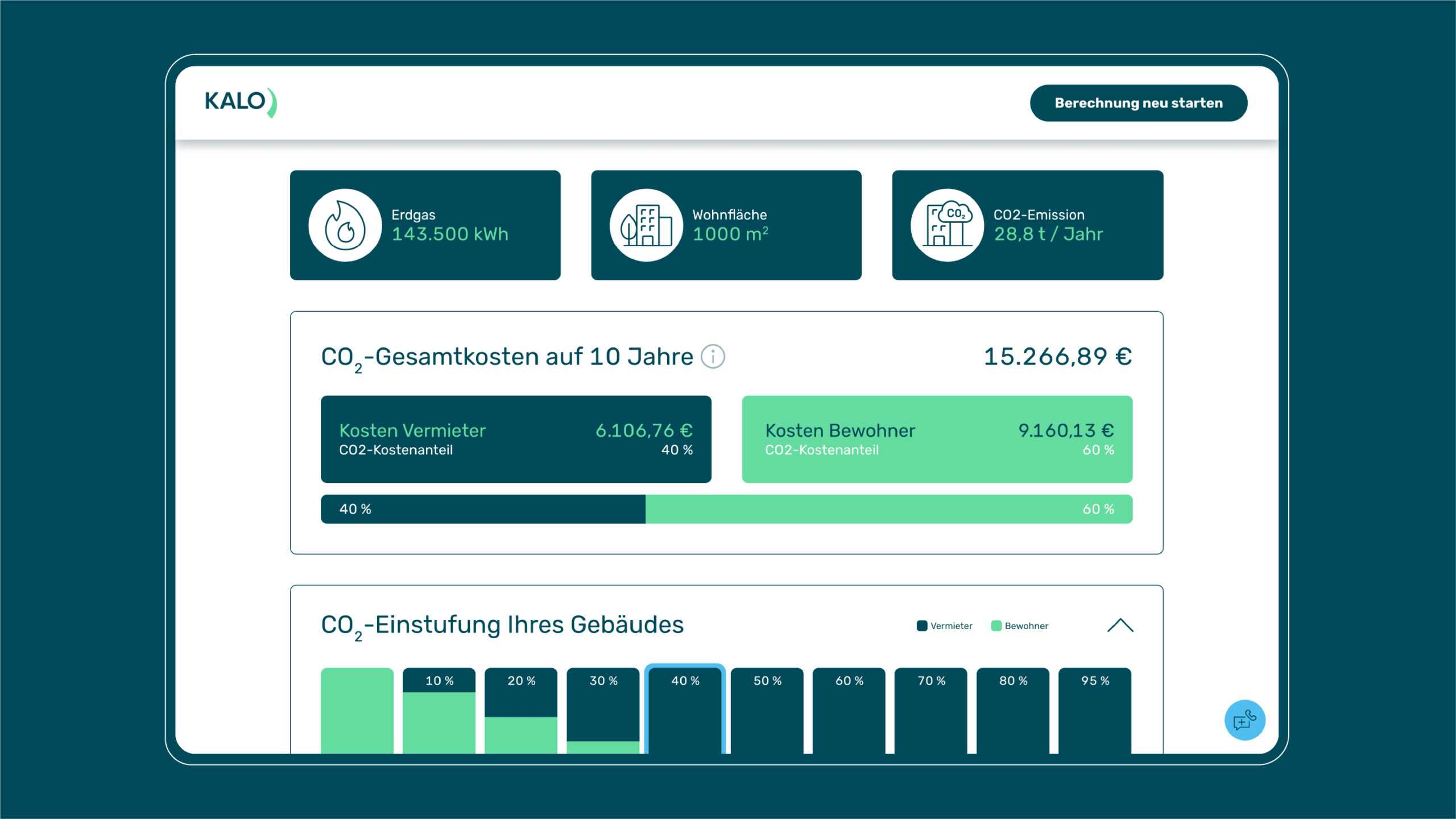
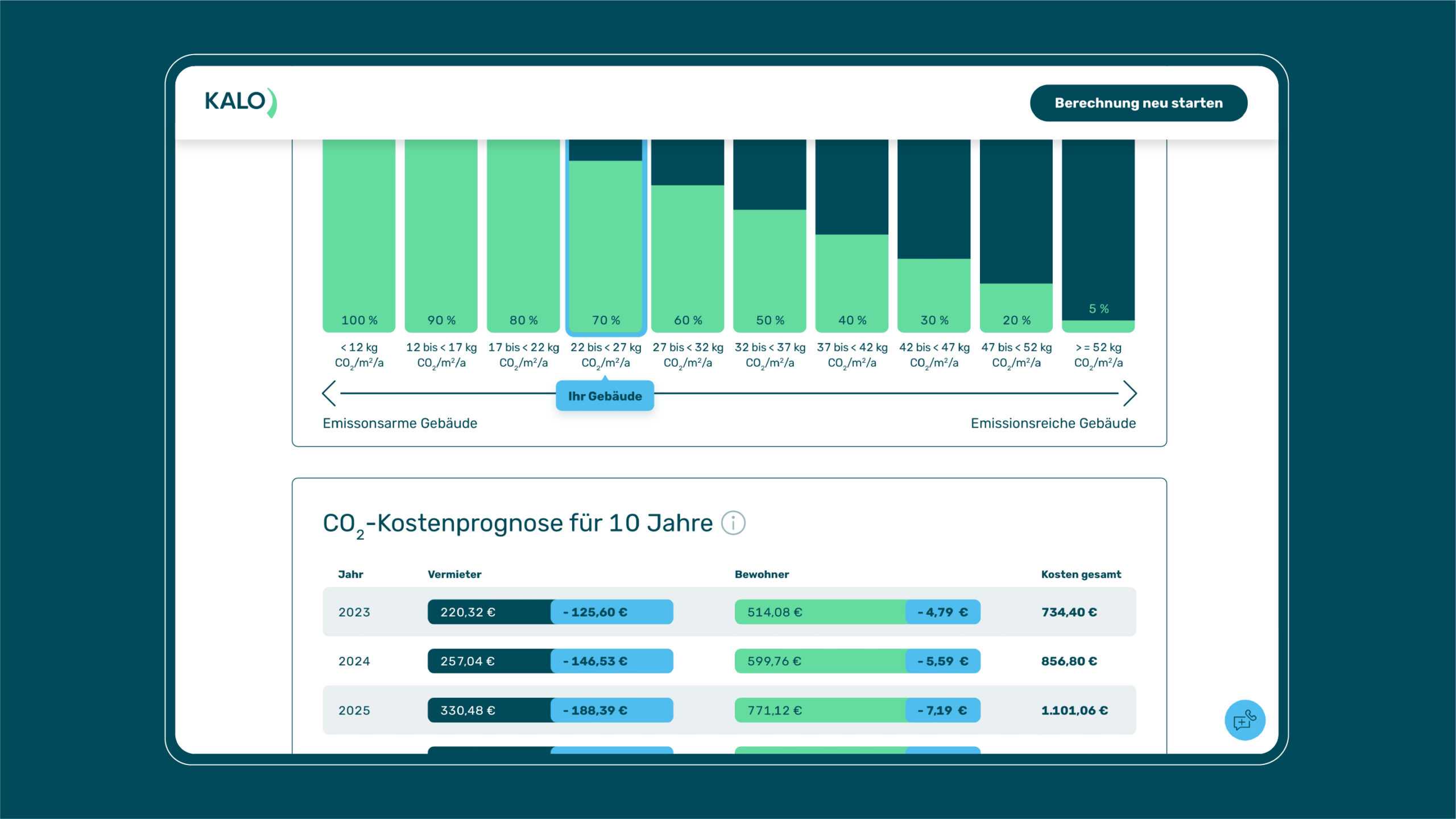
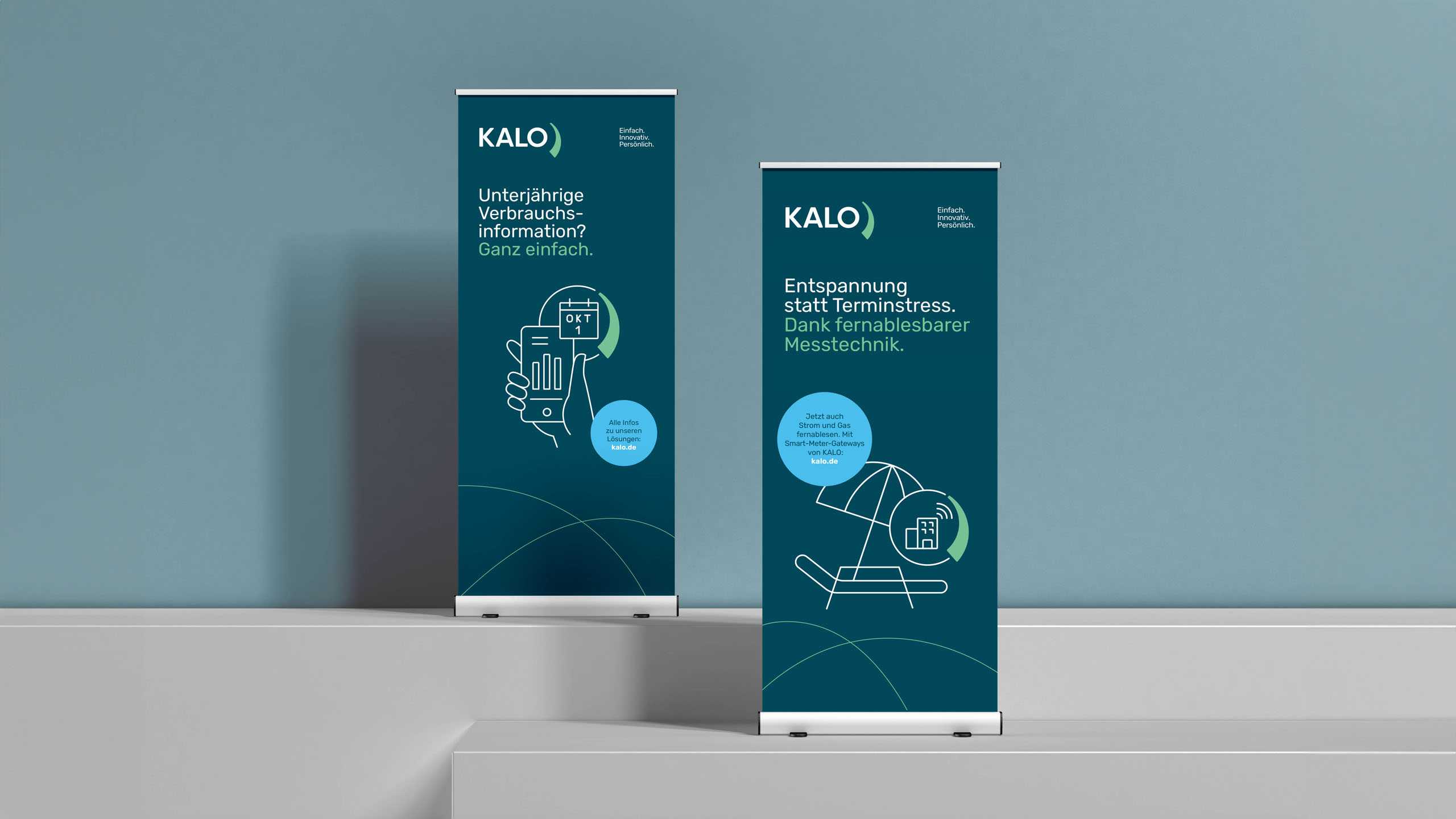
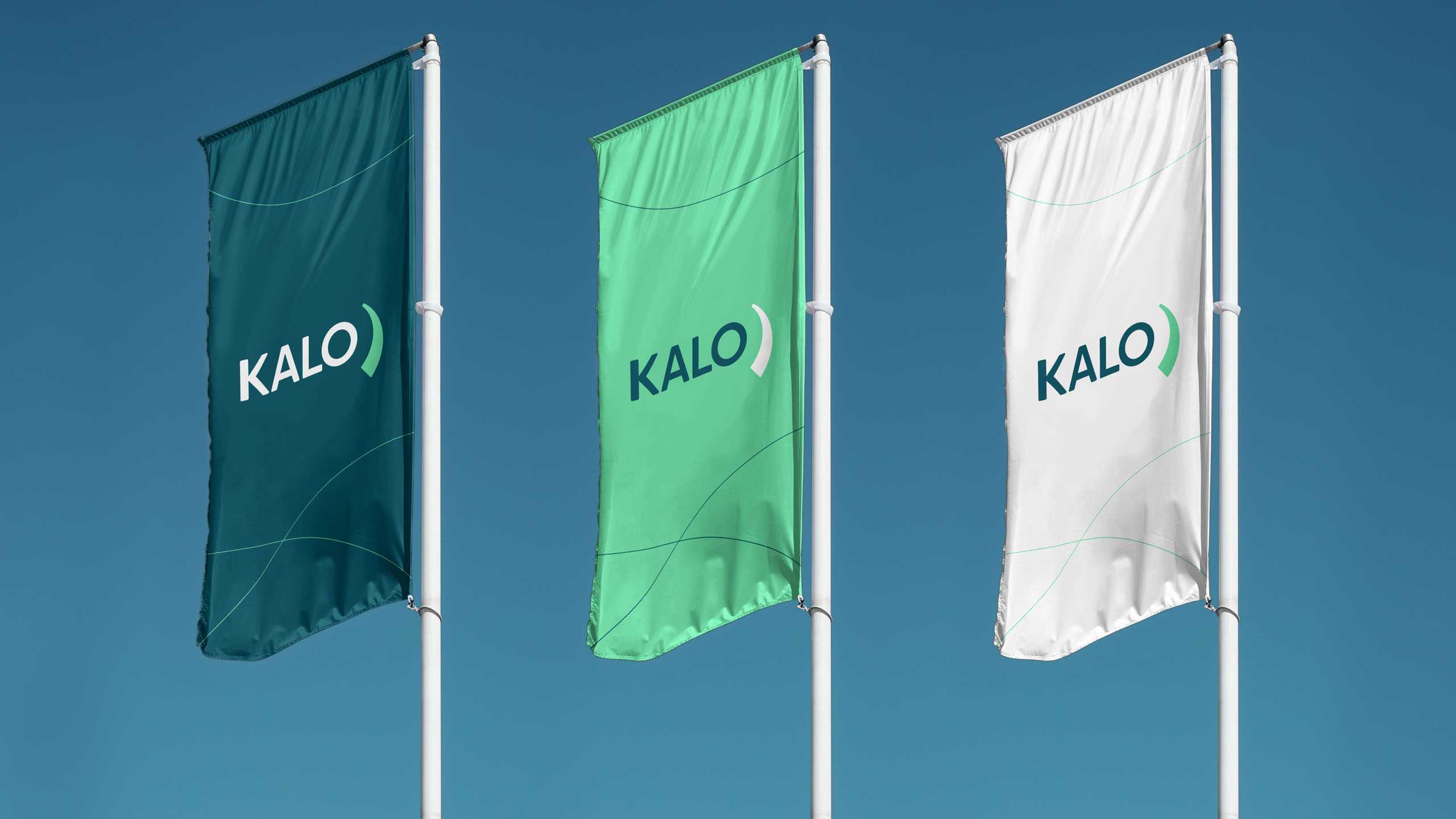
KALO’s corporate purpose is “A better climate begins at home”, which neatly summarises the company’s goal to bring cutting-edge digital technologies into the home to advance climate protection. The full-service provider wants all of its products and services to be easy to grasp and easy to use, a philosophy we made sure was reflected in the new overarching design. We overhauled the logo to lend it a uniquely digital flair – complete with sweeping graphic reminiscent of a path towards the future – while being simple to roll out across all media.
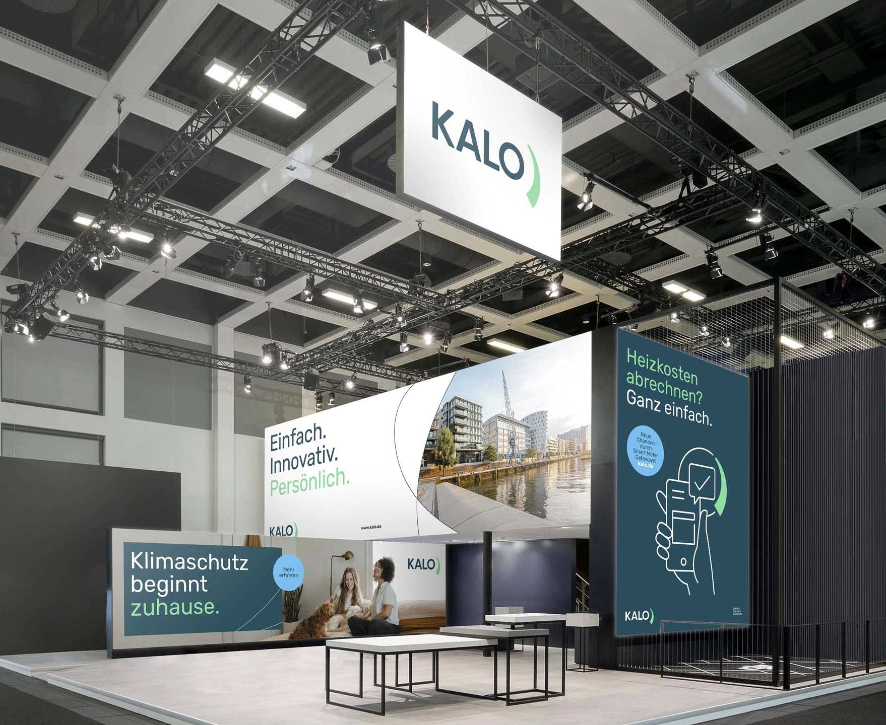
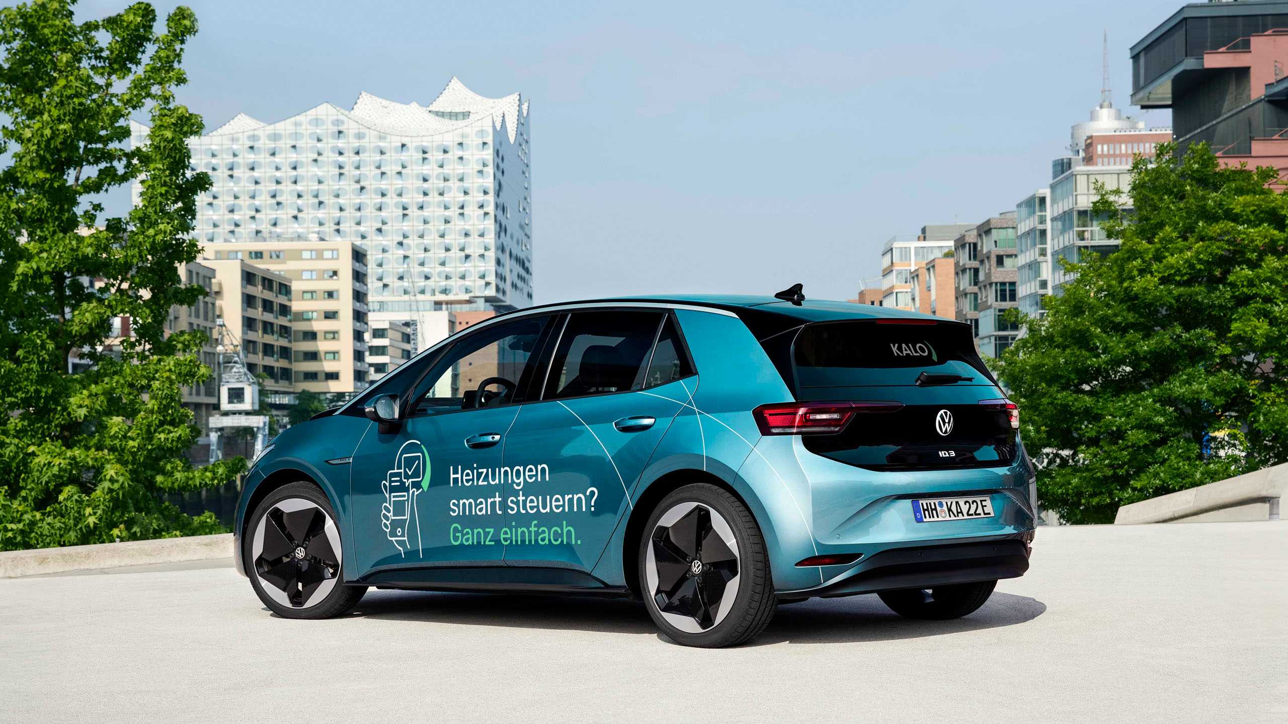
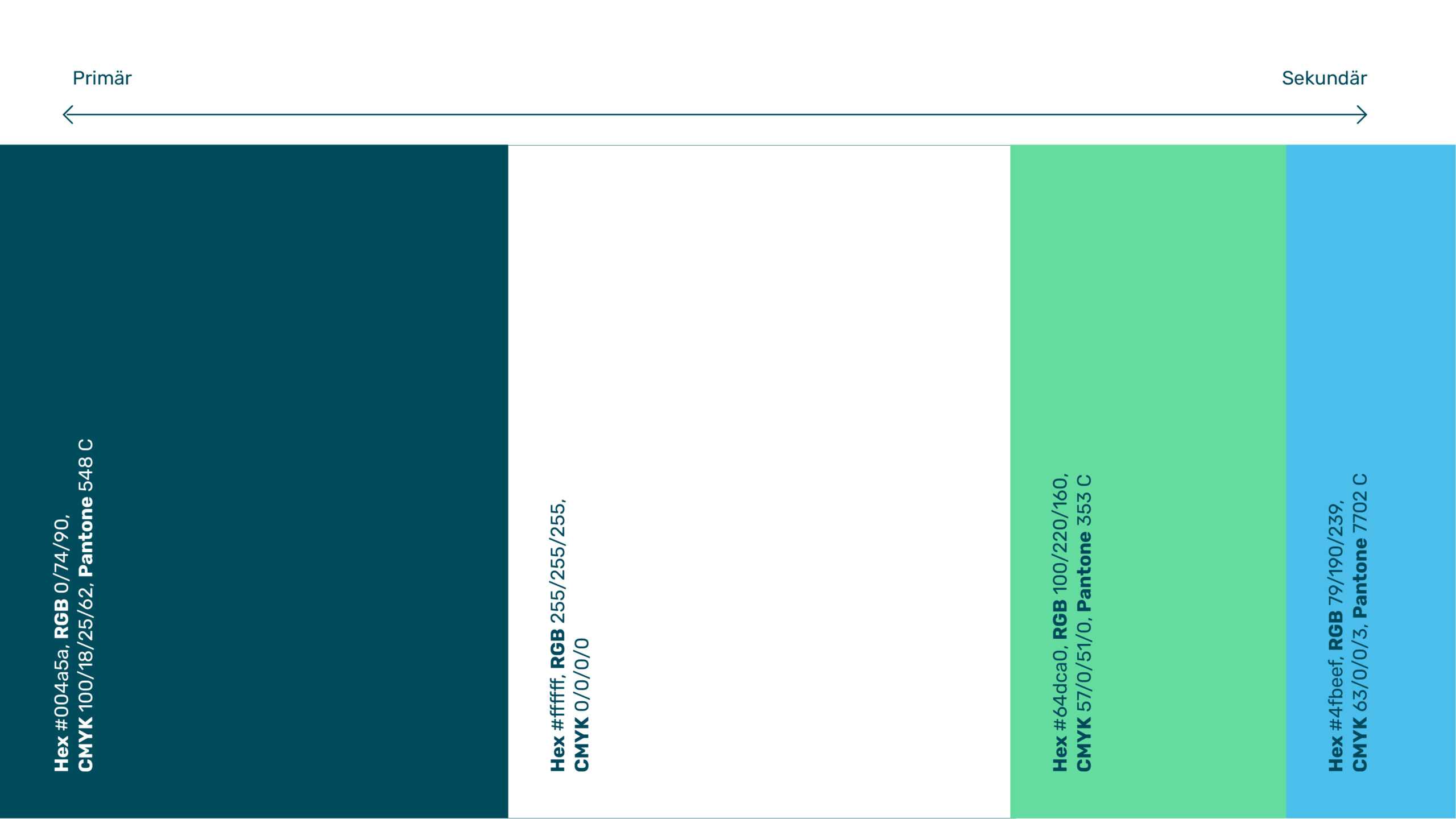
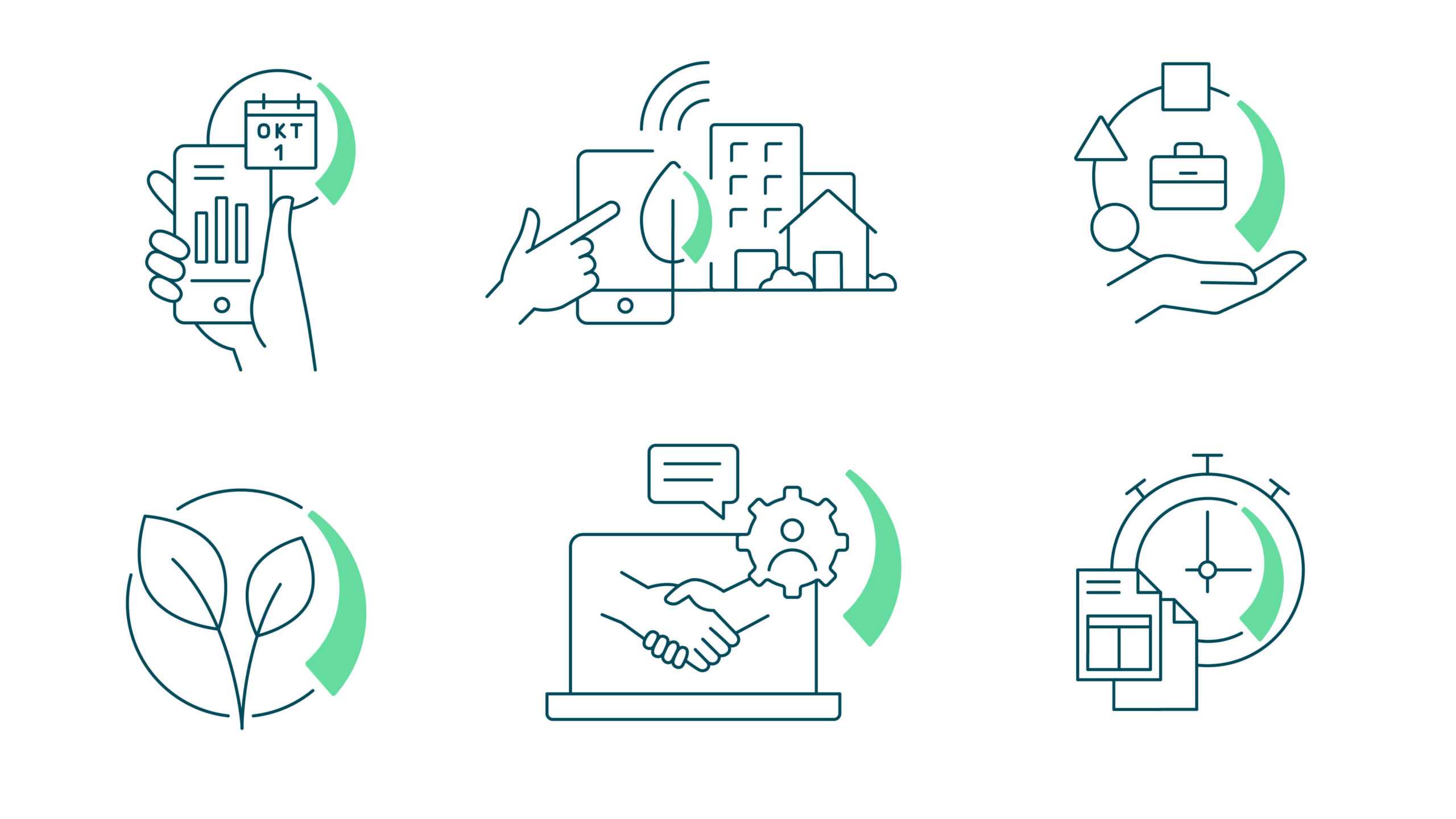
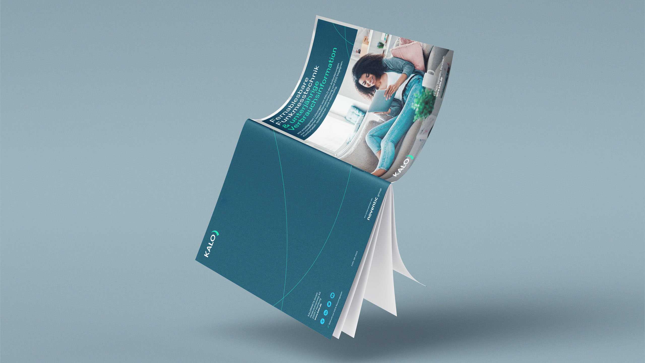
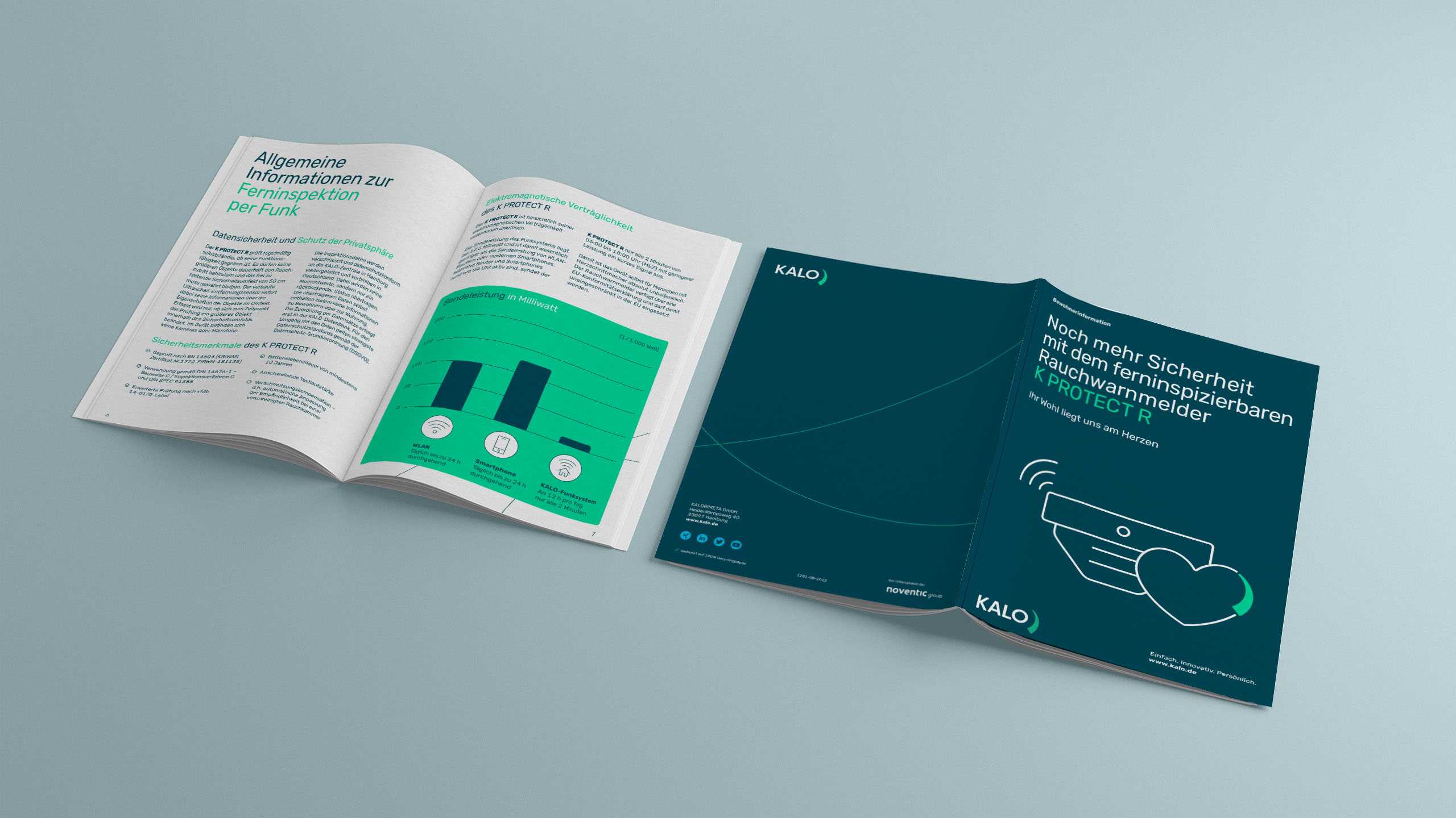
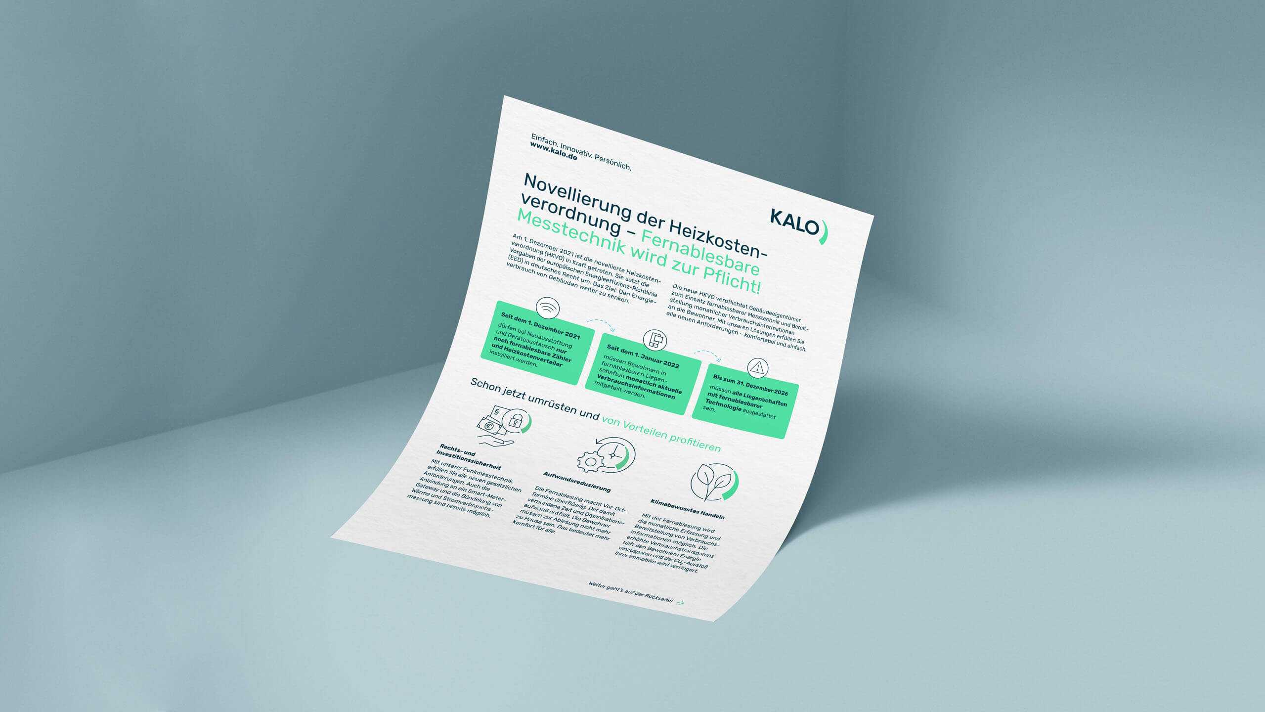
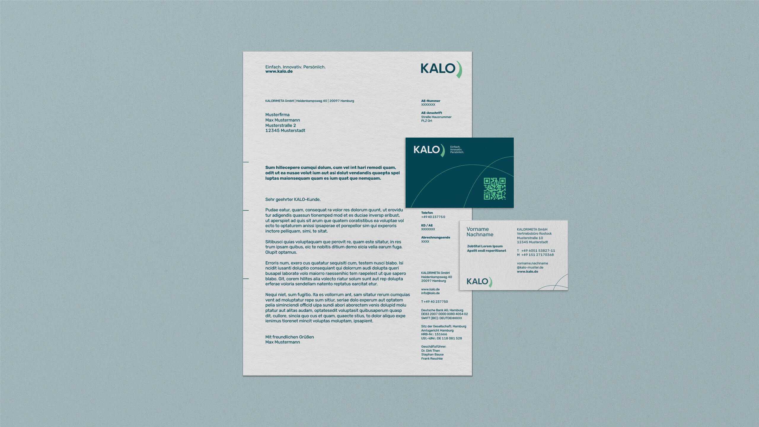
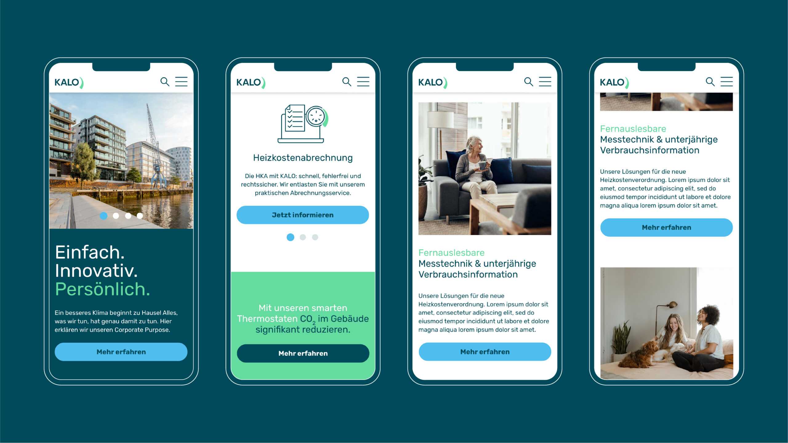
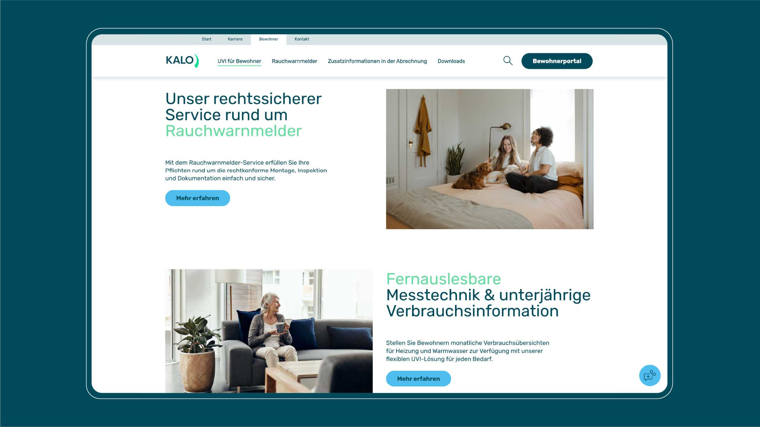
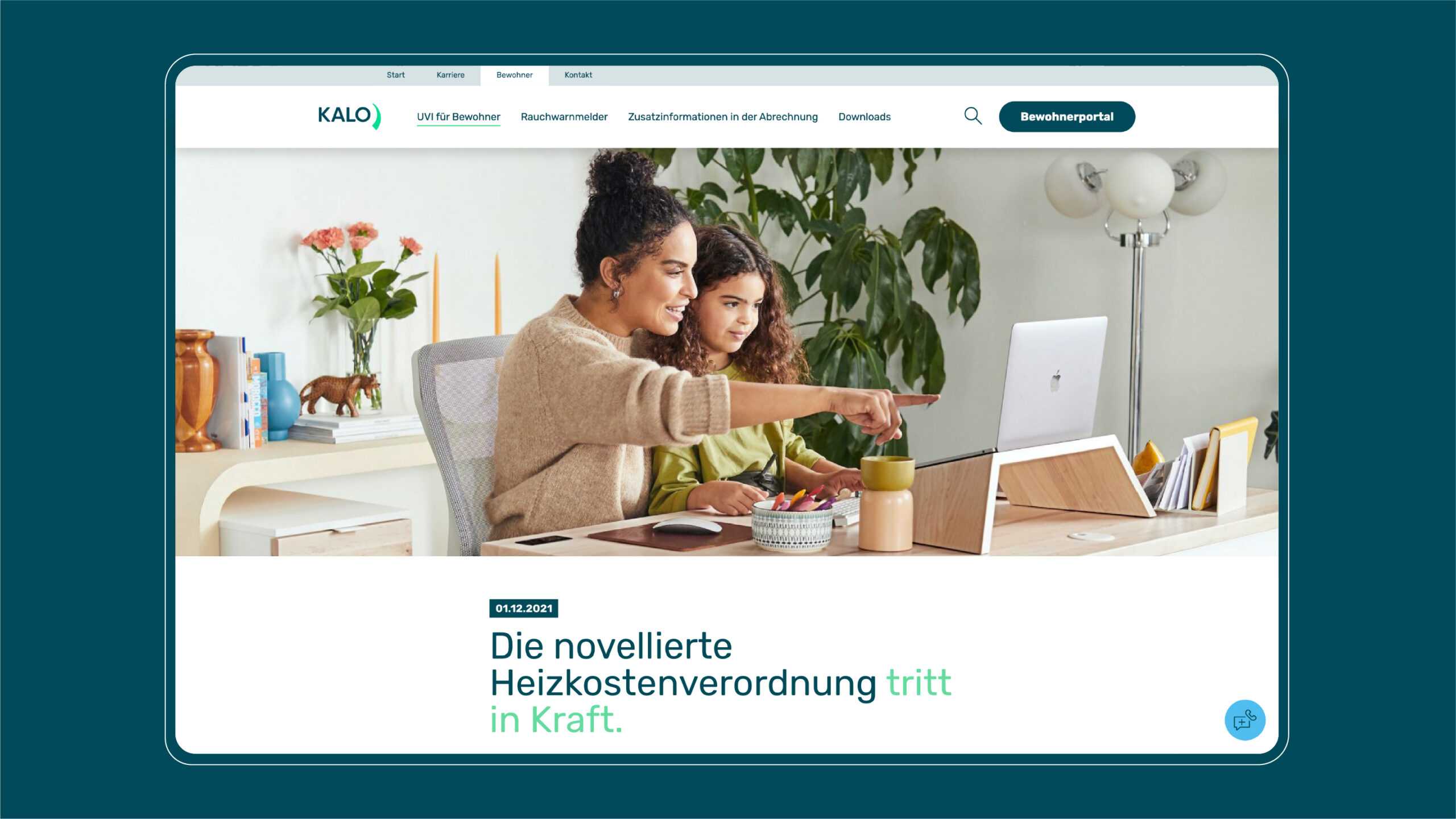
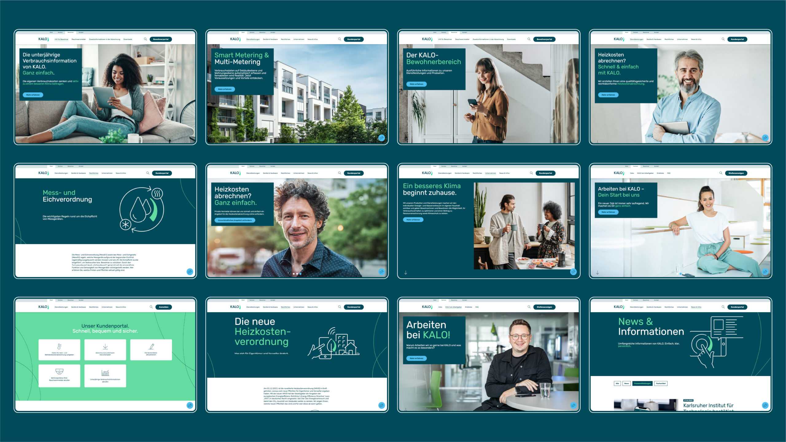
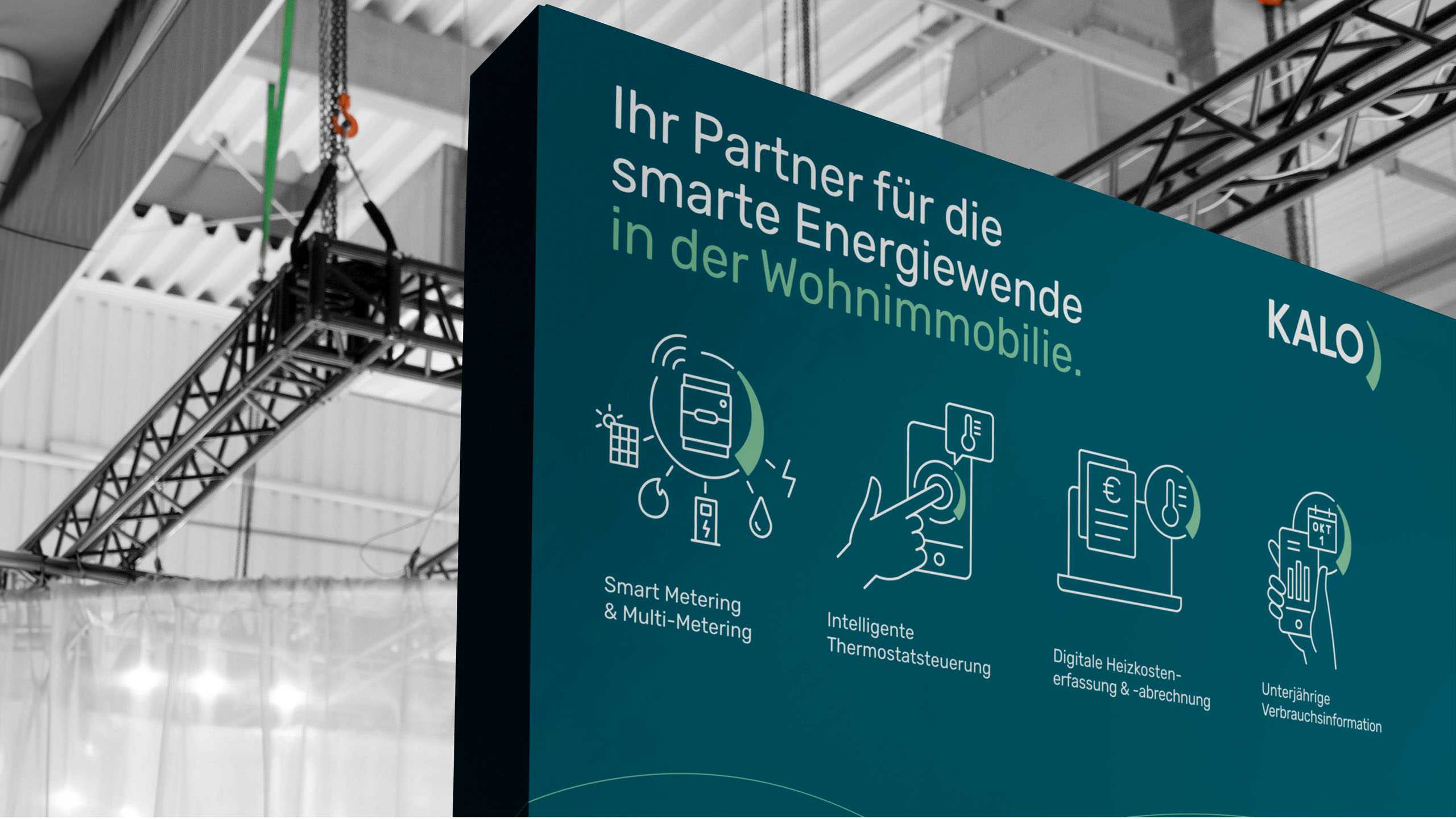
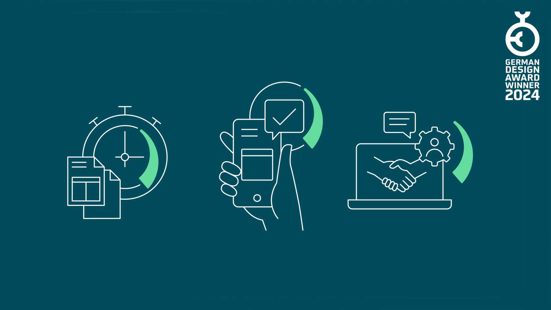
This was followed by the development of a portfolio of engaging digital assets for use on the website, social media and internal channels. We likewise standardised the imagery used by KALO, focusing on pared-back, easy-to-understand iconography in shades of petrol and mint green – both a subtle nod to the company’s focus on sustainability and the perfect way to stand out from the competition with their overreliance on more ‘industry-standard’ tones. As a real estate digitizer and with a view to its own sustainability claim, KALO also follows the digital-first approach in its communication. Nevertheless, it had to be ensured that the brand works across all touchpoints and is also effective in print media for individual use cases – for example in the area of print advertisements or business stationery.
This project was a true design coup for us: it went on to scoop the prize in the ‘rebranding’ category of the German Design Award. A feather in our cap and a small step closer to a more carbon-neutral world.
It doesn’t matter how progressive and solution-oriented you develop your offering portfolio if your brand doesn’t convey that. With the excellent support of Arndt Benedikt, we managed to create a framework to present our smart solutions in a simple, innovative and personal way.
