Next Packet
Laying the tarmac for the digital superhighway
Case Study
Overview
Our Client
Turning hardware into easyware
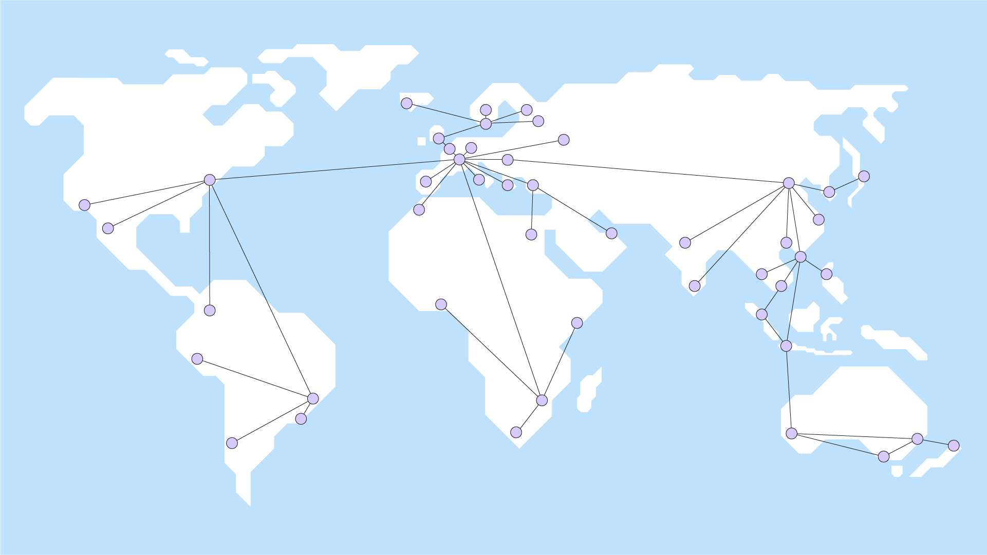
When it comes to technology, Next Packet goes deep. It is seeking to disrupt the market for router hardware by making ports available to companies that either don’t have the clout or readiness to build their own expansive computer networks. Instead of spending time and money setting up new hardware, businesses can use an API to access Next Packet’s router ports—and start collaborating, communicating and gathering data within minutes.
The Challenge
A high concept calls for a big impact
With so many players competing for recognition in the hotly contested world of deep tech, Next Packet’s disruptive concept needed an identity that couldn’t be mistaken for anything else. Something clean. Something smart. And above all something innovative. Just the job for us.
Our Solution
A structured identity with a cyberpunk flair
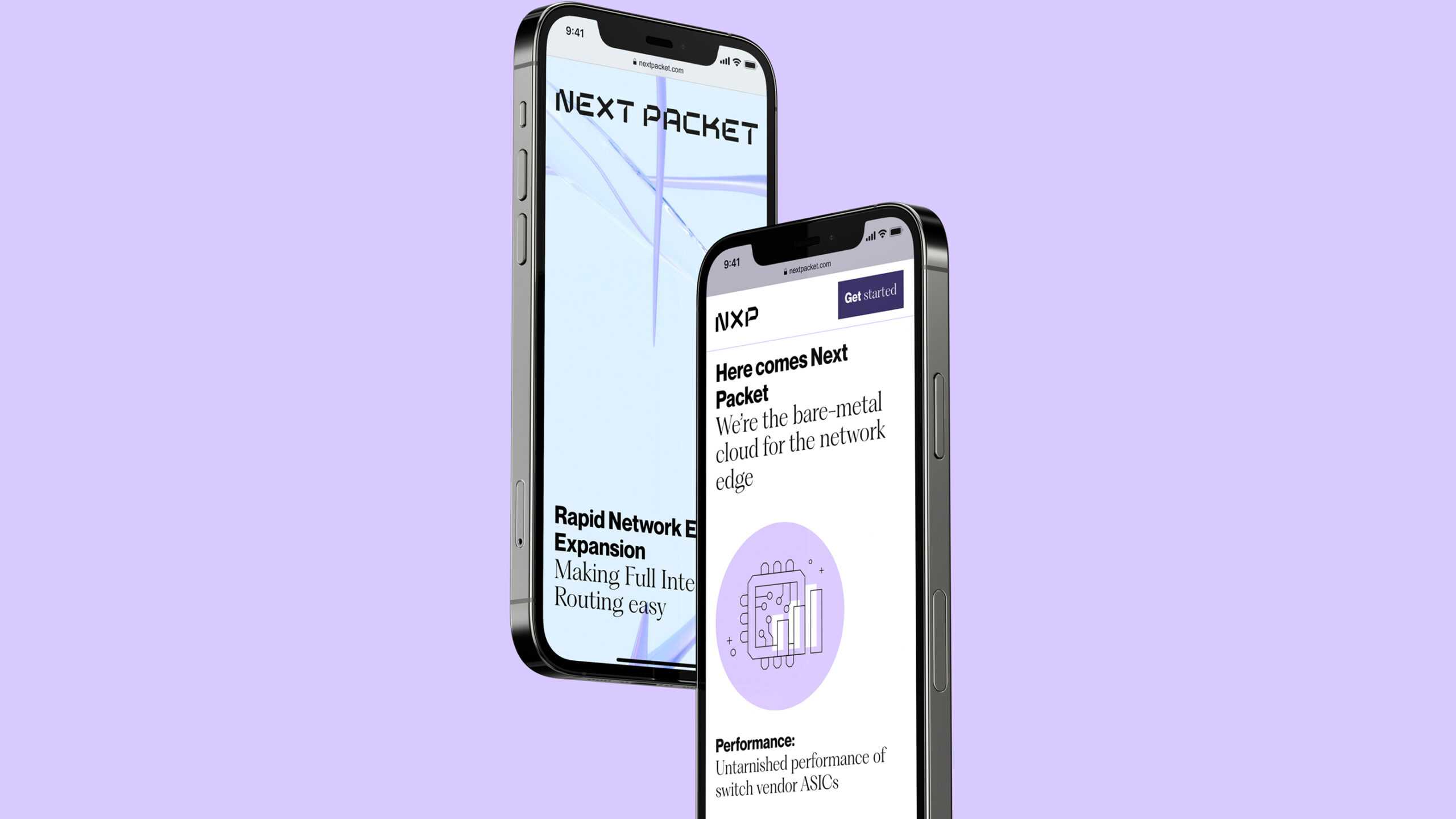
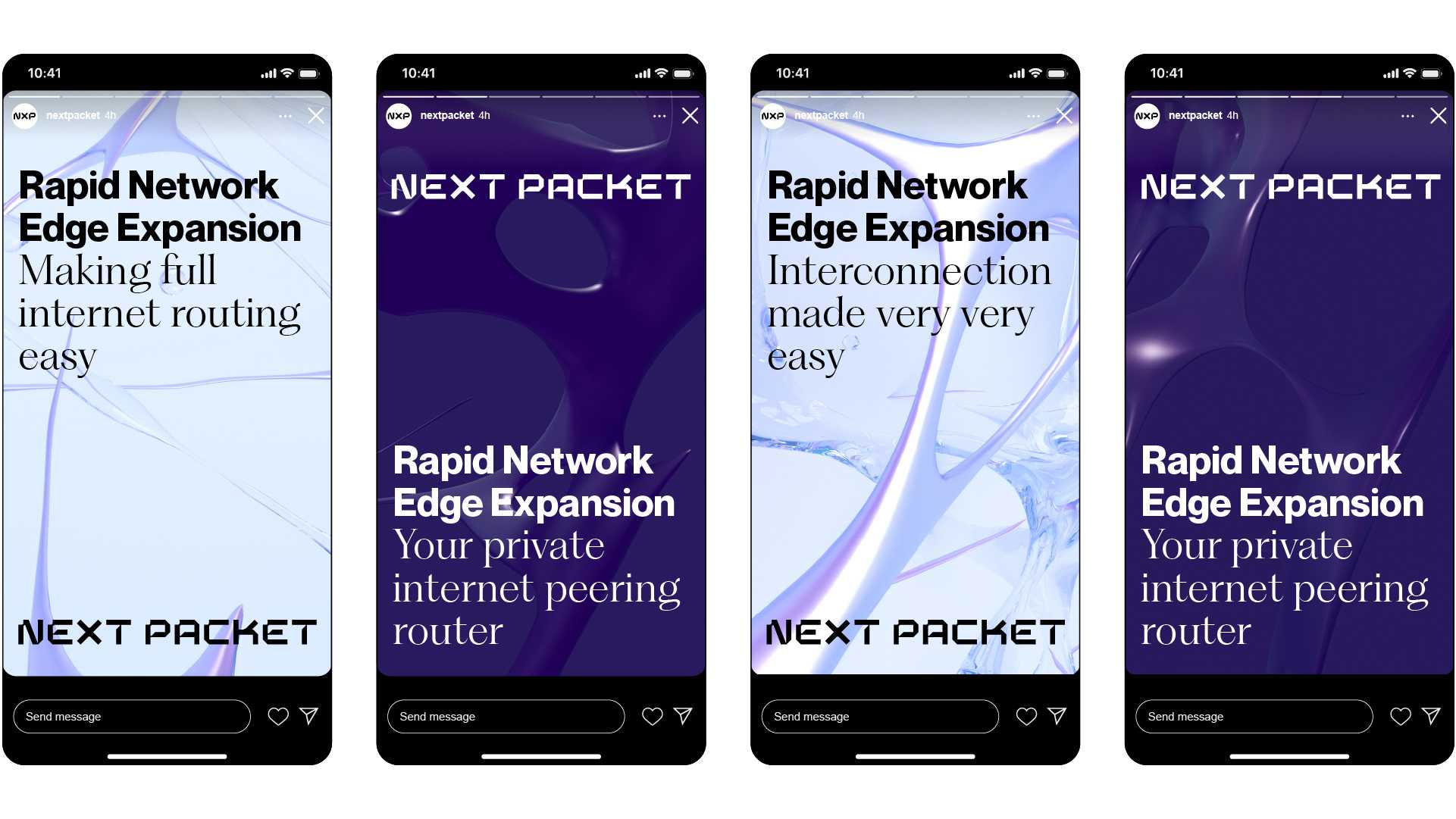
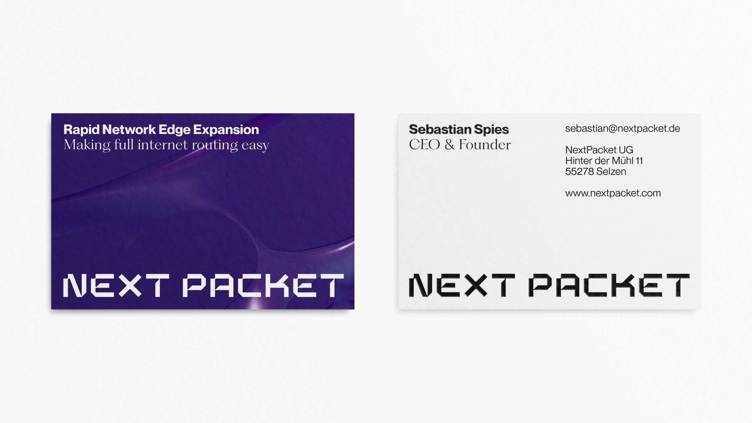
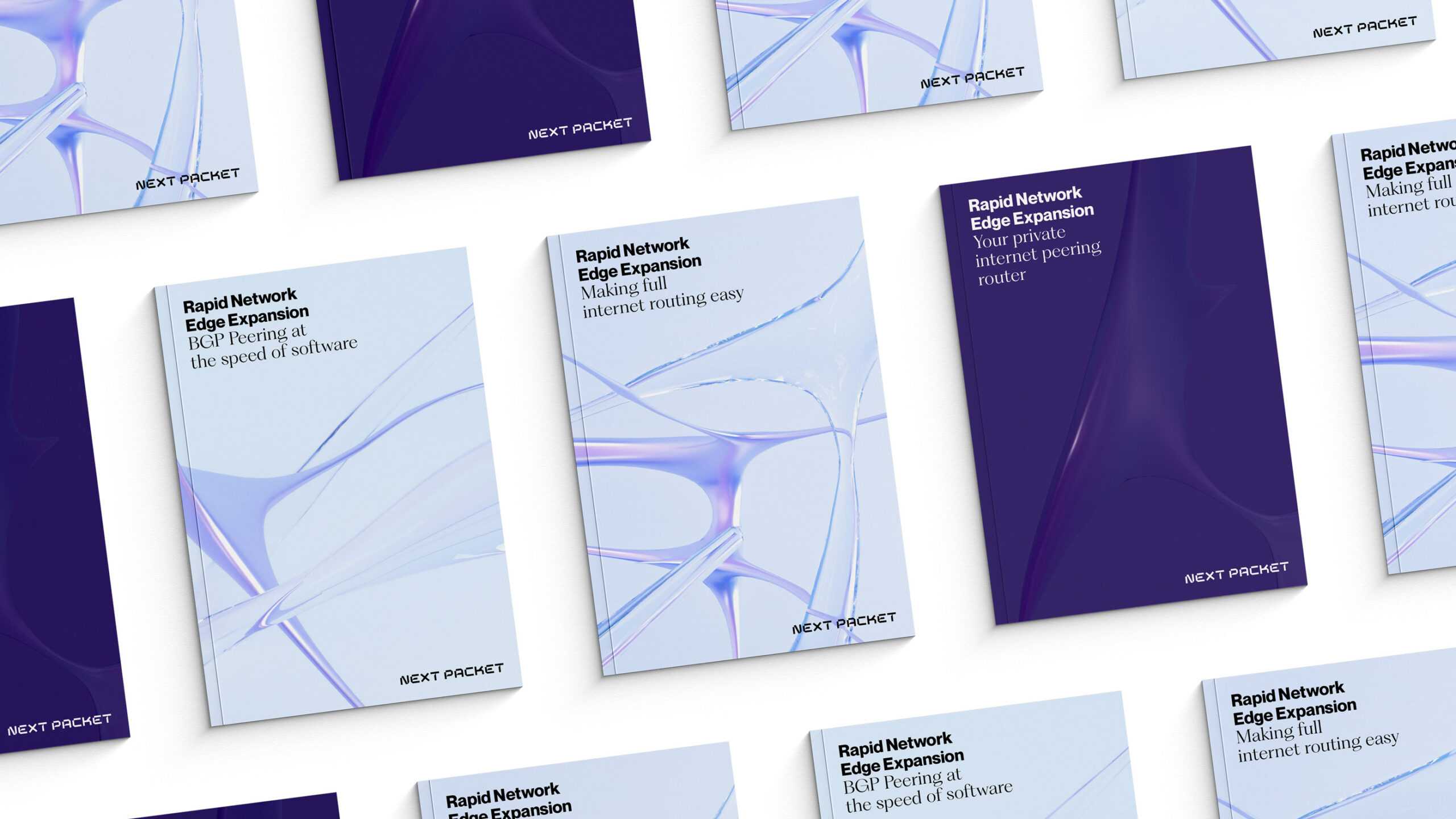
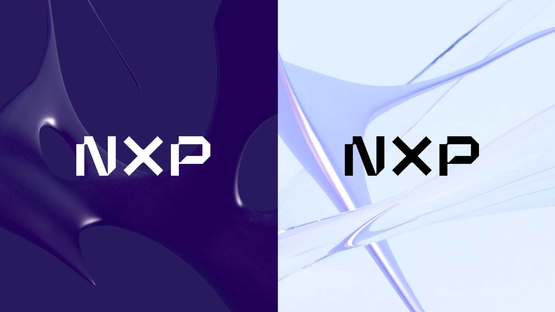
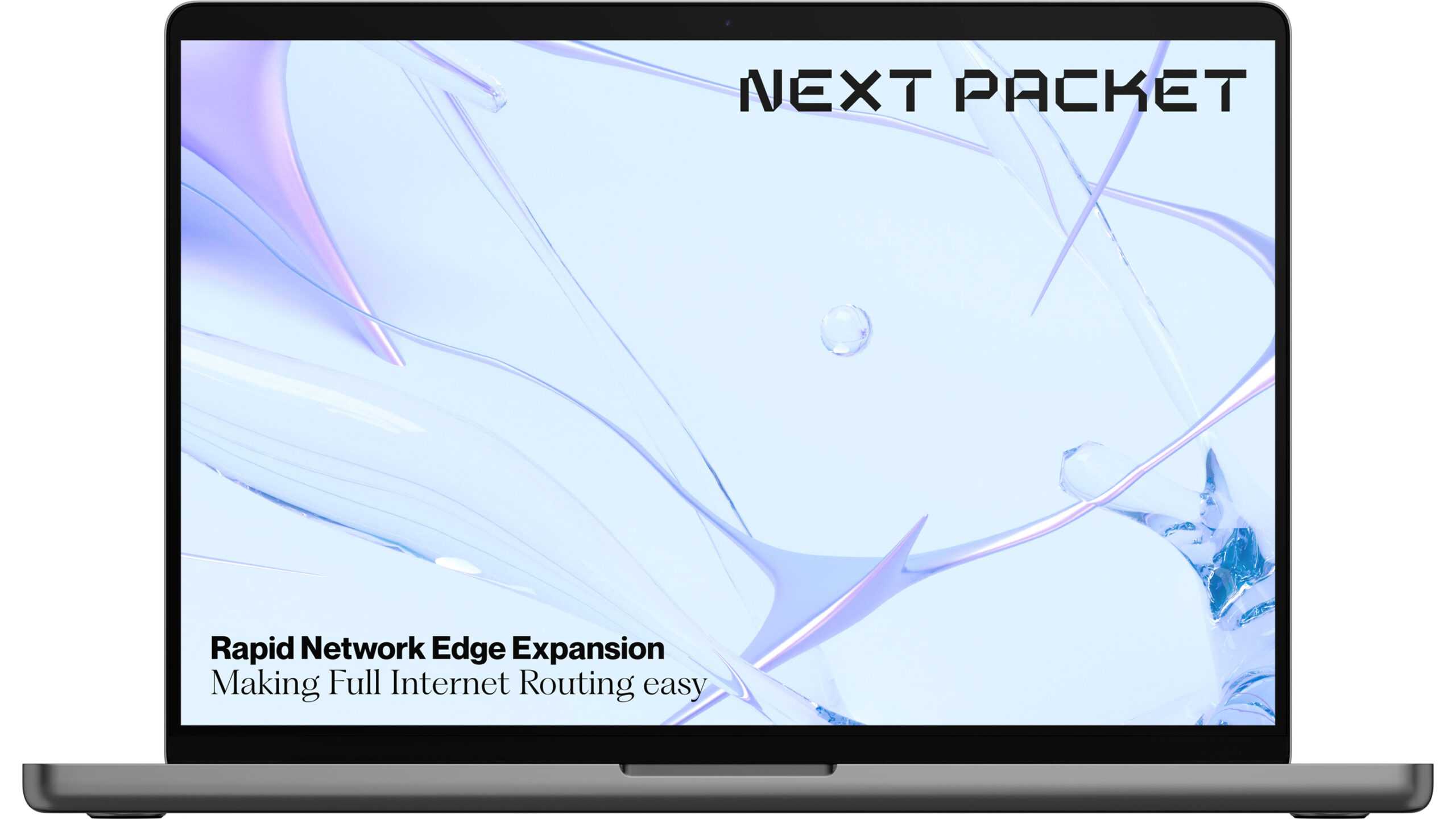
Next Packet’s name is simple, yet forward-looking, which is why we turned it into a word mark. Our design imagined it as a series of interconnecting girders—with each letter creating a network of its own—that exude technical precision. This is also reflected in the visuals, which consist of solid, organic forms superimposed by wire-like counterparts: the latter represents the speed and precision at which technology changes in today’s world, while the former points to the reassuring stability, mass and incremental advancement of computer networks. The word mark and visuals use the same overarching honeycomb structure as their starting point, as shown by the sharp diagonal lines in their design. This is both a nod to the hexagonal architecture used in software design for port-based connections and a clear reference to Next Packet’s disruptive character. The result: a dynamic visual system that can be replicated across various media.
Technology moves fast … but so do we. Next Packet is now well placed to disrupt the market. We bet Elon Musk will be tweeting about them in no time.
The wind of change is blowing through our market, with the way we create networks set to change forever. We wanted to craft a corporate image for Next Packet that reflects this future-forward spirit – and this called for a design innovator that could keep pace with our pioneering mindset. Arndt Benedikt fit the bill perfectly.
