OMR
A consistent brand sprinkled with stardust
Case Study
Overview
Our client
Taking the digital economy into the stratosphere
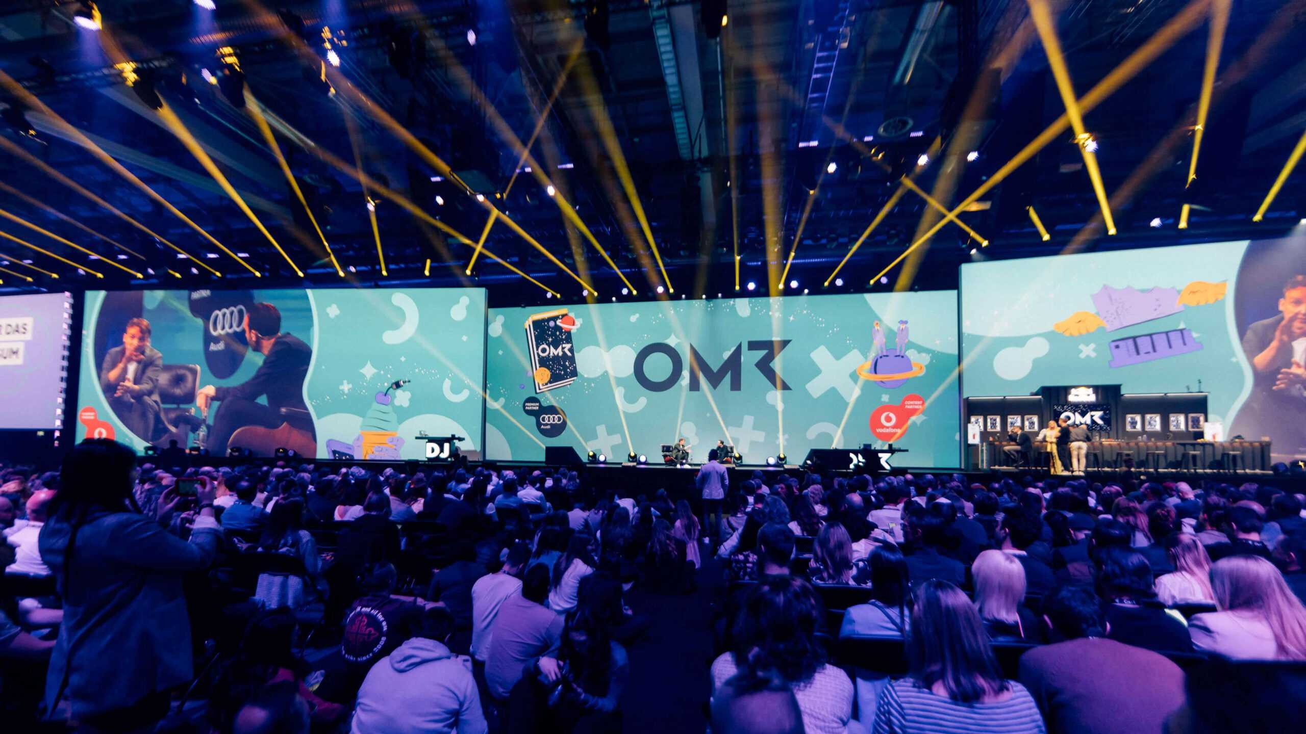
OMR is a byword for success in the digital arena: starting out as an industry conference just over a decade ago, it has since grown into a true heavyweight for all things related to the digital economy. A two-day festival home to Europe’s largest conference stage, a job vacancy and talent promotion portal, a podcast production studio, a software product comparison site, sociopolitical initiatives geared towards equality and fairness, training & further education services for professionals, venture capital for startups and much more: OMR has more strings to its bow than Robin Hood. Phew.
The Challenge
An identity creaking under the weight of success
Having experienced so much diversification in the past few years, OMR’s corporate design was struggling to keep pace with the company’s growth. Although everyone from industry professionals to the man on the street now knows the company’s name, what the digital player needed was a consistent visual identity that could be seamlessly applied by all of its divisions while presenting a single assured face to the world.
Our Solution
Visual fuel to reach the stars
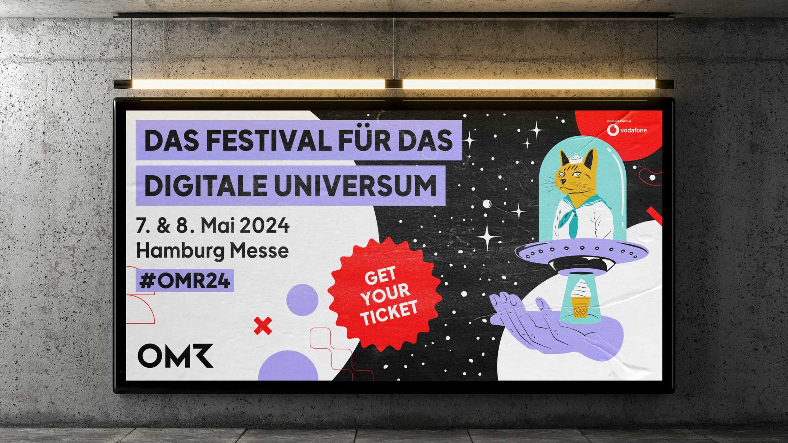
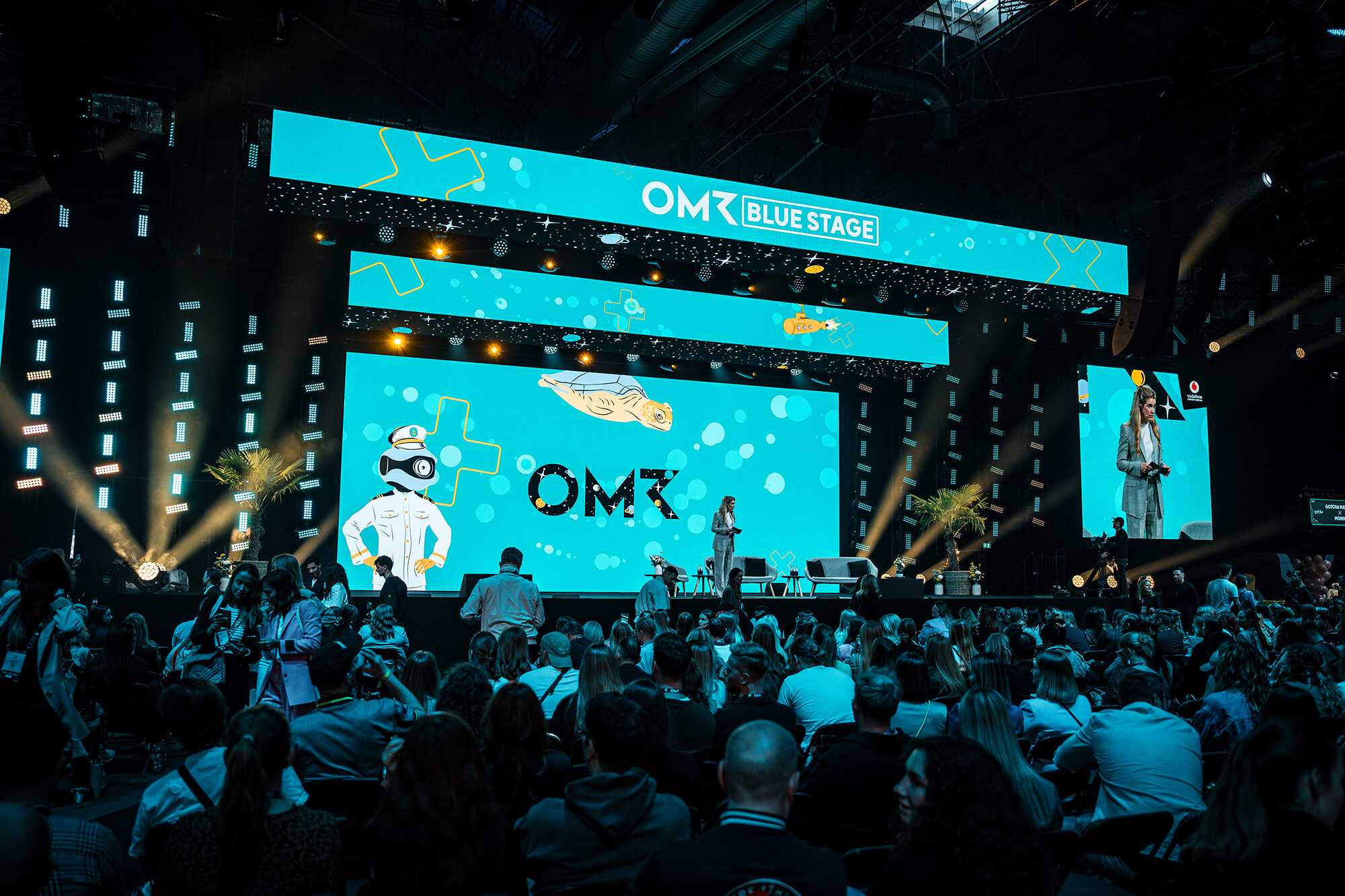
A slew of workshops in close cooperation with OMR’s own people yielded a strong basic concept – that the digital giant takes clients on a journey through the digital cosmos – to underpin our branding and design efforts. From the start, we understood it was essential to ensure the finished product could be rolled out by all branches of OMR with the same level of consistency and user friendliness. With this in mind, we liberated the old logo from the speech bubble that surrounded it to give it more dynamism and flexibility while making it easier and clearer to use across media – whether miniscule or billboard-sized.
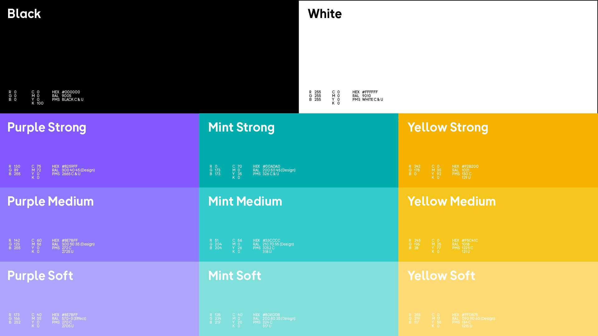
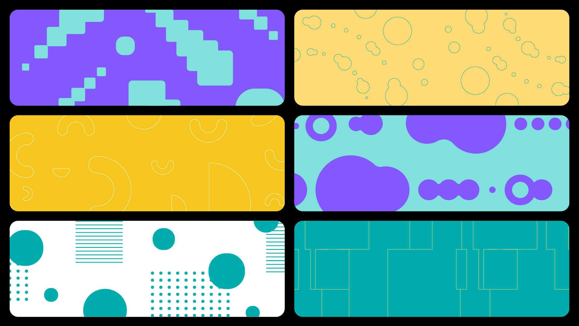
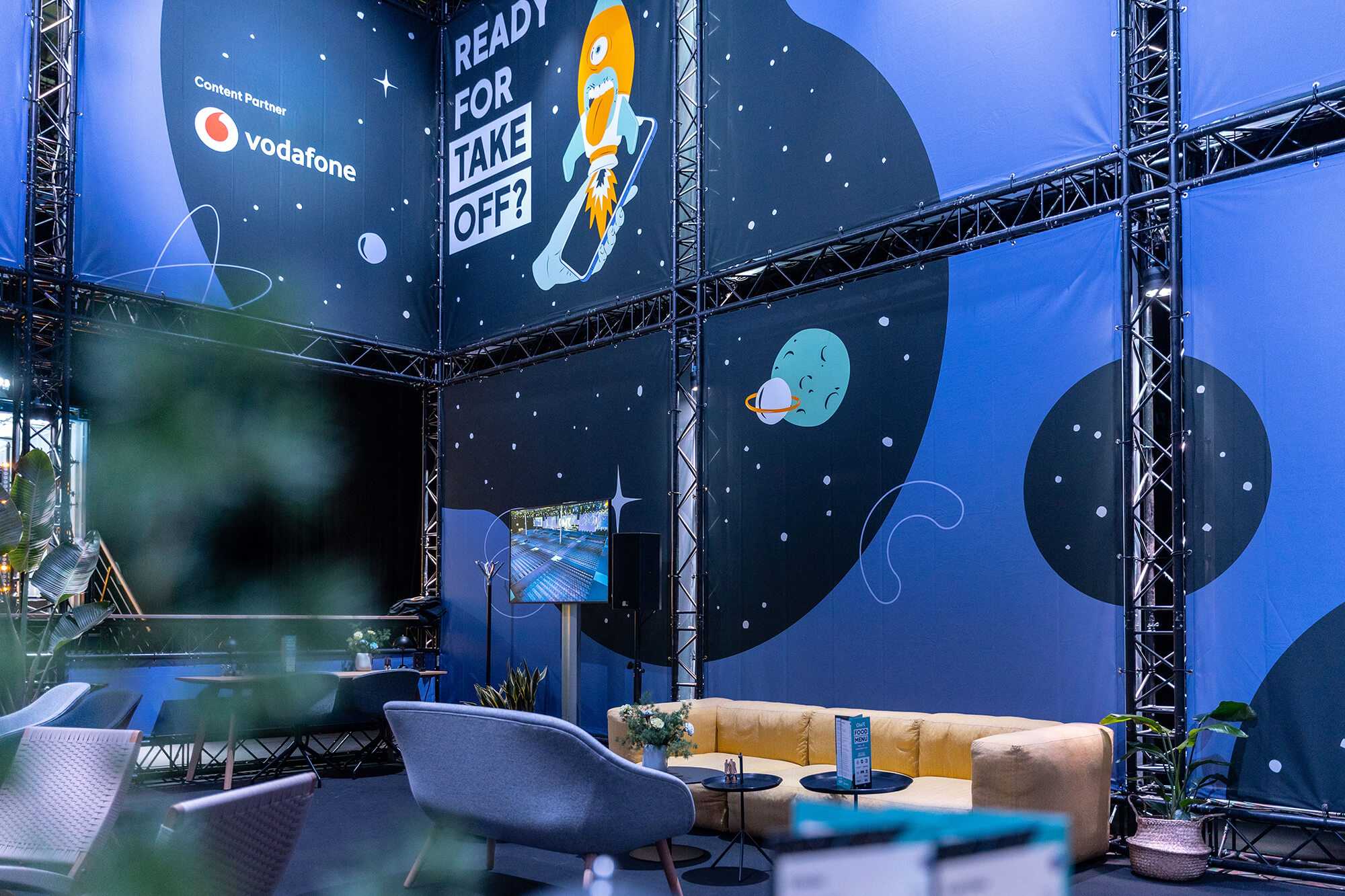
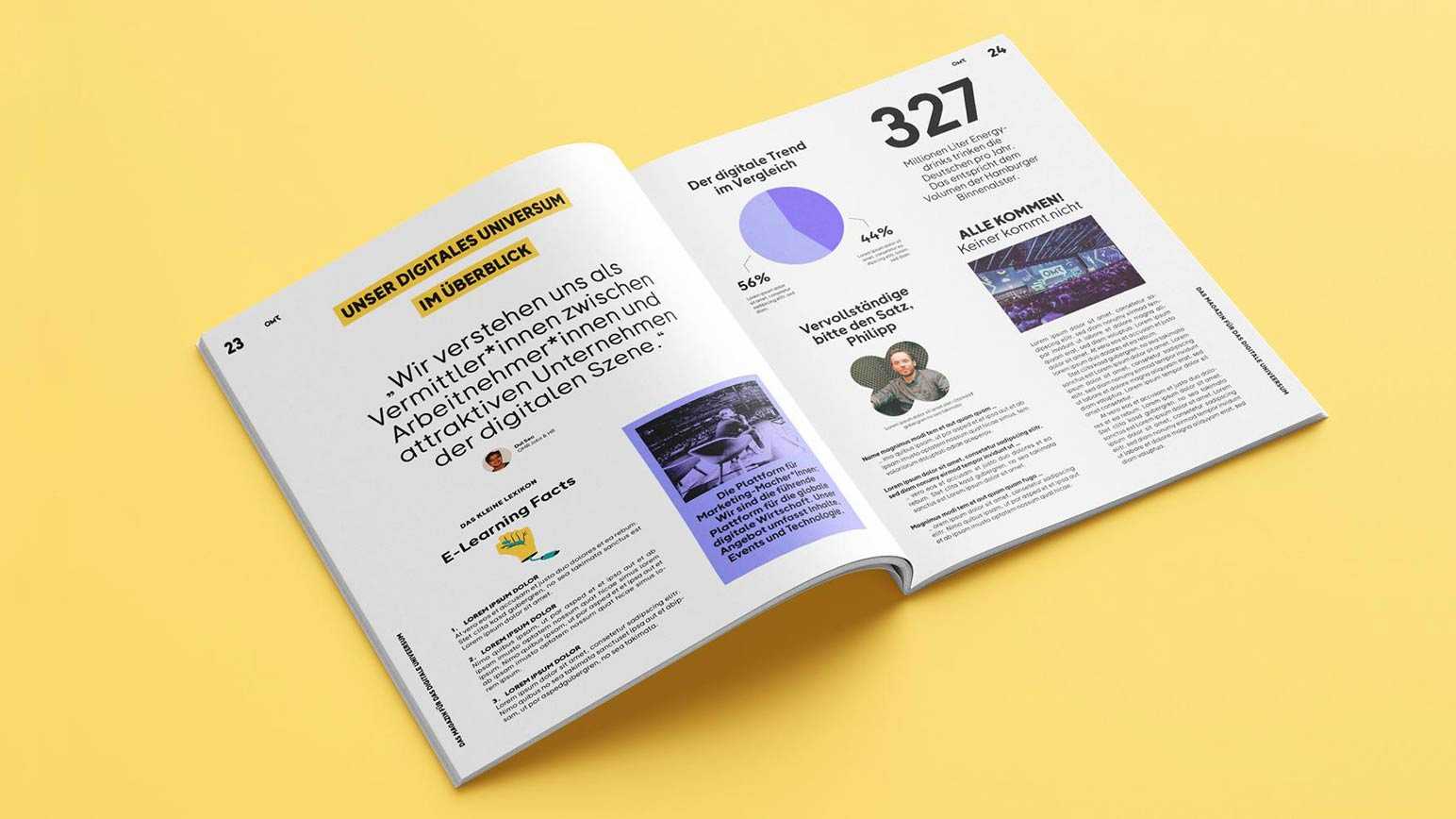
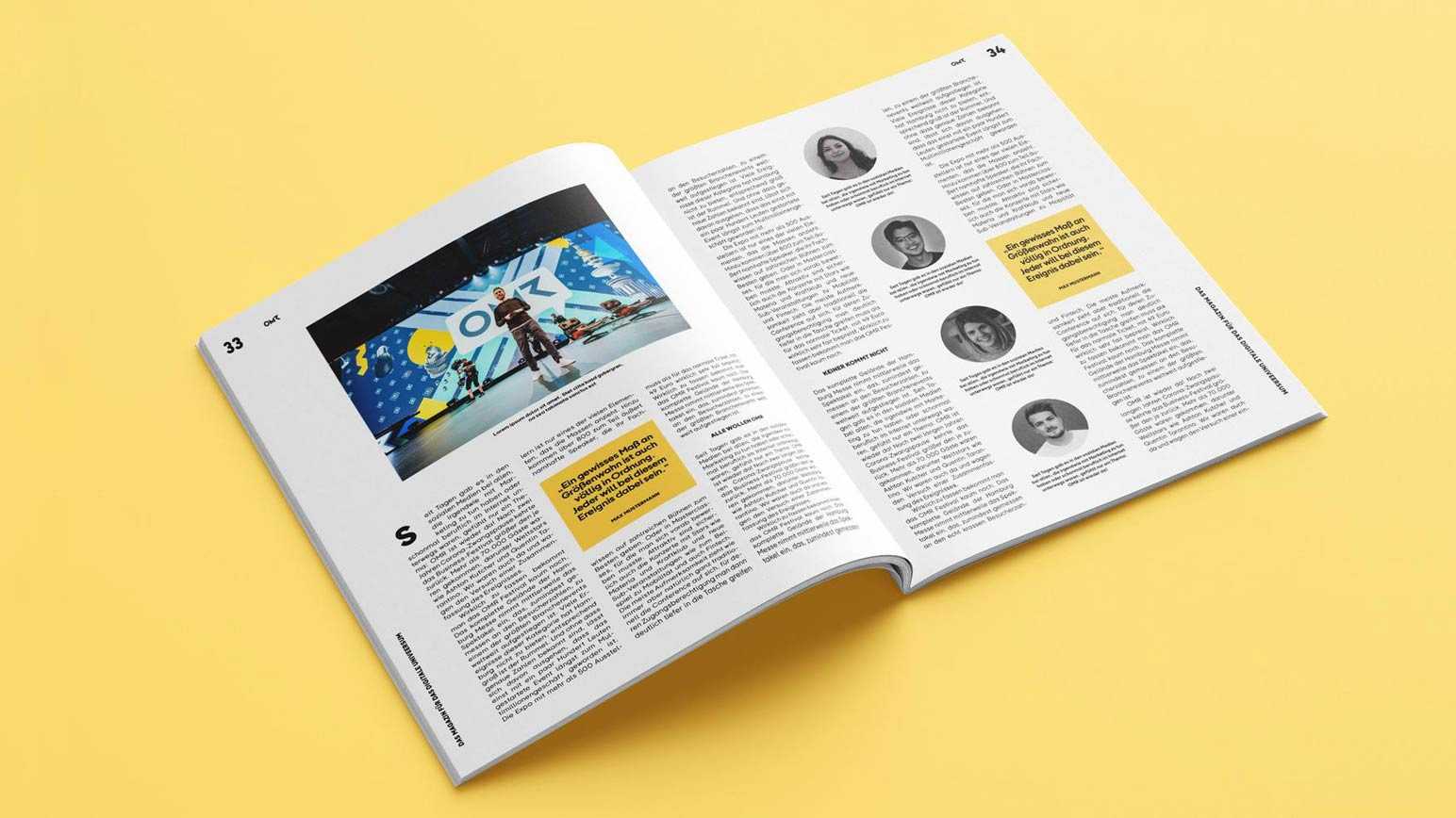
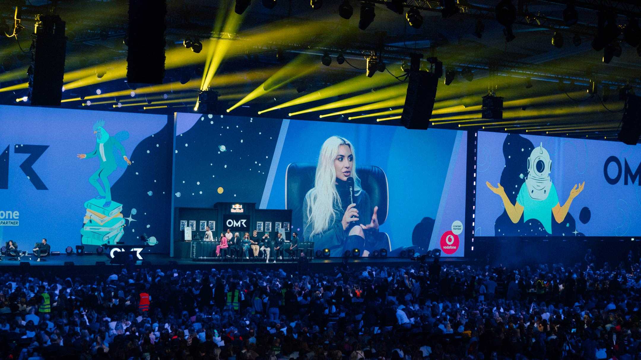
We then rebuilt the brand architecture in its entirety, creating a consistent, cohesive nucleus around which the various divisions of OMR orbit. Not only does this present a united identity to the outside world, but gives OMR’s employees a clearer sense of belonging to a strong team. We tweaked the existing colour palette to create a warmer, more approachable overall feeling, with high-contrast elements to catch the eye online, and augmented these efforts with a visual system that integrates malleable shapes to serve as backgrounds in printed materials, online and on Zoom.
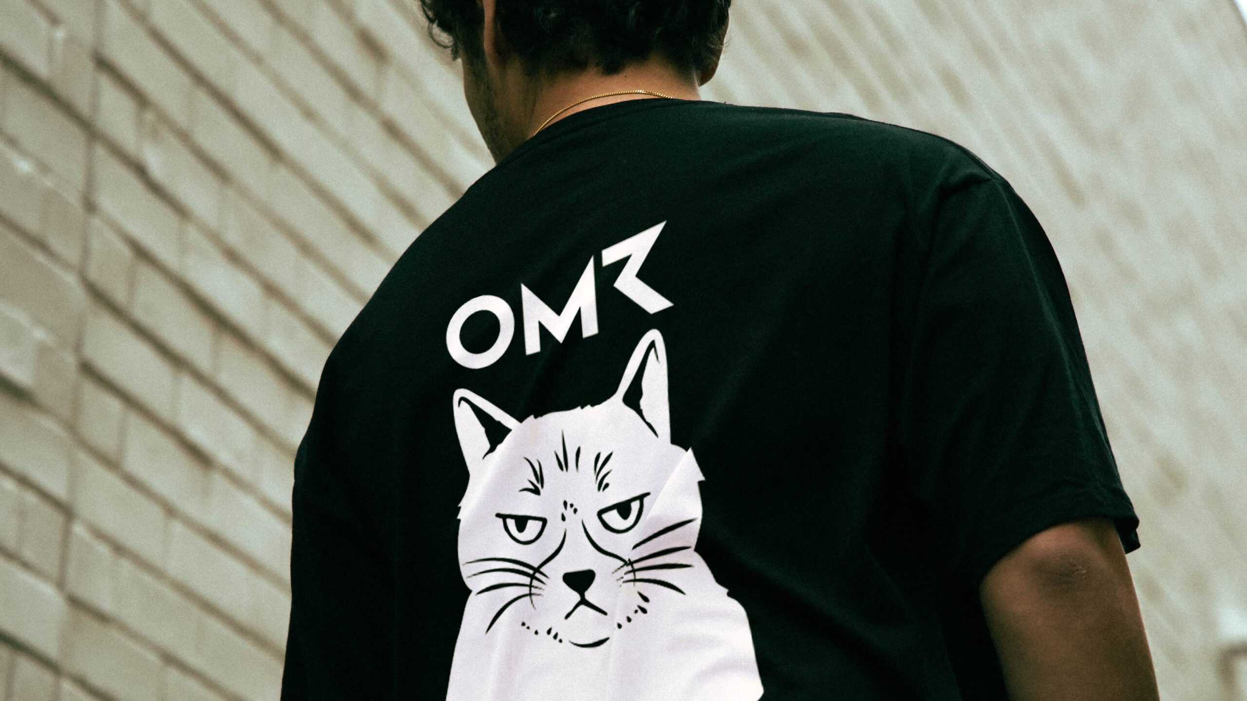
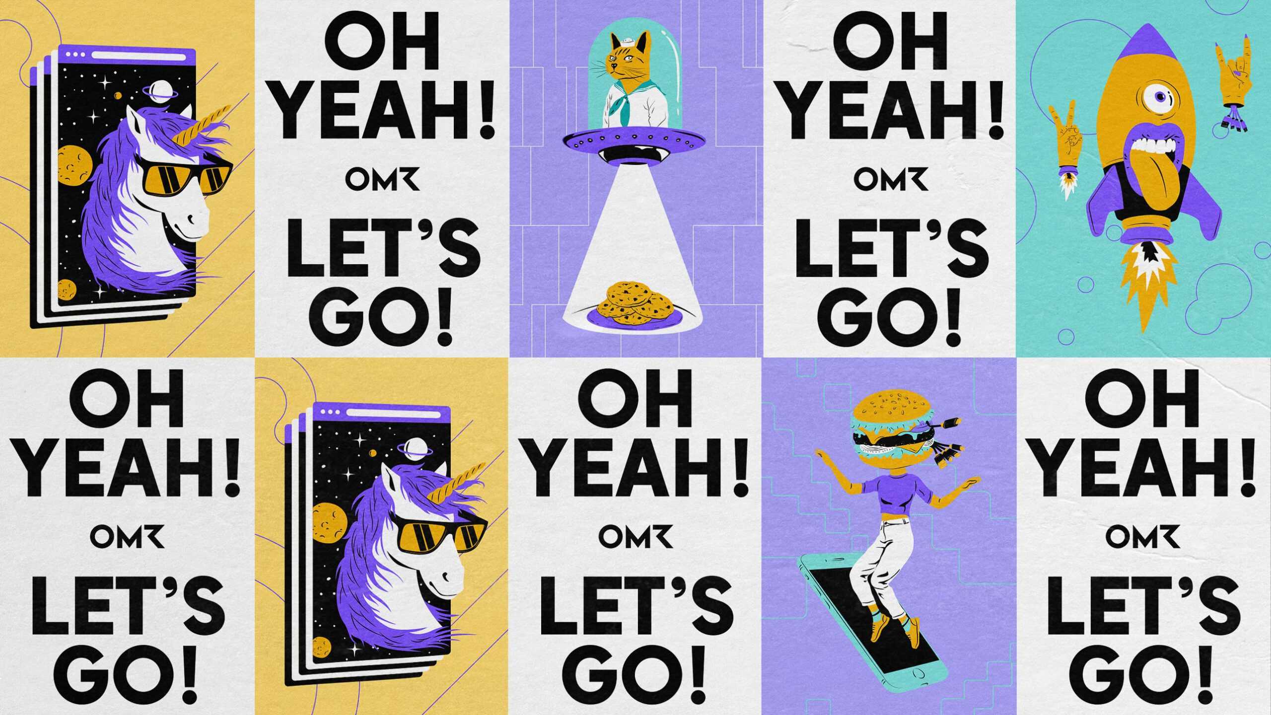
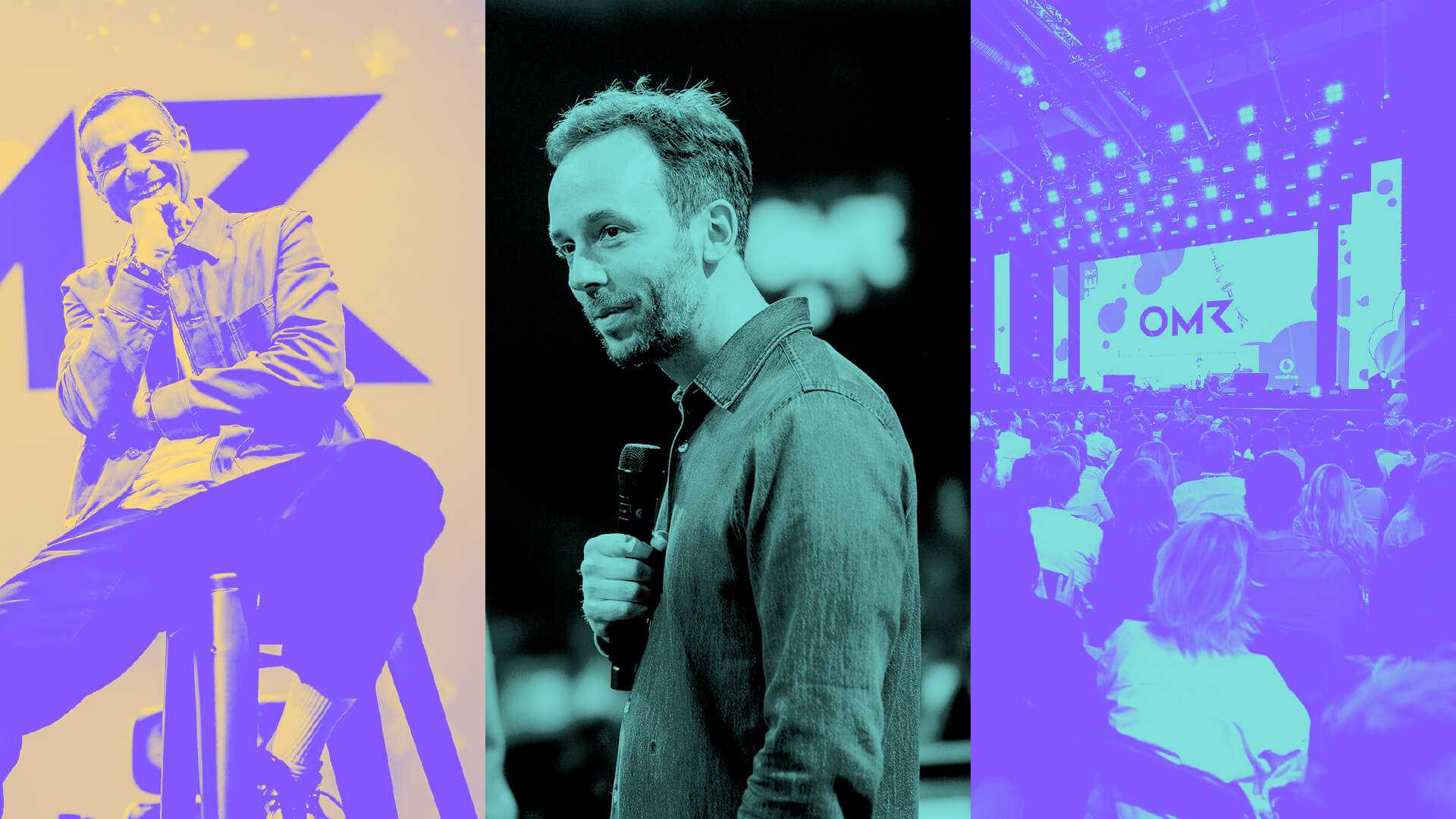
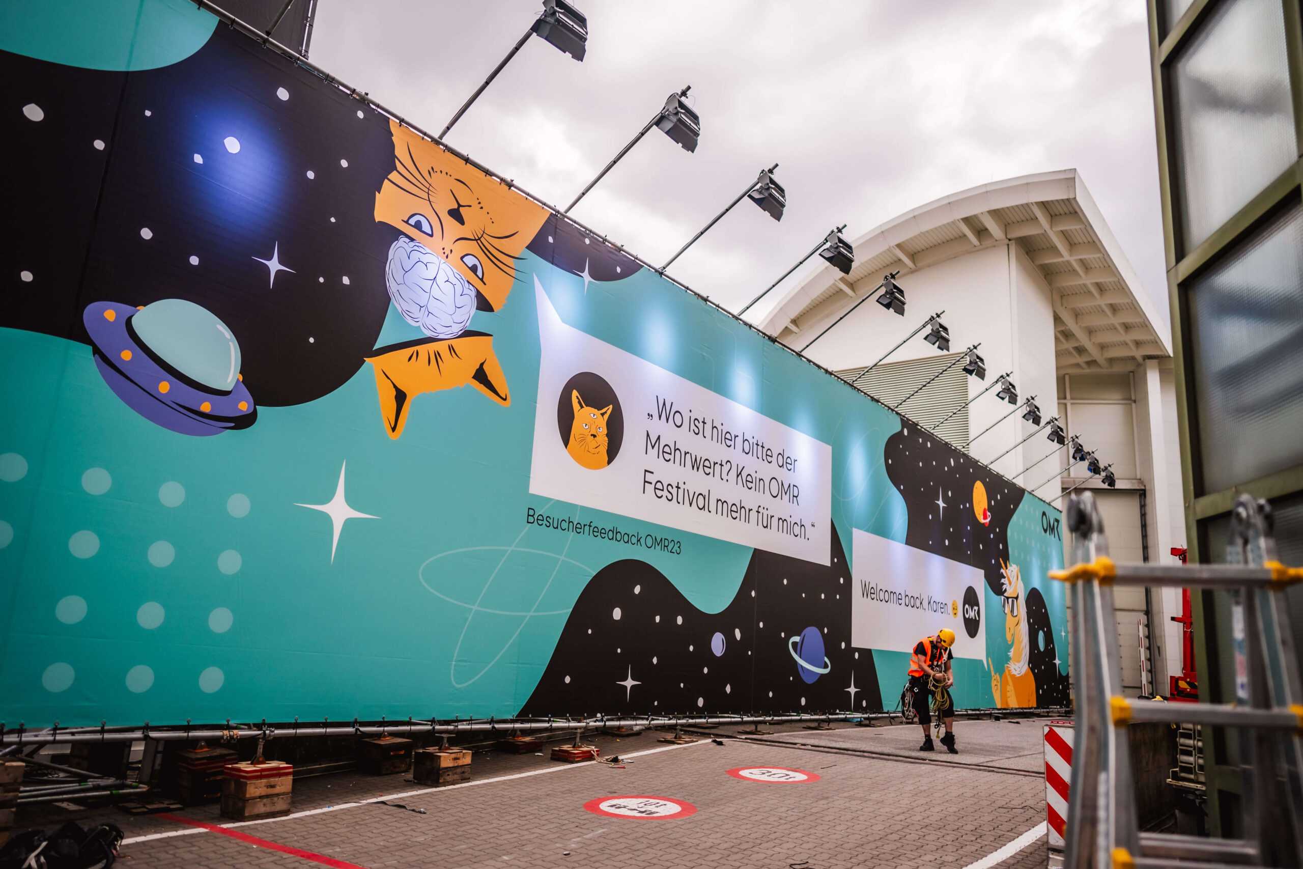
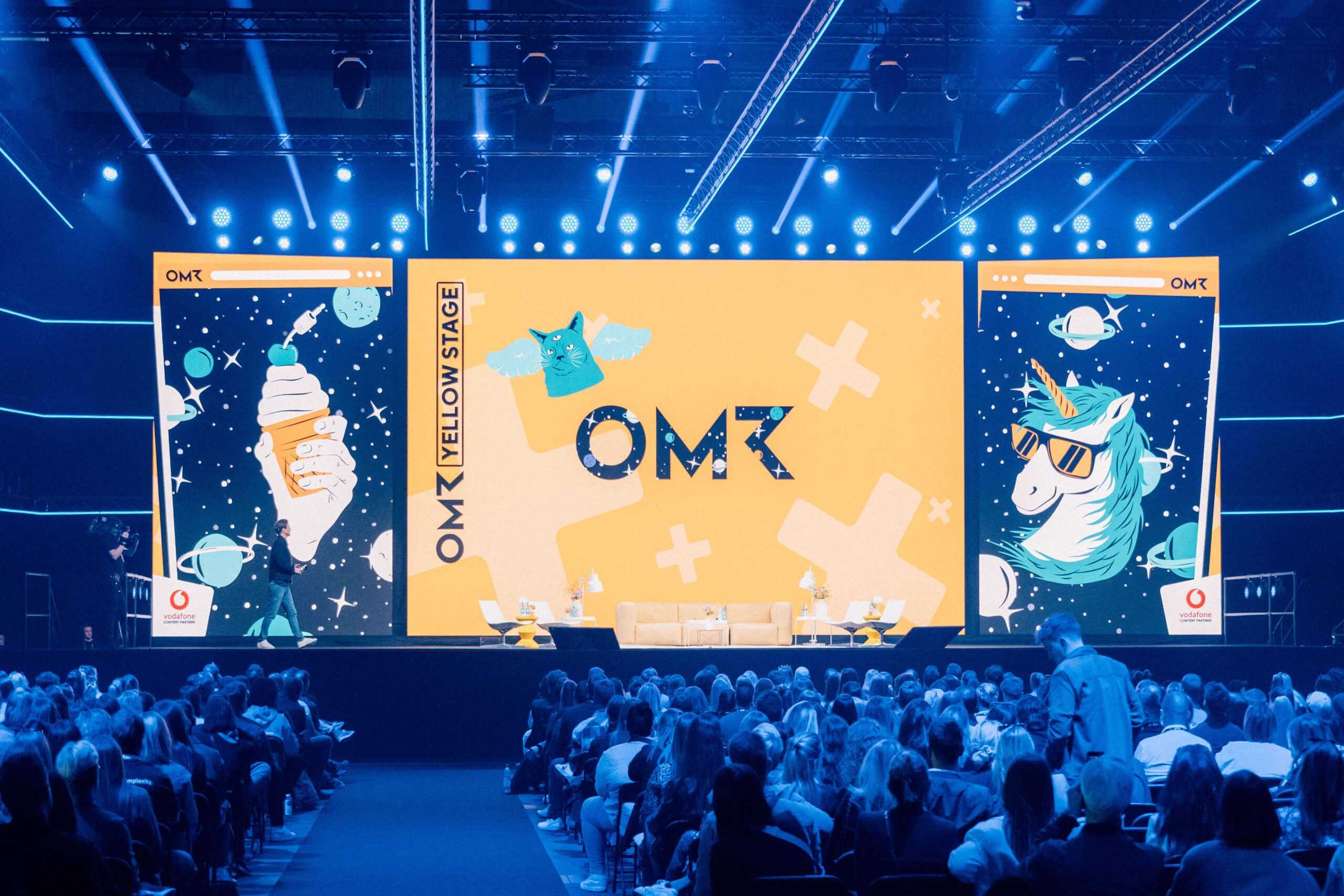
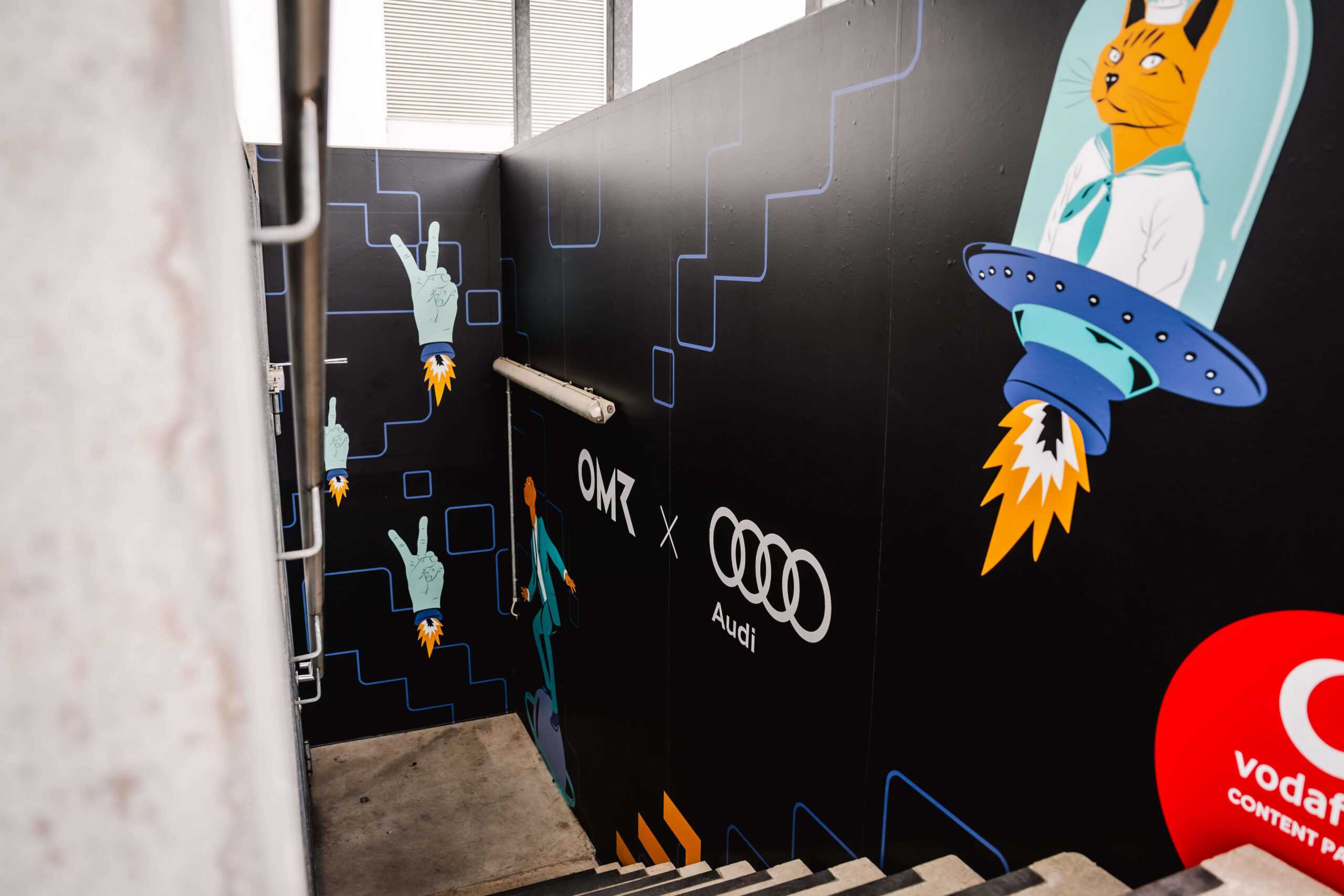
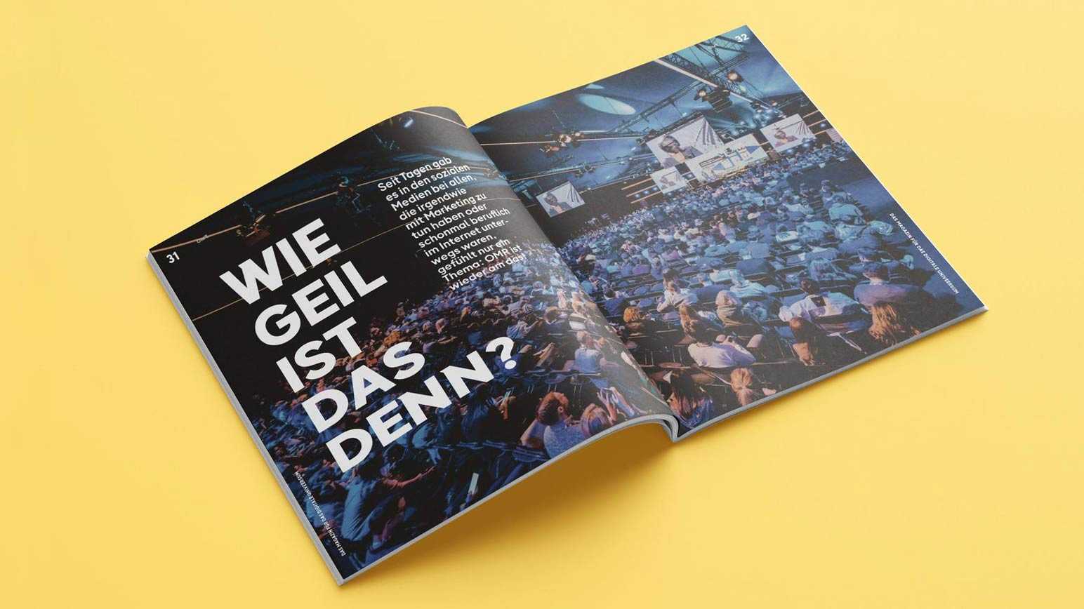
We also created unique illustrations based around a modular concept, thereby allowing them to be combined in any number of ways. The underlying idea here was to attract attention while being idiosyncratic and entertaining. OMR’s black-and-white photo collages were already strong in terms of their emotional resonance but lacked uniformity, prompting us to draw up an organisation-wide guide on how to employ them. The result is a holistic visual identity that demands attention, yet is flexible enough to do justice to every aspect of a multifaceted company – a complex job well done by our team at Arndt Benedikt.
Arndt Benedikt took our brand to new heights, giving it a refreshed and contemporary look that resonates with our target audience and aligns perfectly with our evolving business goals. Together, we refined our visual identity and developed the necessary brand assets for our daily operations. Their creative expertise and seamless communication made the entire process a smooth and enjoyable experience.
Our specially bespoked typeface OMR Sans is perfect for digital applications: It is based on natural shapes and has a distinctive x-height. As a result, it remains legible even in small sizes and can be used in a space-saving manner.
A coherent, instantly recognisable identity is essential for OMR both when it comes to our target audience and our internal stakeholders: for the former because it results in greater brand loyalty, while employees old and new all feel like they belong to the same organisation. Arndt Benedikt created that holistic identity for us.
