Varengold
A rebrand worth its weight in gold
Case Study
Overview
Our Client
Banking on the future
Founded in 1995, Varengold Bank AG is still a relatively young player on the international banking scene – yet it has made a strong name for itself as a champion of ESG finance. Based in Hamburg and with a branch in Bulgaria, the banking innovator seeks to generate the maximum return and sustainable growth for its customers in the fields of marketplace and commercial banking. Marrying traditional banking expertise with innovative solutions, Varengold is all about forward thinking as it celebrates twenty years in the banking business.
The Challenge
New work meets new banking
Over the past few years, Varengold has invested strongly in change. For one thing, it has refined its core services to focus on providing tailor-made commercial and marketplace financial solutions, partnering with fintechs, offering attractive lending options to digital businesses, and giving a golden hand to corporates. Meanwhile, under its “New Work” philosophy, the bank has flourished into an agile, dynamic and people-centric player that is no longer bound by legacy structures or workflows. The only problem? Varengold’s corporate identity and branding no longer reflected what the bank was all about – so the money men needed change.
Our Solution
Looking & feeling like a million bucks
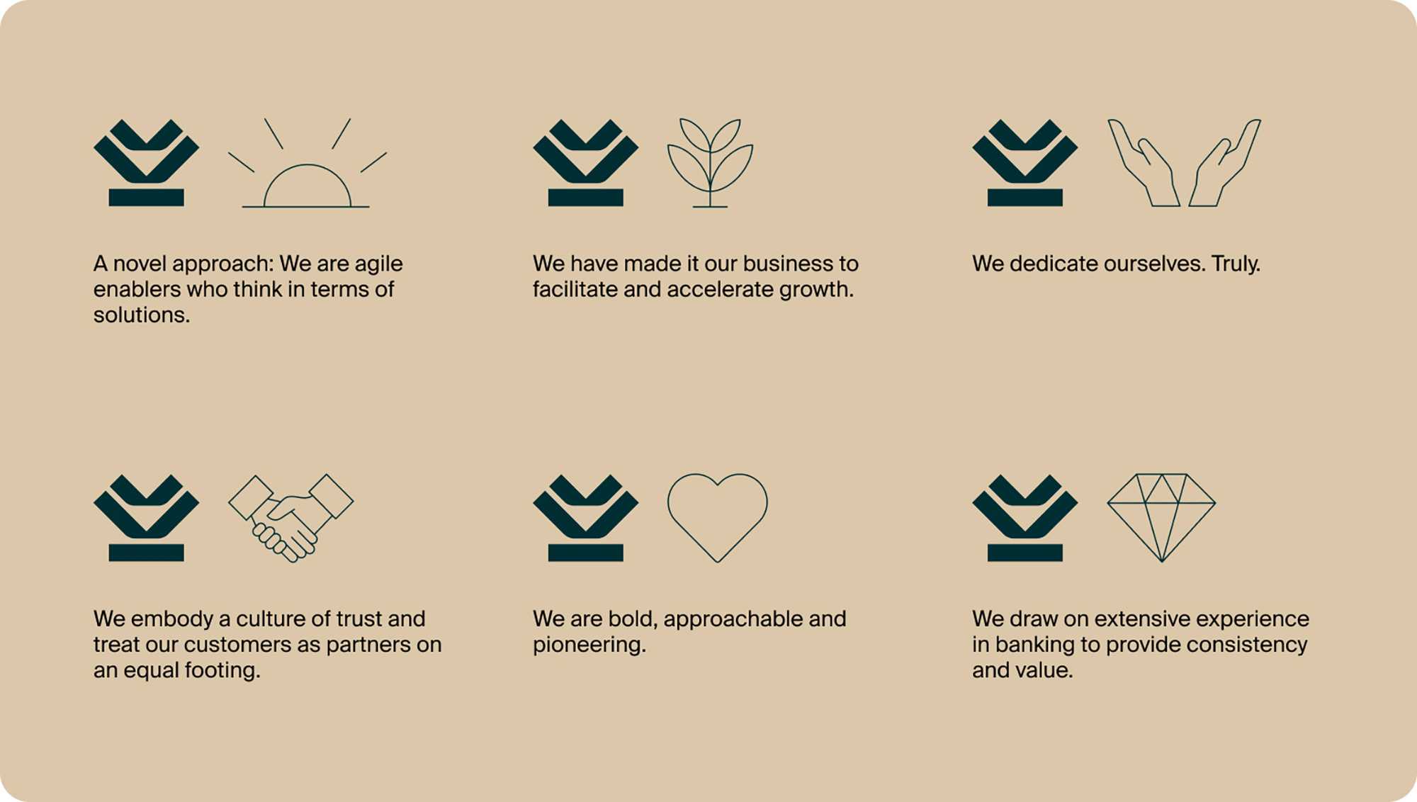
Working closely with Varengold, we first identified the brand’s core values – openness, versatility and clarity – and defining the bank’s purpose: to facilitate and accelerate growth for a client base of corporates, fintechs and digital businesses. The spotlight was to be firmly on Varengold’s tailored financial solutions and their myriad unique benefits . This focus on growth also extends to the bank’s current and future employees: the brand identity had to demonstrate that this is an employer which invests in its people over the long term.
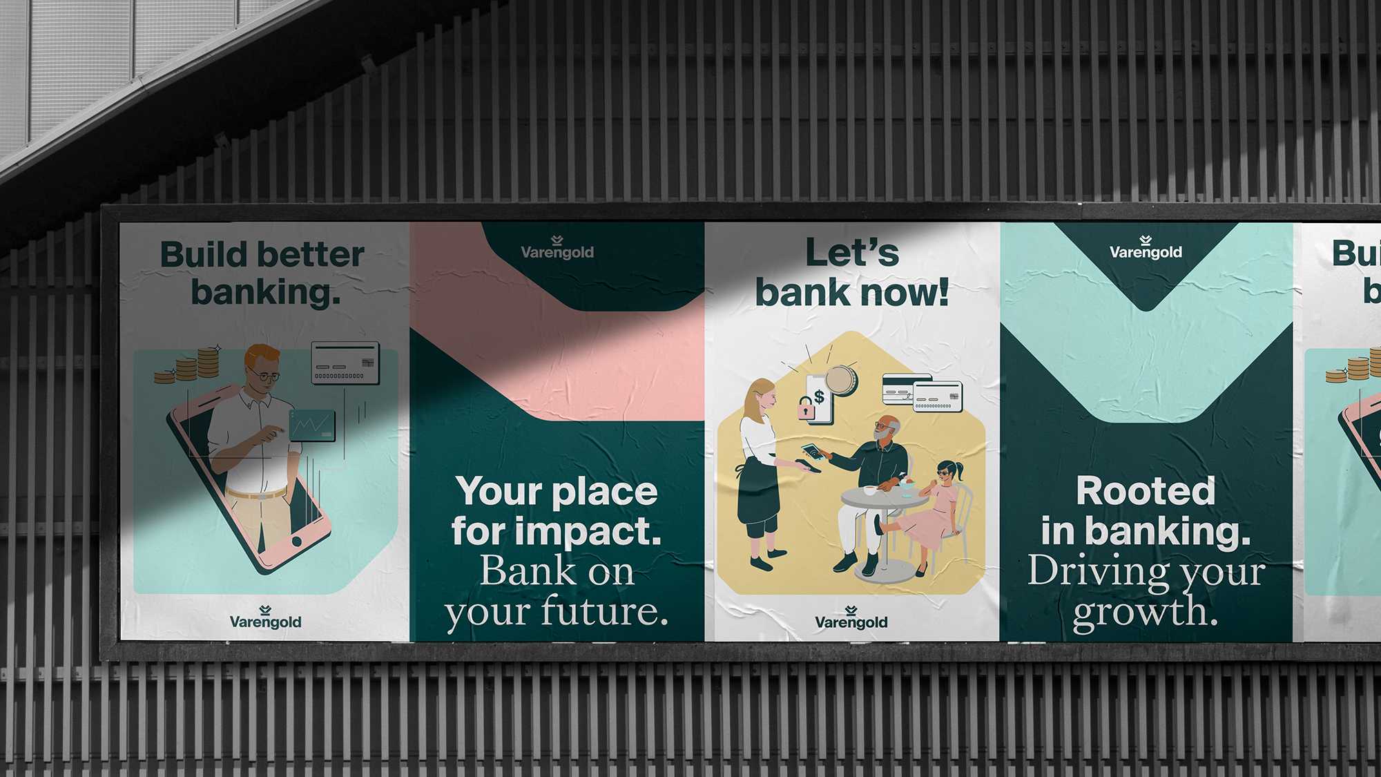
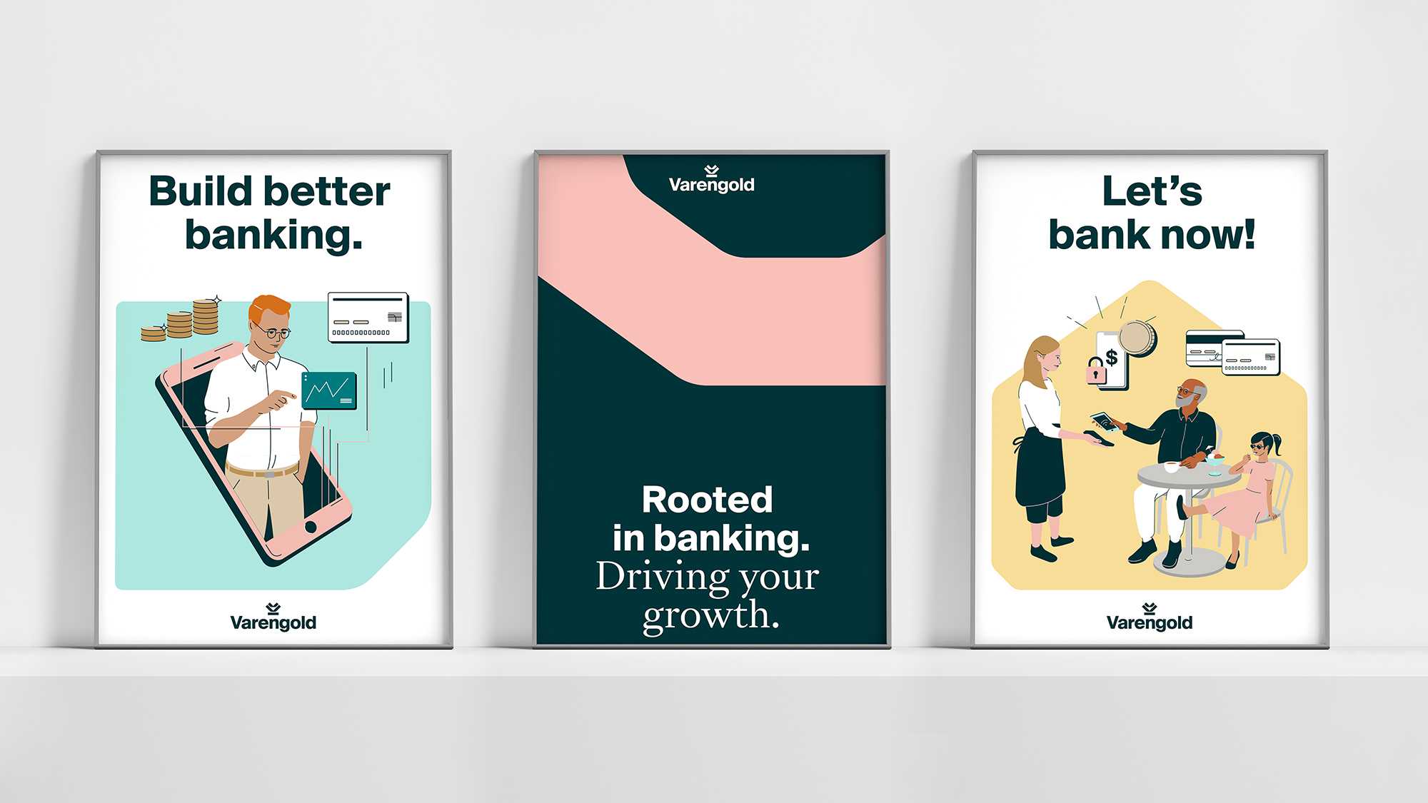
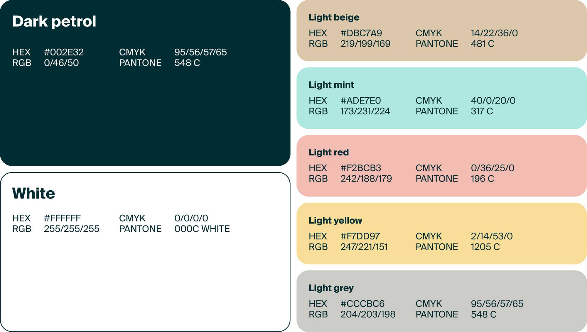
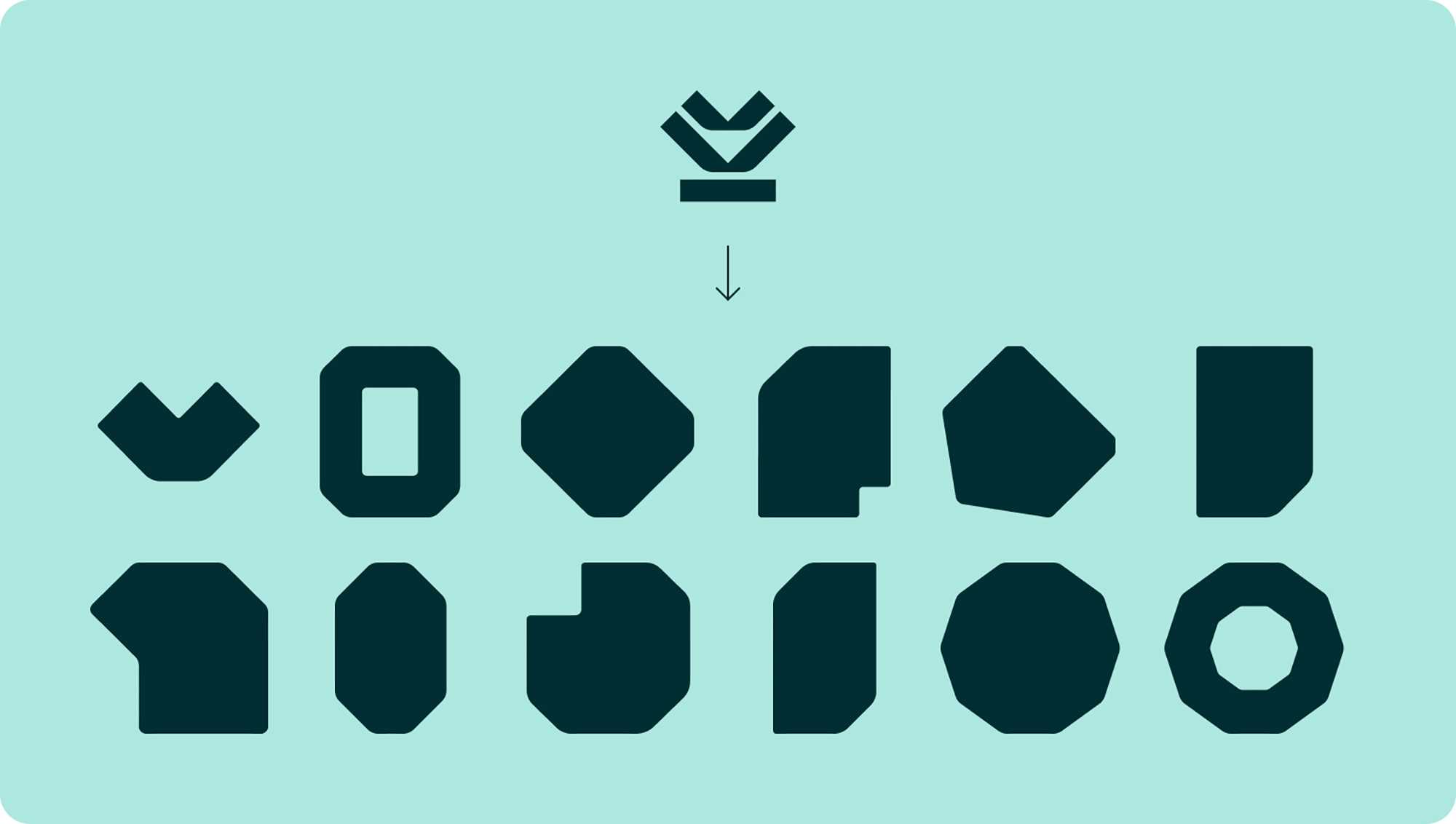
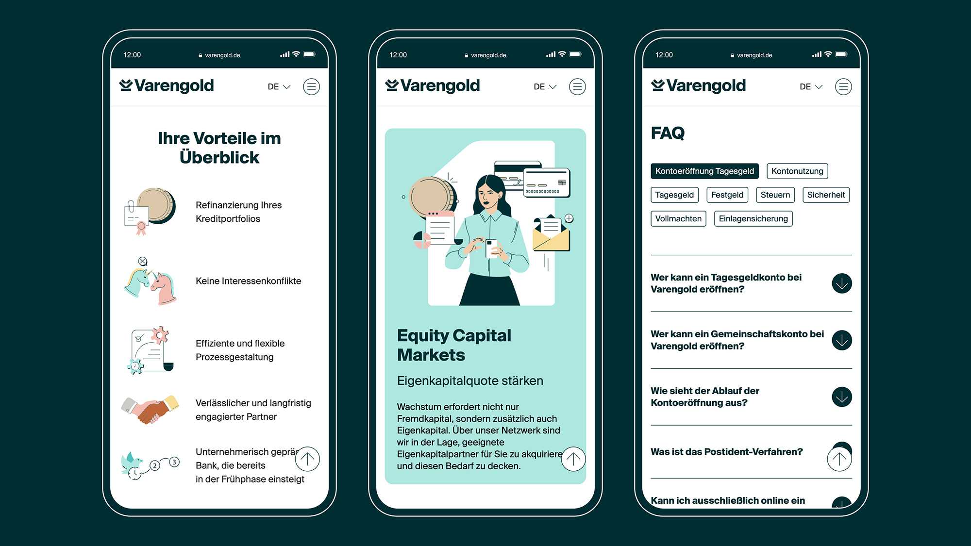
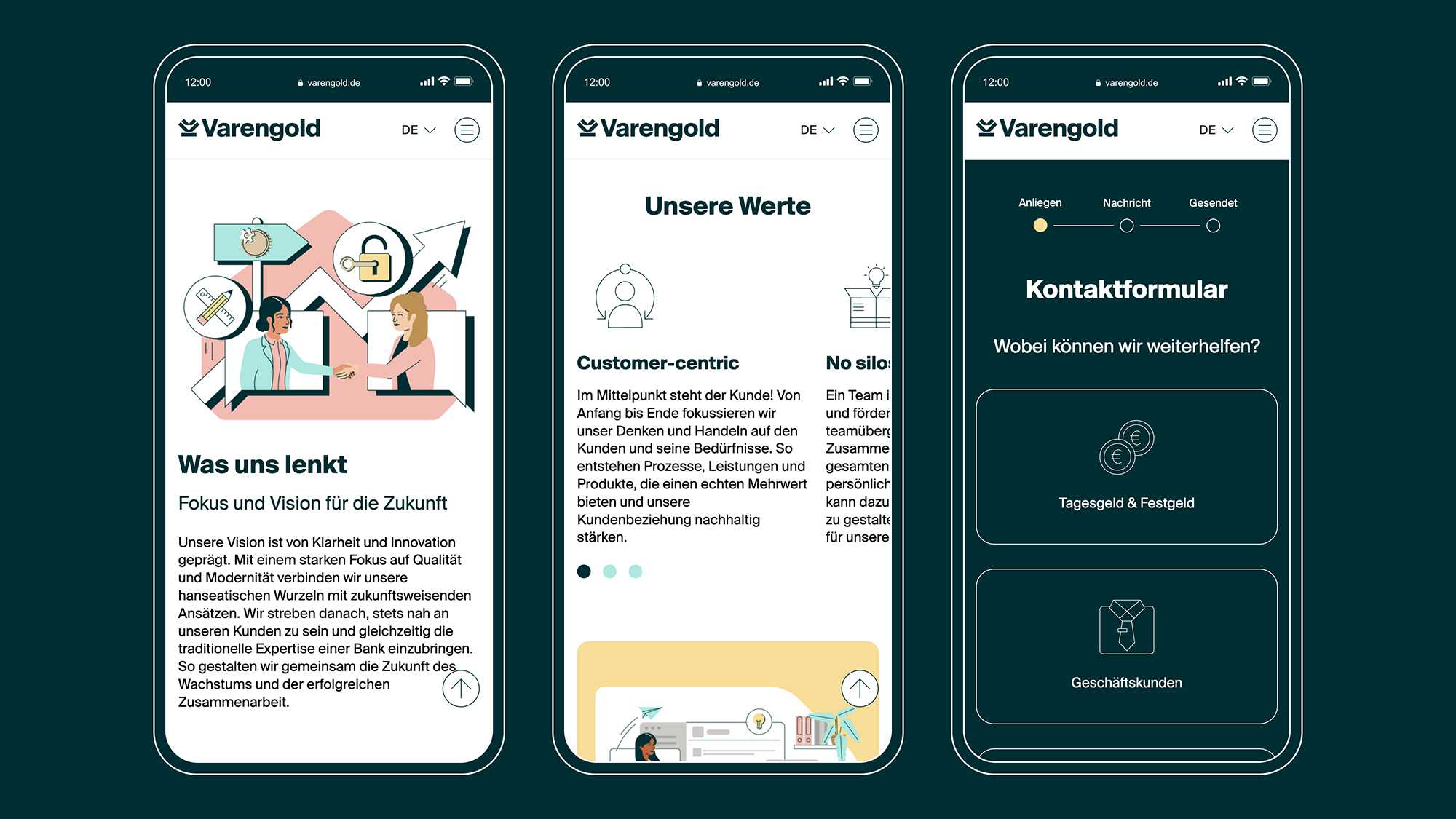
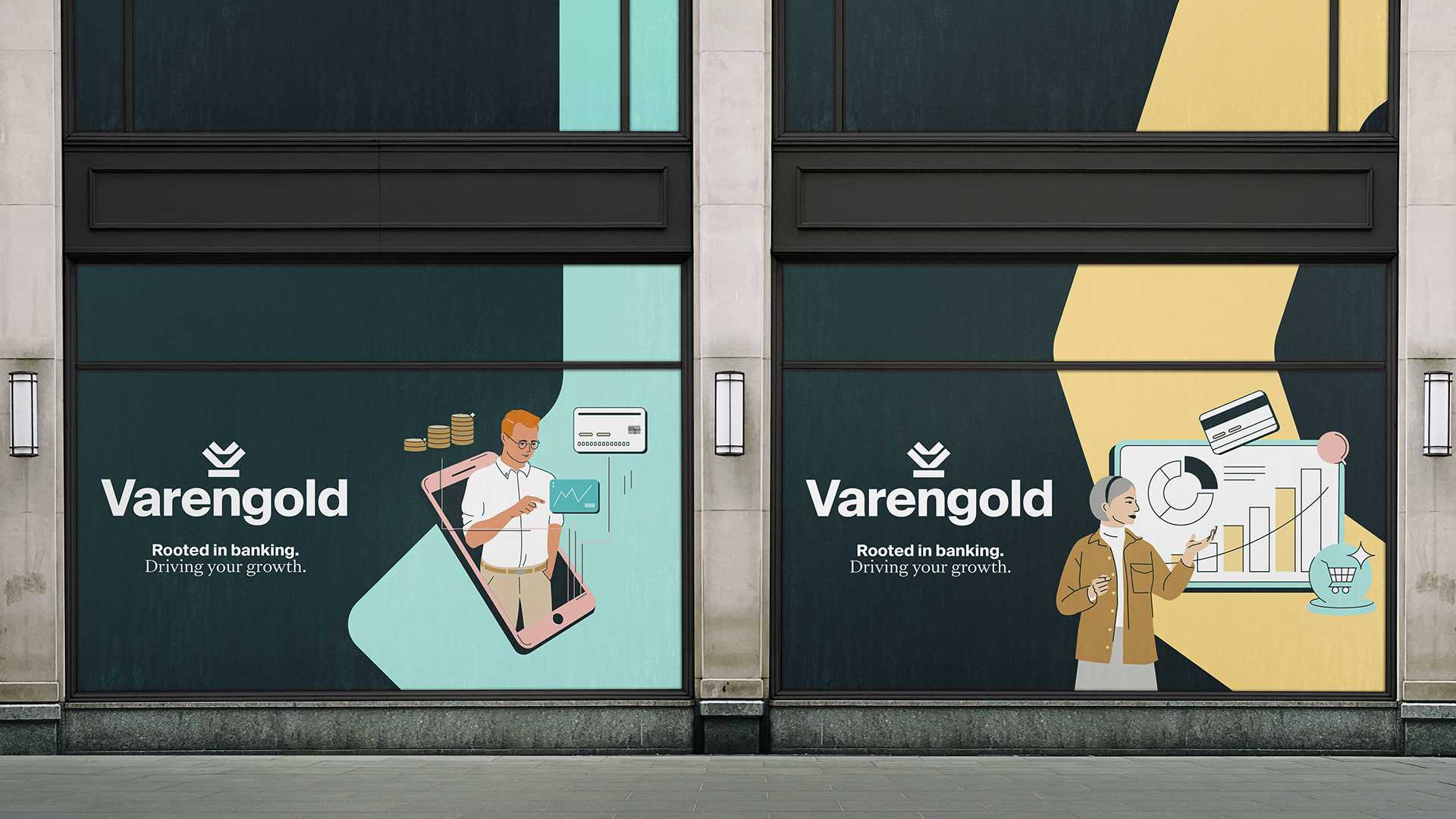
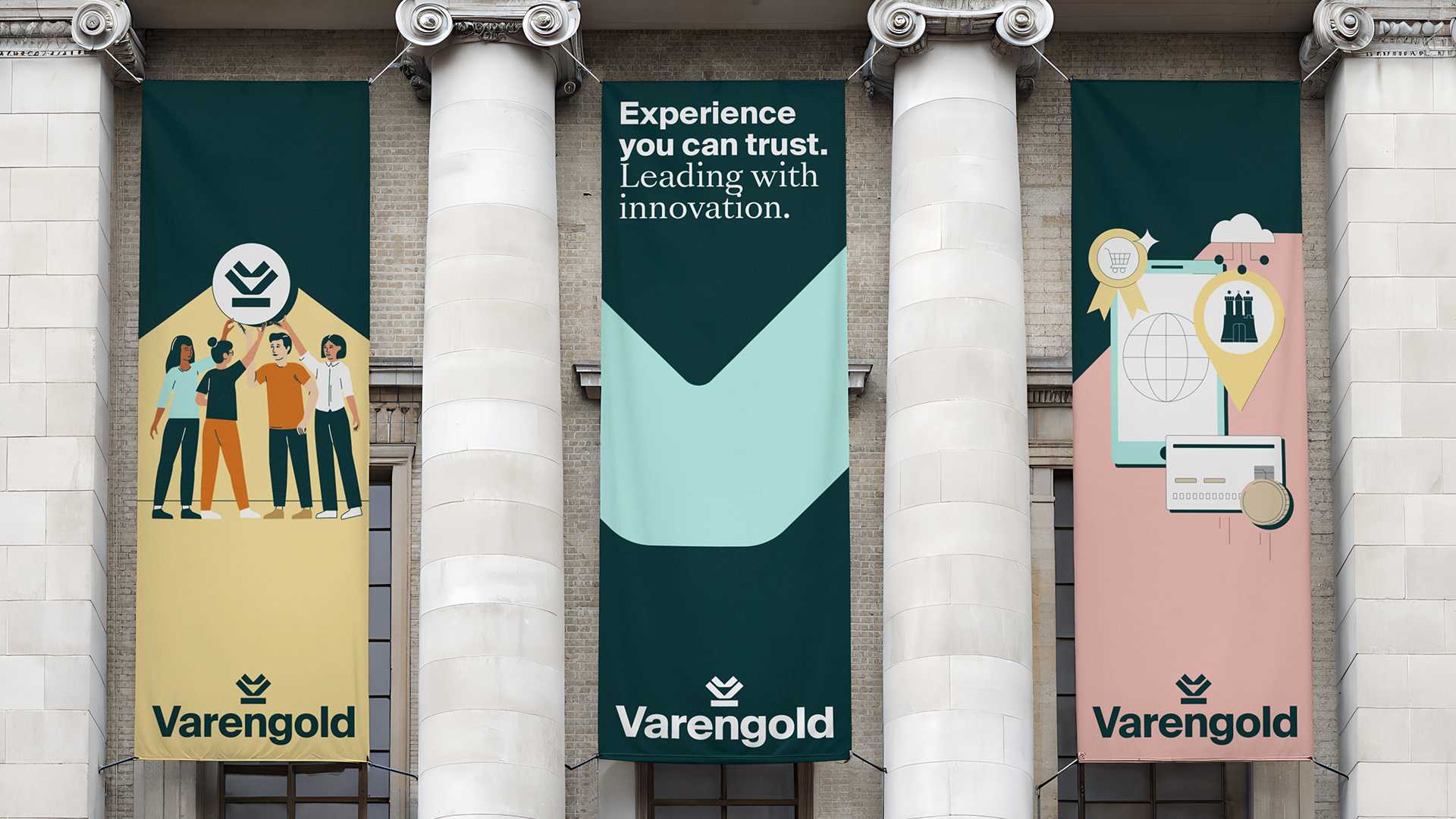
We opened our account with the Varengold logo. The figurative mark consists of a double-storey V with a strong base, representing the bank’s human-centric, growth-oriented, agile character. We created a colour palette that exudes a sense of warmth and trust, and paired it with illustrations and photographs that establish an emotional connection with the target audience while turning complex concepts into simple solutions. From recruiting to events to social media, the new visuals are unmistakably Varengold: open, versatile and clear.
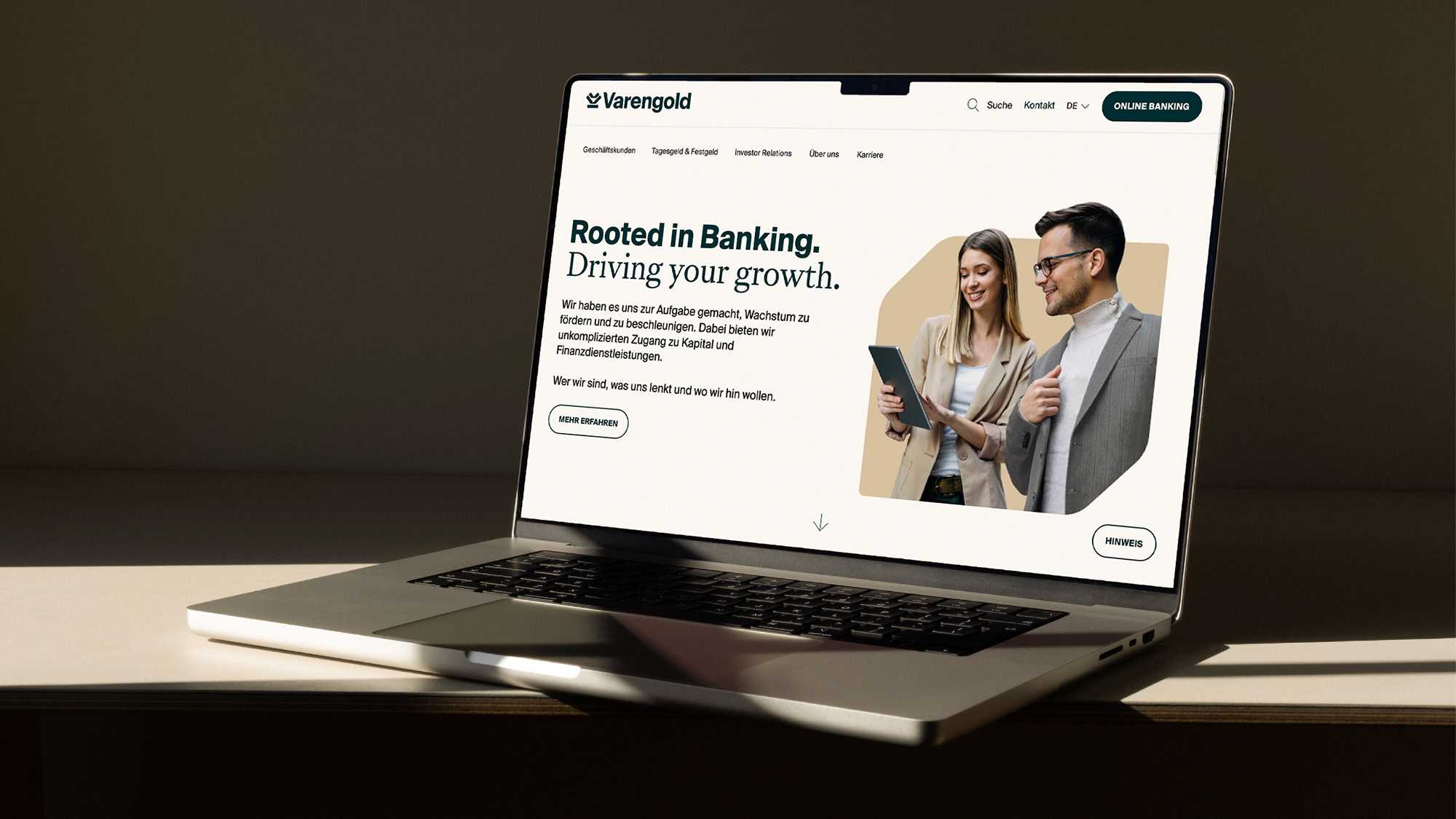
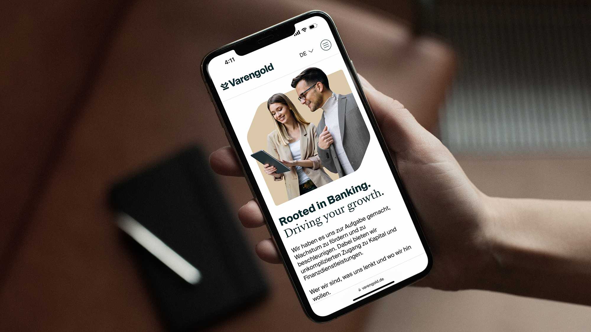
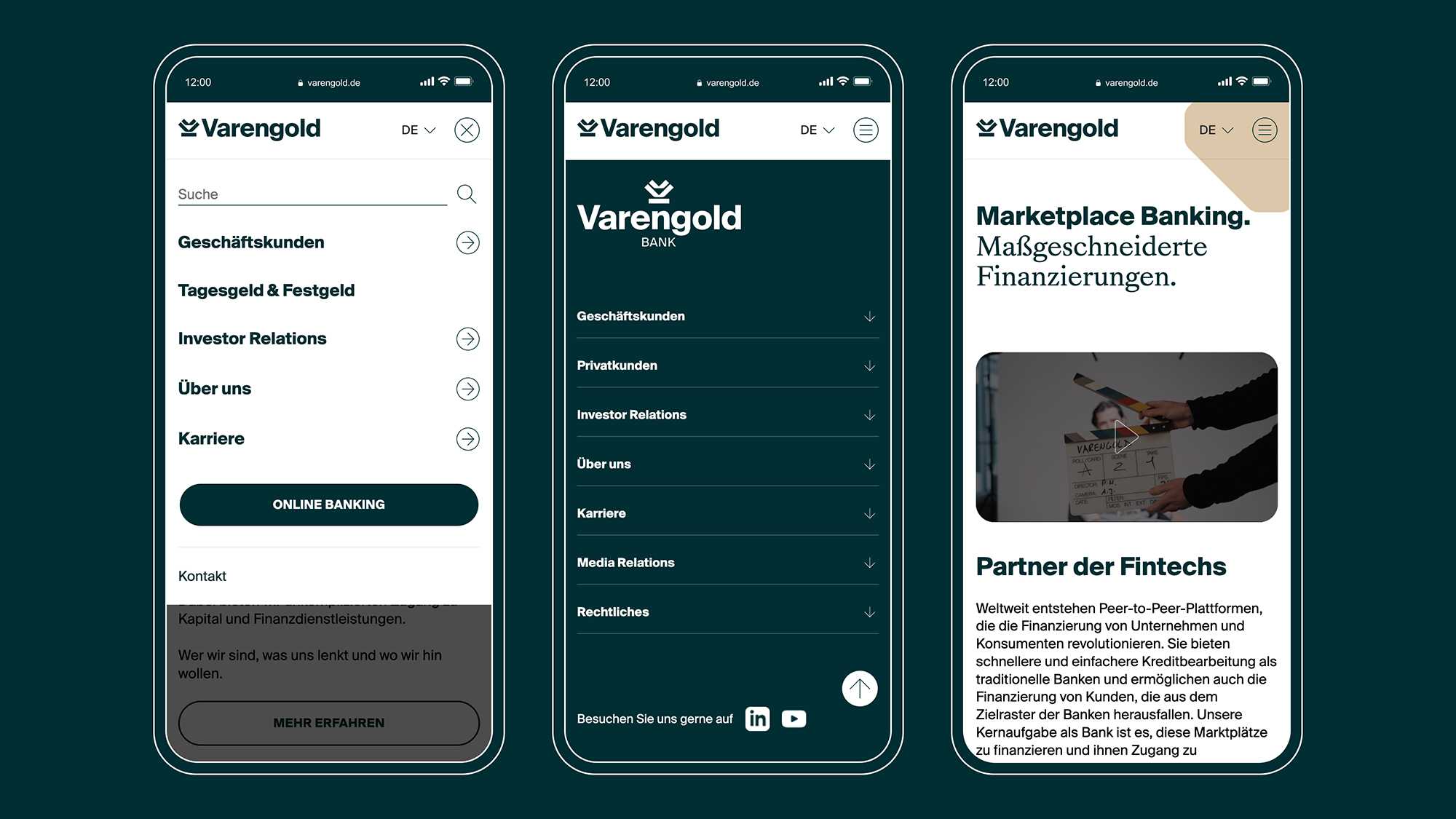
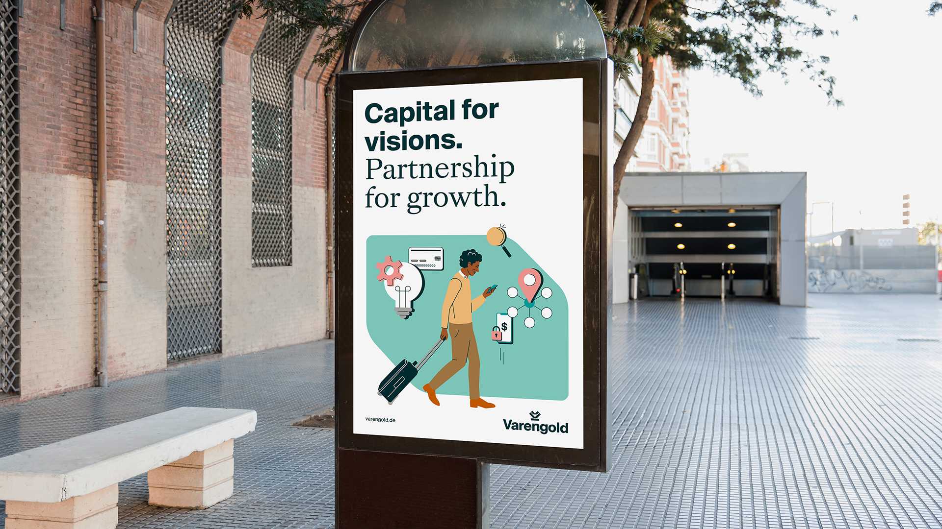
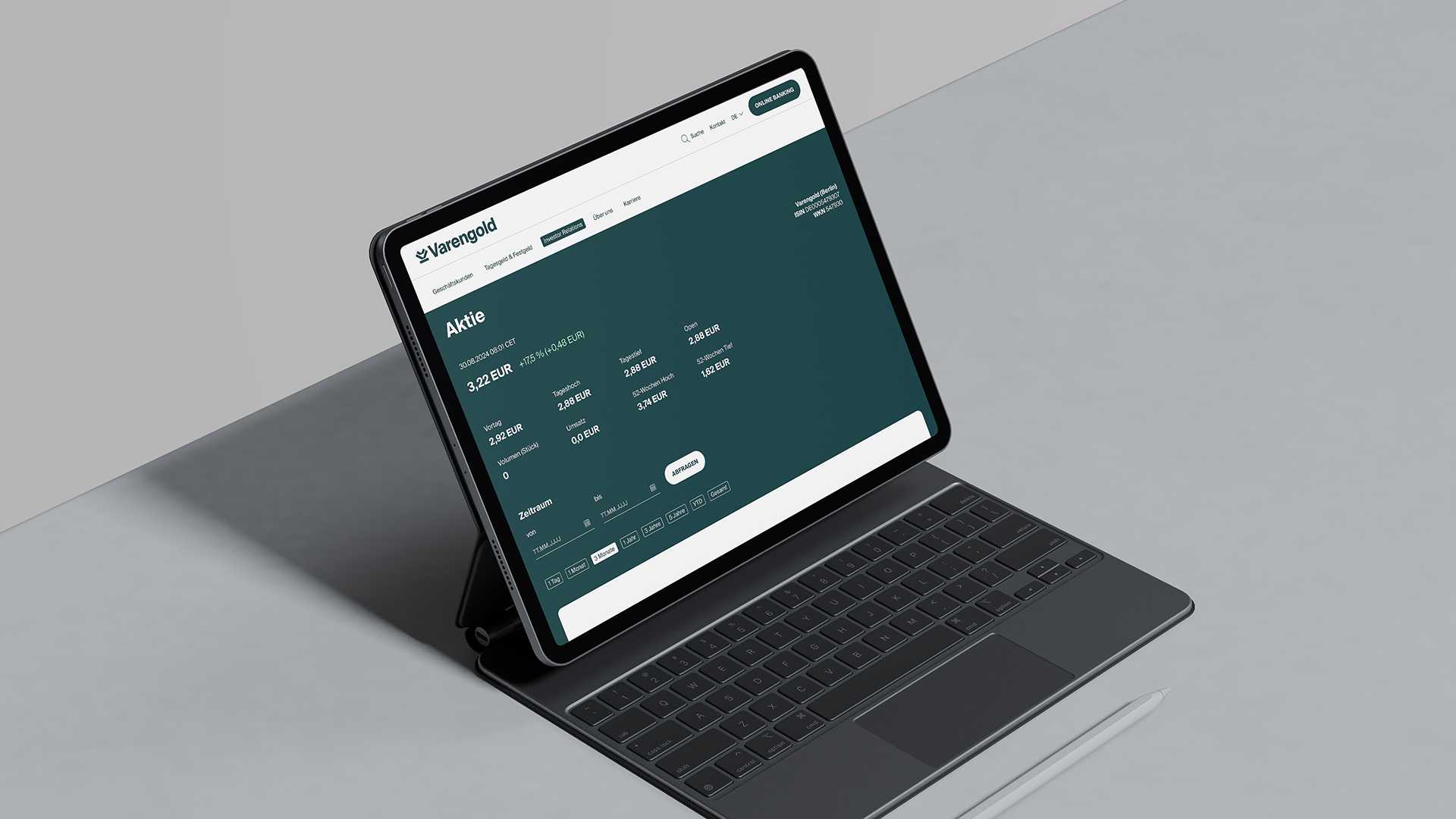
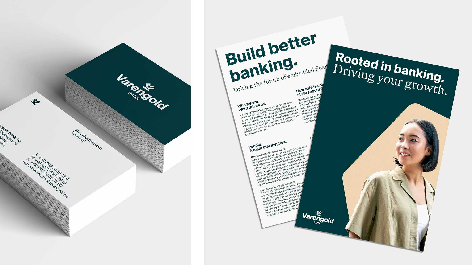
The brand identity was then seamlessly rolled out across all online and offline touchpoints. On the website, the new look foregrounds solutions for customers while bolstering accessibility and lead conversion. Elsewhere, the bank’s advertising materials, internal assets and event signage show industry players and clients alike that Varengold is on the money when it comes to the future of banking: an agile balance of people-centric practices and accelerated growth.
For this rebrand, we delved deep into our expertise vault and hit gold – now if only Varengold would let us into theirs.
The Arndt Benedikt team was quick to grasp our evolution into an agile, future-focused bank with a service portfolio that meets every client need. The rebrand seamlessly marries Varengold’s heritage with our aspirations when it comes to sustainable investments and growth. From the gold-plated design system to presenting our values and core business areas, our banking vision now couldn’t be clearer to the public.
Without unique employer branding, there is little chance of attracting the talent you need to thrive. By working in close collaboration with Arndt Benedikt, we now have a clear North Star and a strong philosophy that takes pride of place on our new website.
