Varp
Vivid visuals for a venture capitalist

Case Study
Overview
Our Client
Pursuing growth in the fertile field of fintech
The European fintech landscape is a hotbed of growth right now. Early-stage venture capital fund VARP is right in the thick of it, investing in startups that provide novel lending and payment solutions, IT infrastructure and more.
The Challenge
Standing apart to stand out
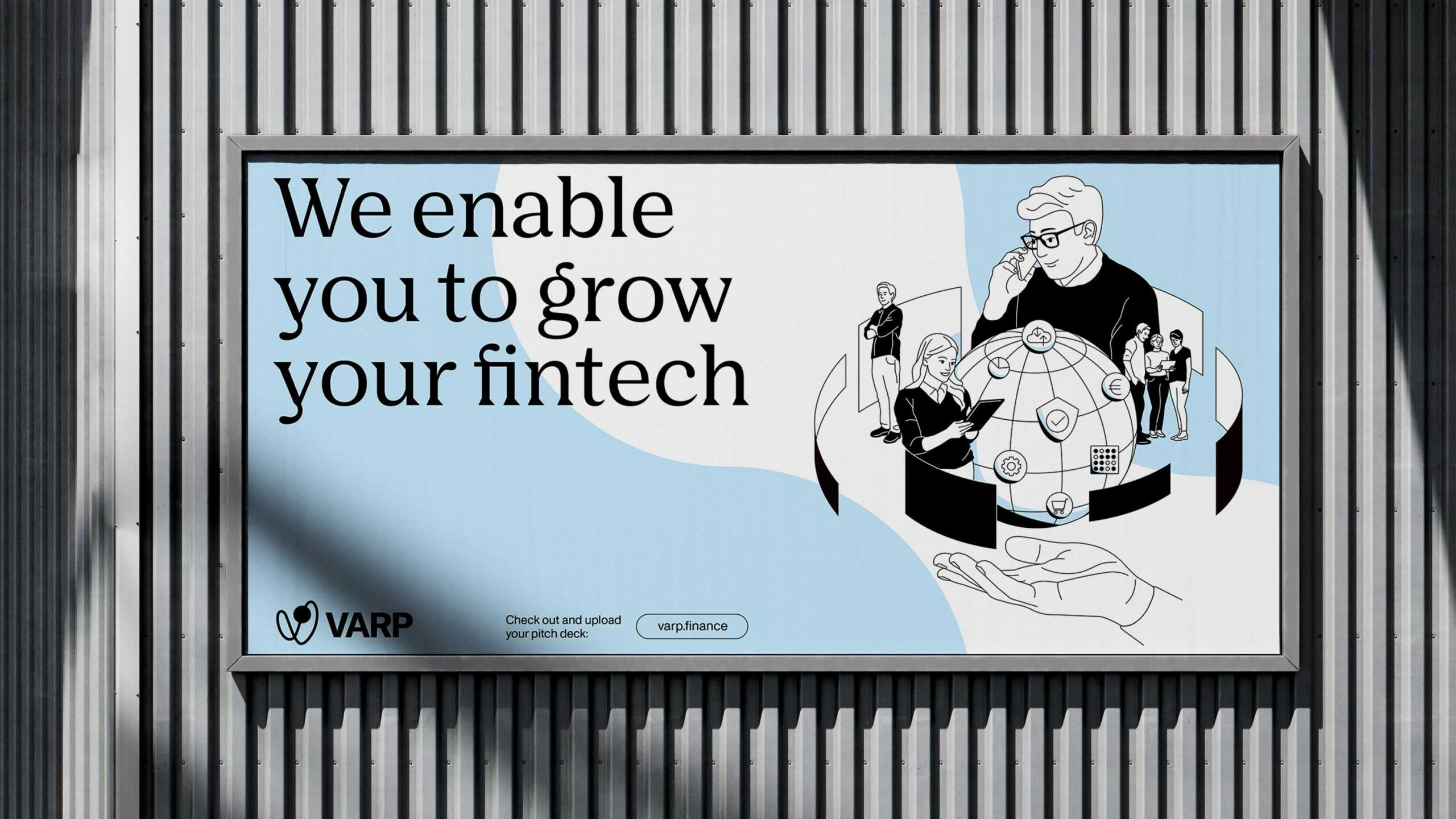
VARP wanted to announce its presence in the fintech market with a visual flourish and show European players large and small that this is the only partner they need for financial expertise, fruitful advice and fresh capital.
Our Solution
A gold-plated image for a VC
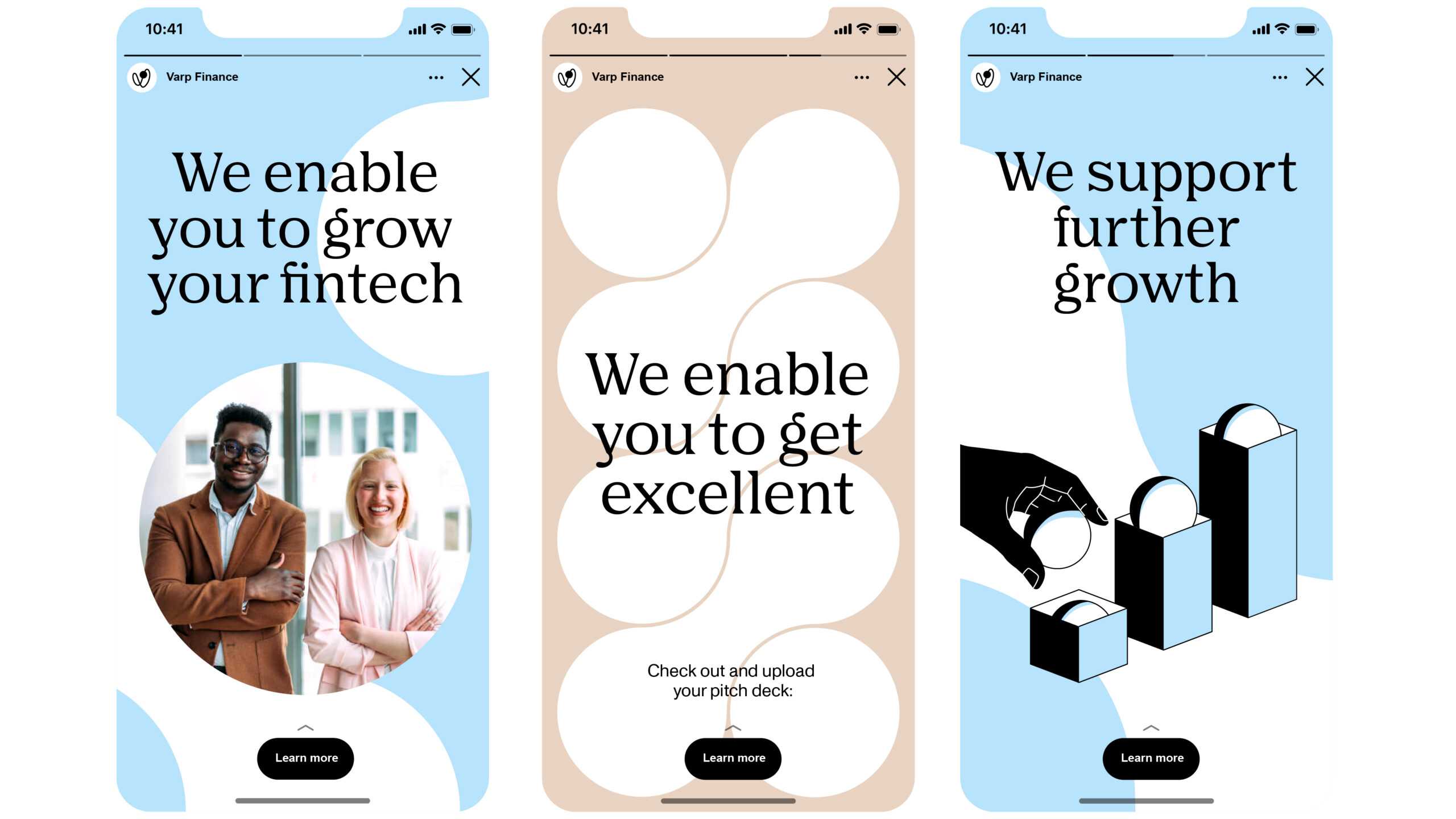
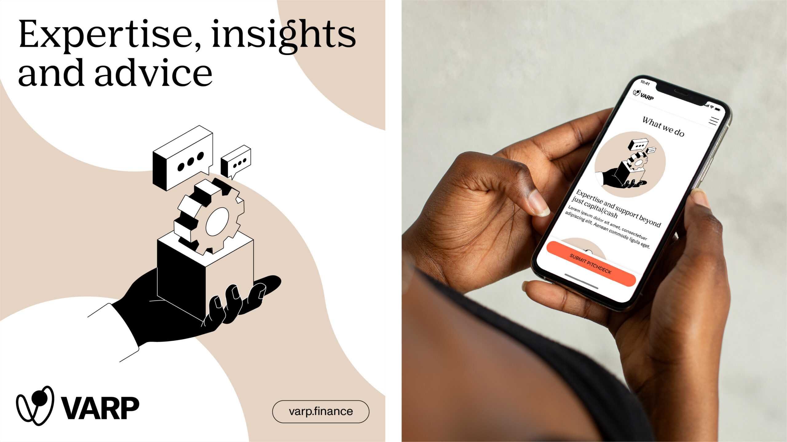
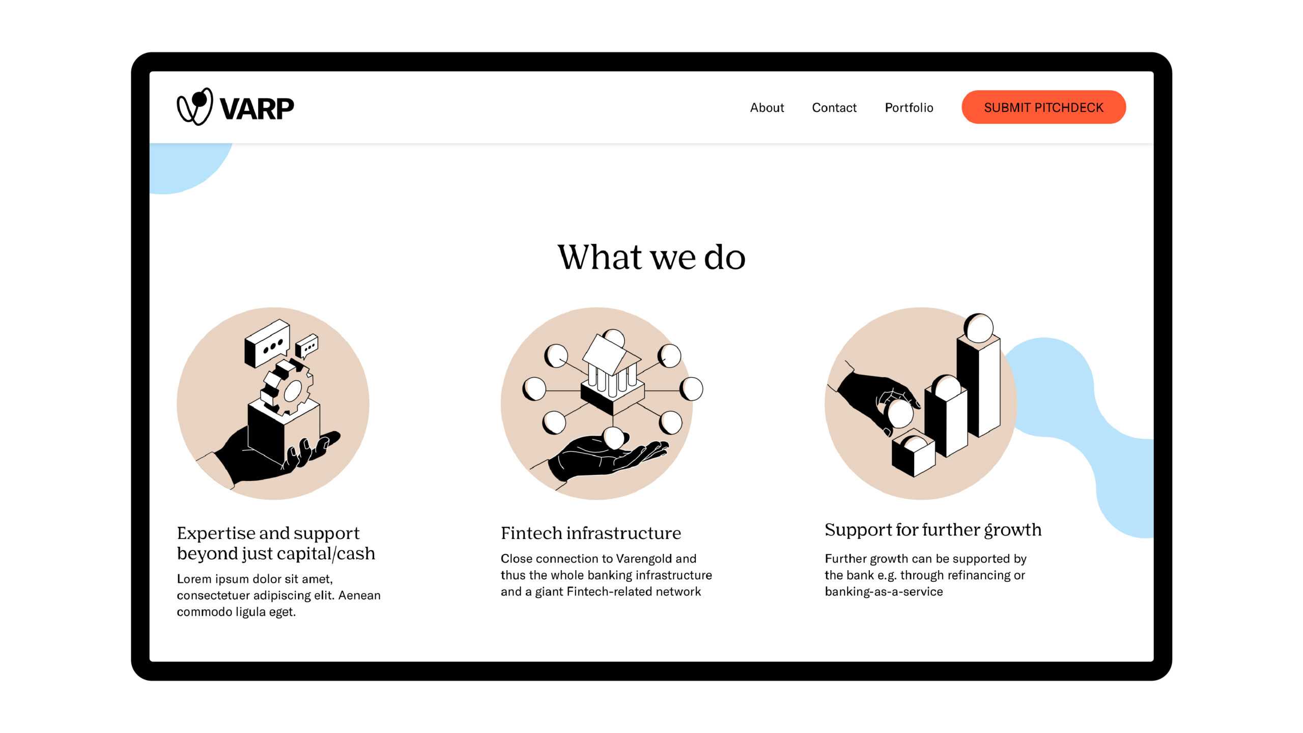
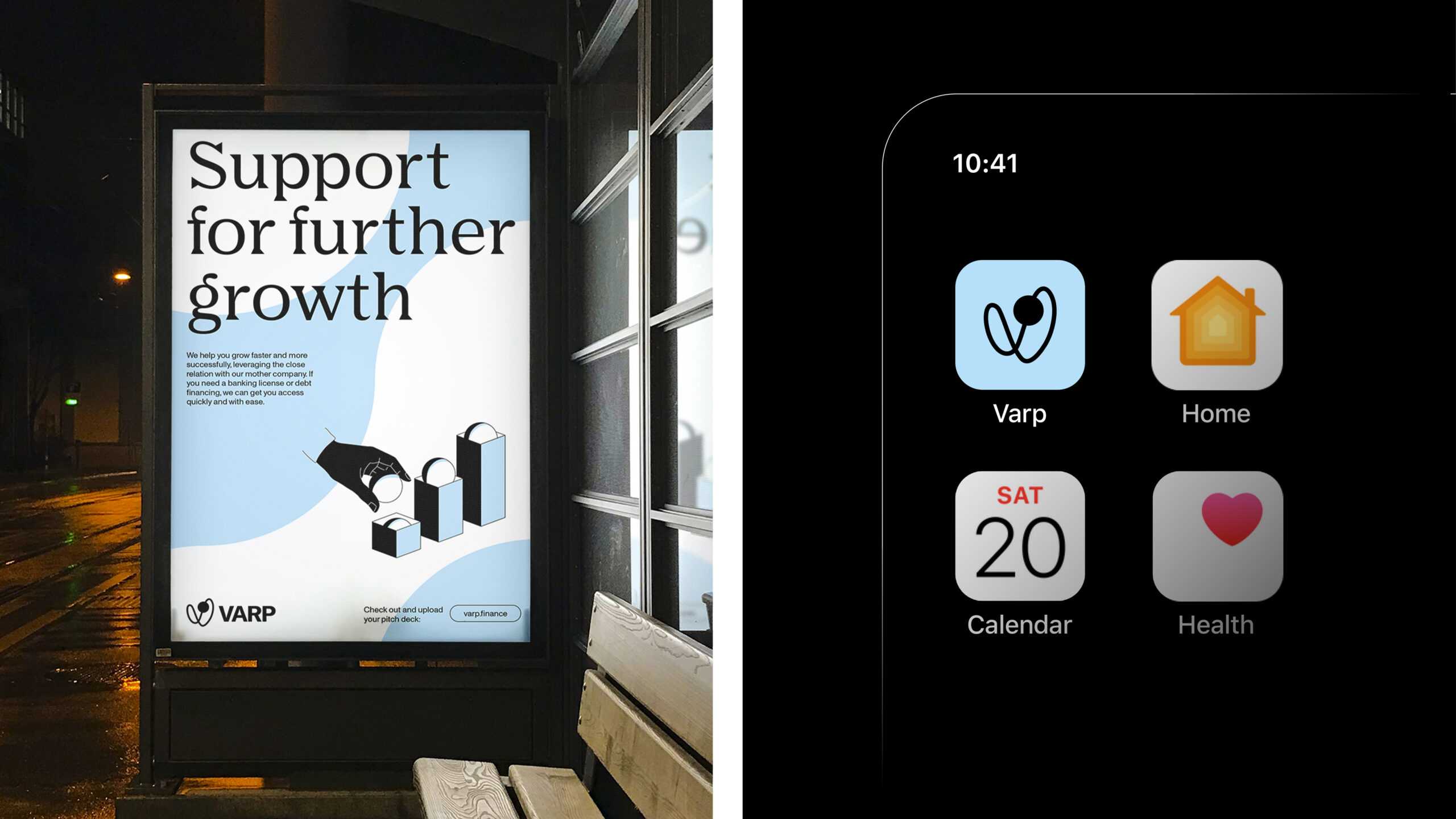
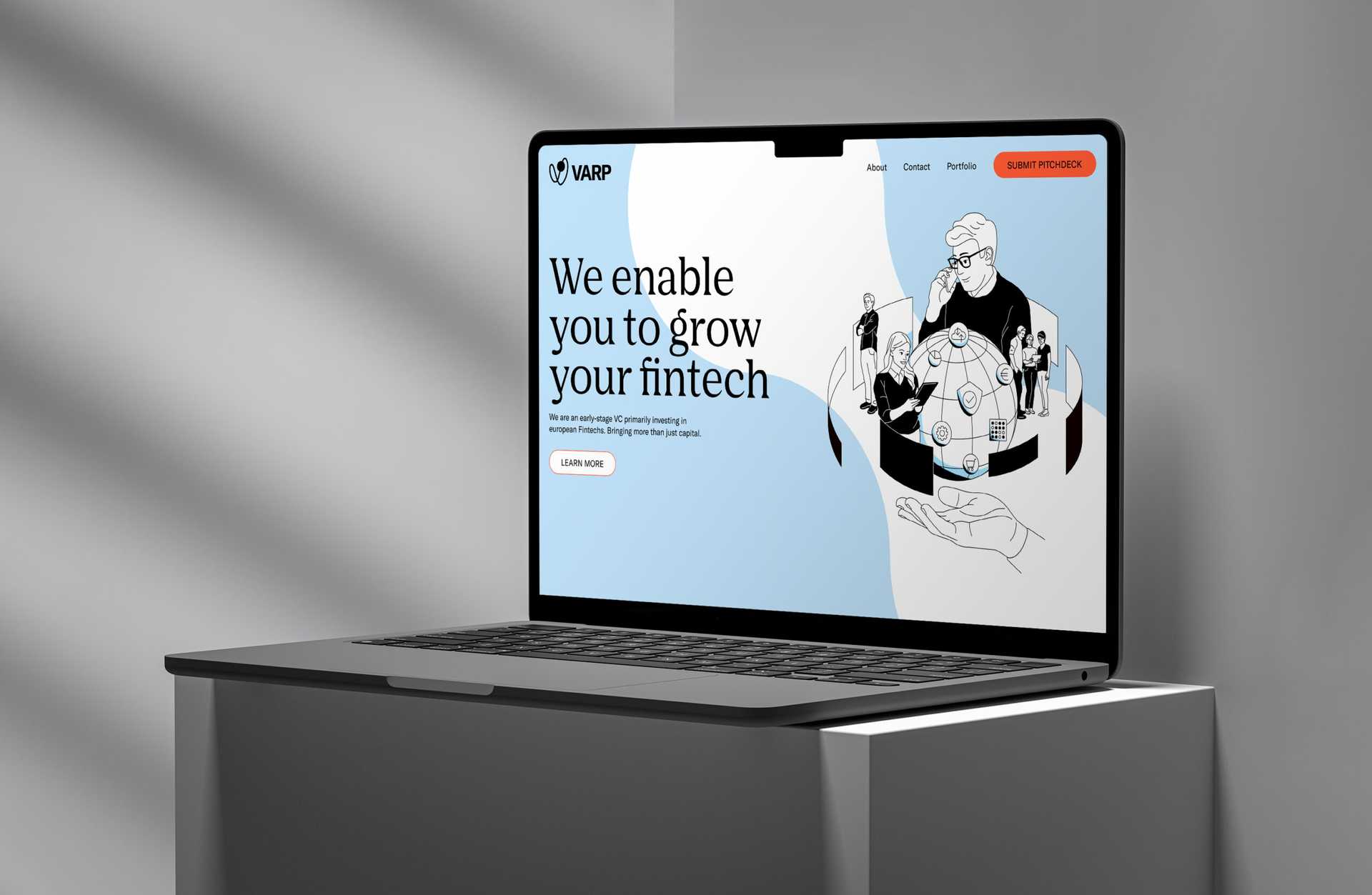
We crafted a visual identity that embodies VARP’s three qualities: the agility of an incubator, the credibility of an established name and the security of a bank. The V-shaped logo, with a ball at its centre, is a direct interpretation of the word ‘varp’ in Icelandic, namely ‘nest’ (there’s that incubation aspect again), while its dynamic shape is a nod towards the VC fund’s other association: warp speed. Based on this structure, we created a series of interlocking, mutually sustaining patterns that VARP can use as background elements online (e.g. Zoom, Teams) and elsewhere.
This is one design that didn’t take long for us to incubate. European fintechs: get ready for a strong investment partner in your corner. VARP speed, Mr Sulu.
A strong visual identity attracts attention. We worked with Arndt Benedikt to settle on our image as an agile early-stage venture capital firm and implement a design that radiated credibility.
