Wir nutzen Cookies und andere Technologien

Diese Webseite setzt Cookies, Web Beacons, JavaScript und ähnliche Technologien ein. Ich stimme zu, dass der Webseitenbetreiber und Drittparteien pseudonymisierte Benutzerprofile für die Personalisierung der Webseite, Marktforschung und Werbung erstellen. Die generierten Informationen können zwar an Drittparteien weitergeleitet werden, aber nicht mit persönlichen Informationen kombiniert werden. Detaillierte Informationen dazu und wie Sie Ihre Zustimmung zurückziehen finden Sie in der Datenschutzerklärung der Seite.

Arndt Benedikt
En
De
De
En

Amore
Creating an event concept to fall in love with
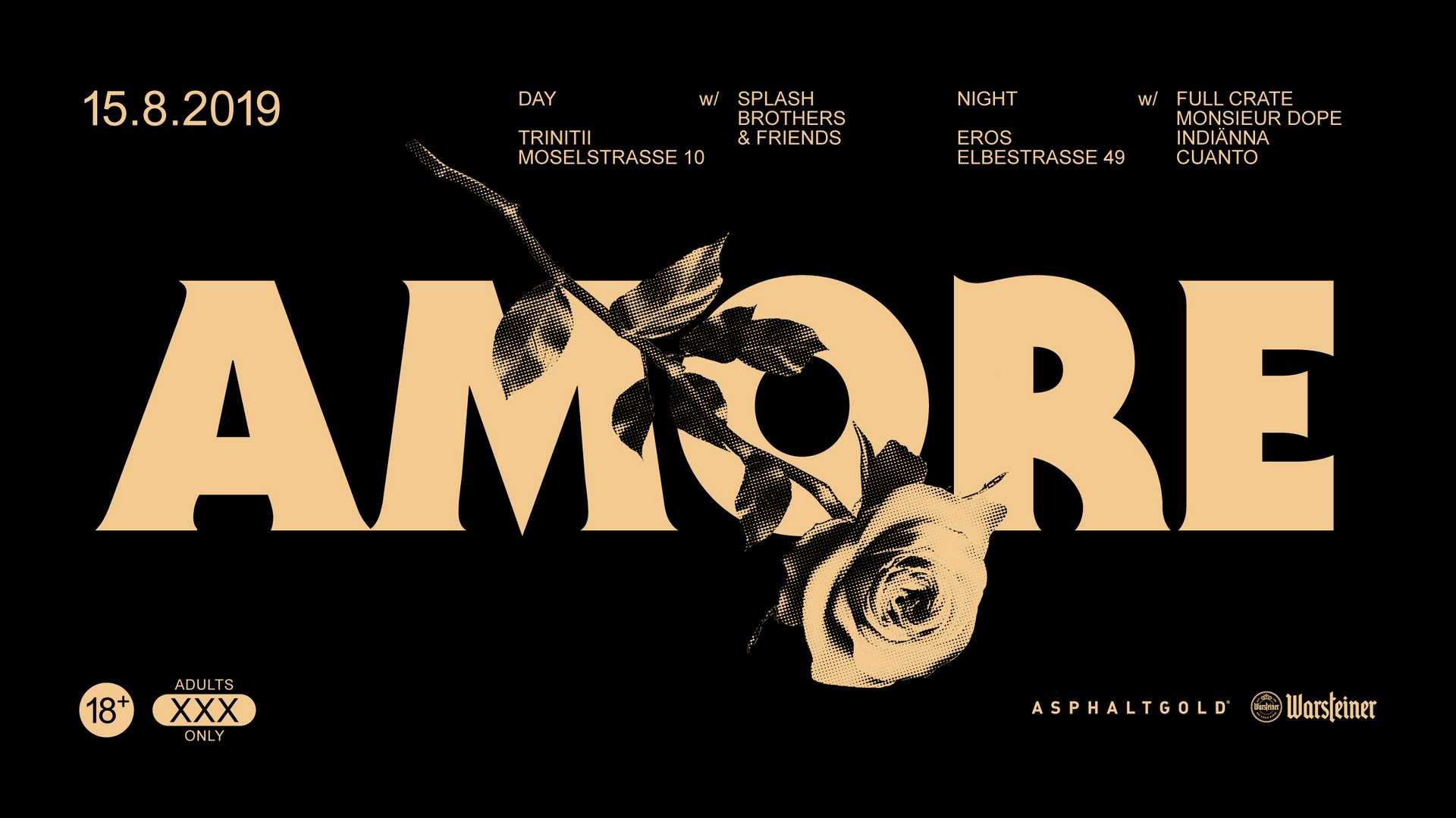
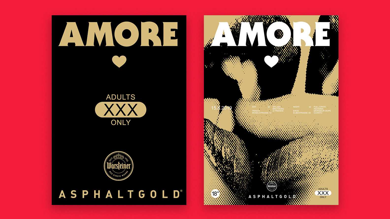
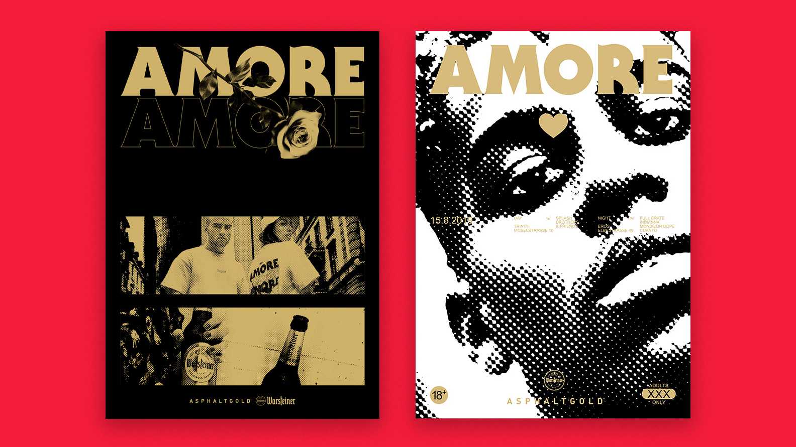
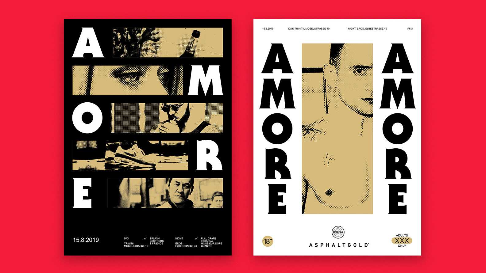
Amore keyvisual with event dates etc
Client
Asphaltgold, Warsteiner
Branch
Events
Charity
Services
Brand Design
Naming
Social Media
Animation
Event
Printed Matter
Amore keyvisual with event dates etc

Case Study
Overview

Frankfurt’s Bahnhofsviertel is one of the most interesting places in Germany

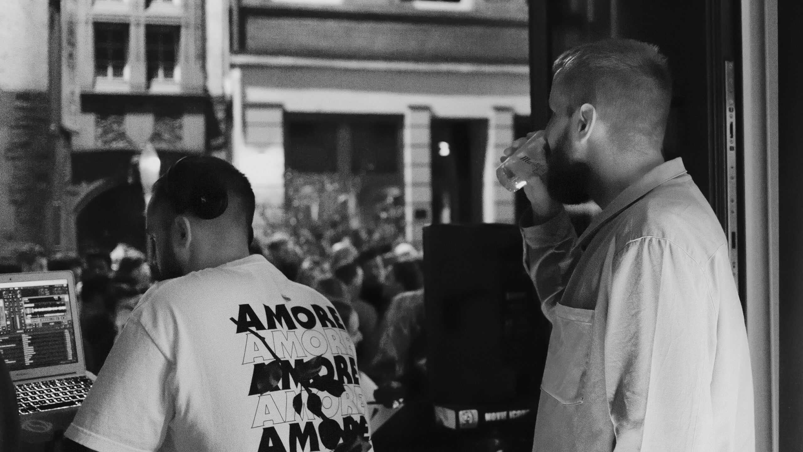
On only half a square kilometre, brothels, art and some of the city’s hippest clubs meet. Once a year, the district celebrates itself with the Bahnhofsviertelnacht, which now attracts 50,000 visitors. Warsteiner and Asphaltgold used this backdrop for a crashing charity event with which they also celebrated the friendship between the two brands in an image-effective way. We developed the motto, the visual concept and of course all the assets of the event. Amore – che altro?

Giving never goes out of style!

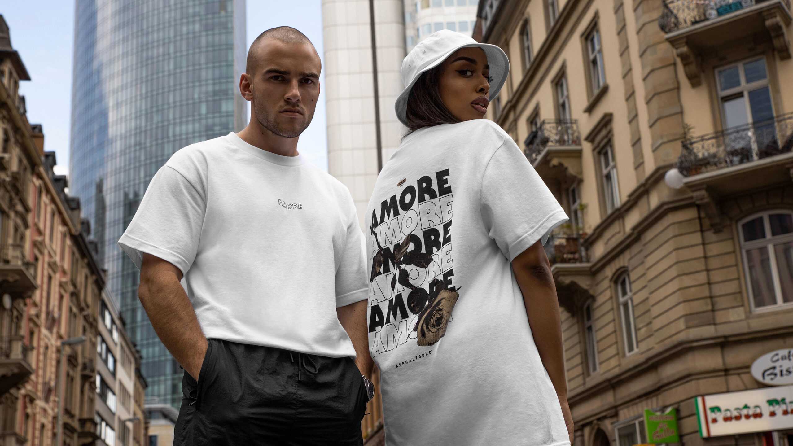
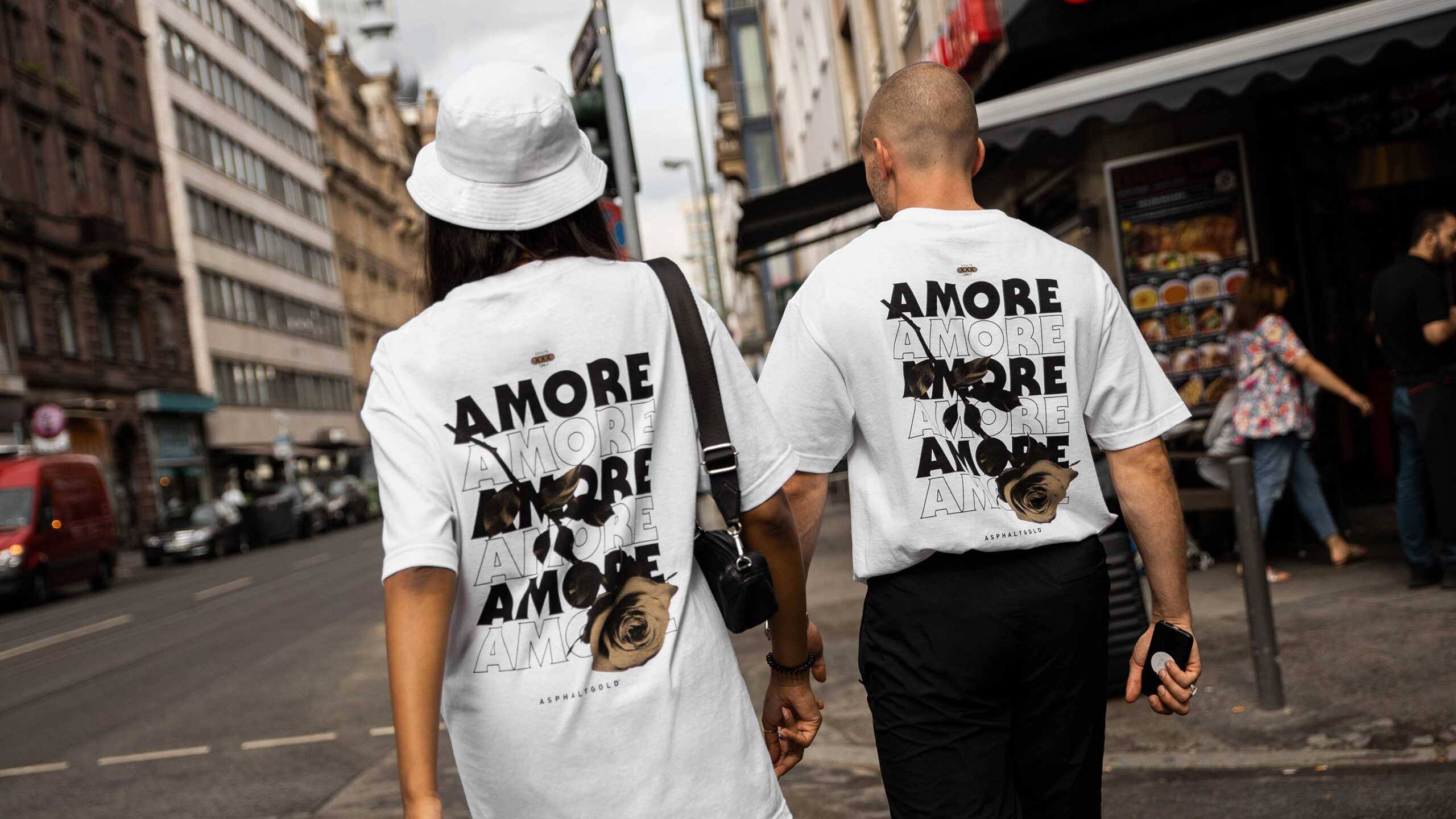
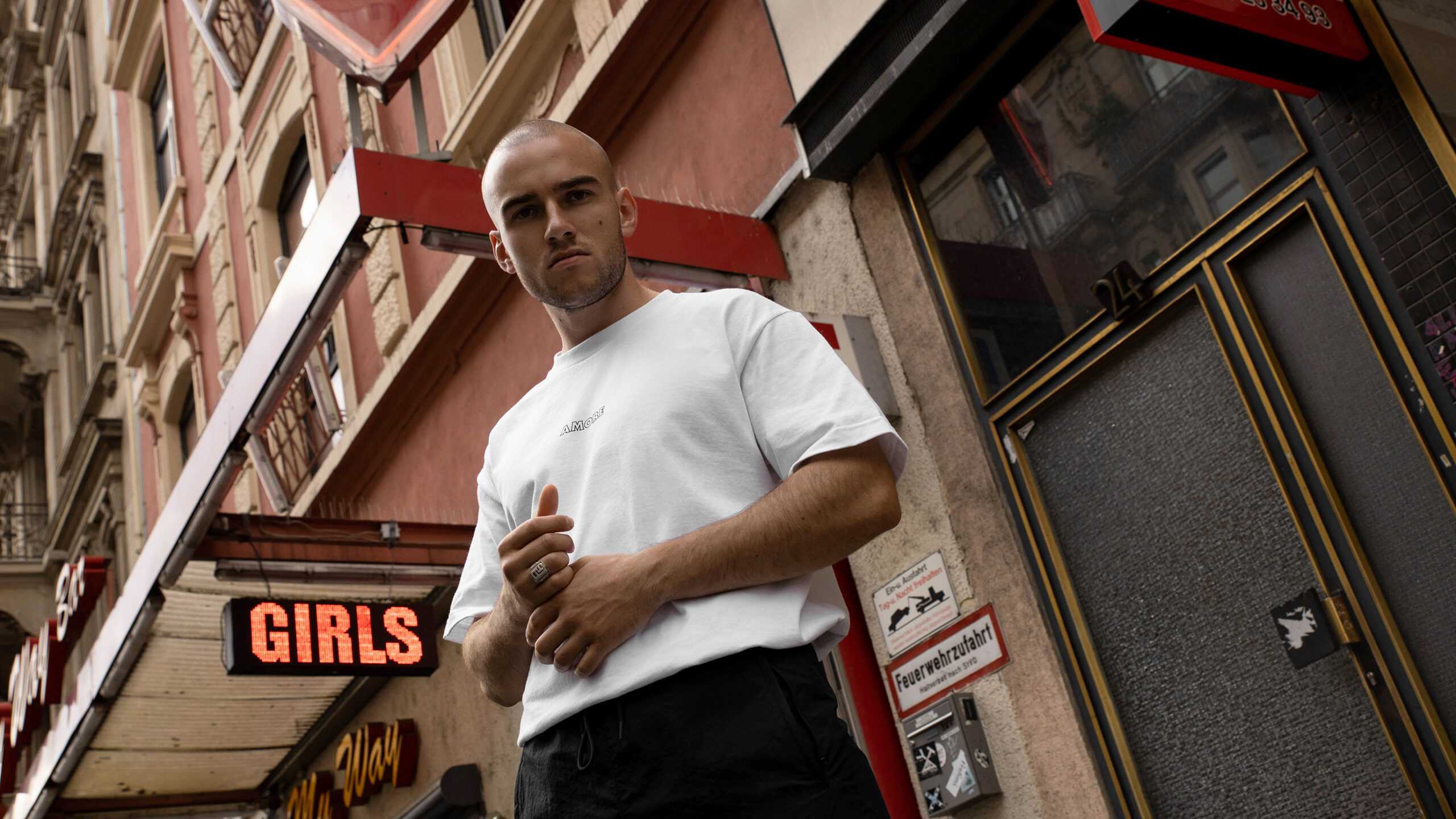
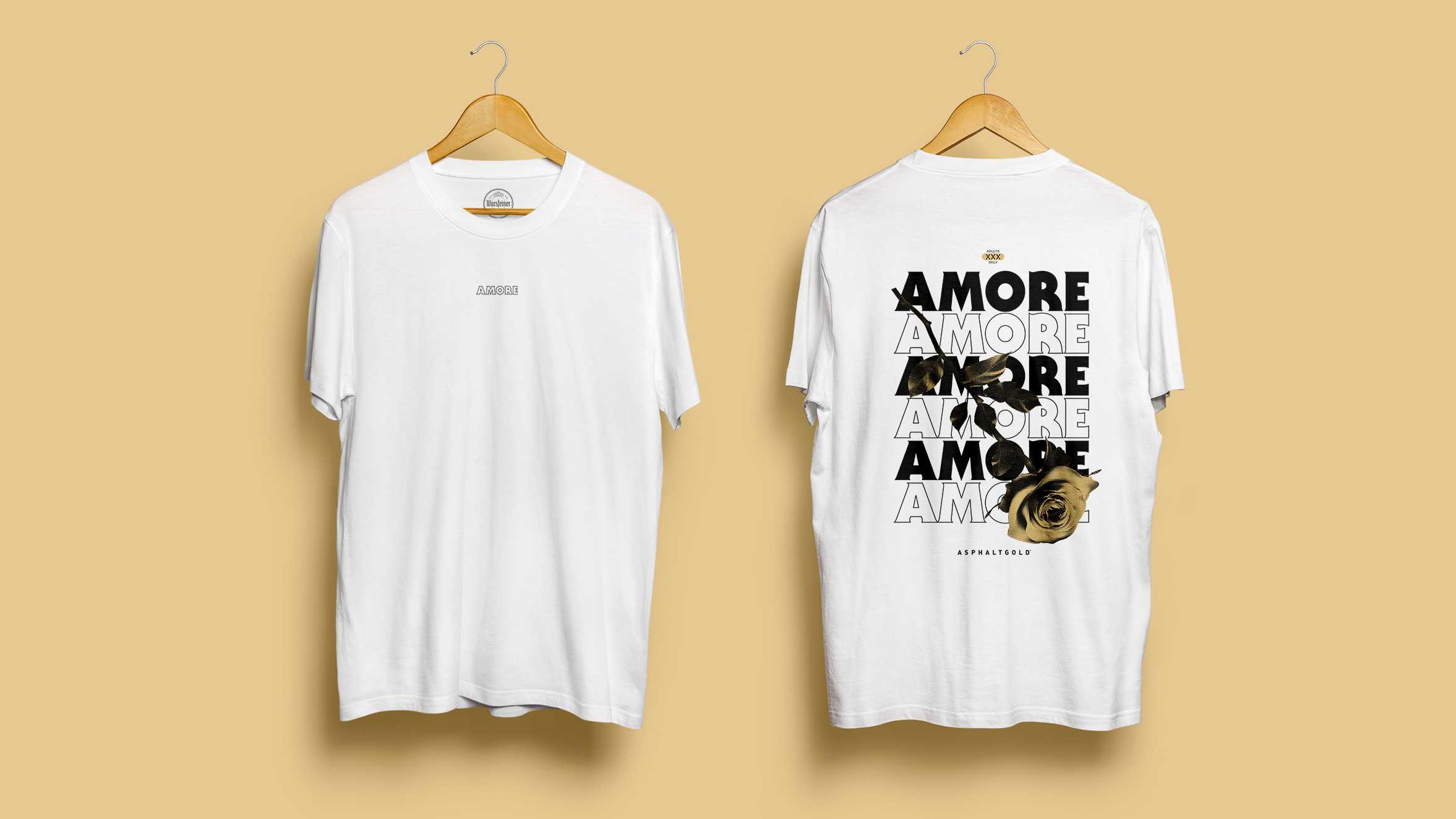
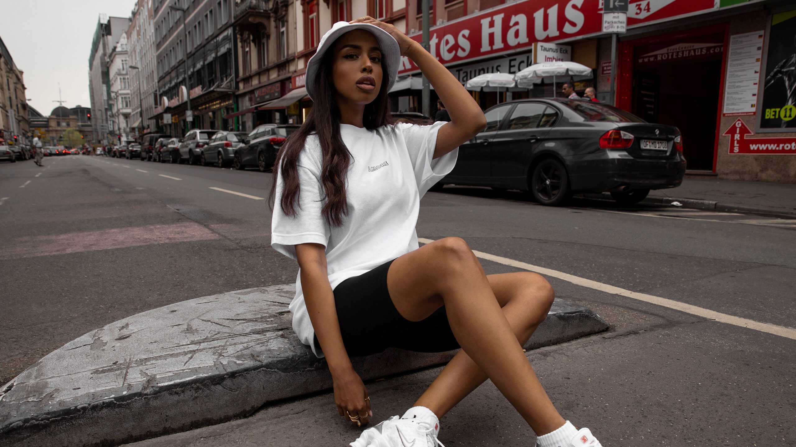
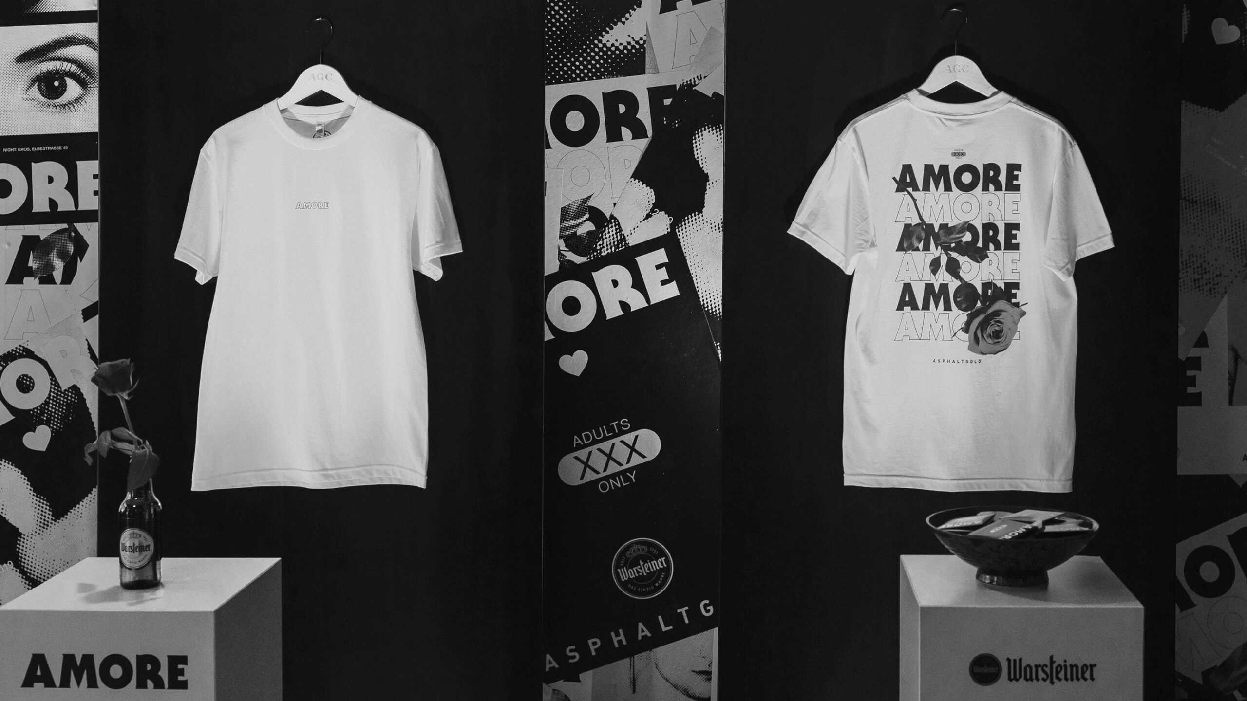
The two brands clearly wanted to get involved with the district and give it something back. For this purpose, we designed a top-class charity event under the motto “Amore”. The concept plays with love, humanity and friendship on the one hand, but also offers enough projection space for the red light milieu and everything that goes with it. In the center of the charity thought stood an exclusively of us arranged T-Shirt, which was sold at the event location. The revenue went to Doña Carmen e.V., which stands up for the rights of prostitutes.

With Amore to detail

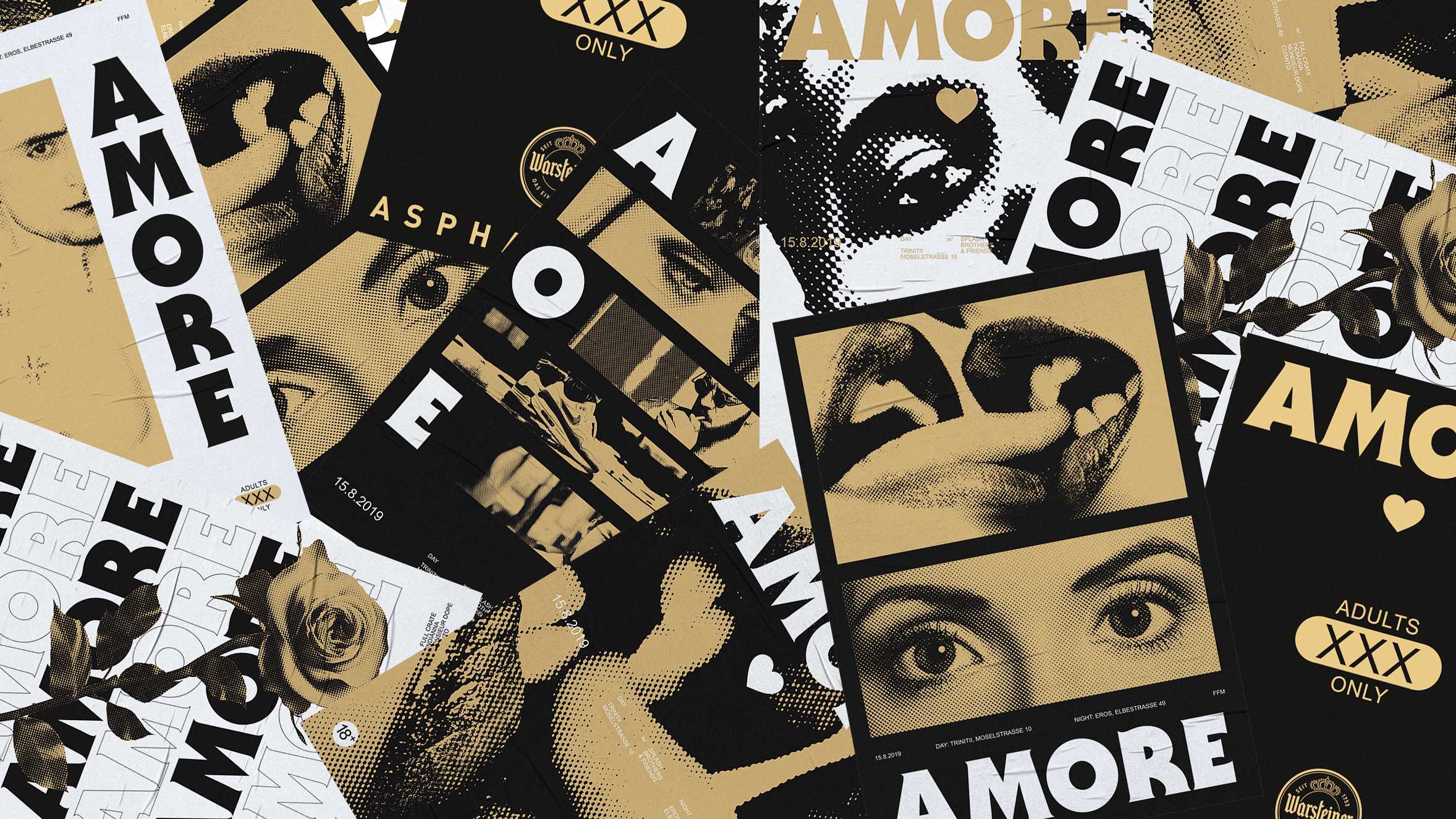
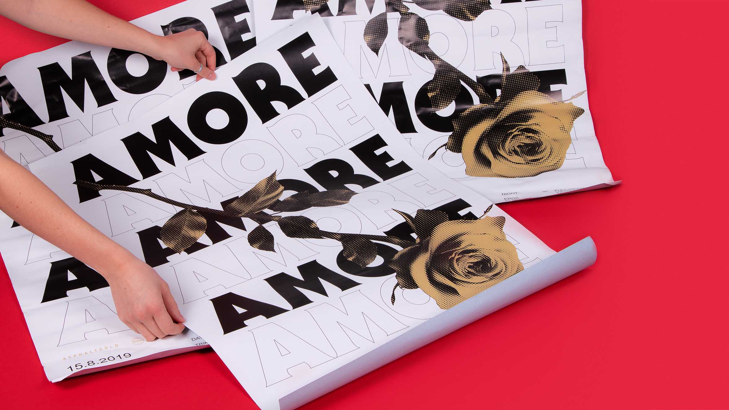
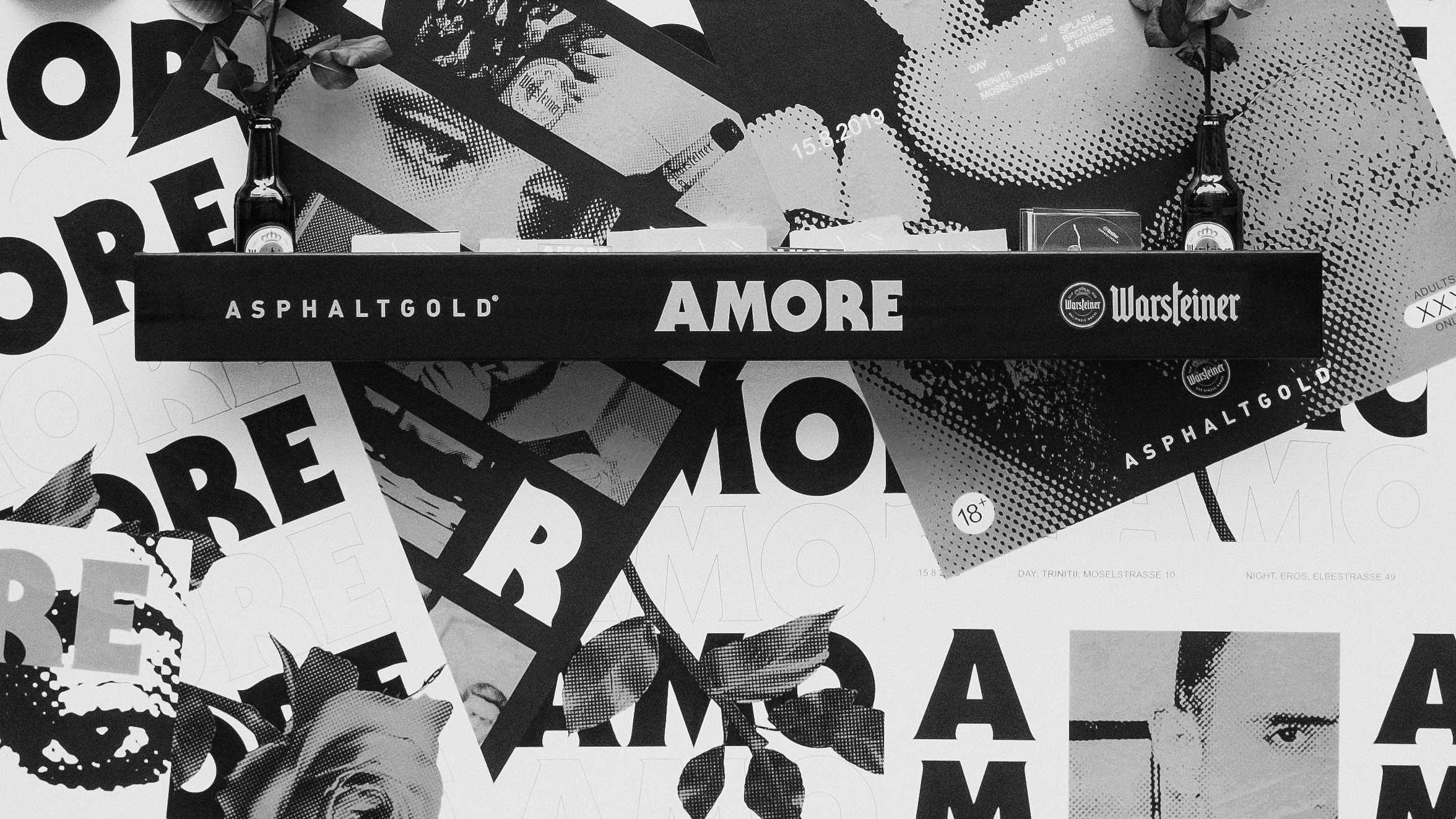
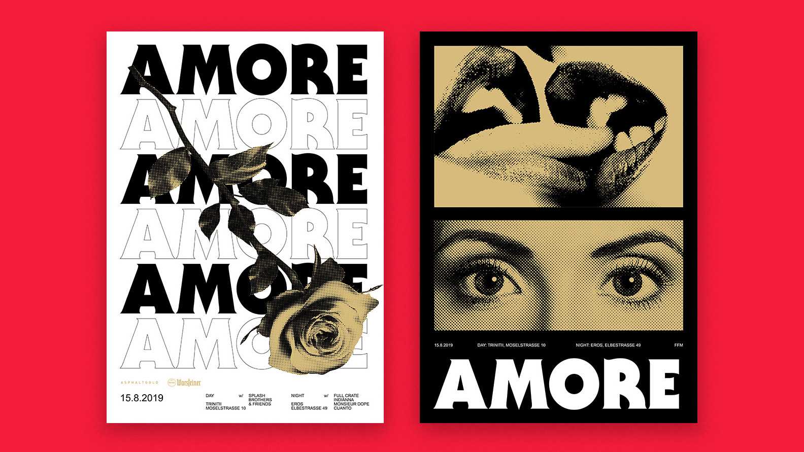
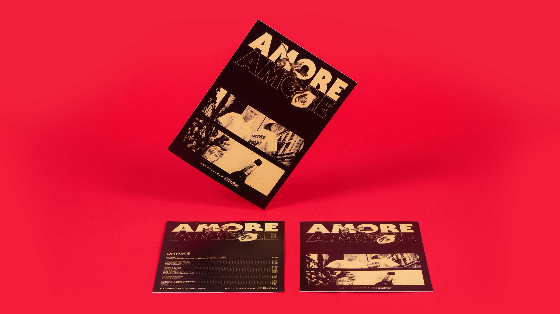
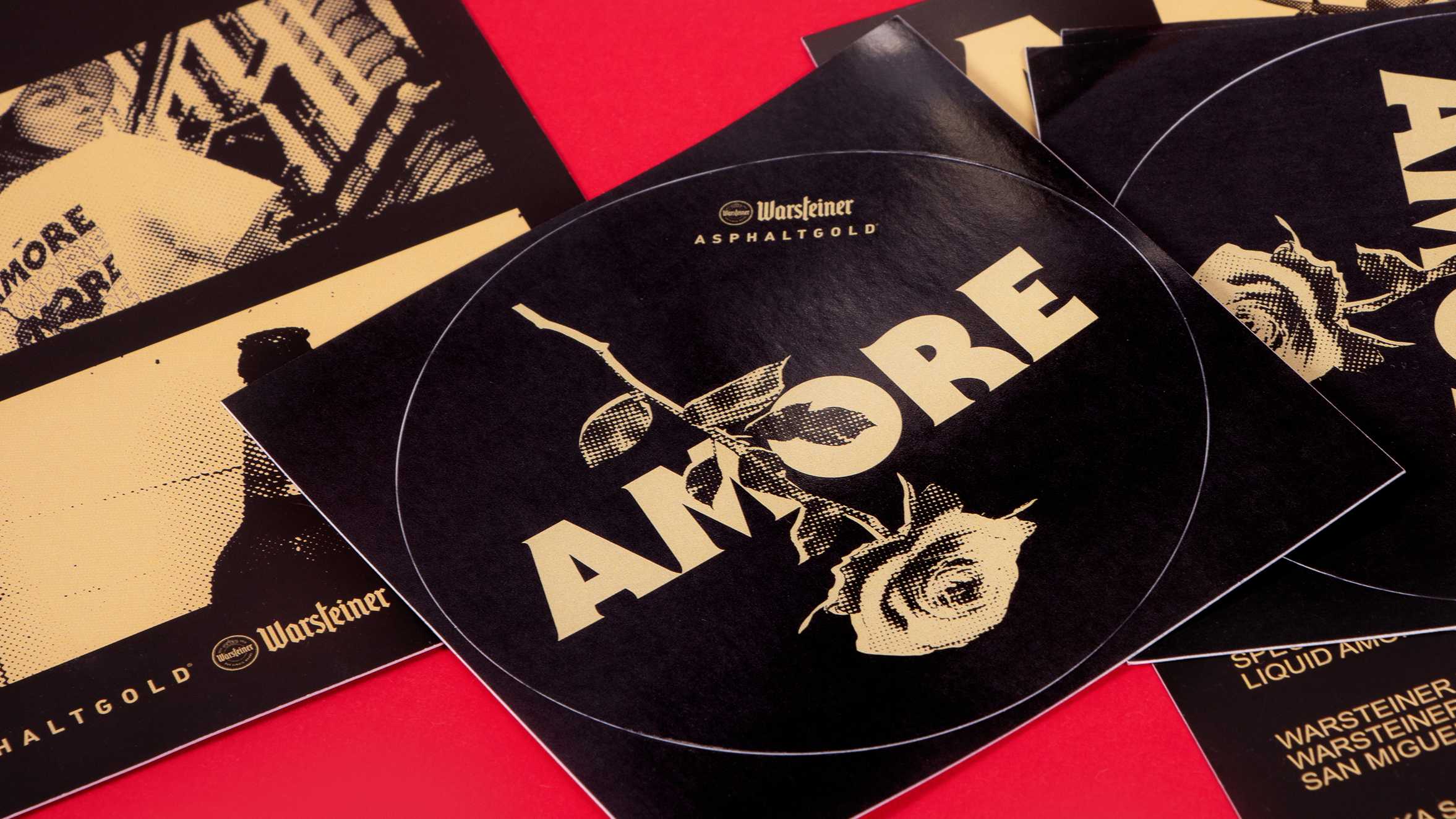
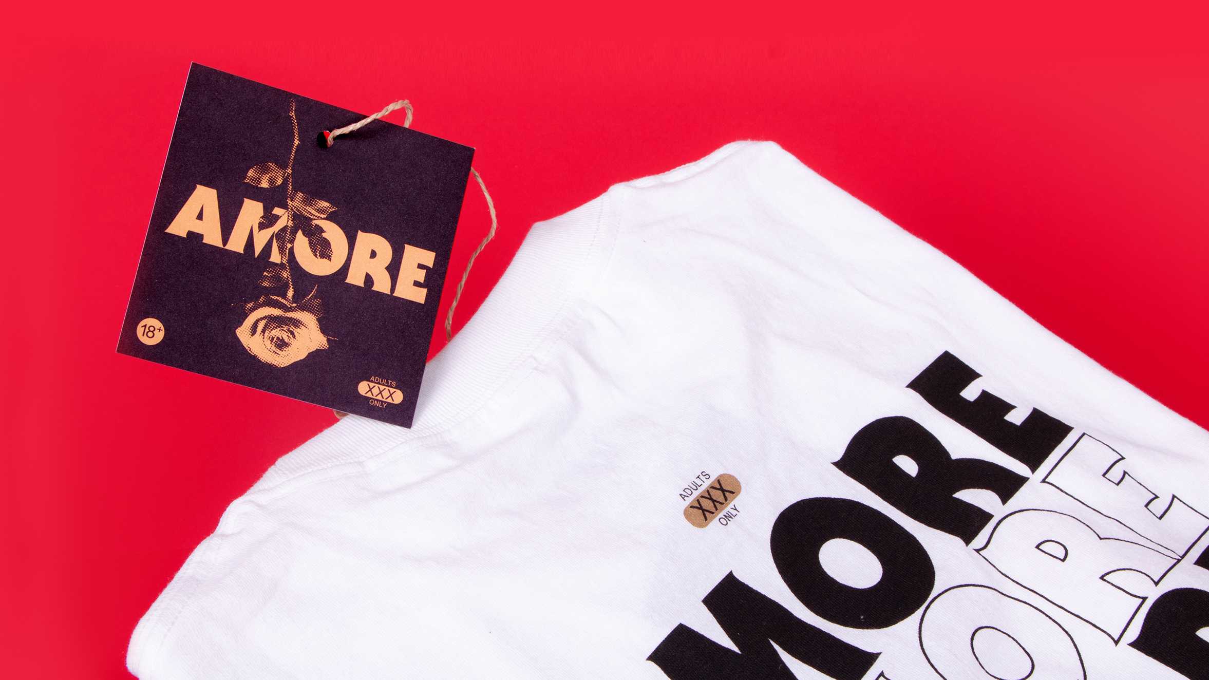
For the event design, we used the motif of the rose as the overall key visual with which we branded the event and gave it the visual bracket. The rose itself stands for love and affection, the rough style and the thorns for offside and danger. We mixed the motif with a documentary image world and insignia from the milieu to create a consistent design system. We used it for a variety of applications, both online and offline. Interior design of the event locations in cooperation with Volkmann Grolik.
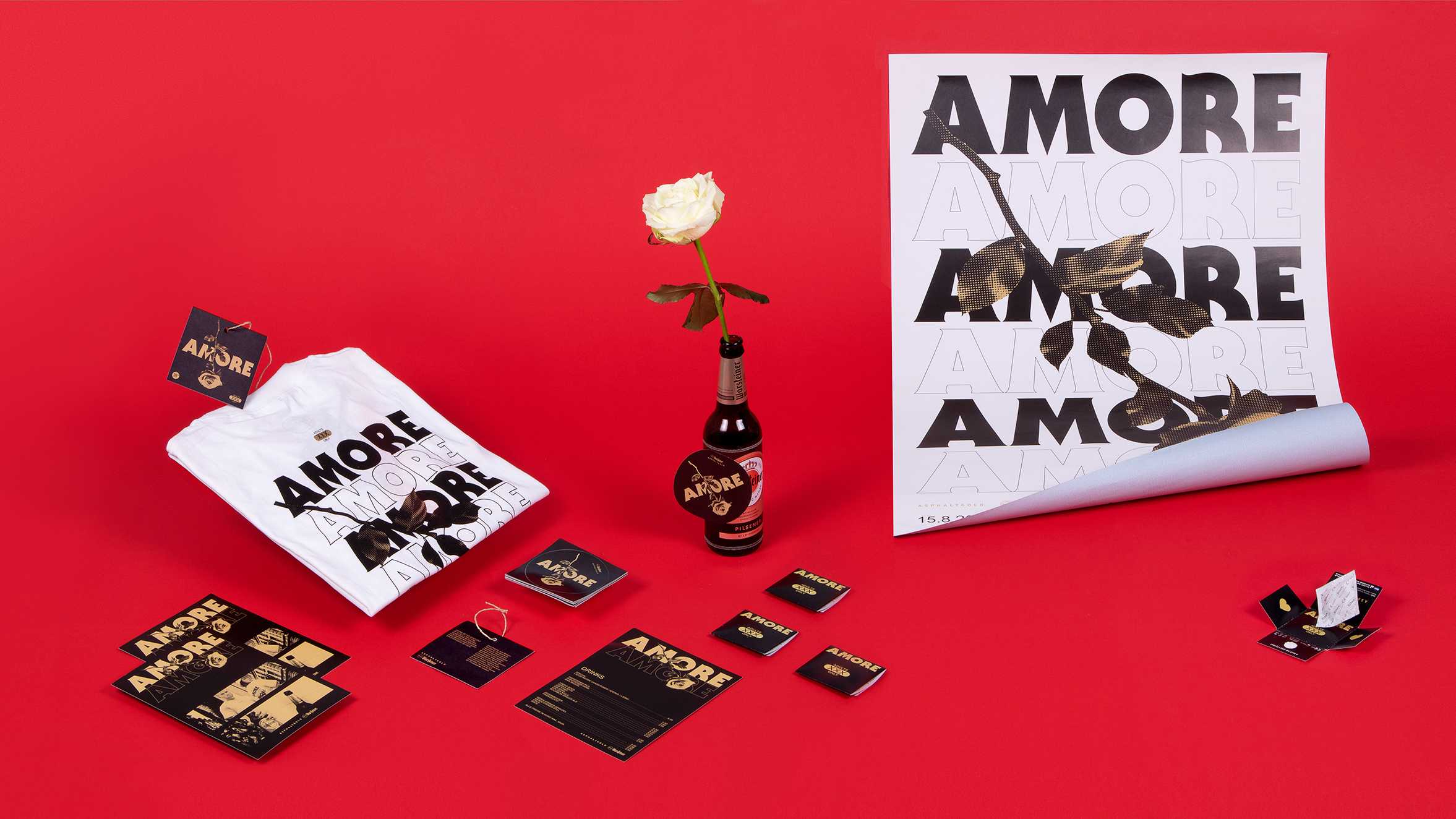
Amore print products
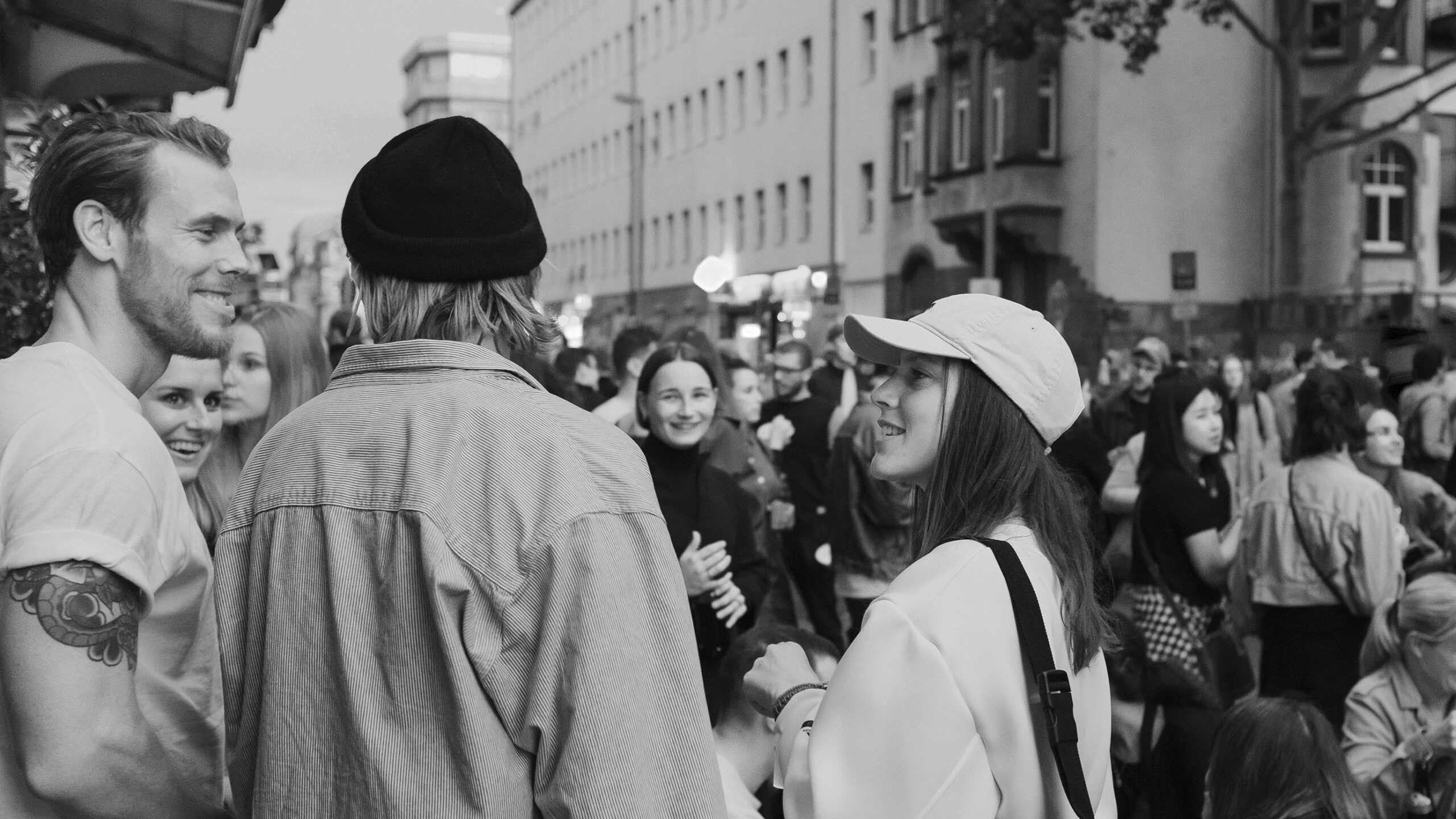
people at the amore festival
Two models wearing the Amore shirt
two models wearing an amore tshirt
model wearing an amore tshirt
Charity tee
Photo shoot, Frankfurt Bahnhofsviertel
1/0
mockup of amore tshirt
Charity tee
2/0
model wearing an amore tshirt
Charity tee
Photo shoot, Frankfurt Bahnhofsviertel
3/0
posterwall with posters made for amore
dj and person at amore festival
Bahnhofsviertelnacht
Event location
1/0
decoration with amore corporate design
Poster wall
Event location
2/0
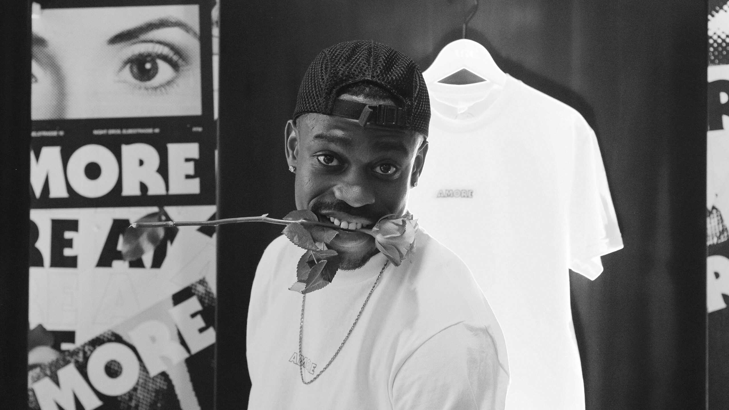
image of amore stand with tshirts at amore festival
Charity tee showroom
Event location, interior design
3/0
person working at amore stand with a rose in mouth
Amore posters on red background
mockup of amore poster

1/0
mockup of amore poster

2/0
mockup of amore poster

3/0
mockup of amore poster

4/0
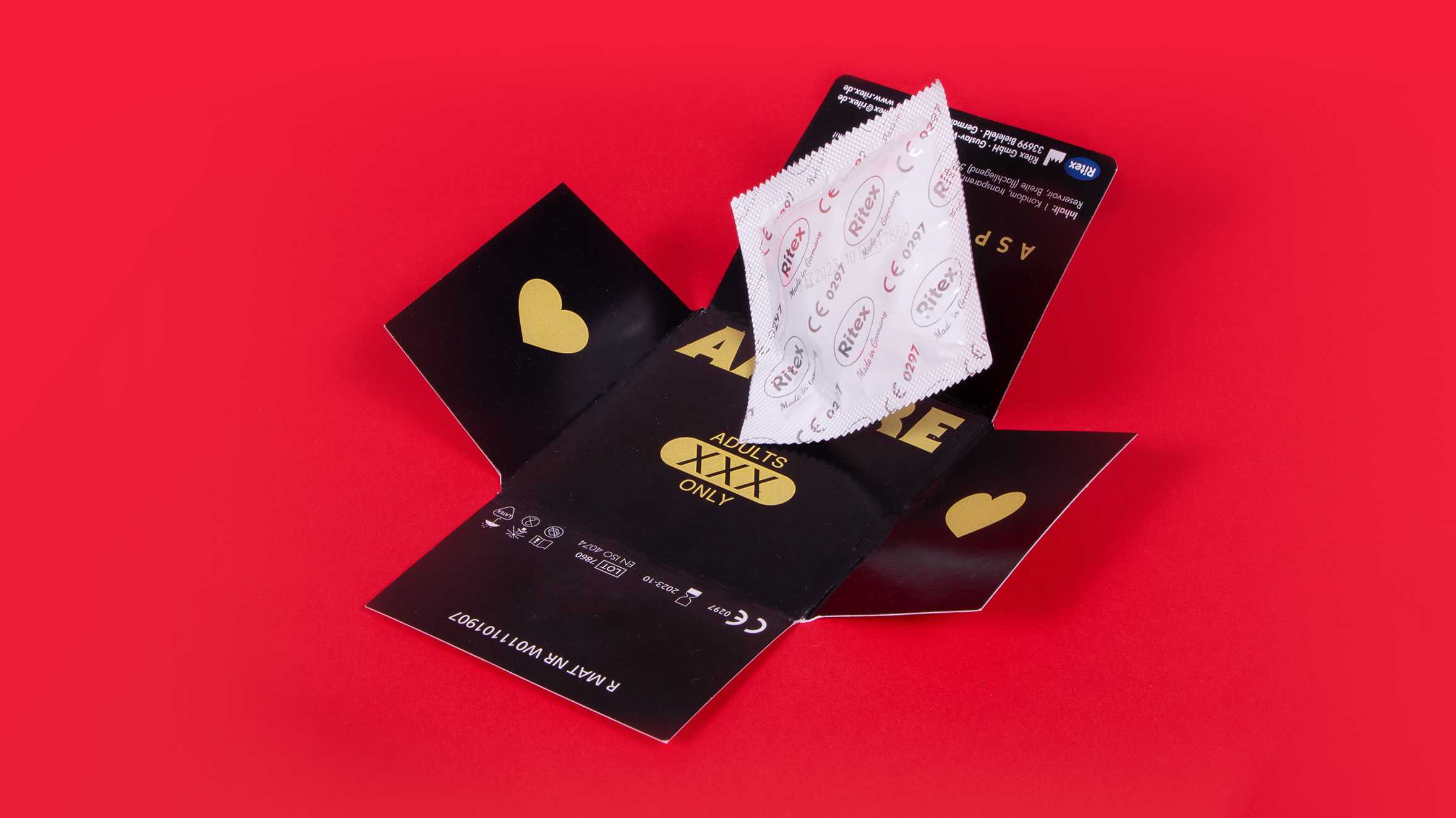
Condom packaging in amore visual identity
mockup of amore flyer

1/0
image of amore stickers

2/0
clothing tag in amore visual identity

3/0
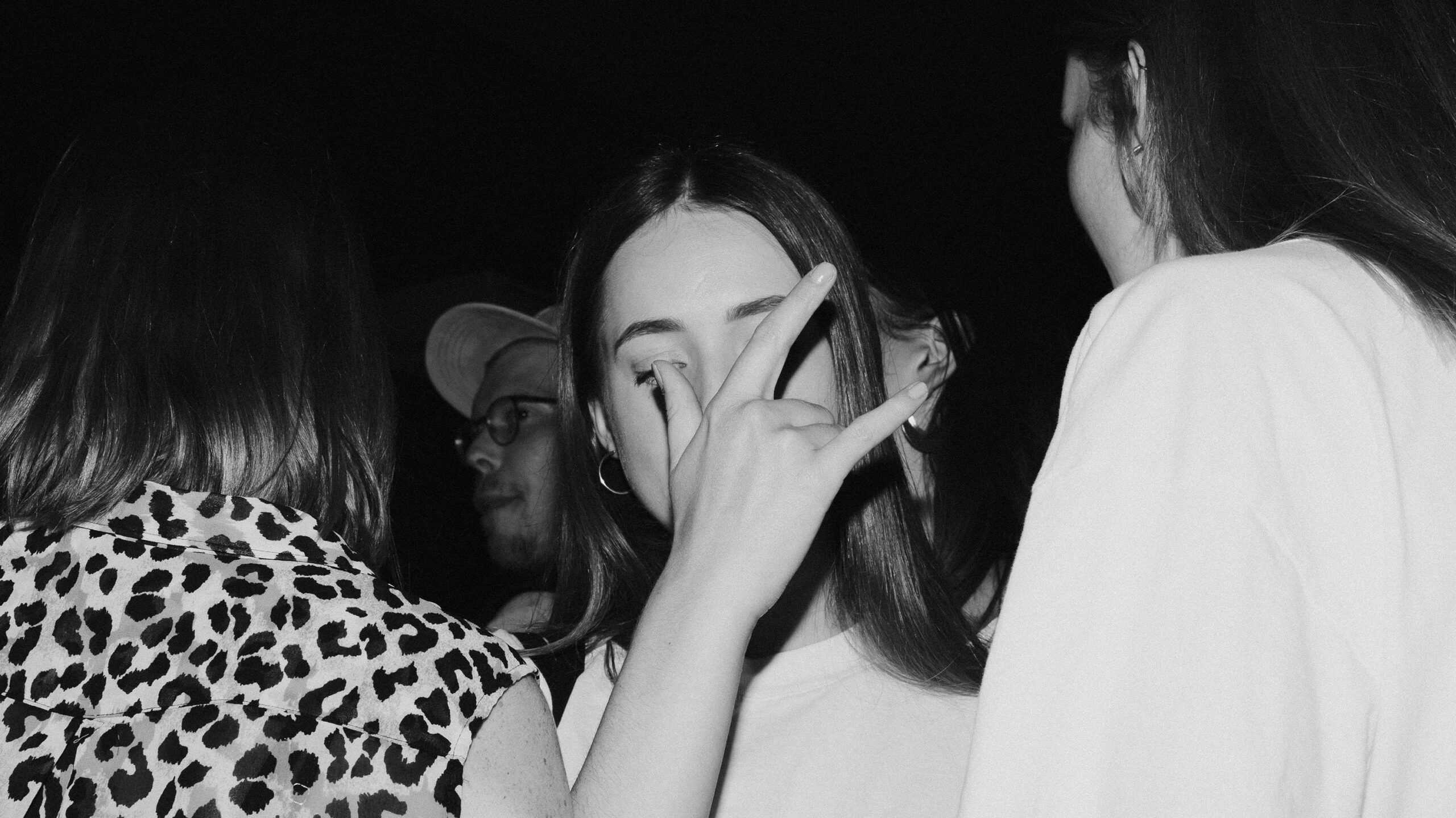
image of people at amore festival
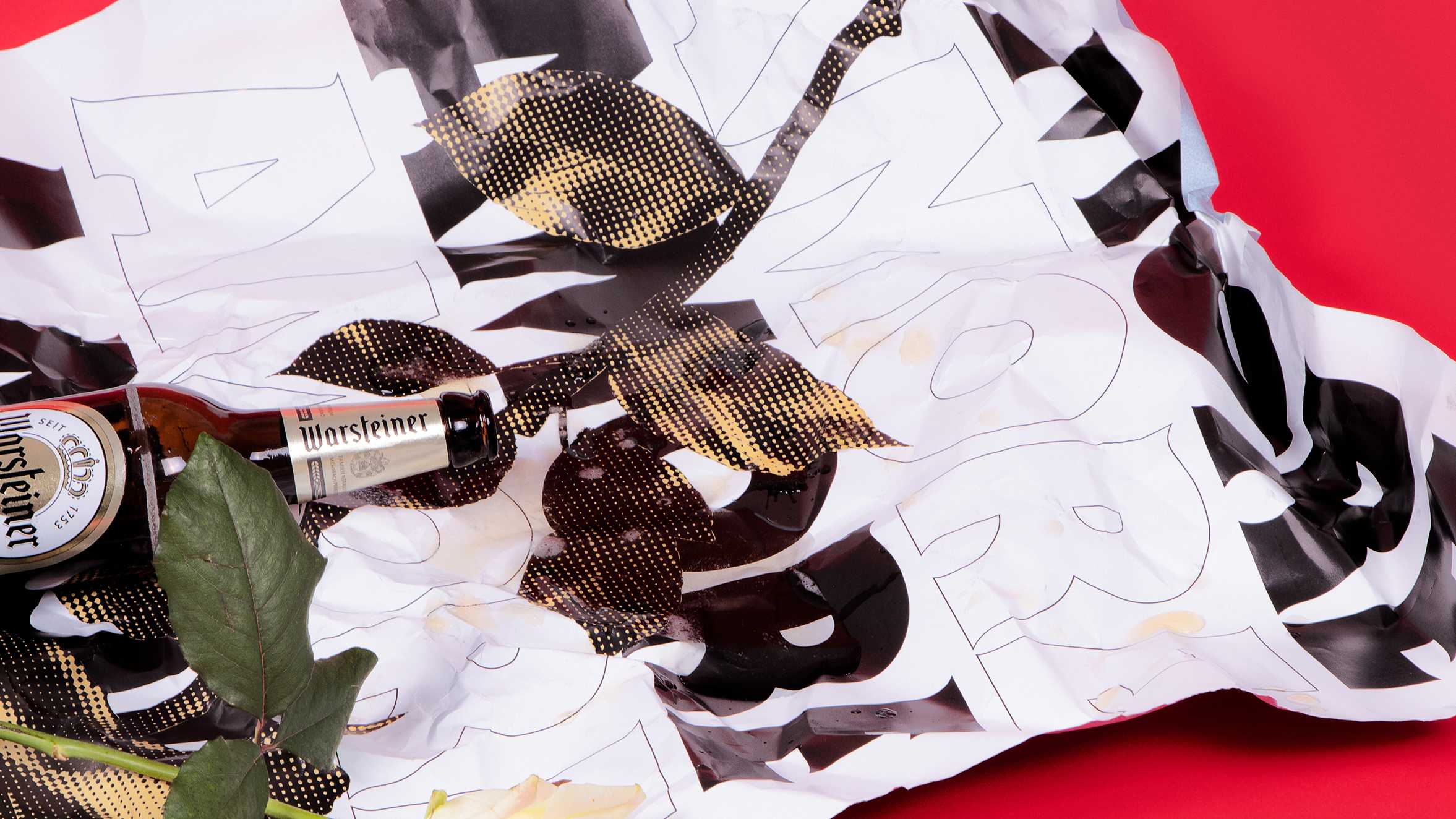
A spilled beer bottle on top of a crumbled amore poster

More projects like what you like

Your project is missing?
We should have a word!

© Arndt Benedikt
@studioarndtbenedikt
@arndtbenedikt
Arndt Benedikt
info@arndt-benedikt.de
+49. 69. 27 31 56 80