Breezy
Smashing stereotypes and blazing a new trail

Case Study
Overview
Our Client
Helping cannabis take root in the 21st century
The days of park handovers, stems and sneaky trips to Amsterdam are over. With opinions on cannabis shifting among lawmakers and the public, Breezy wants to seize the momentum by getting people to fall in love with Mary Jane and rehabilitate the plant’s reputation in the eyes of the world – especially as a medical wonder herb. Through a combination of quality cannabis products, community-building and edutainment, Breezy is aiming to make the magic dragon as socially acceptable as a game of frisbee.
The Challenge
Crafting the identity of a game-changing movement
Breezy doesn’t see itself simply as a brand. Rather, it is the catalyst for a grassroots (literally!) community seeking to build widespread acceptance for a natural plant with many beneficial qualities. To be taken seriously and gain credibility beyond its core audience, the company’s visual identity had to reflect this community spirit while dispelling tired tropes.
Our Solution
Credibility and clarity rolled into one
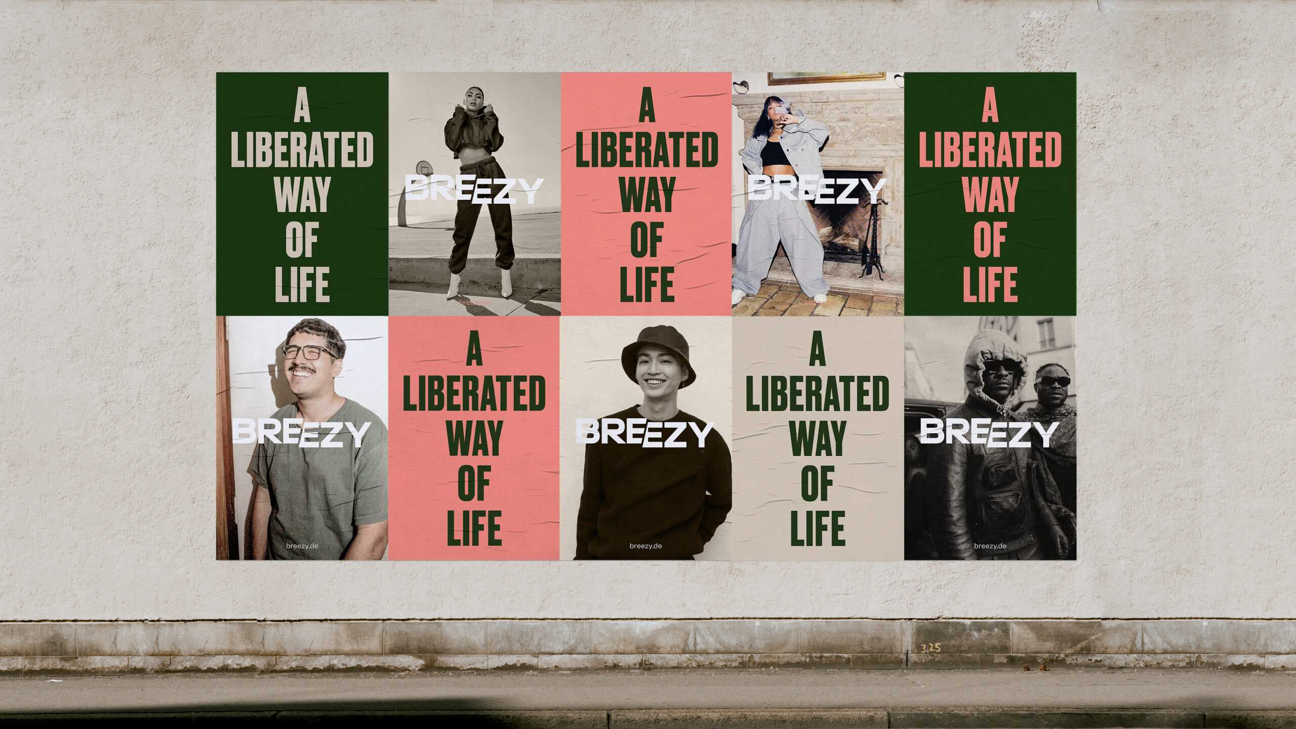
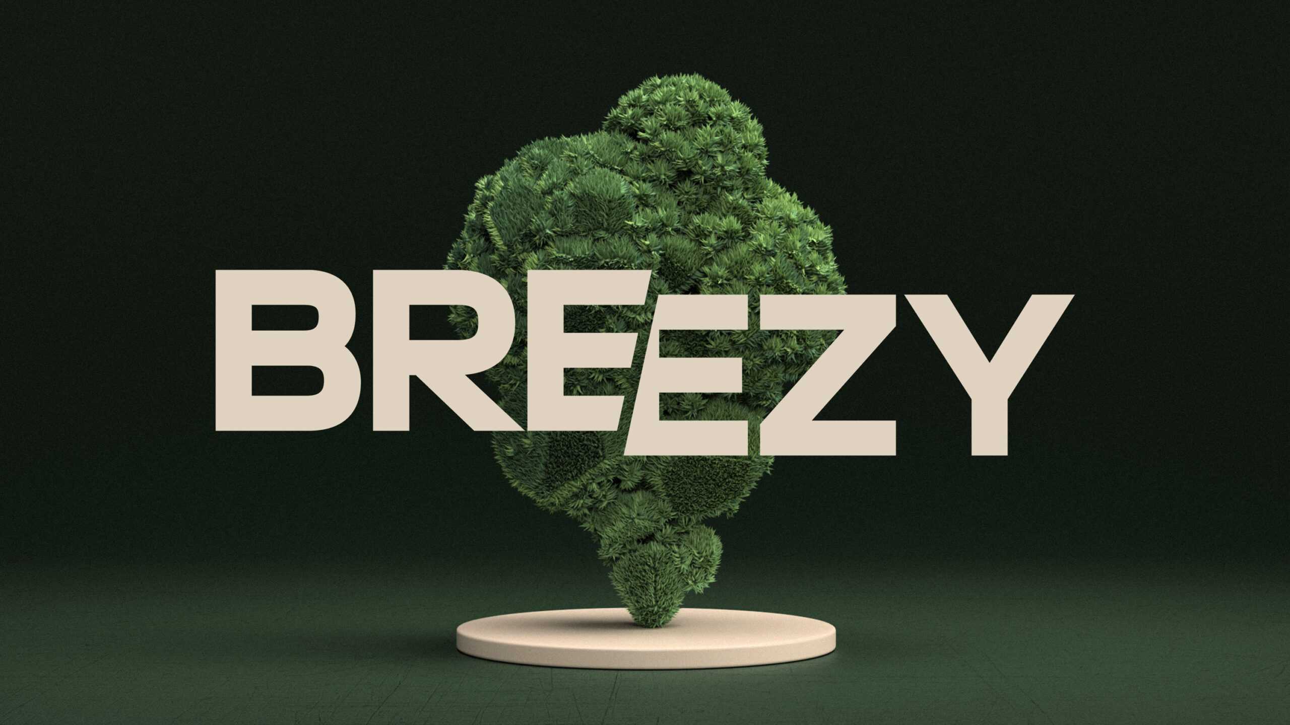
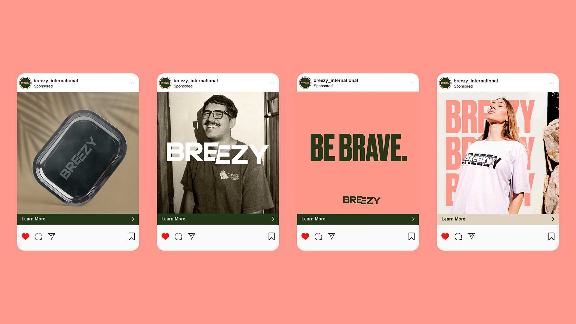
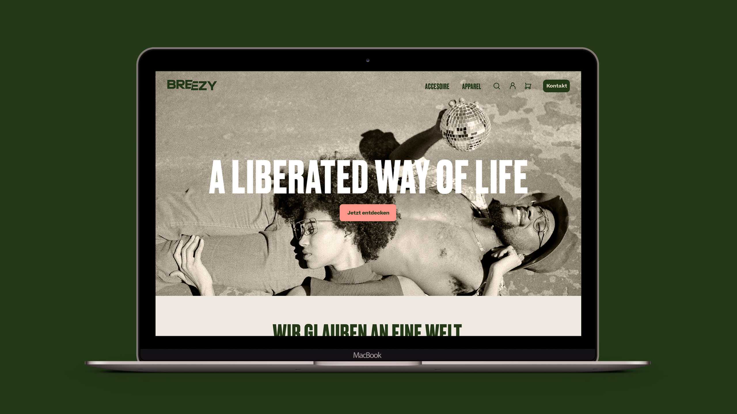
We kicked things off by designing a logo for Breezy that would capture the brand’s core identity: a renegade spirit aiming to smash outdated perceptions while being utterly upfront about its motivations. Hence a logo that is clear and easy to read with no frills, but which nevertheless has a nonconformist element to it: the slash – akin to the hard line of a rolling paper – running between the two Es. As for the wider visual identity, we decided to be honest: we relied on full-colour, high-contrast, desaturated photos of people from all walks of life and backgrounds enjoying cannabis recreationally. The idea was to show that there is no need to be prejudiced towards the product: it’s as natural as meeting for a beer or playing a game of ping pong.
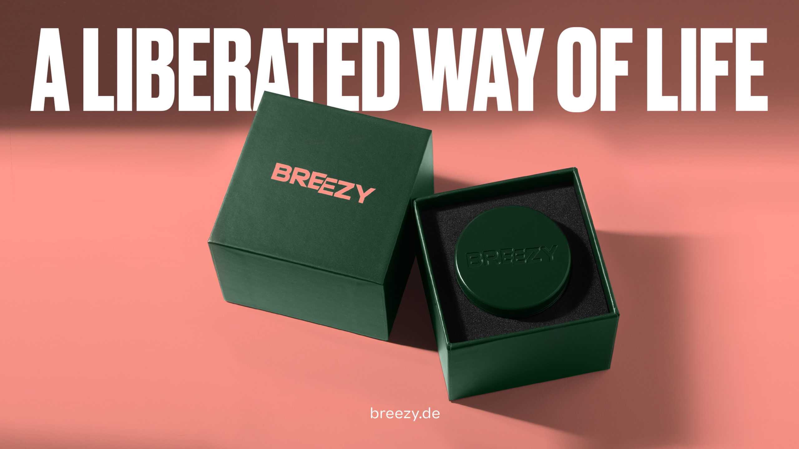
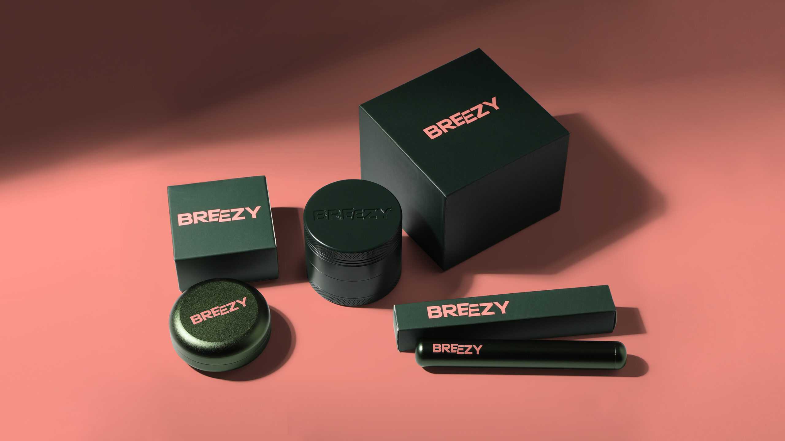
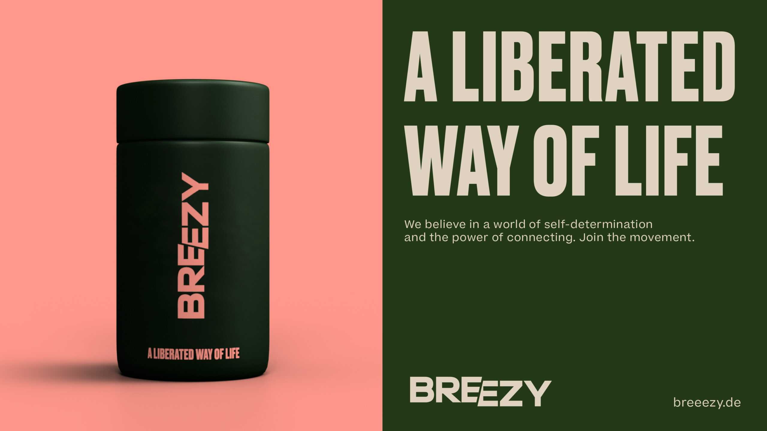
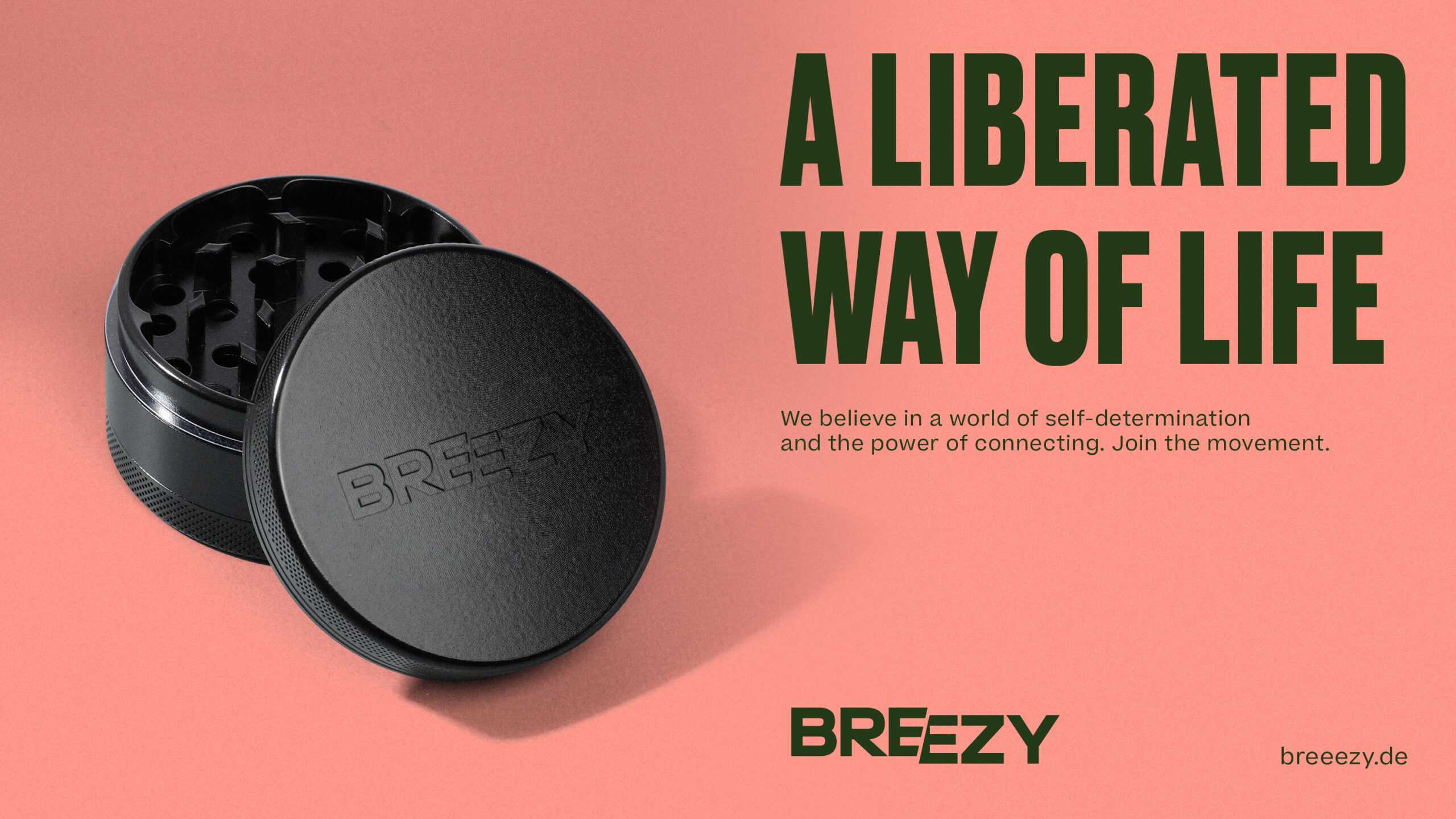
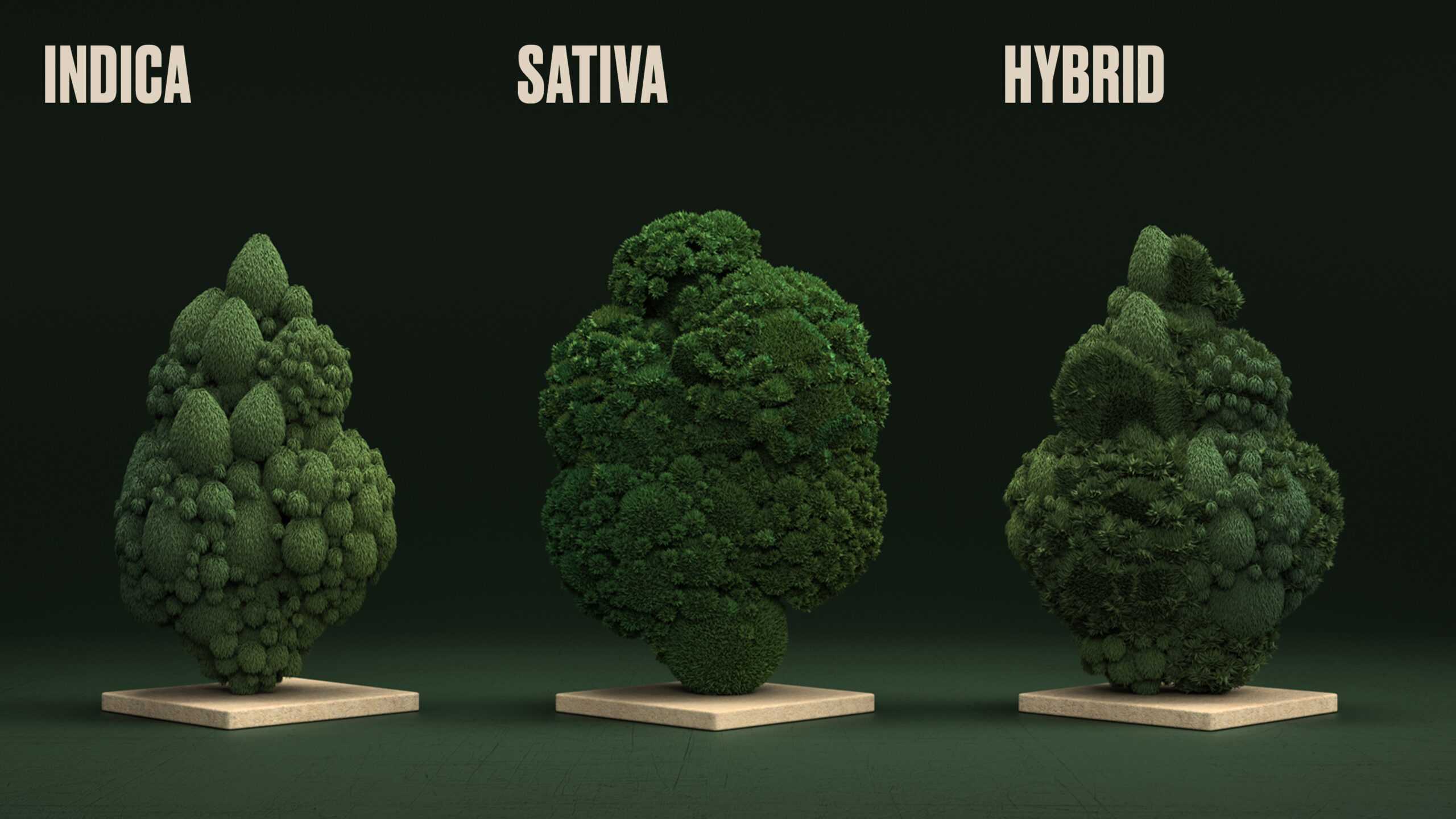
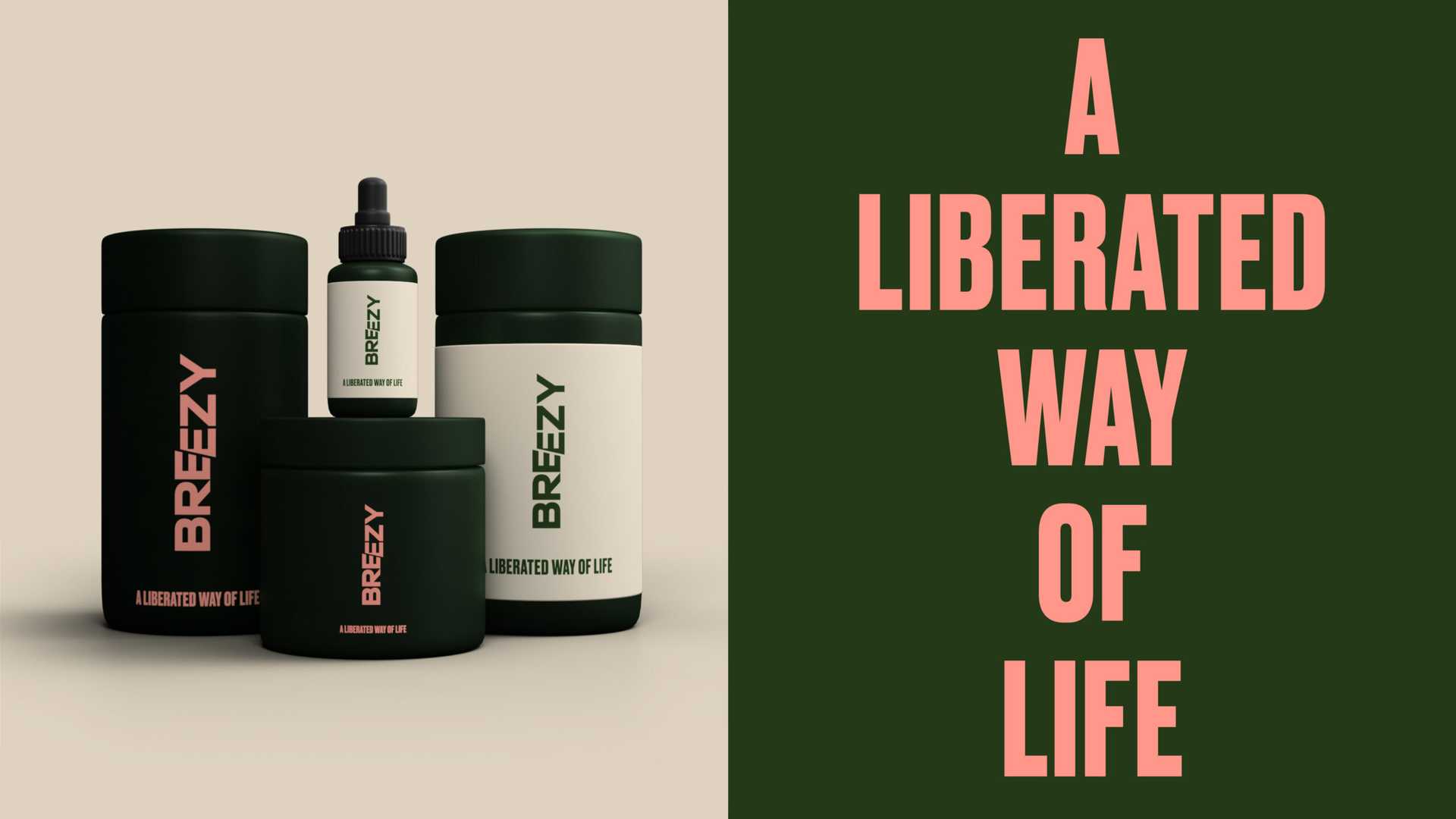
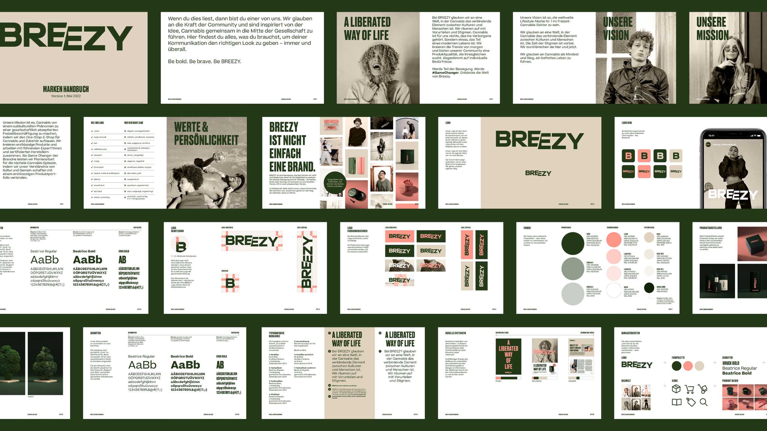
This soft, desaturated colour palette likewise found its way into the ultra-modern font/layout system, which is easy to apply online and offline. It is also used for branding purposes on Breezy’s accessories, which includes everything from grinders to rolling papers. Since Breezy naturally has no love for clichés, all stereotypical depictions of the famous leaf were cast aside, with impressionistic, abstract 3D renderings instead being created to capture their hazy spirit. Finally, we set out the look & feel of Breezy in a comprehensive brand book.
After decades in the making, the weed has finally been freed. Anyone know what we could do to celebrate?

The task in front of us to destigmatise cannabis is big – and we gladly take it. As a community driven brand we embrace approaches that think outside the box in a completely new way. That’s what Arndt Benedikt has done for us with their design system.

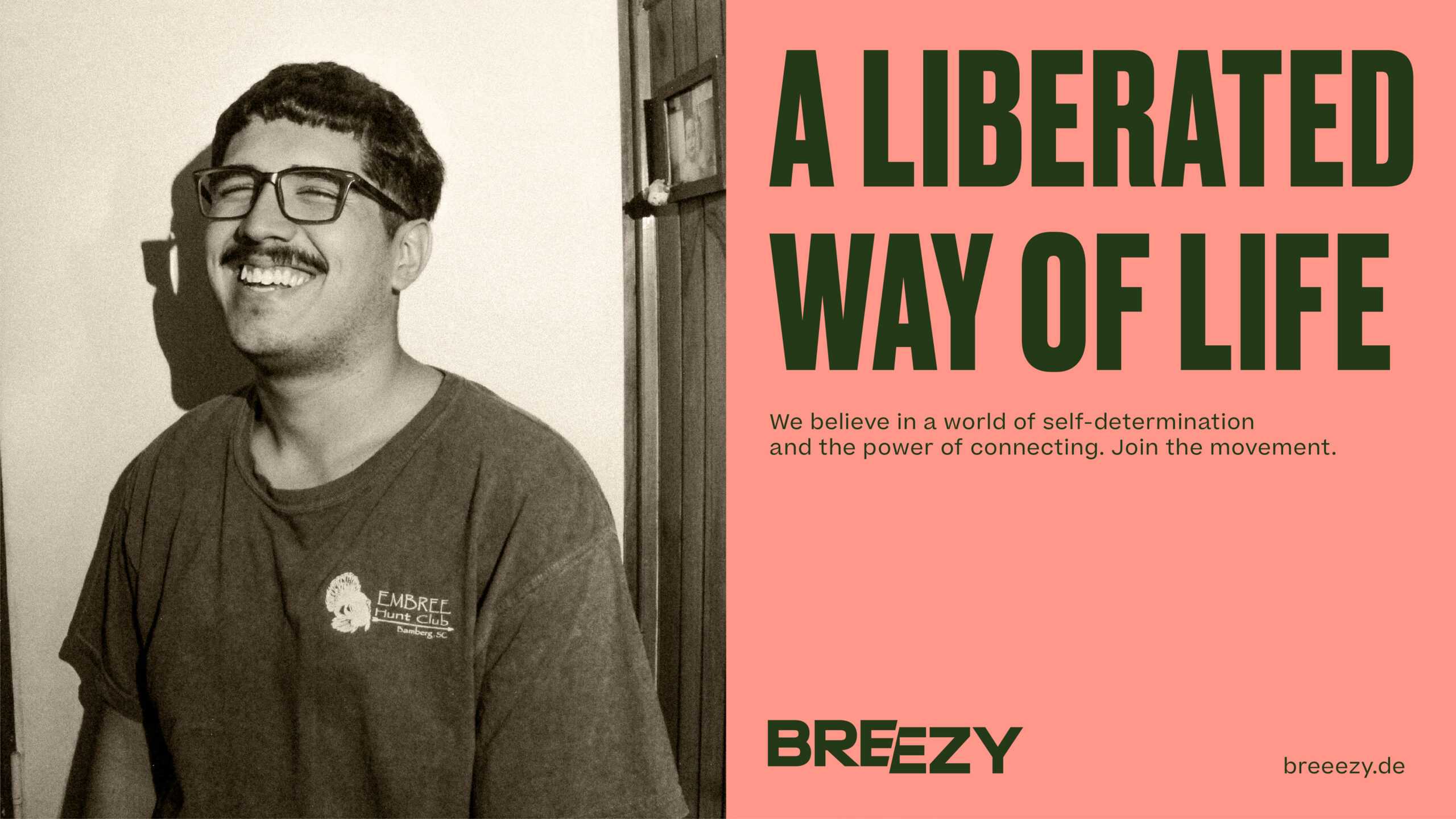
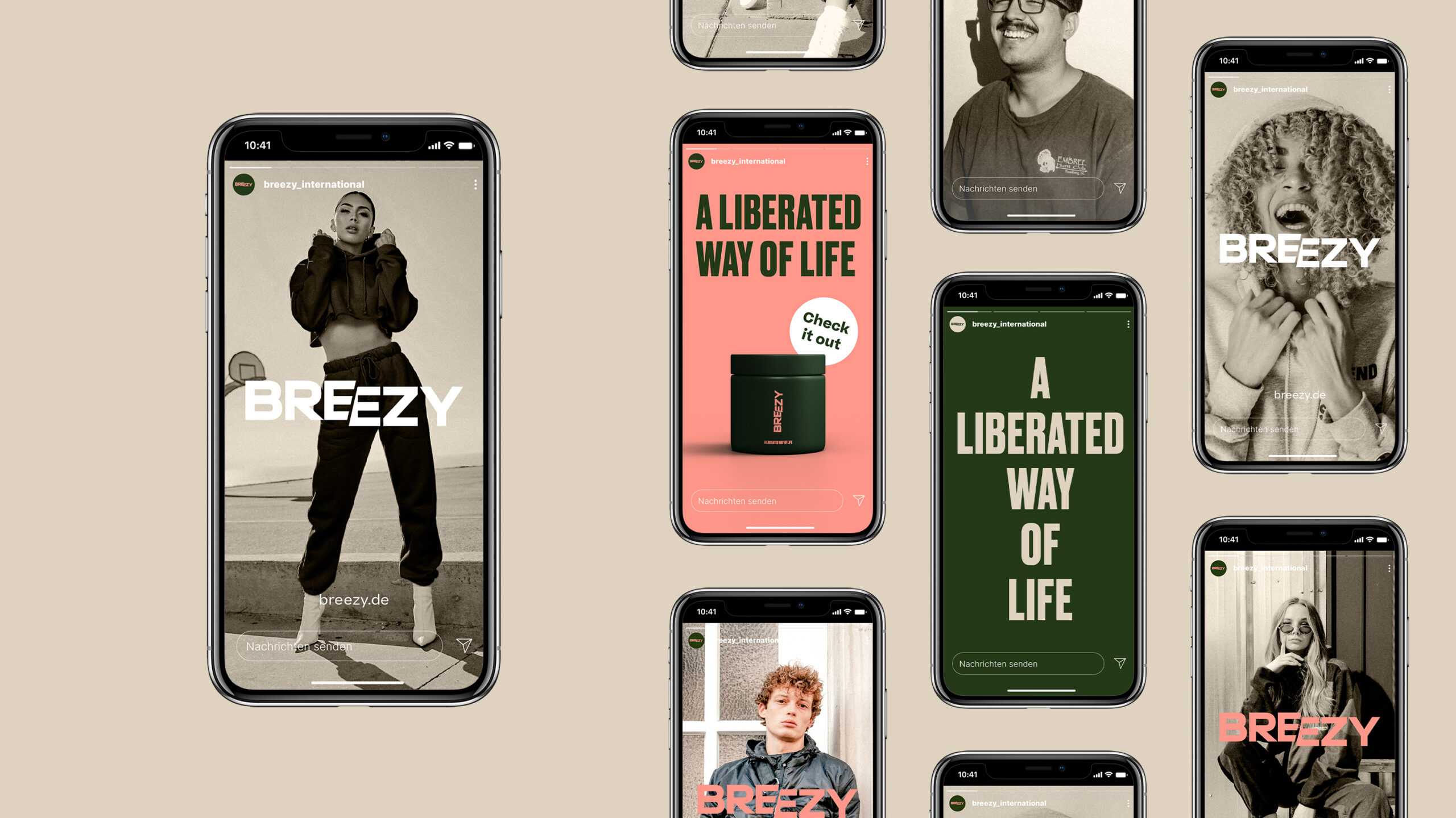
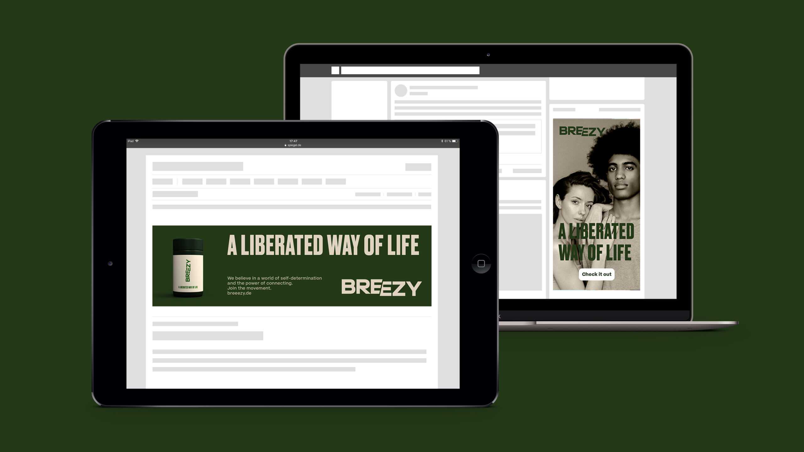
Across social media, website ads and the brand’s webshop with a bold designed landing page.
