The Base
A design fit for the future of urban living

Case Study
Overview
Our Client
Home is where the co-working space, gym, cinema and meditation room are
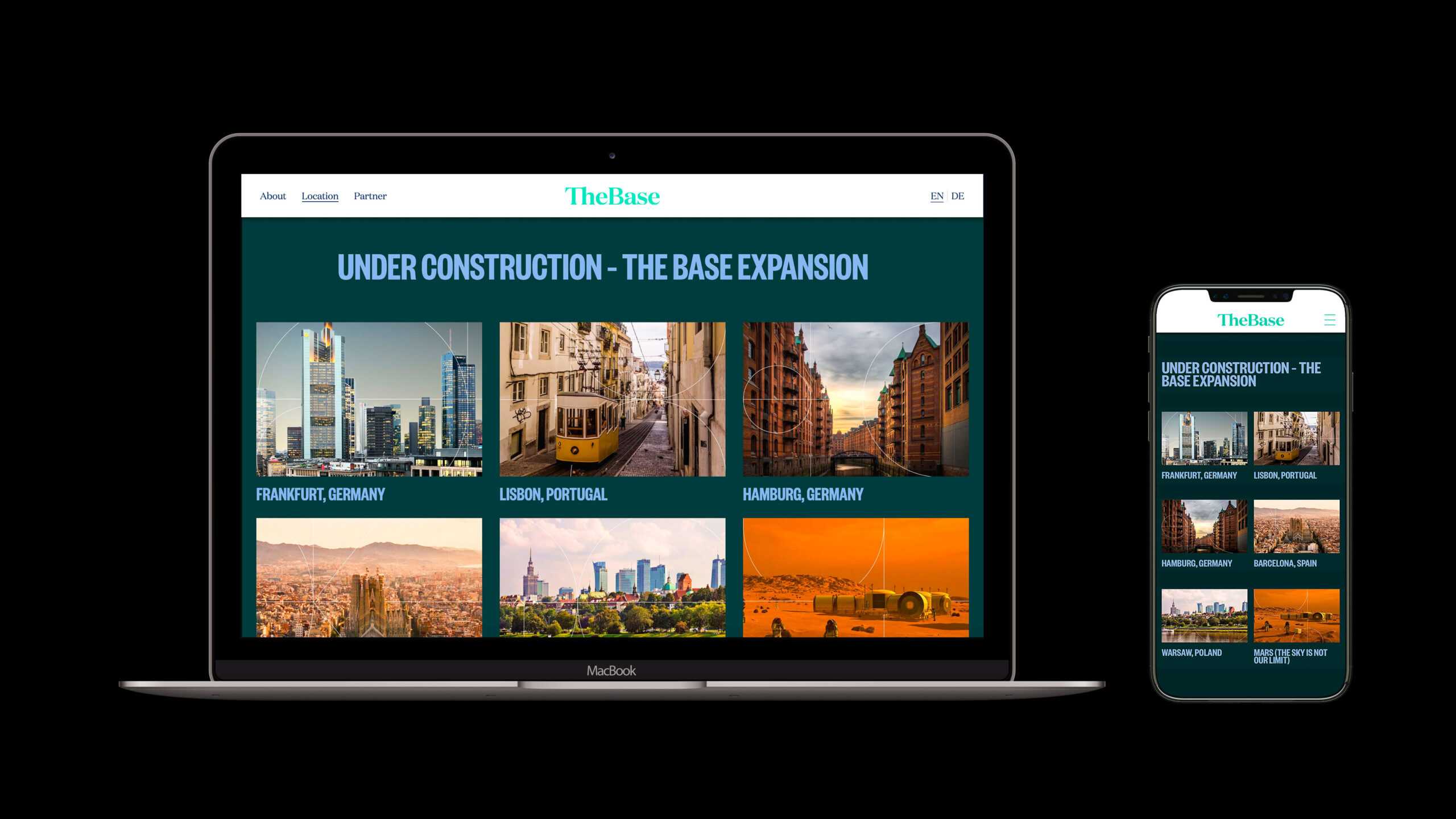
The name says it all: The Base is the place for people to work, live, experience and inspire. With a mission statement to combat loneliness in urban spaces, The Base designs and provides unique co-living spaces containing everything an urban go-getter would need to feel right at home in a new city: from chic apartments and shared workspaces to gyms, kitchen facilities, cinemas and even meditation areas. Originally based in Europe’s party-and-startup capital of Berlin, the company plans to open a minimum of 15 spaces across the continent by 2025 – so count on seeing happier faces in a city near you soon.
The Challenge
The comfort of the familiar
A base isn’t just a home – it contains everything a person could want in order to live their life to the fullest. One essential part of that? Community. This was the core idea behind The Base: to bring people together within diverse communities that inspire and empower. The company wanted to make this clear to residents, employees, investors, visitors and more through its the corporate design at its locations and online.
Our Solution
Shaping an all-inclusive community
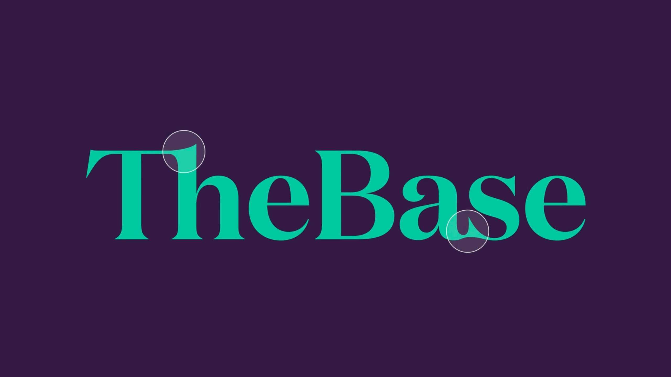
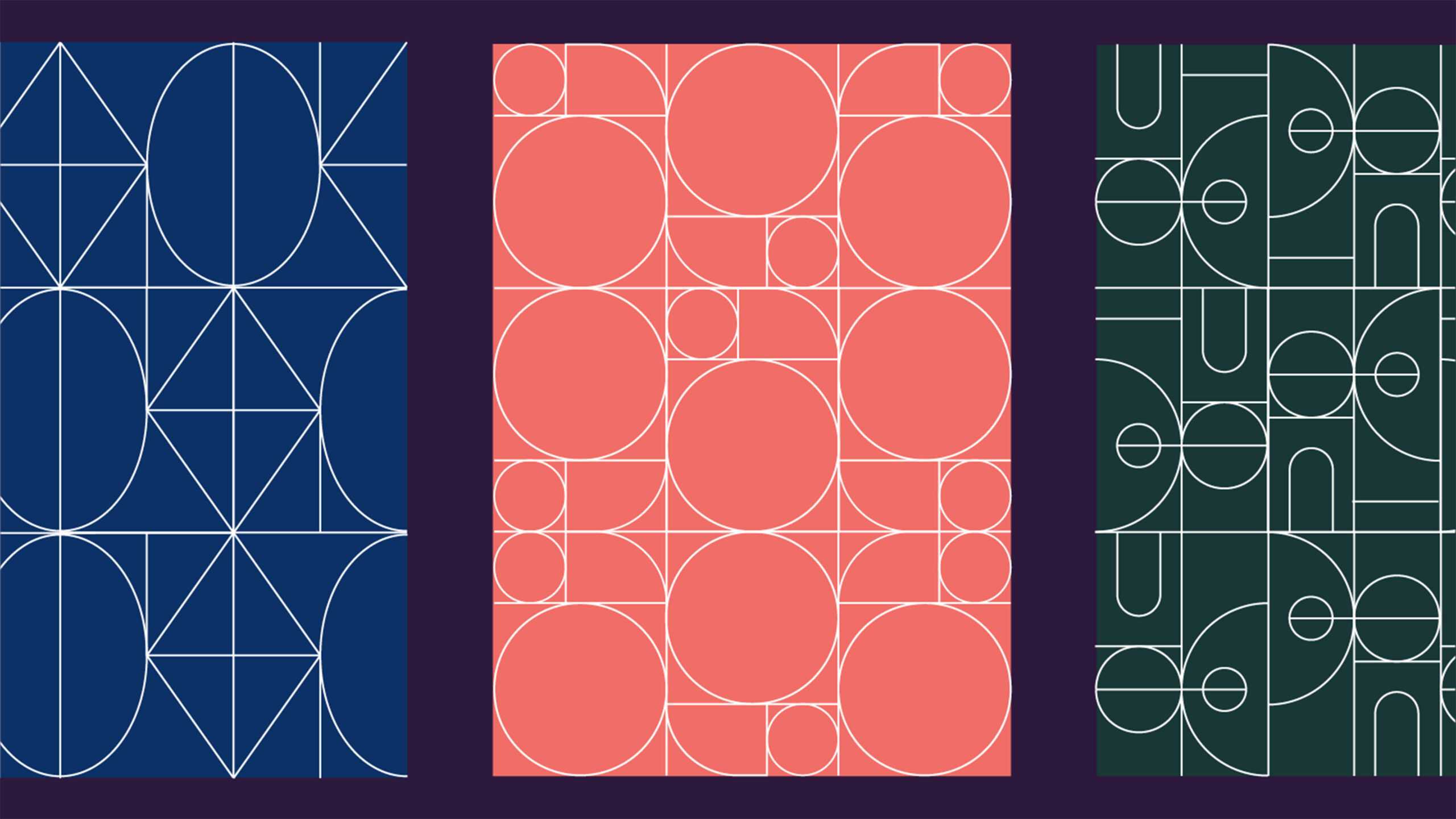
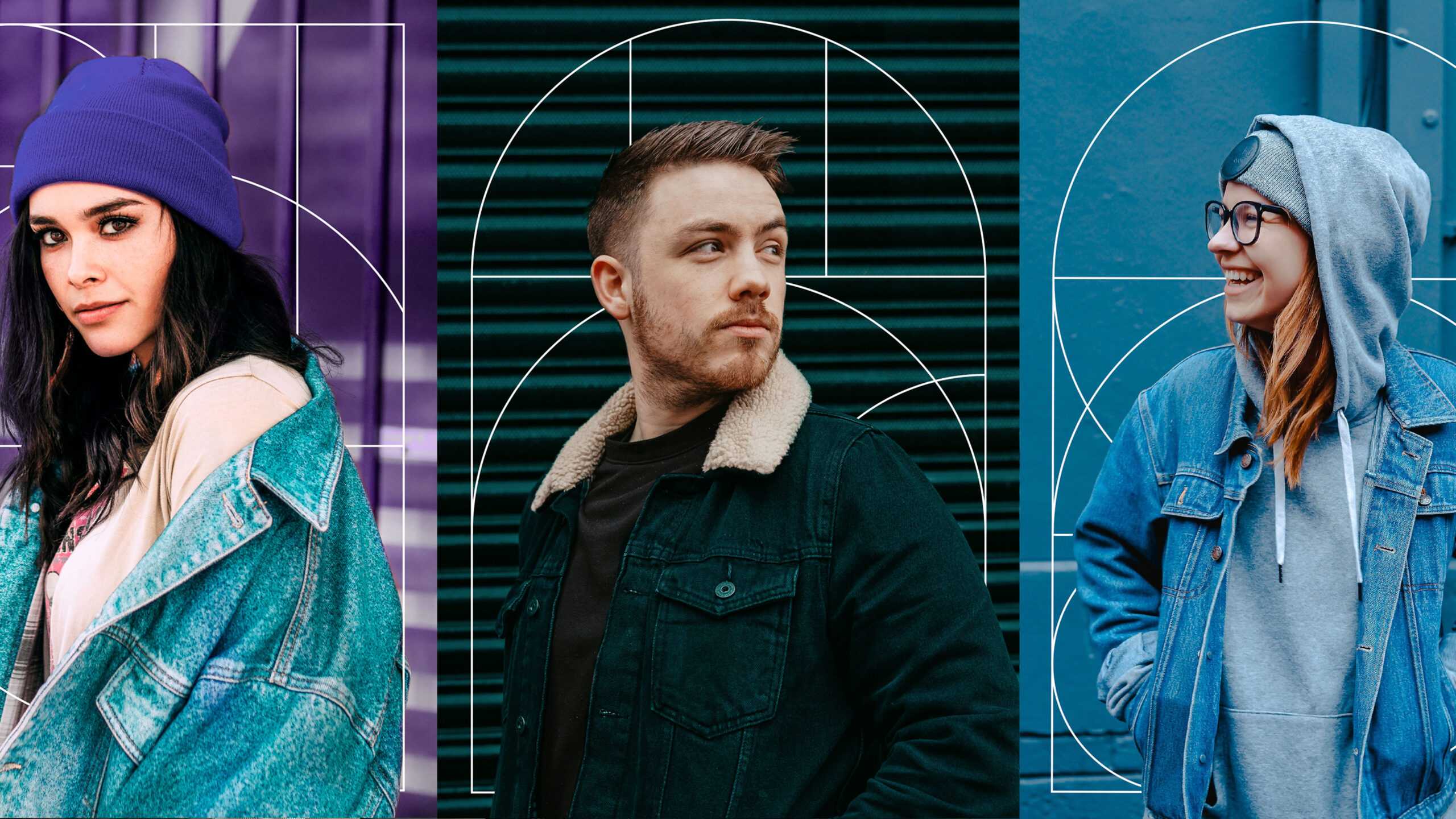
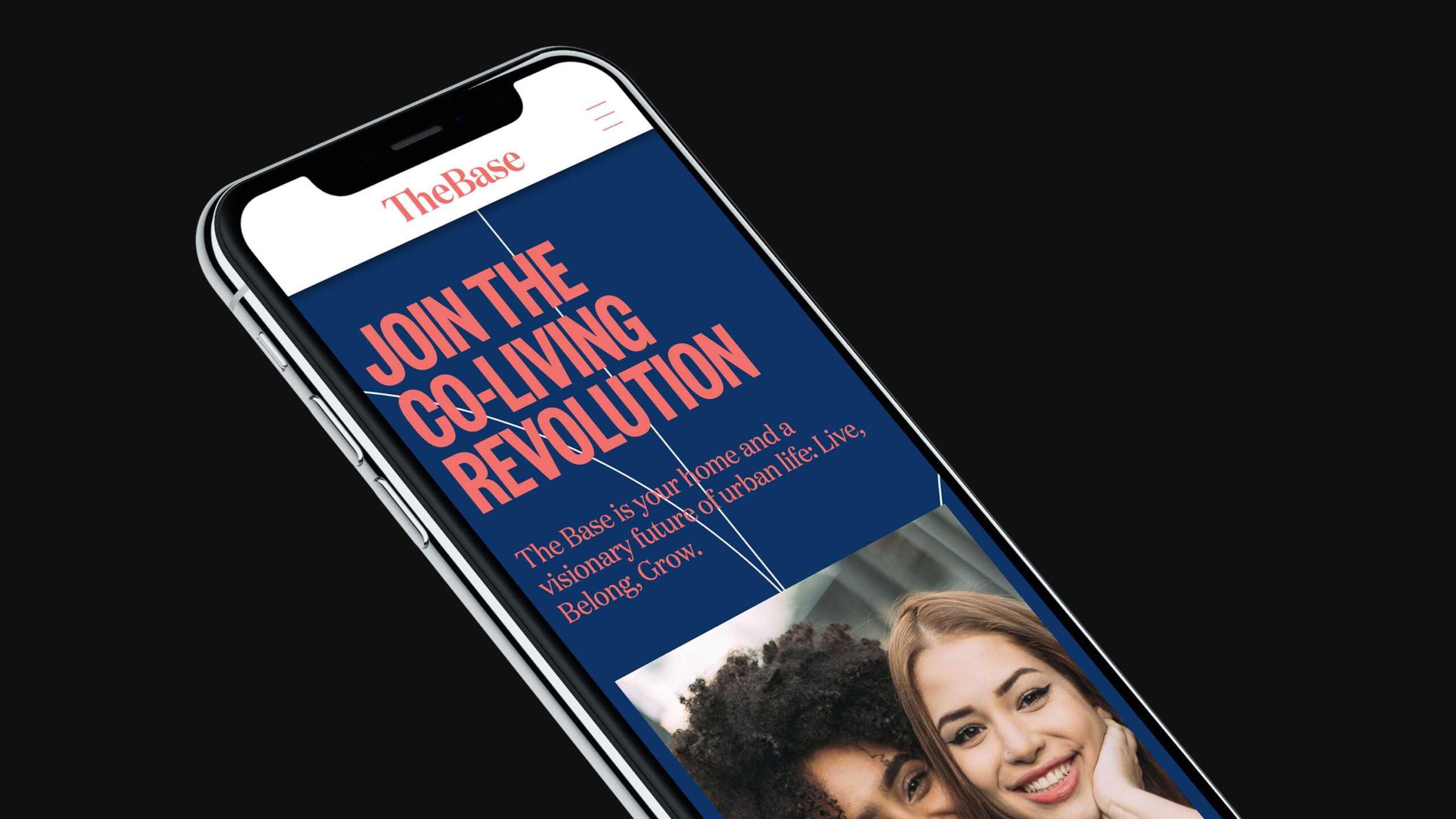
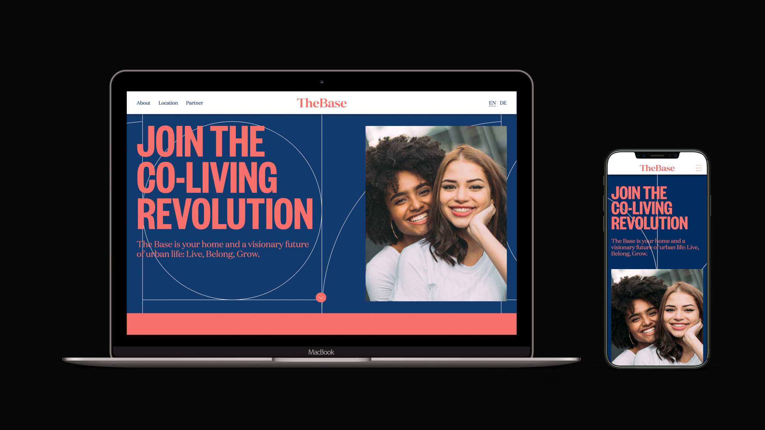
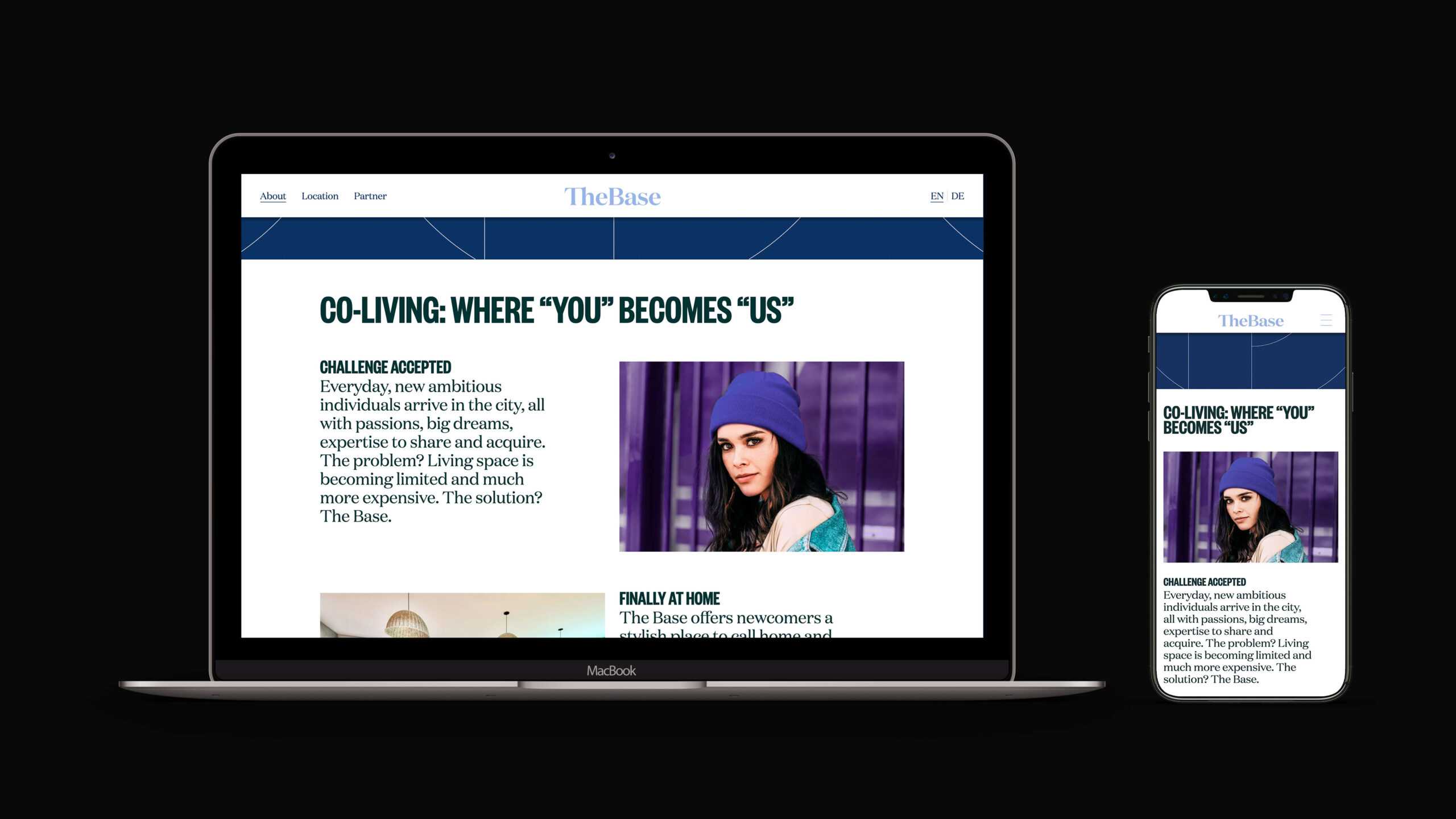
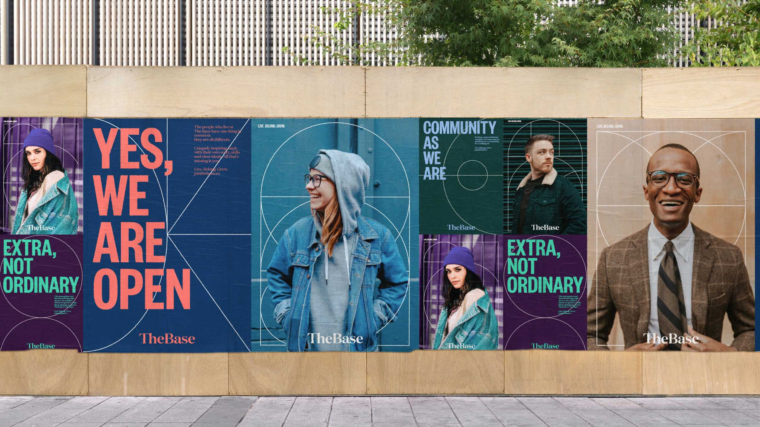
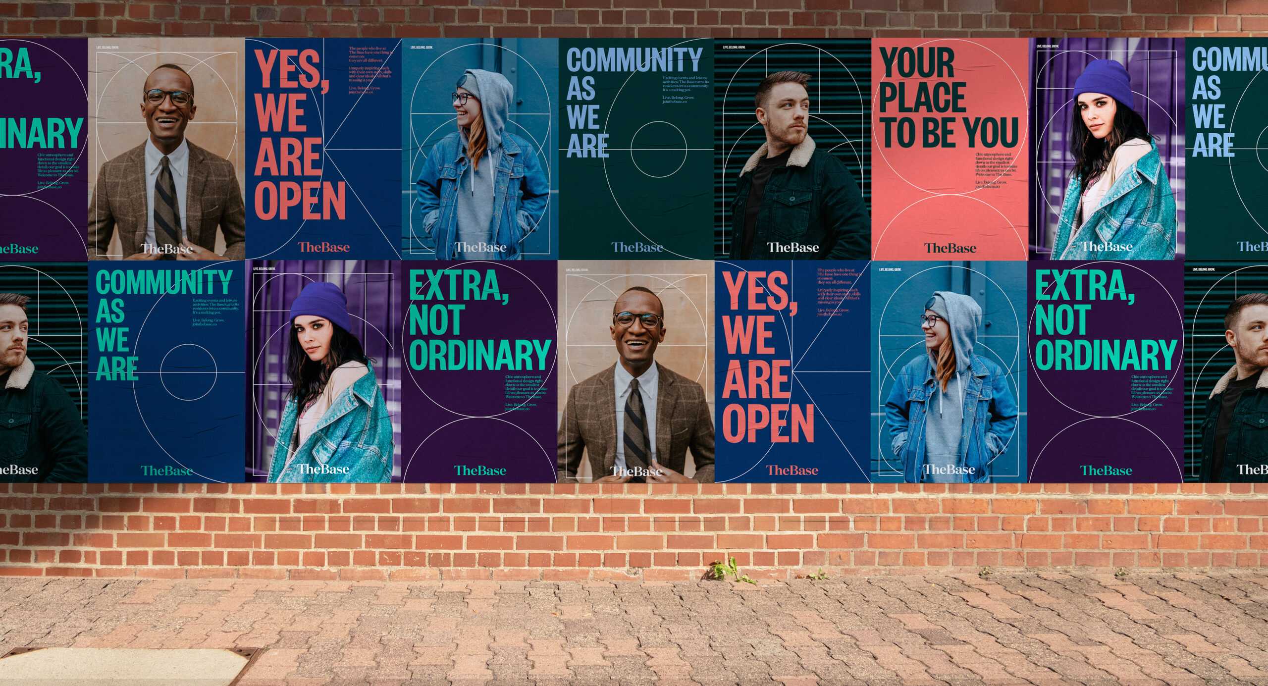
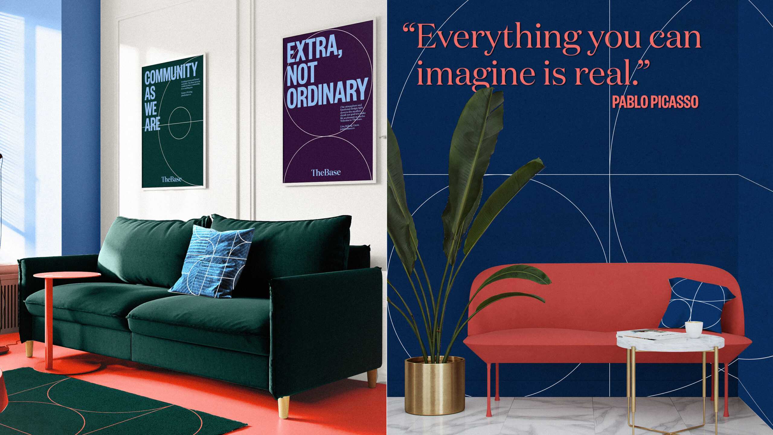
Our initial workshops enabled us to find the factor that underlies The Base: A desire to connect. This gave us a solid base (see what we did there?) from which to craft a clear vision for the company: To provide unique global spaces that inspire, unite and redefine urban living. We then sought to crystallize the connecting factor in a strong visual system whose notion of togetherness would be instantly recognizable. We built the notion of a strong, unbreakable bond into the logo itself by joining the ‘t’ and ‘h’ in The and the ‘a’ and ‘s’ in Base, and then combined two stylish typefaces for a sense of dynamism and diversity. This is reinforced by the use of geometric patterns that interlock, overlap and join together – and feature bold, complementing colors to elicit a sense of closeness and feel-good vibes. Photographs are another key element: We shone the spotlight on future residents, so that everybody who wanders through The Base’s doors – whether in real life or digitally – understands that they are entering a true community. We also settled on a voice for The Base to use in its web, ad and corporate texts that connects readers to the company’s ethos. Reinforcing the connecting factor in everything from print & social media and the website to walls, soap bottles and business cards, our corporate design shows the world exactly what The Base stands for and serves as the starting point for shaping all-inclusive communities in cities all over Europe.
There’s an old saying: “A great city, a great solitude”. Now that the Base has shaken things up, we think the new version could be “A great city, a fantastic mood.”
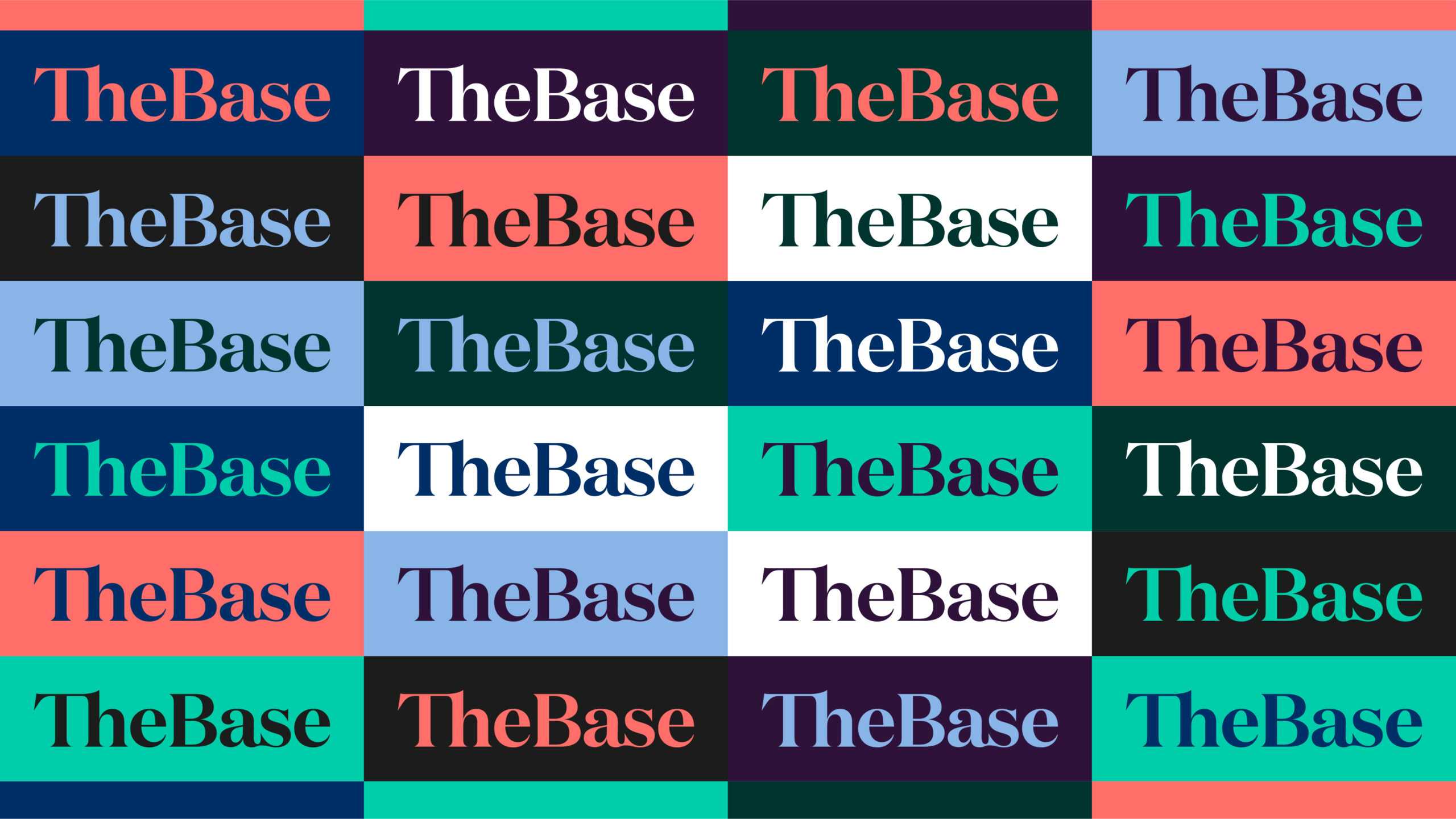
The brand design consistently pays attention to the brand in its core-values and orientation. And it is easy to use with a hands-on approach: logo + color palette + typeface + icon set + imagery + patterns + defined tone of voice = The design system can be assembled like Lego for all individual applications.
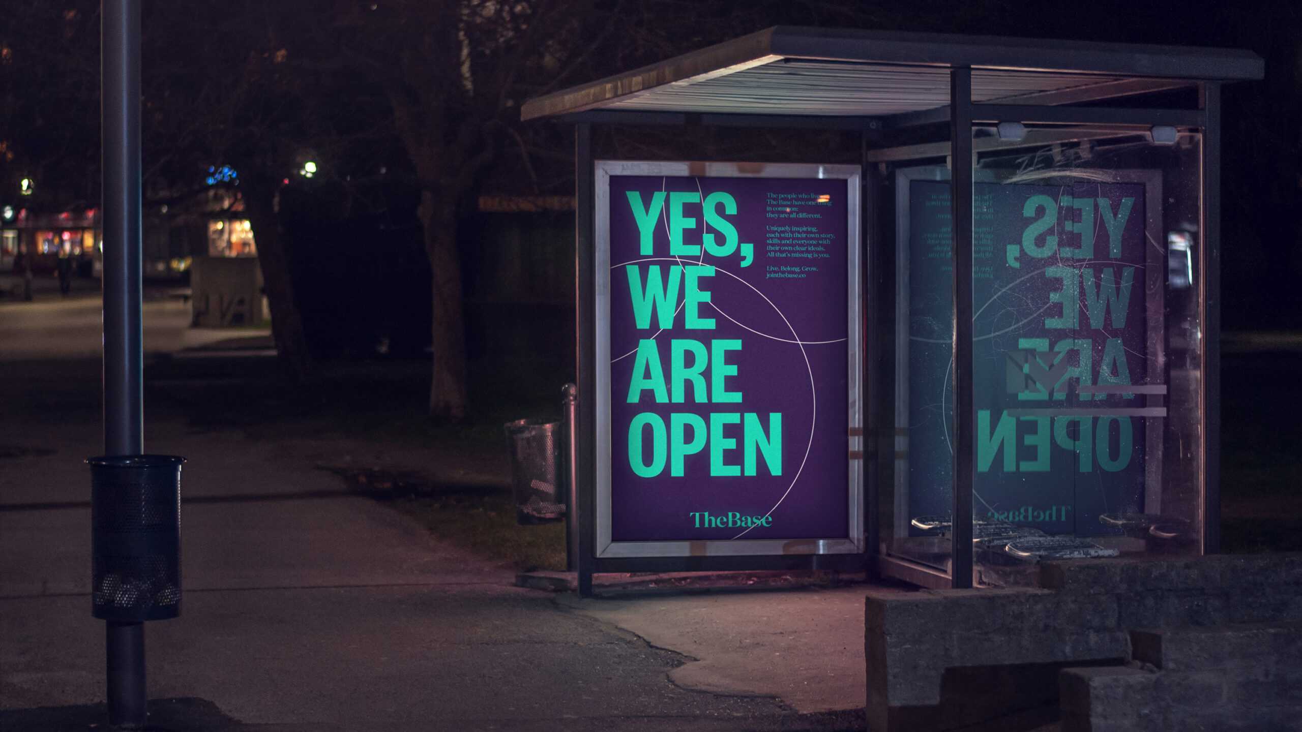
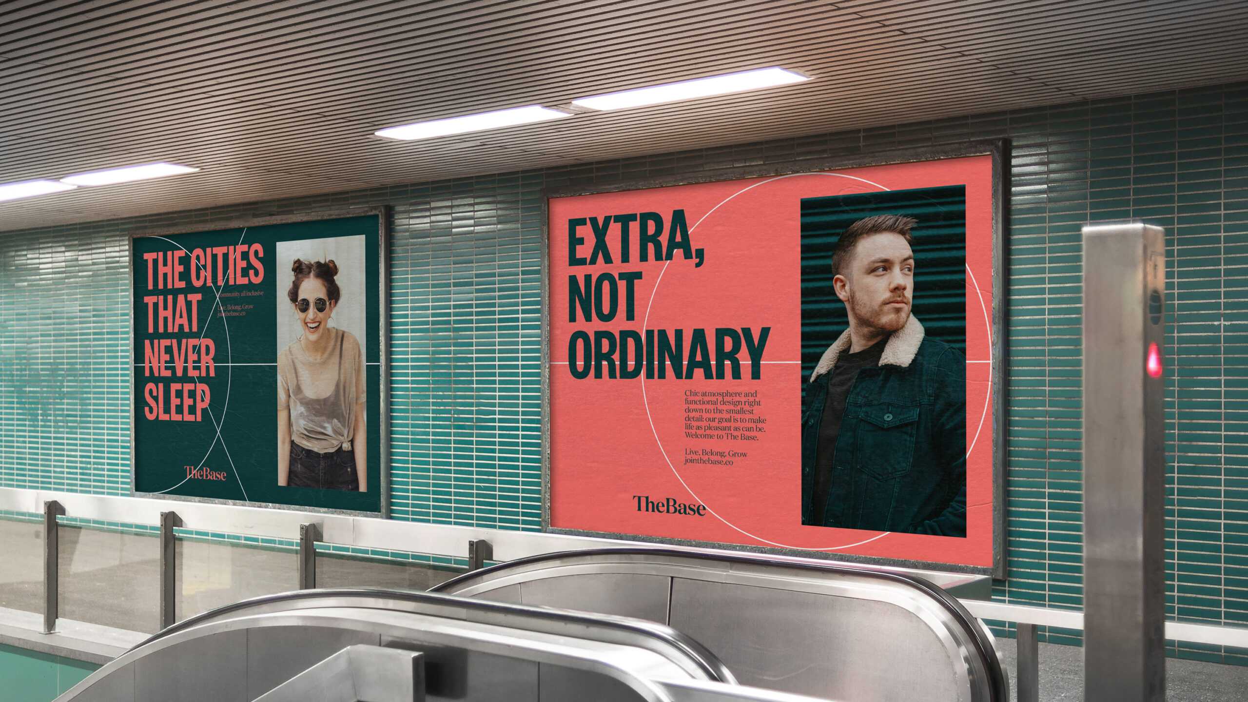
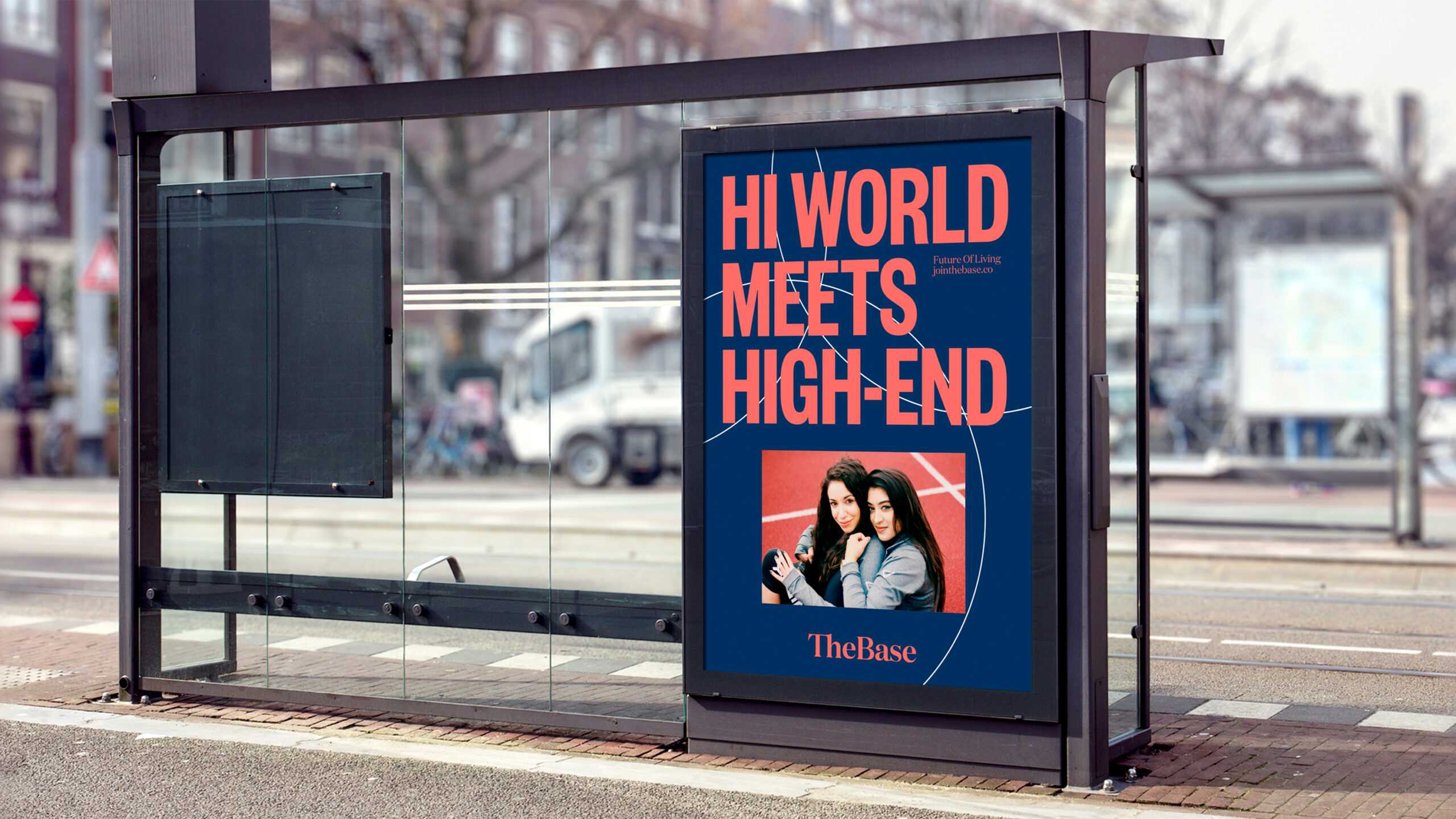
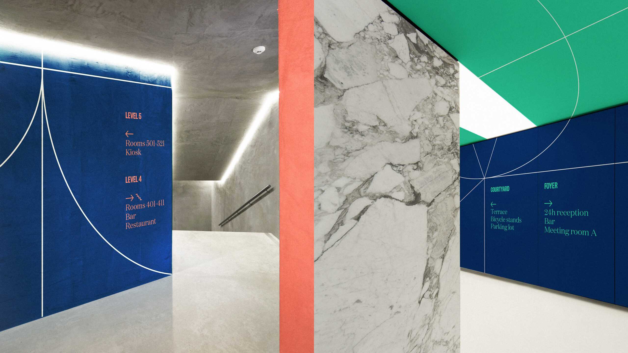
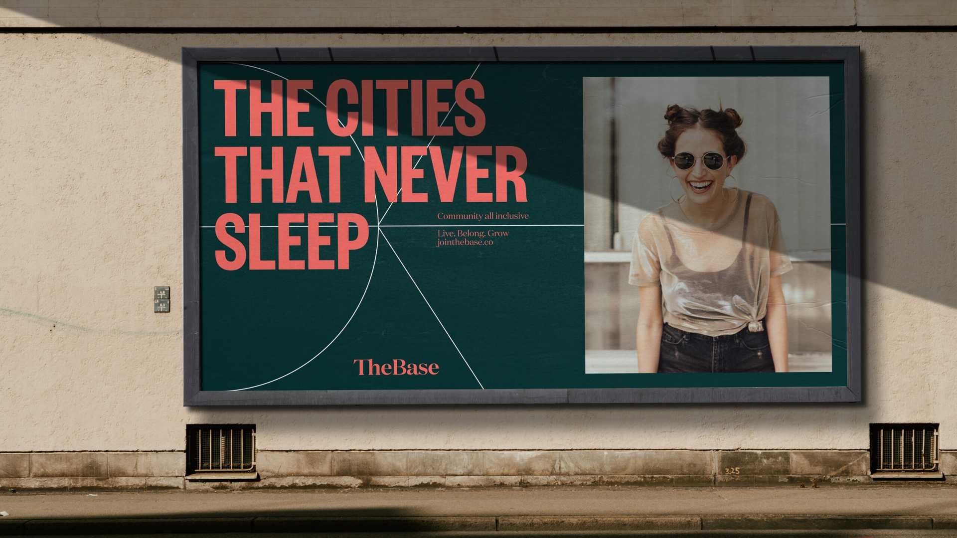
Various out of home applications and design proposals were made for the brand’s rollout and offline communication.
The experts at Arndt Benedikt managed to sum up the essence of our brand in one word – CONNECT – and turn it into a fully fledged visual system. We’re definitely glad we connected with them!
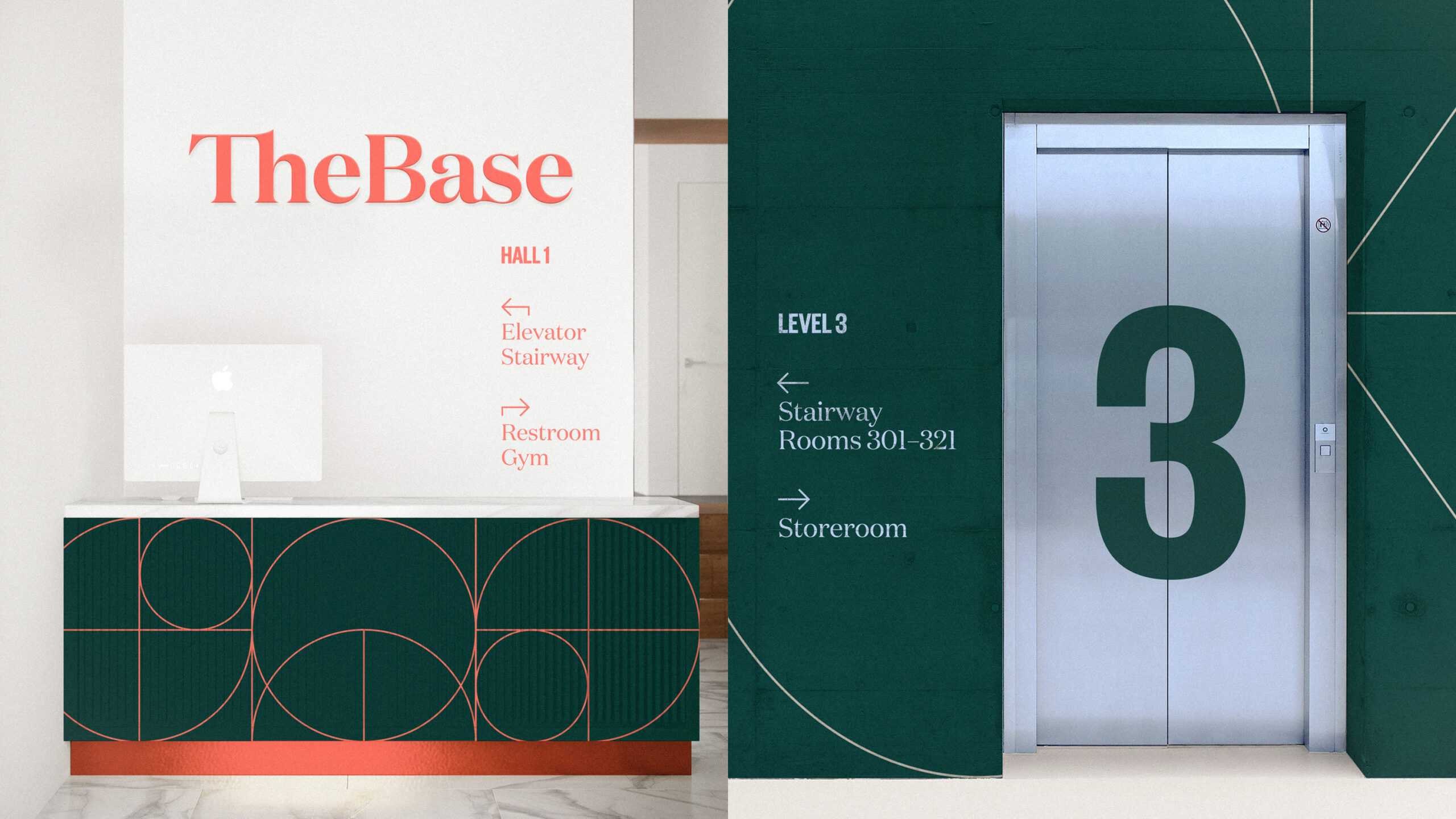
A consistent design language continues throughout the actual co-living space. By the use of the brand’s vibrant brand color palette, it’s tone of voice, patterns and a clear guidance system.
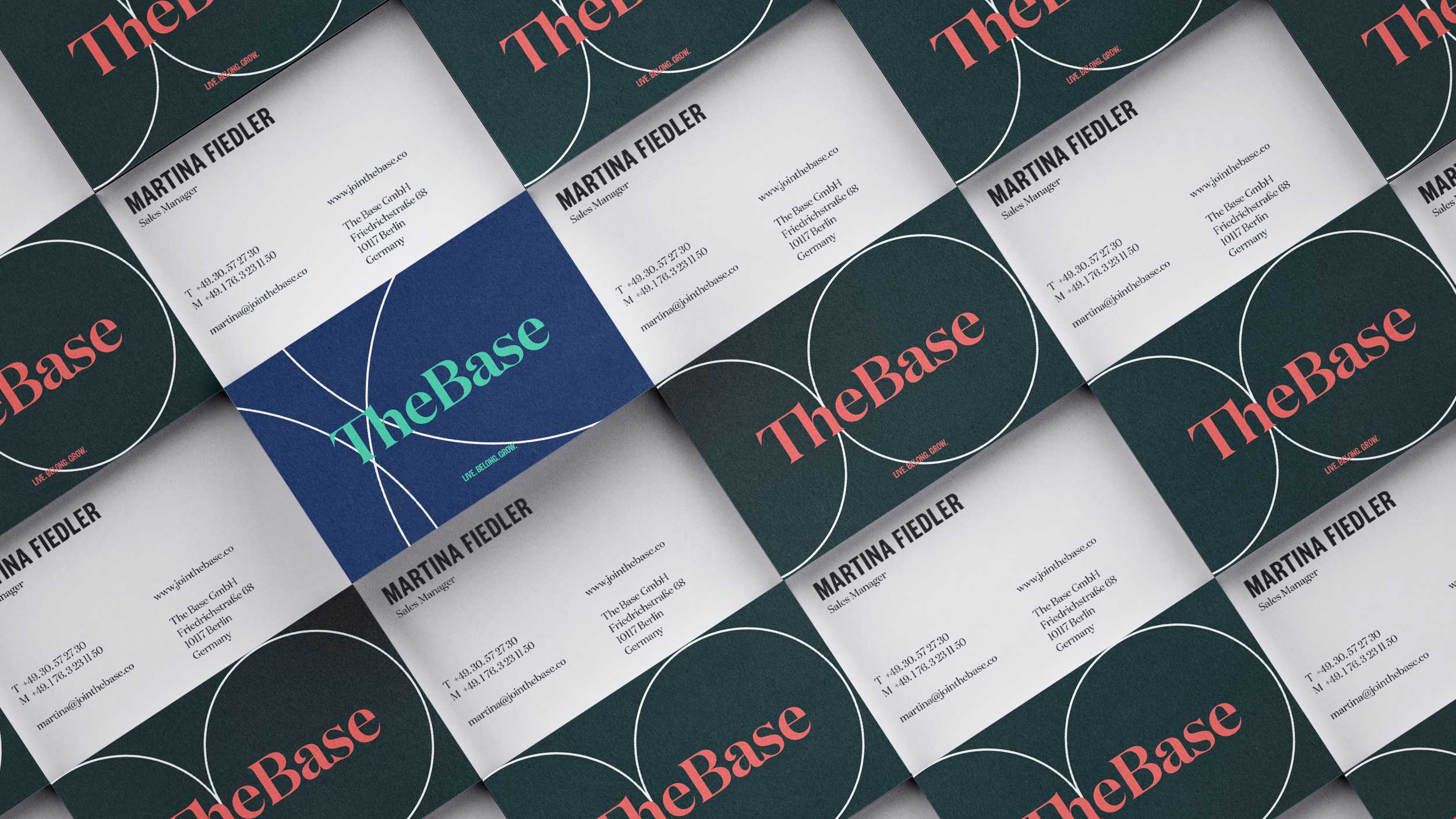
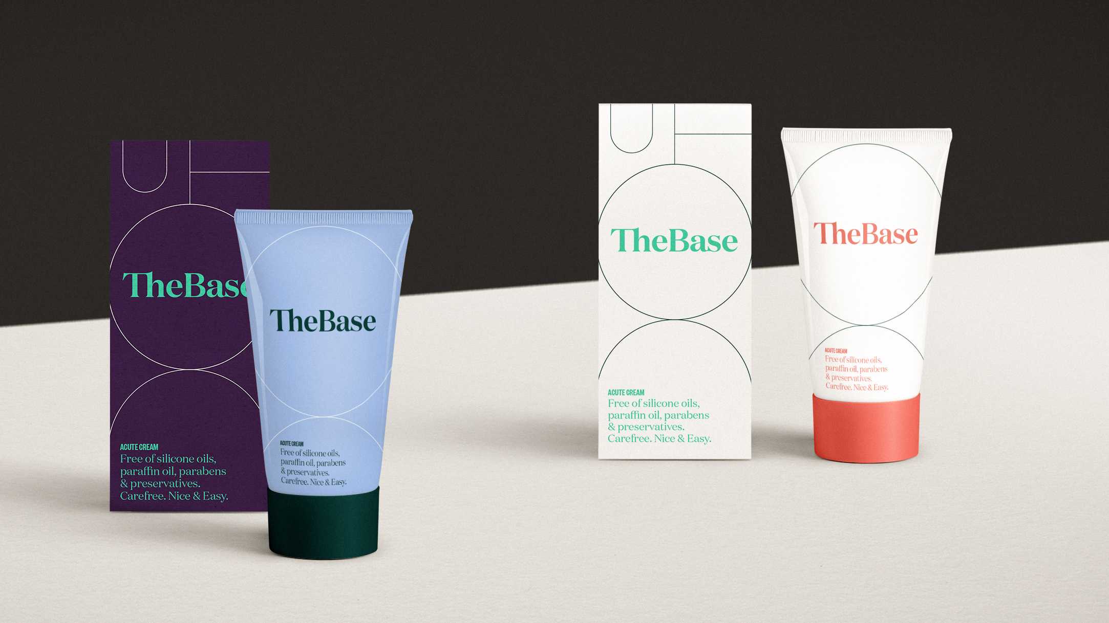
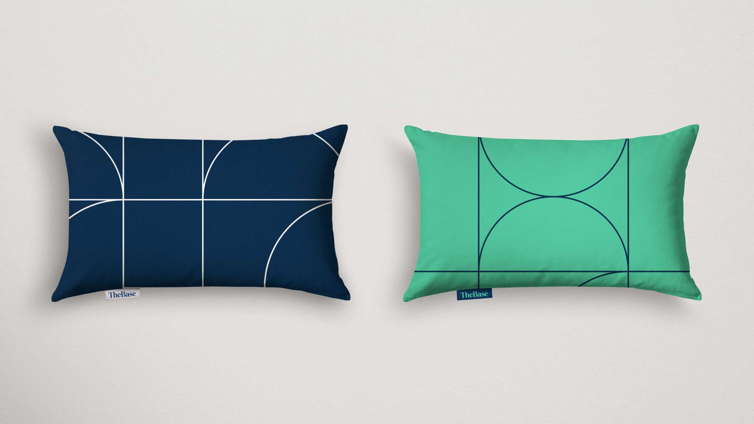
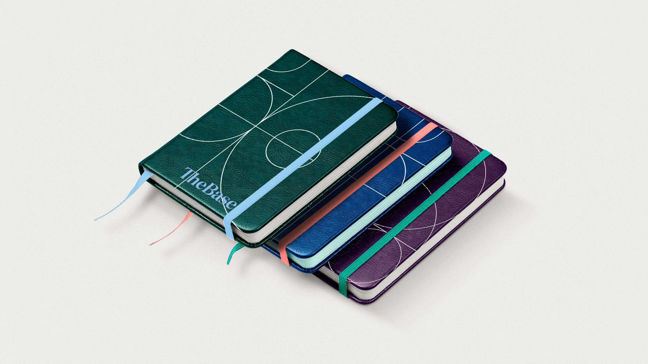
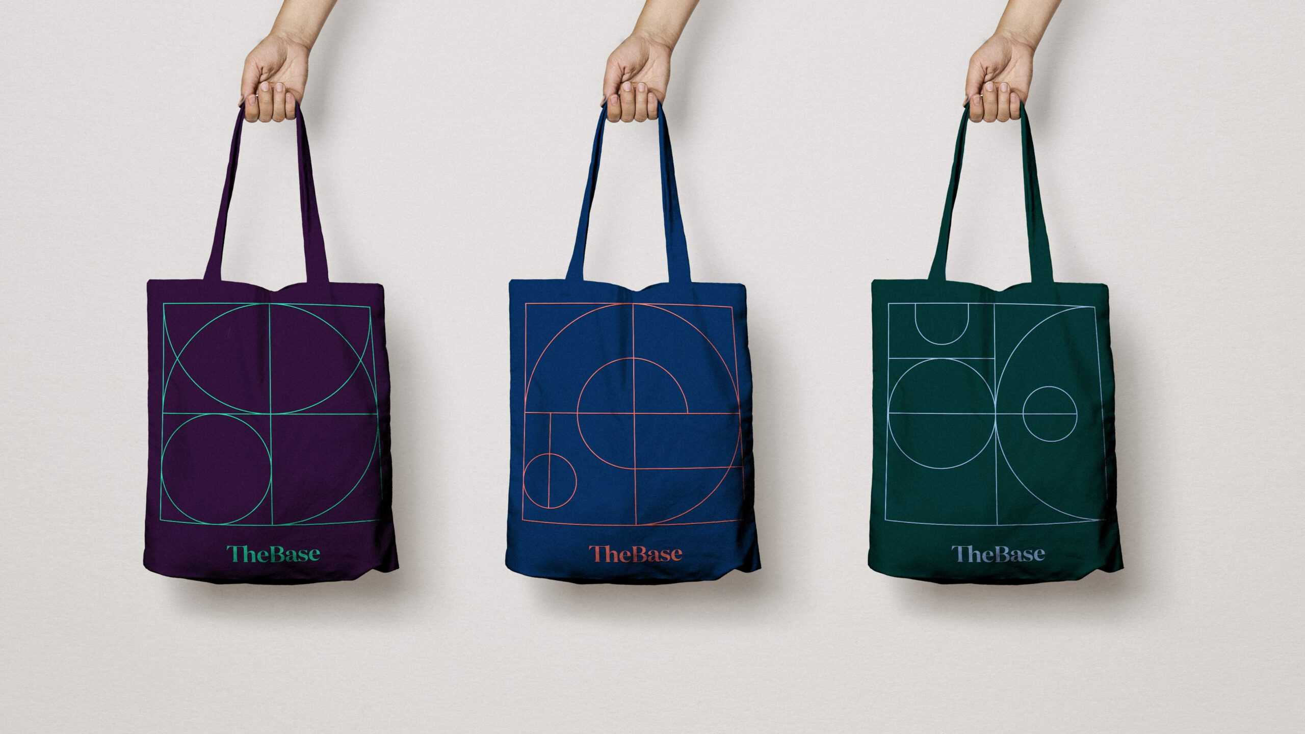
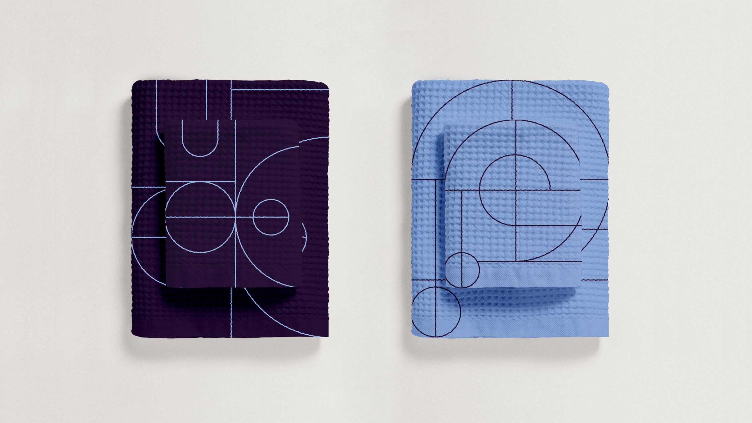
From business cards, to bathroom goods, pillows, towels and merch goodies. everything speaks the same language.
