Dear Monday
A powerful presence for an empowered community
Case Study
Overview
Our Client
Leadership for future female leaders
Dear Monday isn’t just a coaching brand – it’s a genuine movement seeking to change a system that still sidelines women’s voices. At a time when gender equity worldwide is under greater pressure than at any time in the past few decades, Dear Monday stands as a rallying point for ambitious women who refuse to settle for tokenism or glass ceilings. Through unapologetically feminist coaching, galvanising seminars and a widely celebrated podcast, the platform equips women with not just skills, but the business language, confidence and strategies they need to lead, disrupt and transform. Rooted in emotional intelligence and radical inclusion, Dear Monday bridges personal ambition with collective progress. Regular collaborations with female trailblazers in politics, academia, finance and tech make this a platform for women who are claiming and reshaping essential spaces the world over.
The Challenge
Building on the purpose of the past
Originally launched as the “Female Leadership Academy,” the brand had evolved well beyond its early identity. As its digital ecosystem grew and its impact deepened, it became clear to the founders that their business baby had grown into a collective force for change. Women weren’t just looking for training; they were seeking solidarity, visibility and a space where their ambition could thrive on its own terms. What the movement needed was a rebrand that could carry the weight of the movement’s vision: emotionally intelligent, confident yet approachable, and flexible enough to resonate everywhere from Instagram feeds to international stages. Because today’s women leaders aren’t just fitting in – they’re reshaping the narrative.
Our Solution
Monday, rebranded
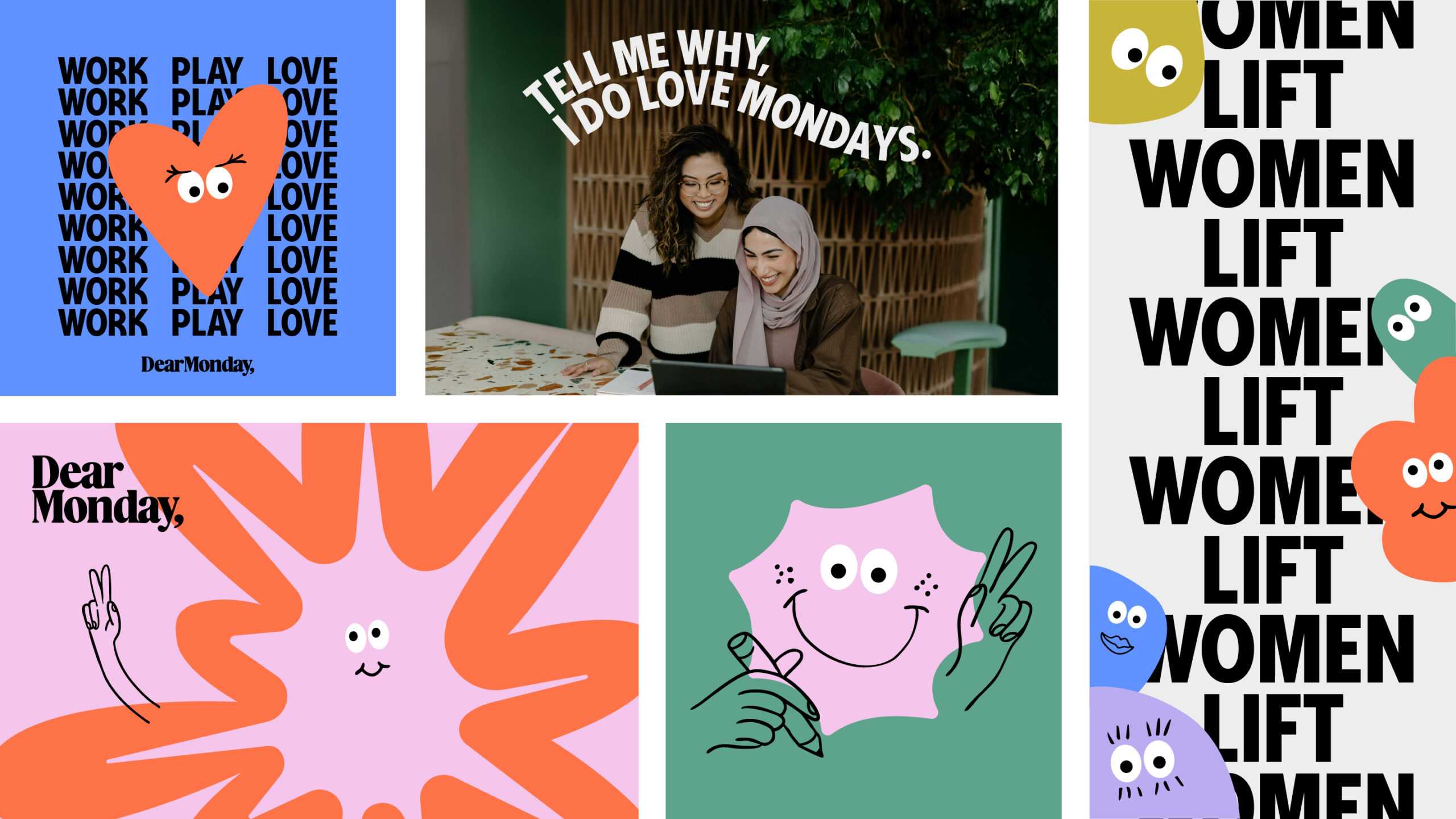
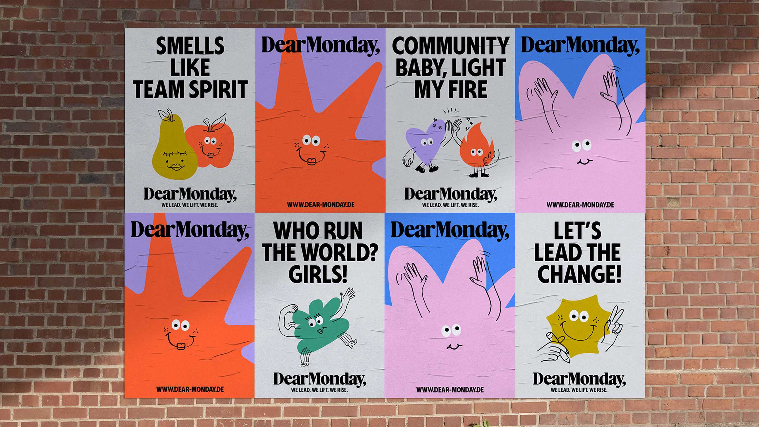
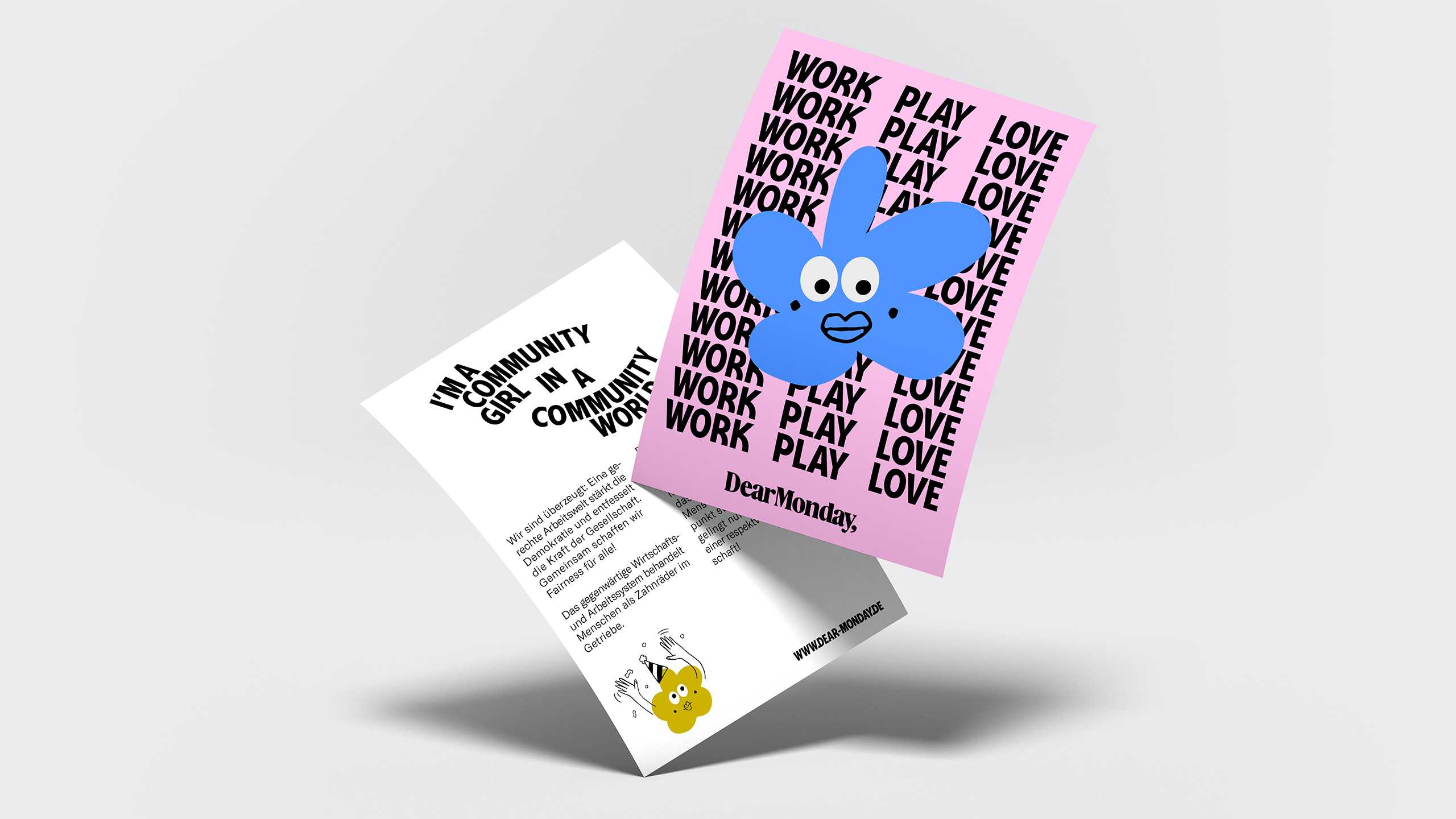
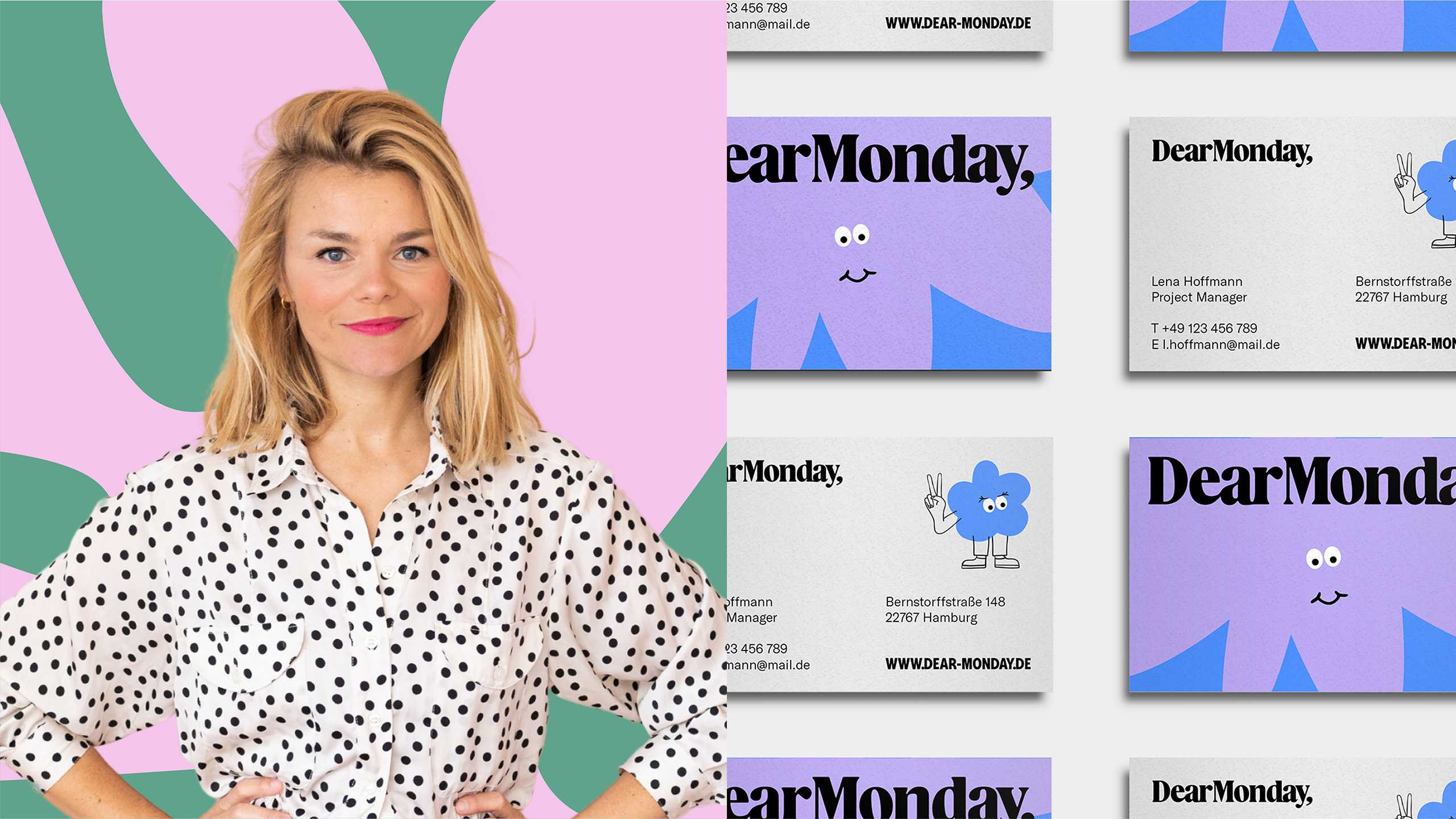
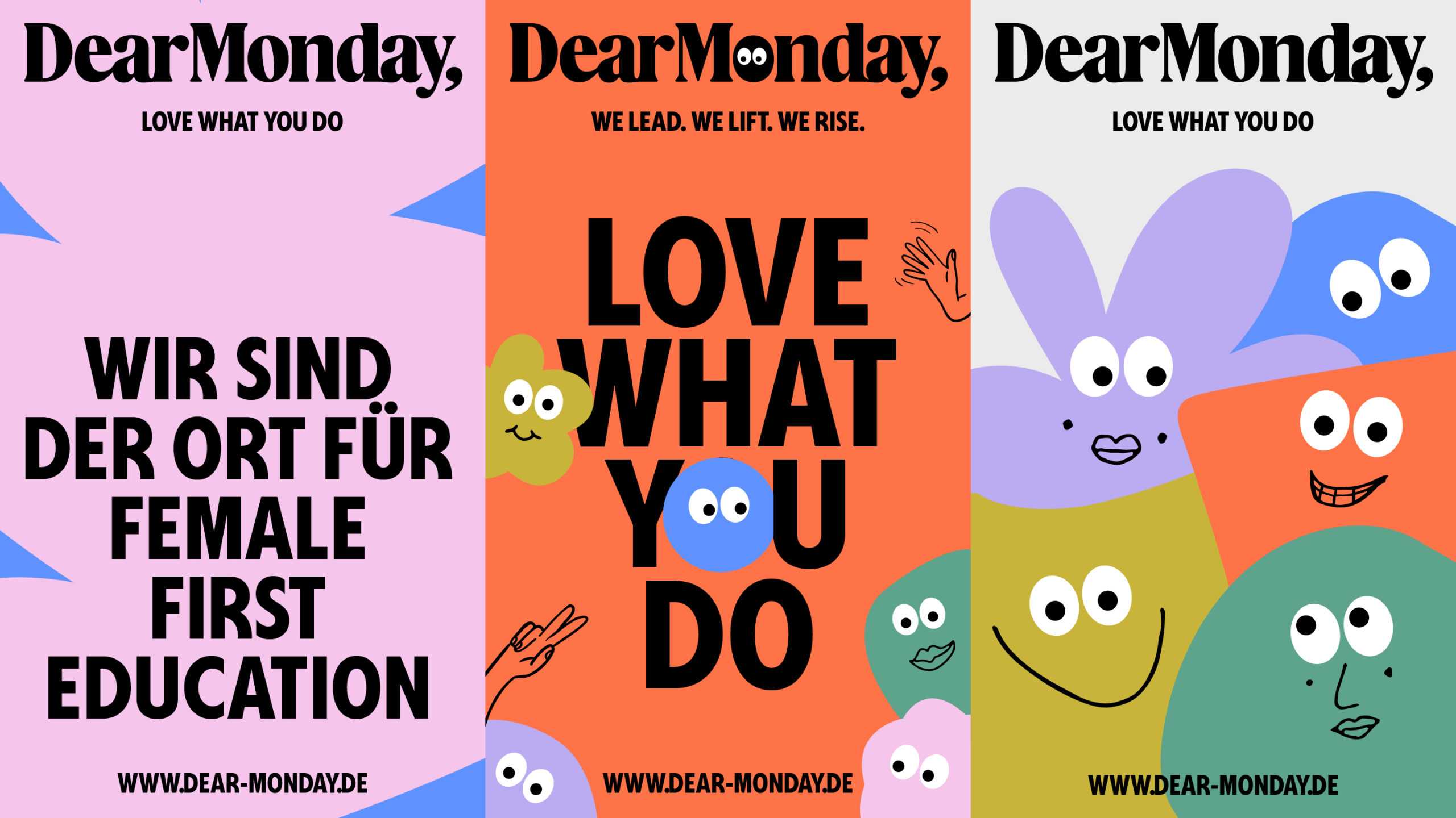
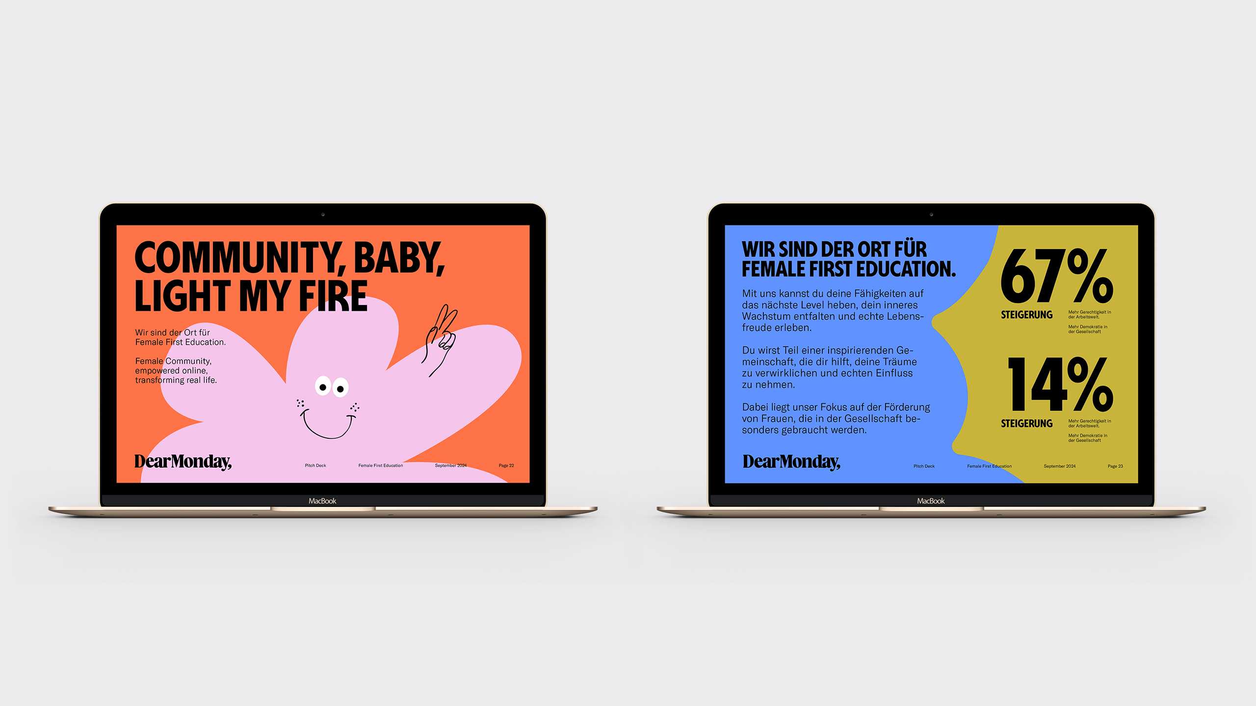
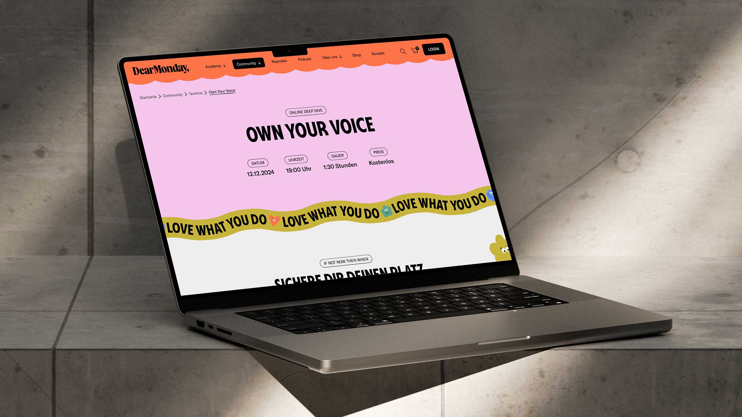
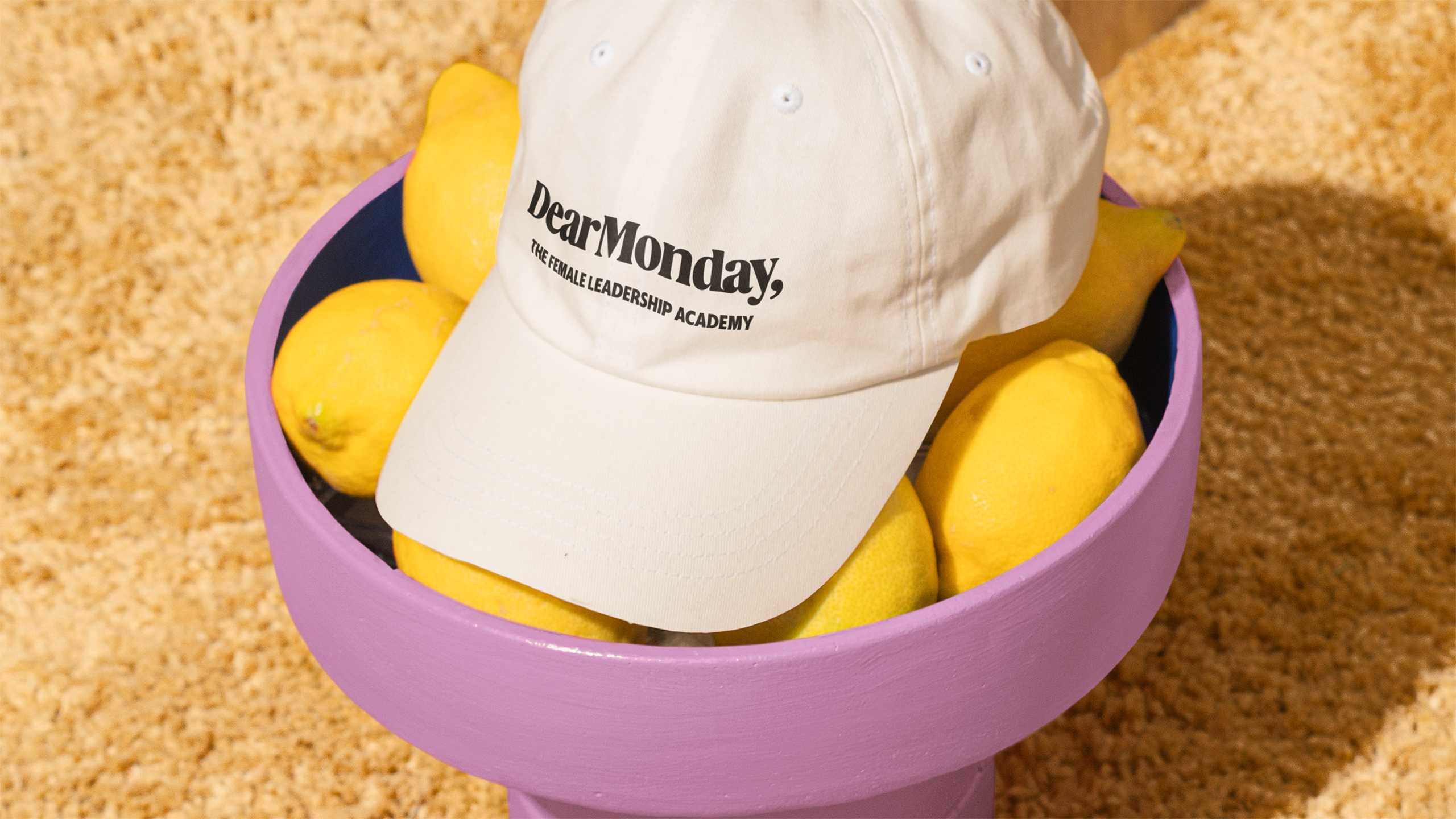
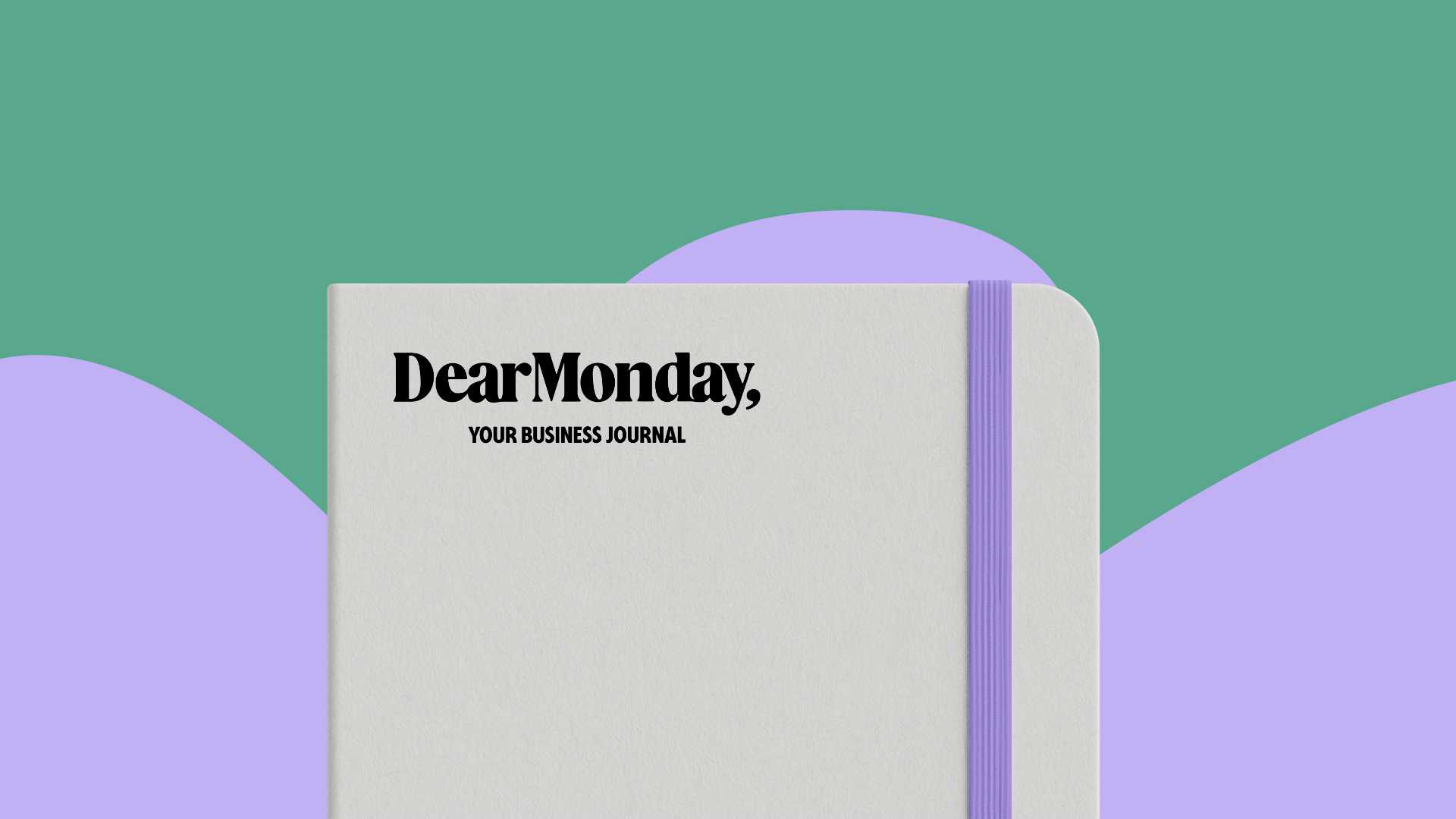
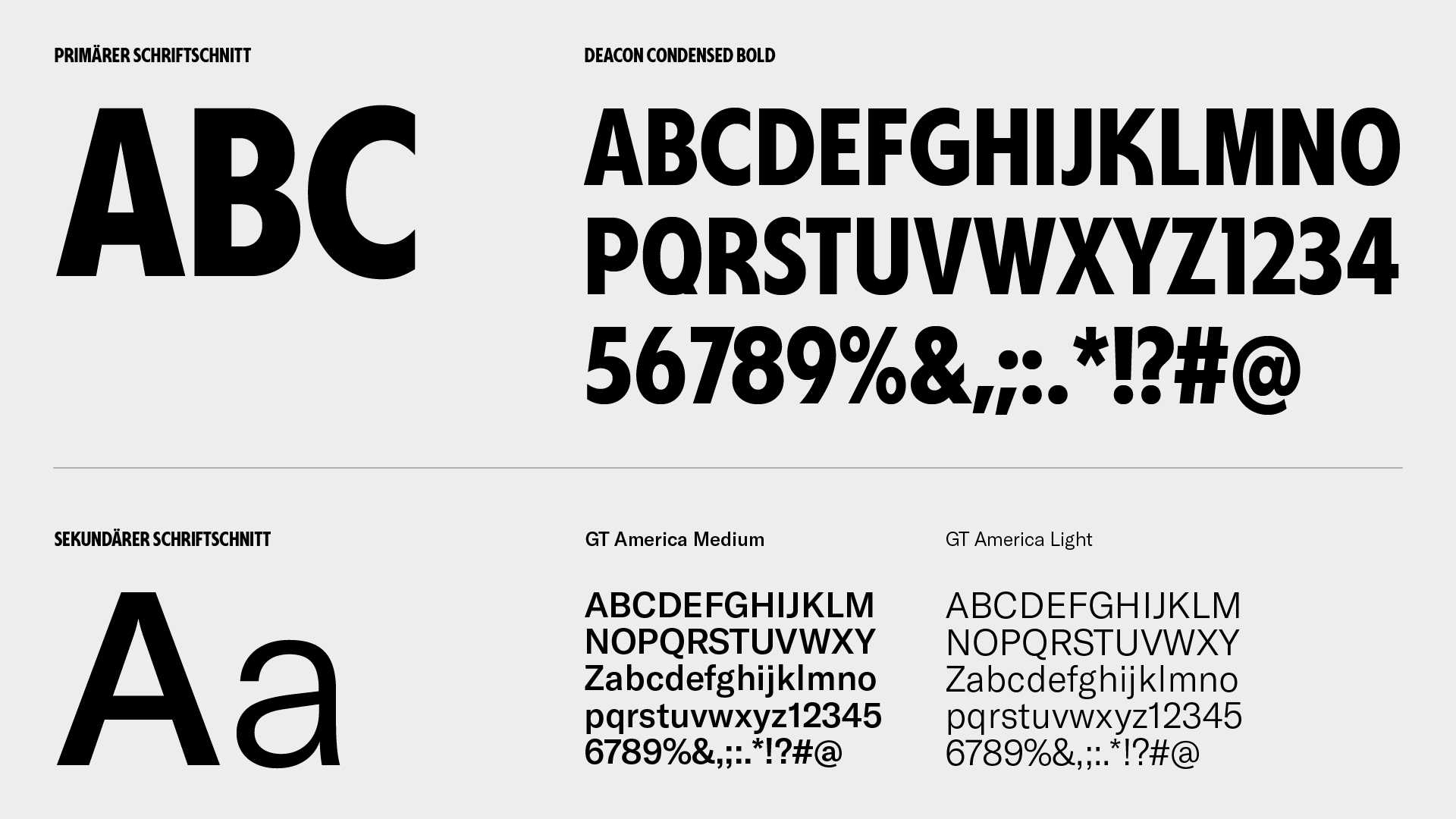
A revolution needs a name, and what could be better than one that flips the script on the working week and encourages female leaders to be the change they want to be in the world? Forget the Sunday Scaries: say hello to Dear Monday. A special name deserves a special logo, so we developed a wordmark based around a unique serif font inspired by the feel of printed matter. The ligatures connect the letters organically in a clear nod to exchange and community. The overall brand identity took its cue from that energy: bold where it counts, joyful when appropriate, and very much composed from top to toe. his is paired with a typography system that knows how to make an entrance: a punchy, movement-inspired headline font with a calm, versatile sans serif for everything else.
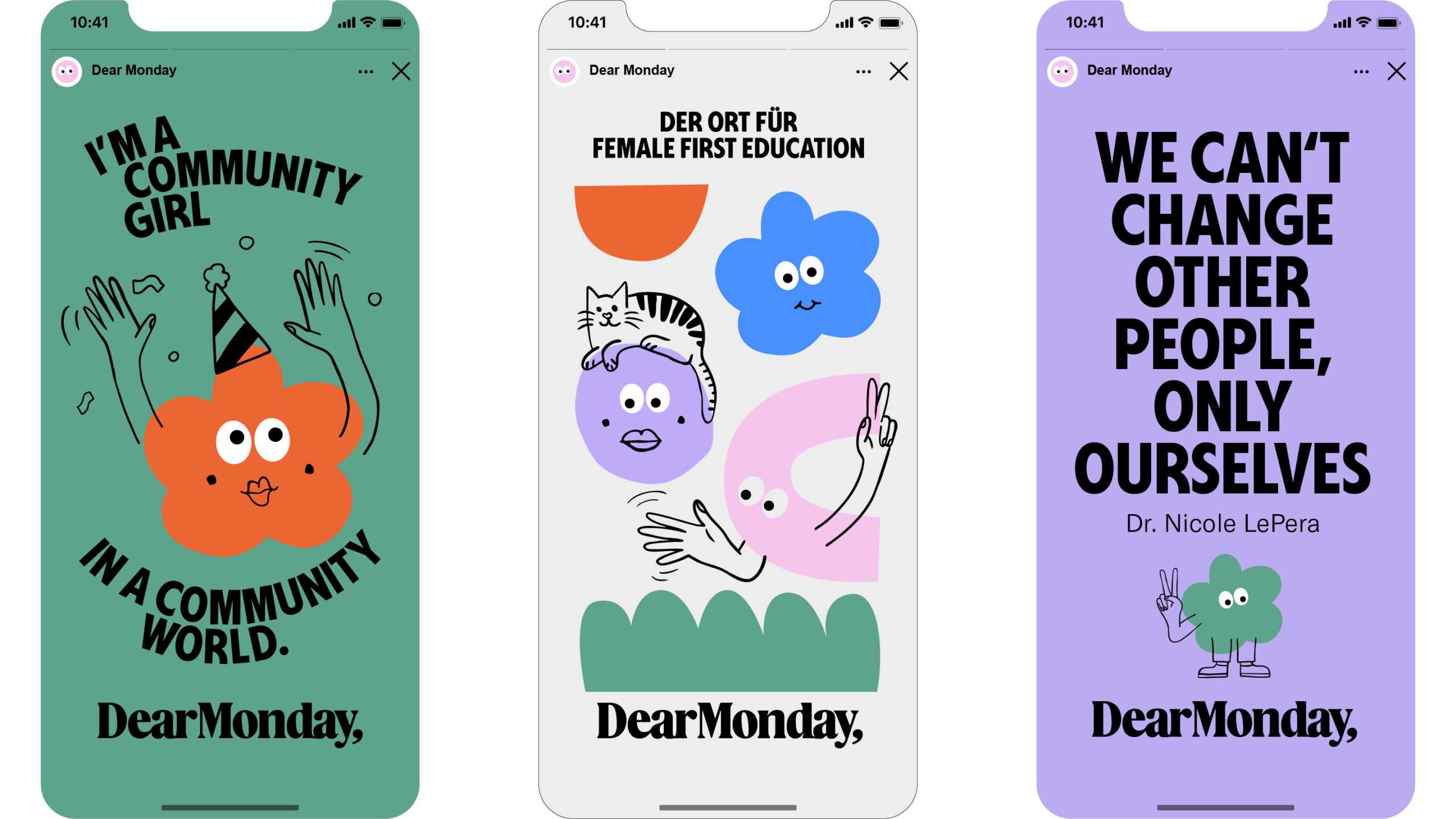
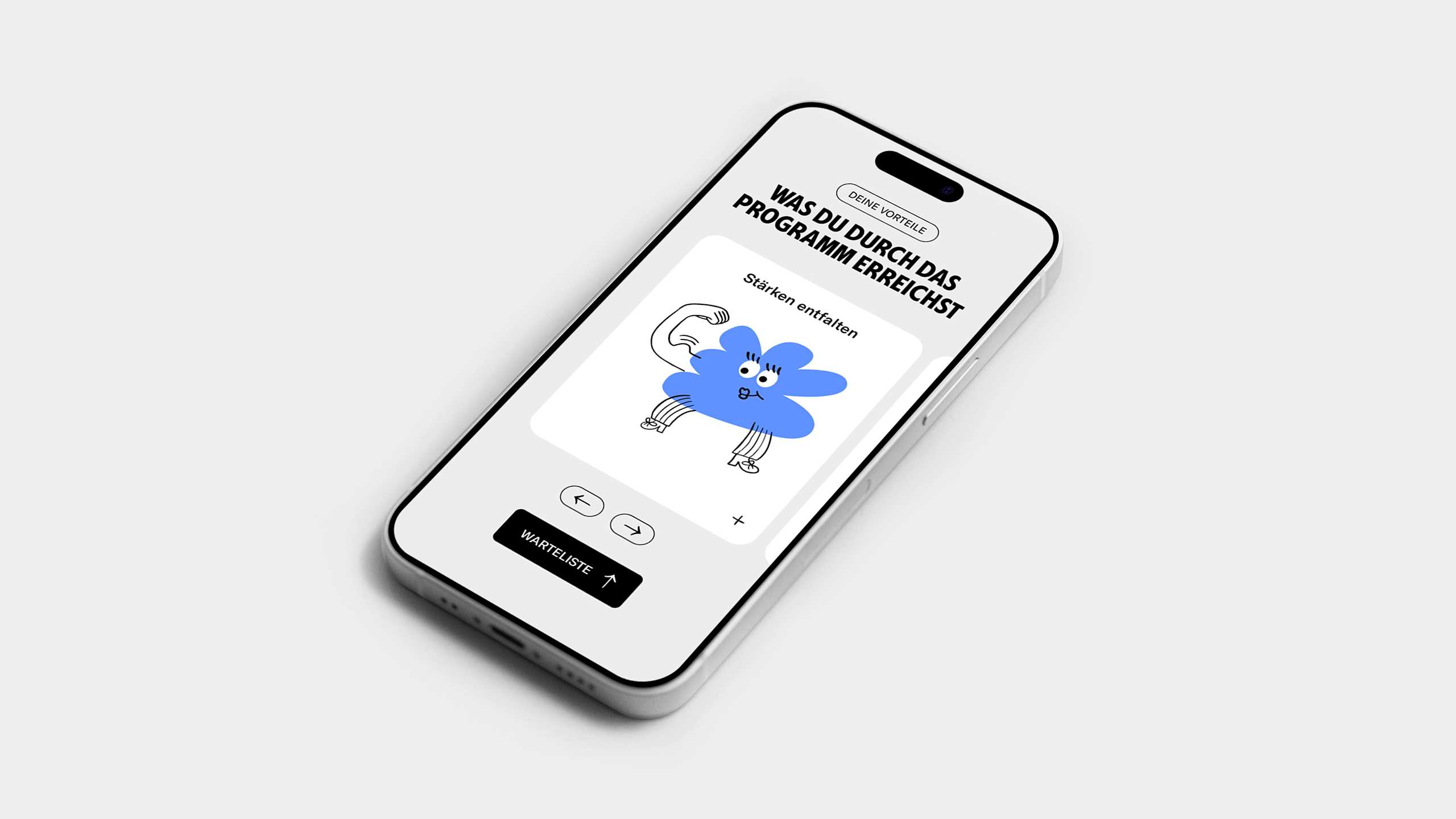
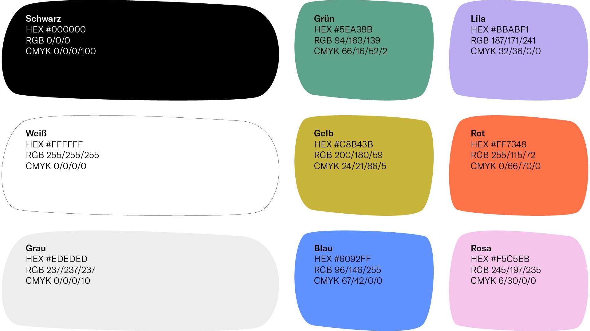
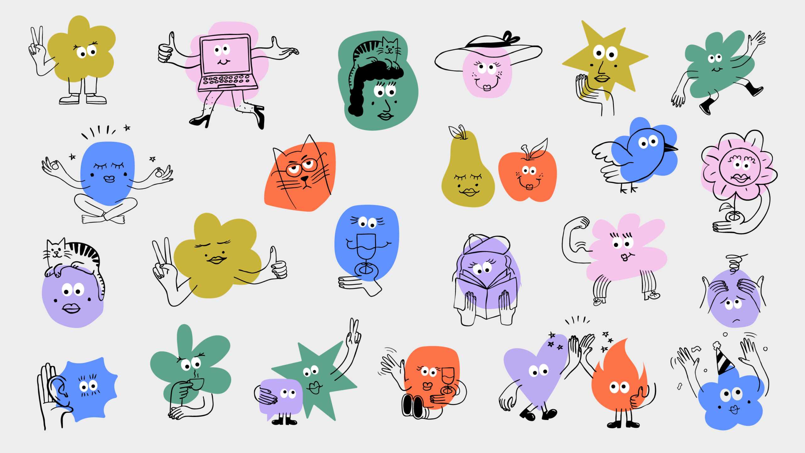
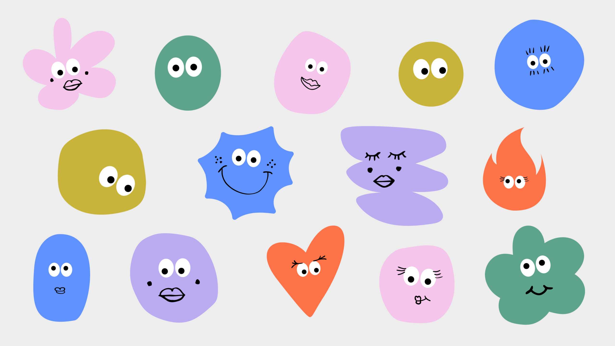
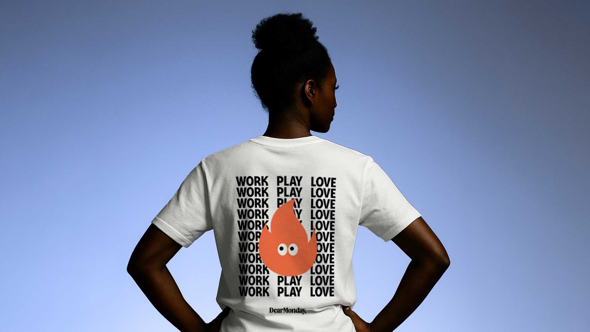
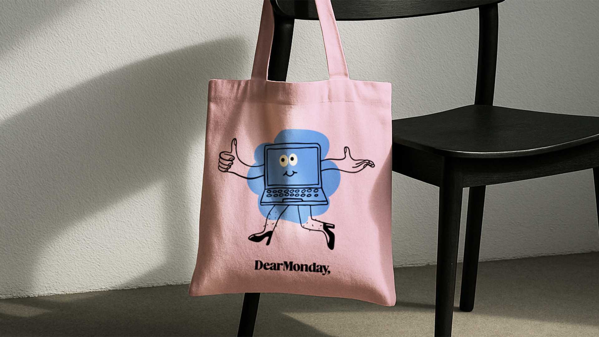
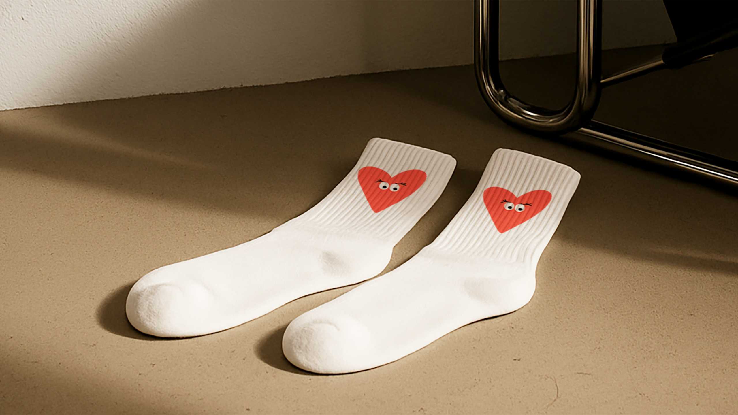
The colour palette? From bright, chatty hues to grounded neutrals, the tones are a celebration of diversity and inclusion. This sets the scene for the Mondies: uniquely designed, playful illustrations that are the very embodiment of community, self-expression and diversity. Add in a sans serif typeface for maximum readability and real-world photography, and we have an interlocking design system that tells a story at every turn. The result is a visual identity that doesn’t just support personal and professional growth for women – it beams with their collective star power. Clarity, energy and just the right amount of spark: the perfect basis for putting more female leaders into the world.
We might just have done the impossible with this one: we’re looking forward to Dear Monday more than dress-down Friday. Amazing what a leading mentality can do!
