Go Wow
A potent design that never gets tired

Case Study
Overview
Our Client
A business that’s up and coming
Ask any influencer, gym head or guy on the street: Nutritional supplements are big business. From prescription preparations to food supplements, society’s increasing obsession with health, fitness and well-being are leading men to turn to performance-enhancing supplements in all areas of their lives. The folks at Go Wow know this, which is why they’re seeking to disrupt the market – or maybe fill a hole in it? – with a powder-based product that enhances male potency thanks to its combination of active ingredients. FYI: That’s potency in the bedroom rather than on the bench press.
The Challenge
Hitting that sweet spot
As an unknown quantity, Go Wow needed a corporate design that would turn heads in a crowded market and get people talking in all the right ways. From the brand itself to the product packaging, this was the full Monty of design projects. One more thing: as a product intended to give men a little extra get up and go, it was important not to overstep the boundaries of taste.
Our Solution
A serious design for some funny business
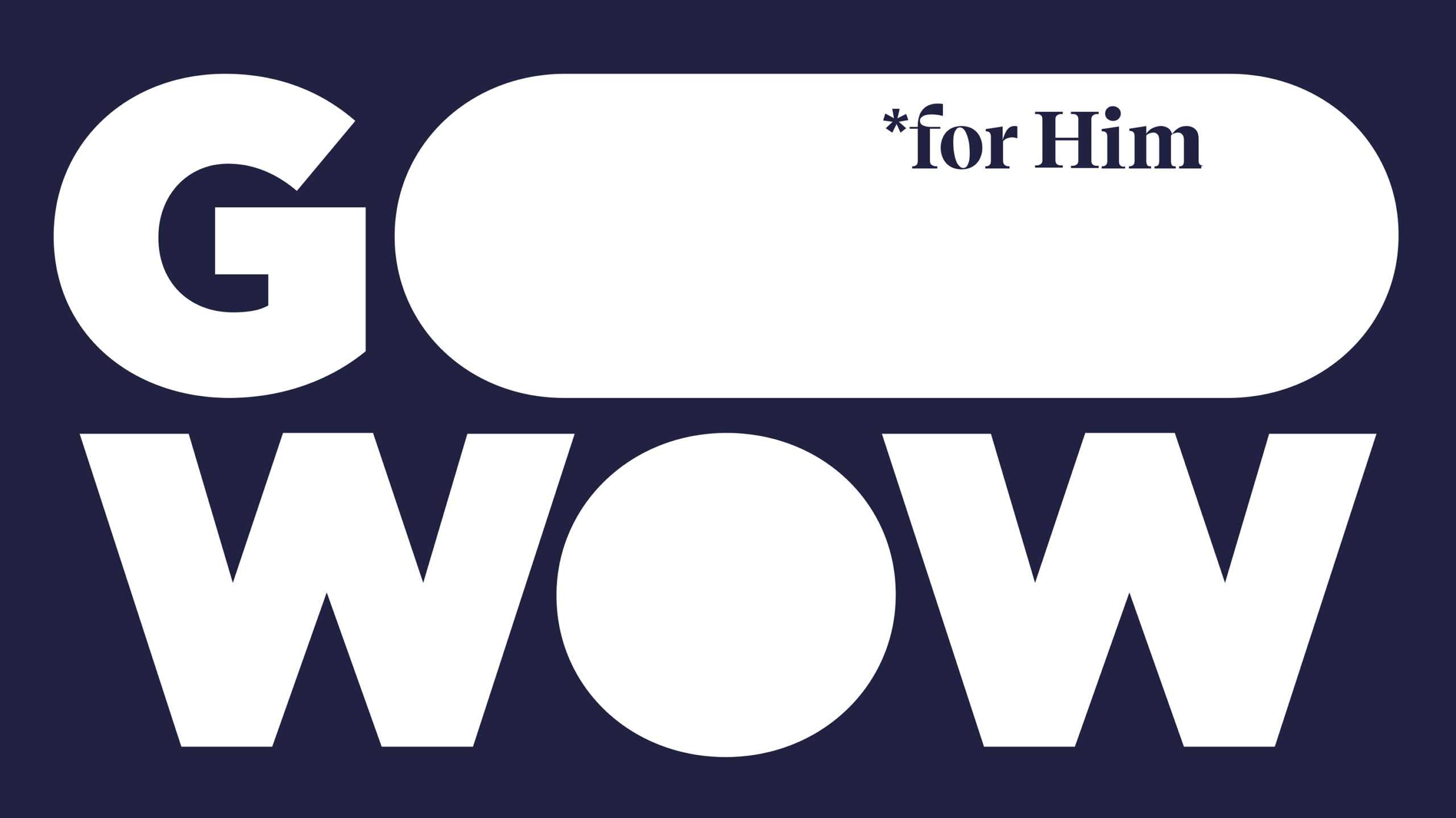
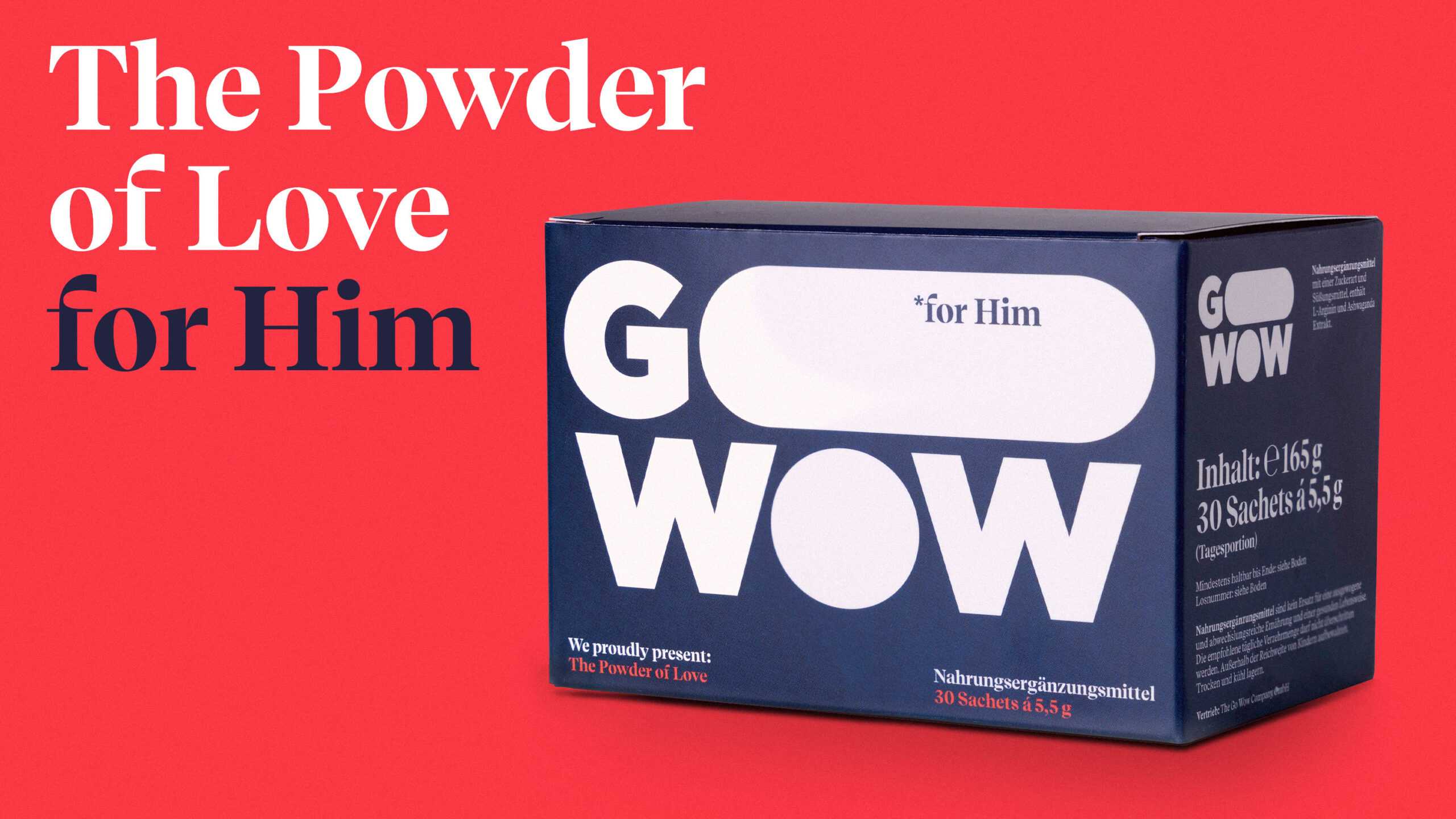
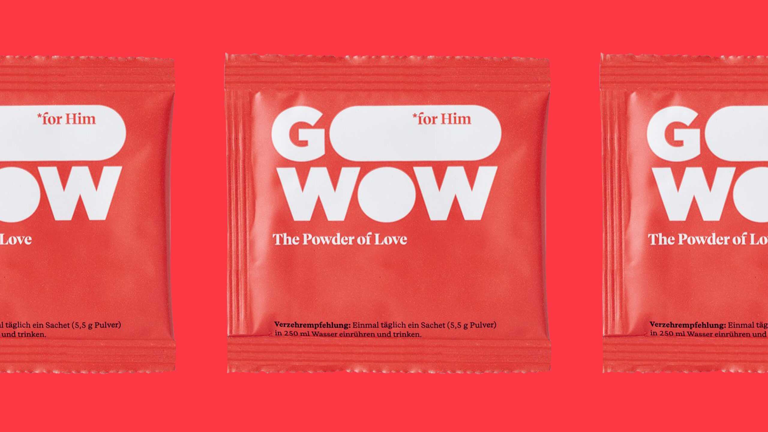
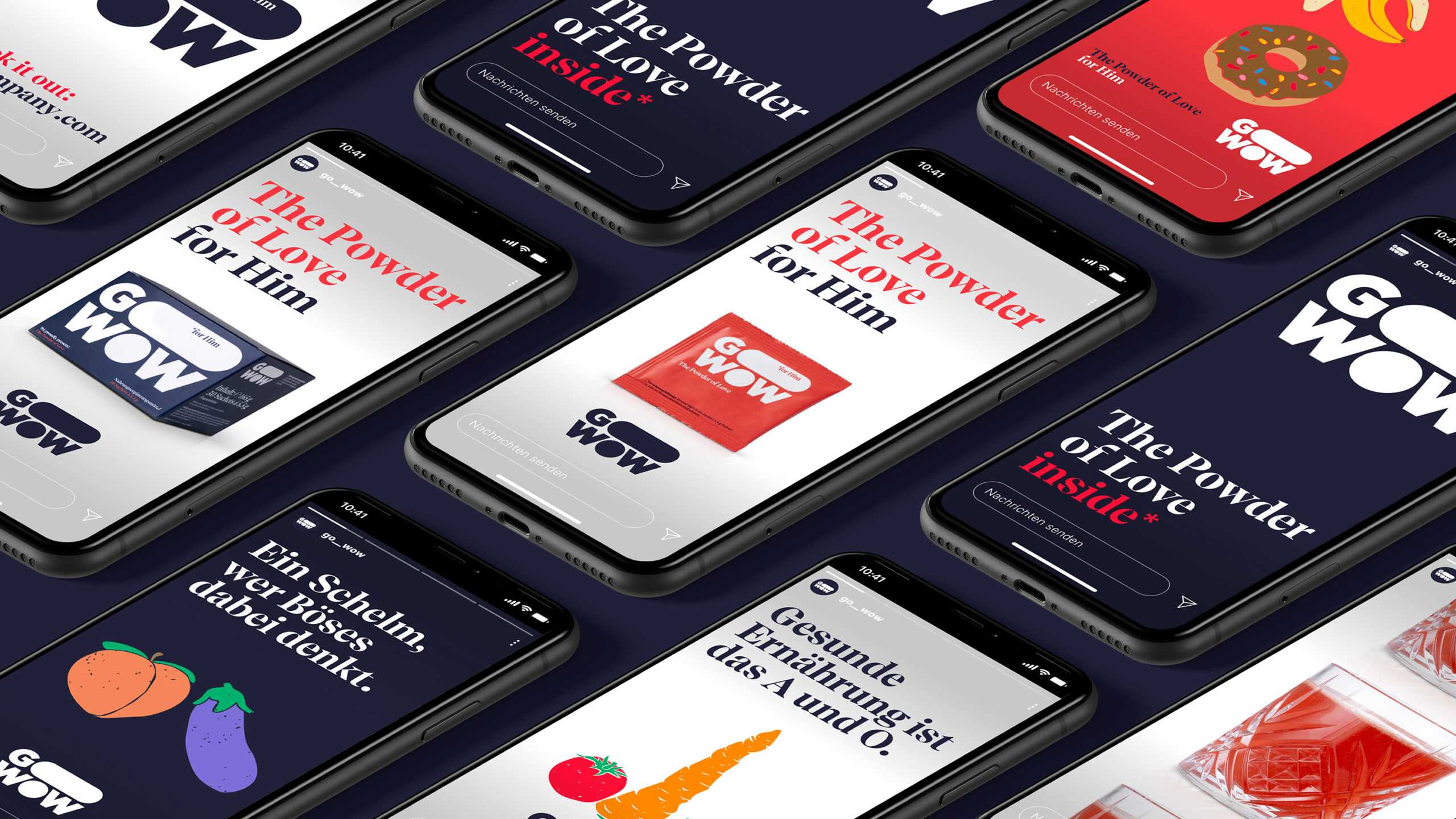
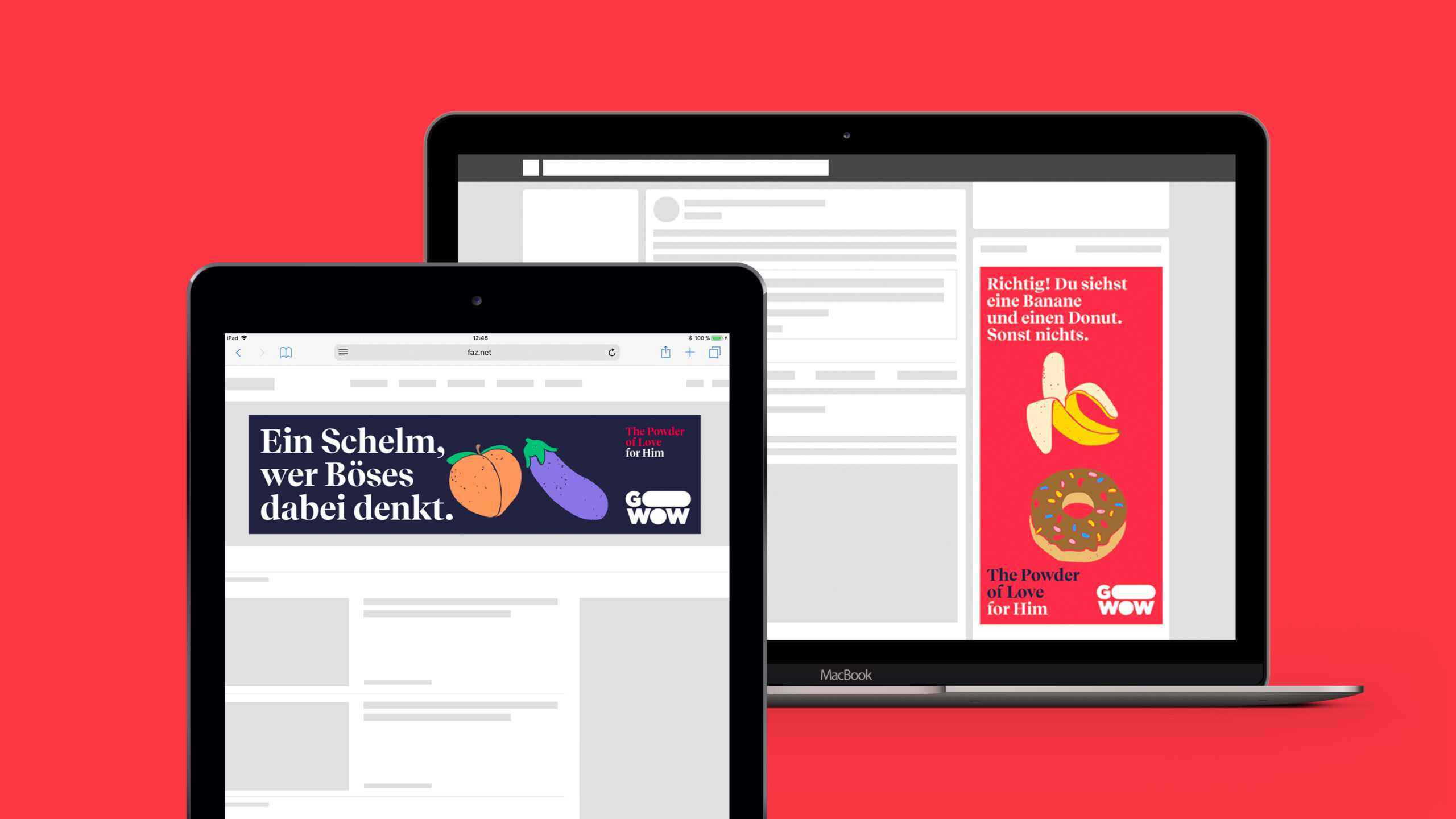
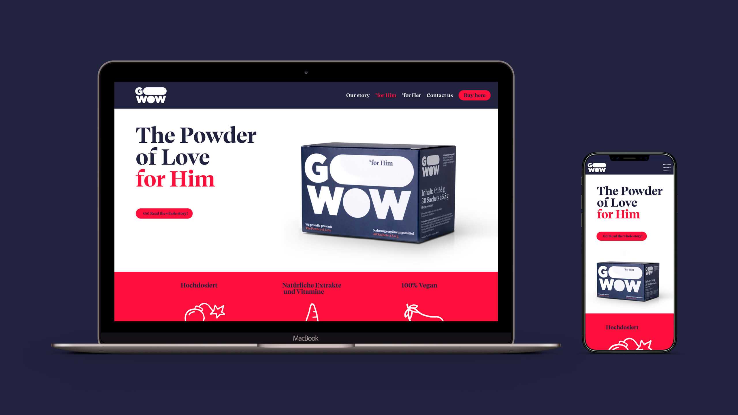
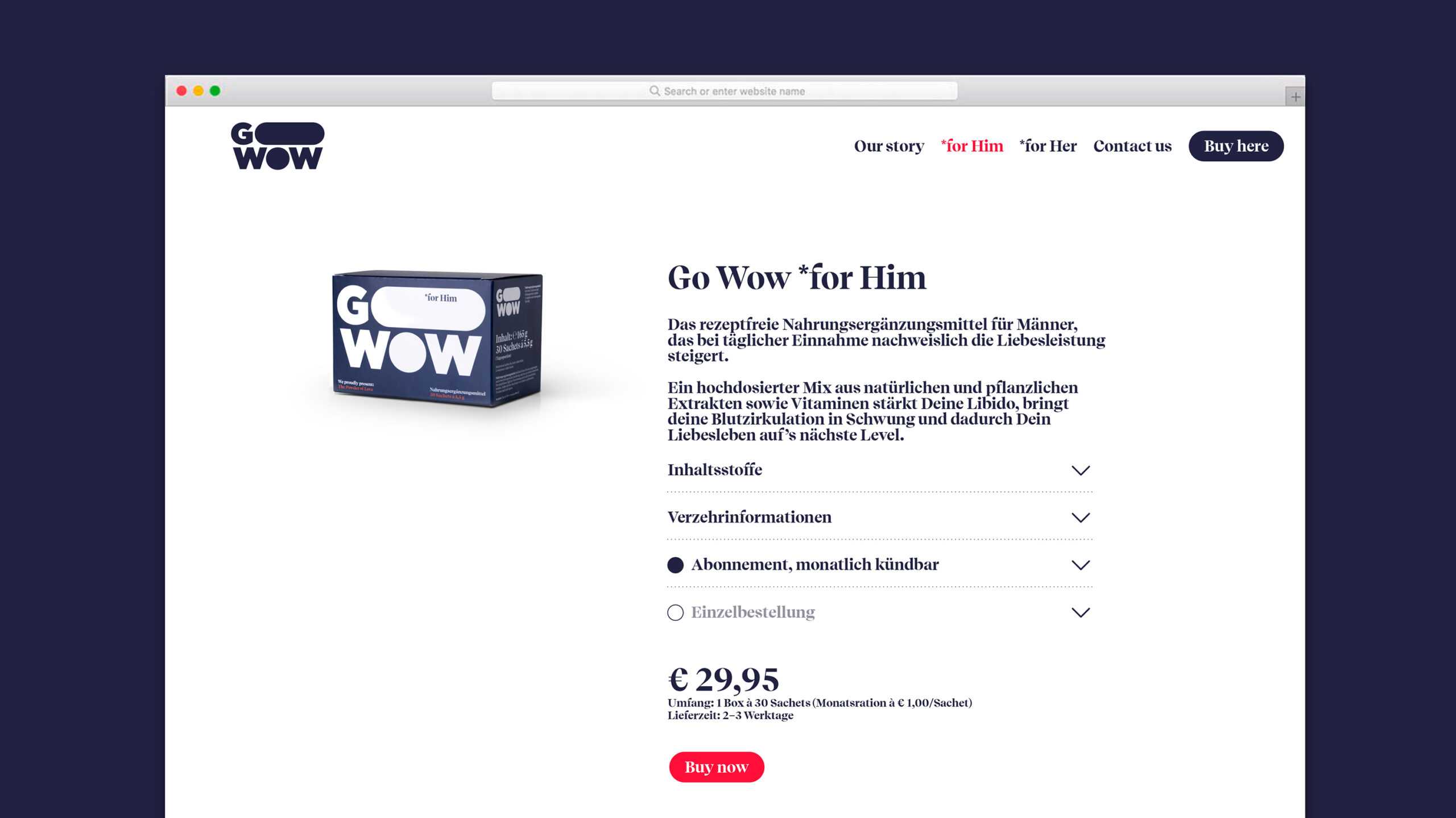
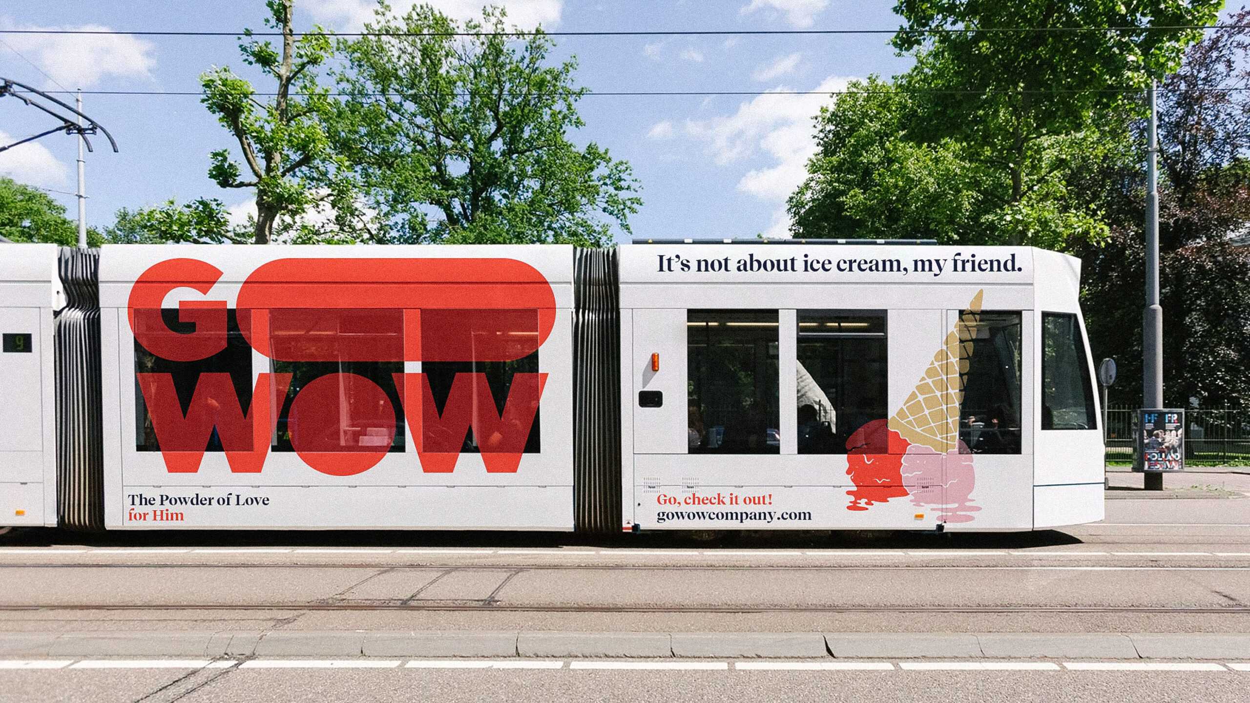
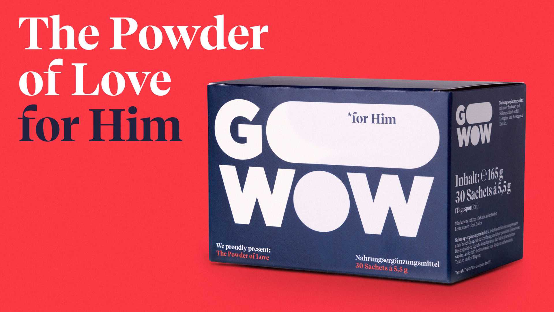
We started by conducting a series of workshops to determine how to position Go Wow in the market for nutritional supplements. The startup’s ideal target group? Men with a taste for adventure in the bedroom and an eye on products that can take their carefully curated lifestyles to the next level. The latter was the key: no other competitor was courting the lifestyle segment, making it prime real estate for Go Wow. As a result, when we turned to the design our focus was on highlighting the product’s ability to boost the lifestyle of men about town without making it sound as though they had a deficiency – in which is why we made sure to keep things playful. For the logo, we settled on a bold, masculine wordmark, with an elongated ‘O’ in ‘Go’ serving as a tongue-in-cheek reference to the product’s virile qualities. We followed this up by having the powder sachets resemble a classic condom wrapper to put the customer at ease and break down inhibitions. It wasn’t all double entendres, though, as the colour palette shows: the virile red and navy blue that serve as the primary tones are distinctly masculine to highlight the product’s power, while a set of softer secondary colours – used primarily in Go Wow’s advertising – appeals once again to the lifestyle side of things, with nods to experimentation, joy and passion. With the visual system in place, we turned our attention to the Go Wow store, where the product will be sold in the initial phase. Our efforts here included designing an online advertising campaign based on bold, suggestive illustrations and slogans that challenge the reader (while also sending a wink their way), as well as print ads and various outdoor formats.
And so we can safely say that as far as Go Wow’s corporate design is concerned, we kept our end up. Now excuse us – we have a little extra energy to burn off.
The logo itself — goooooing wow — proudly embraces the product packaging itself, as well as the supplement sachets.
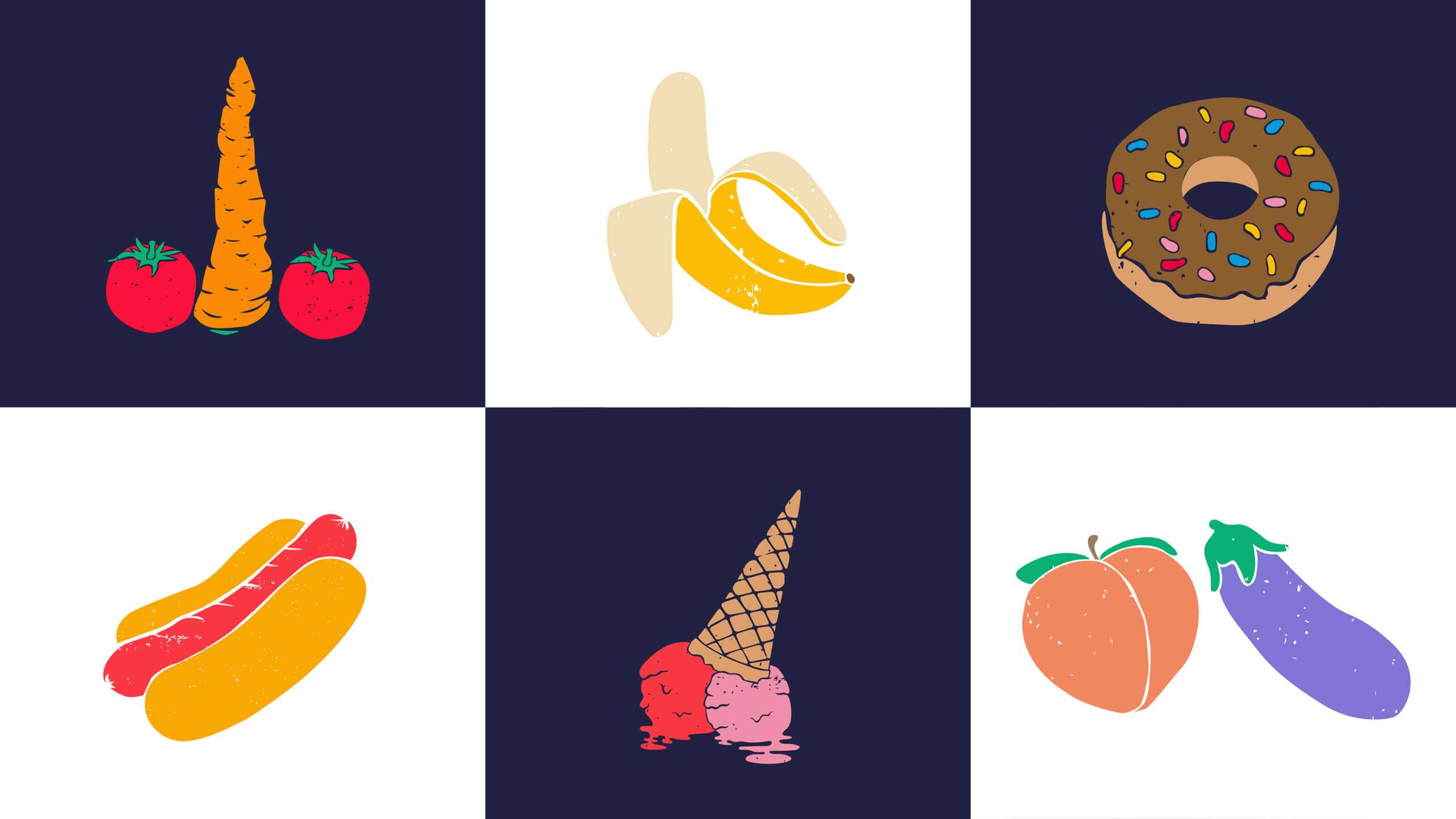
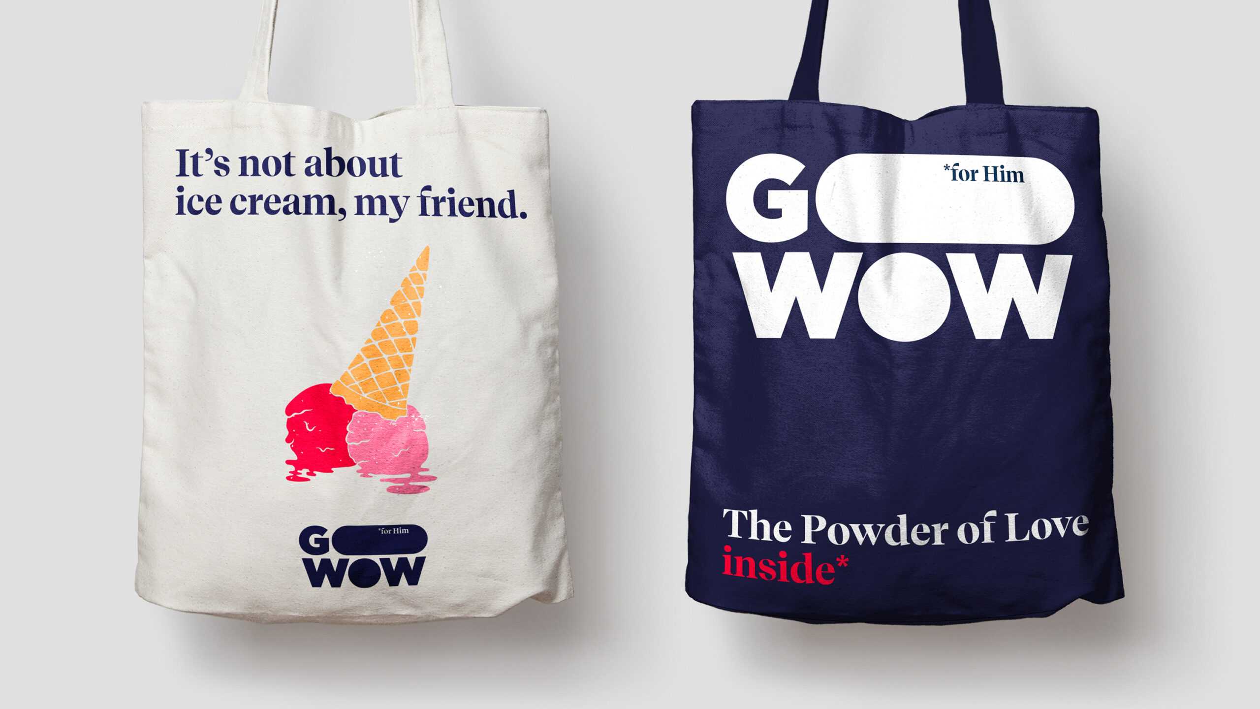
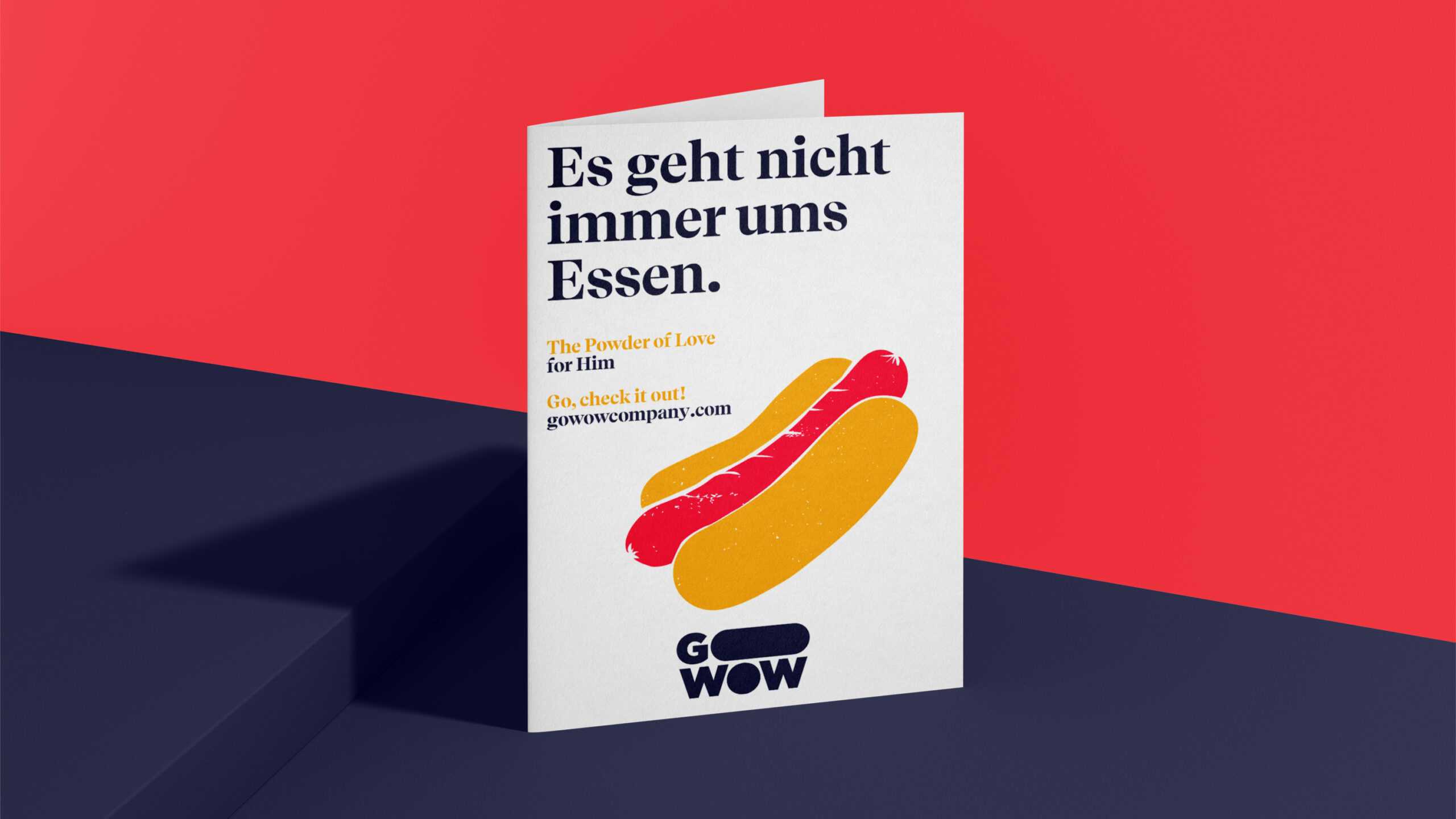
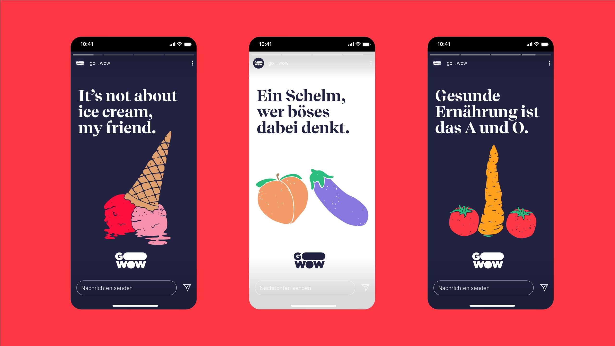
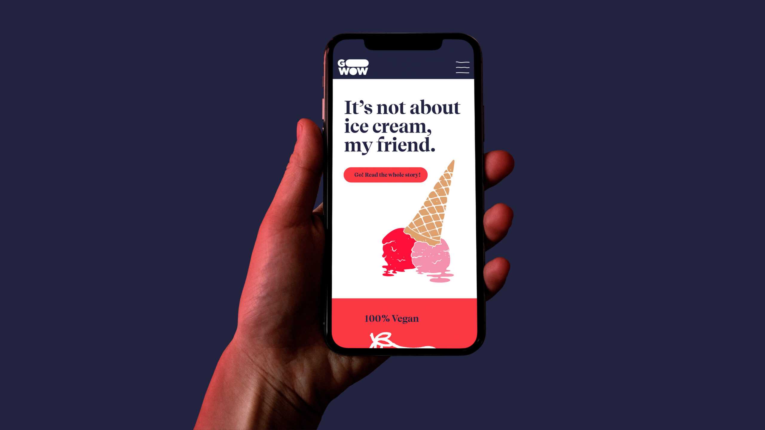
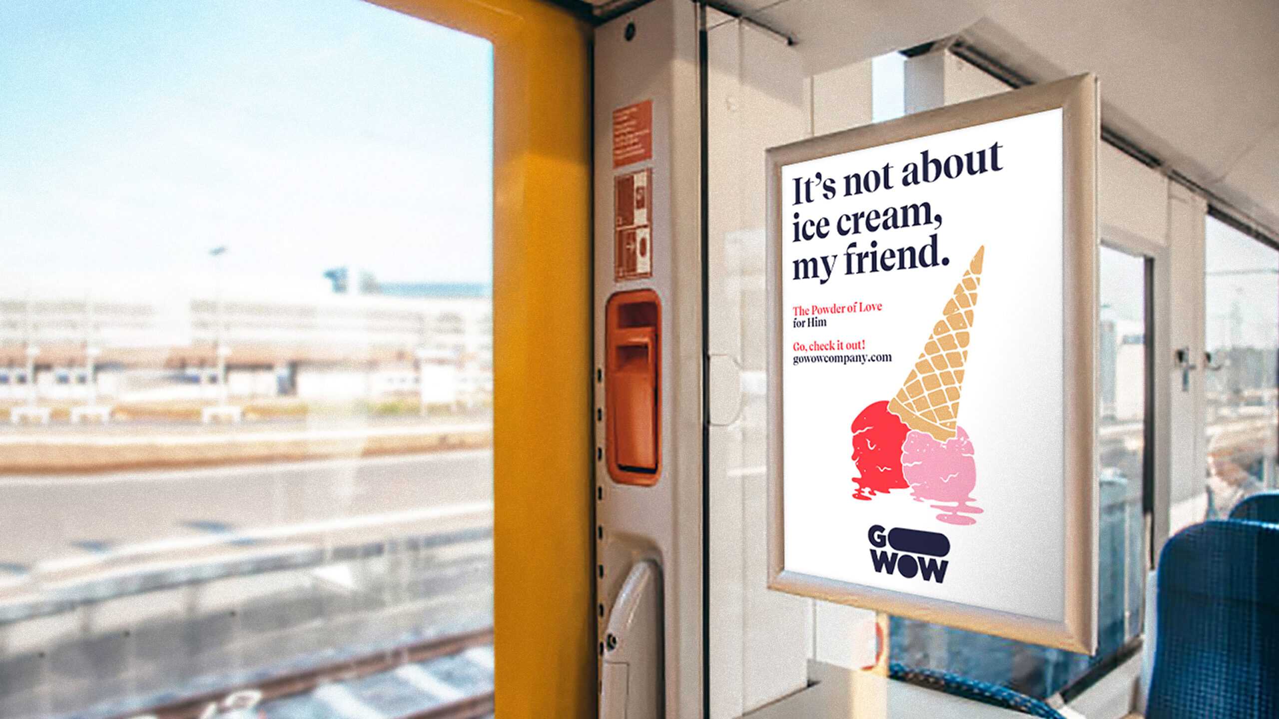
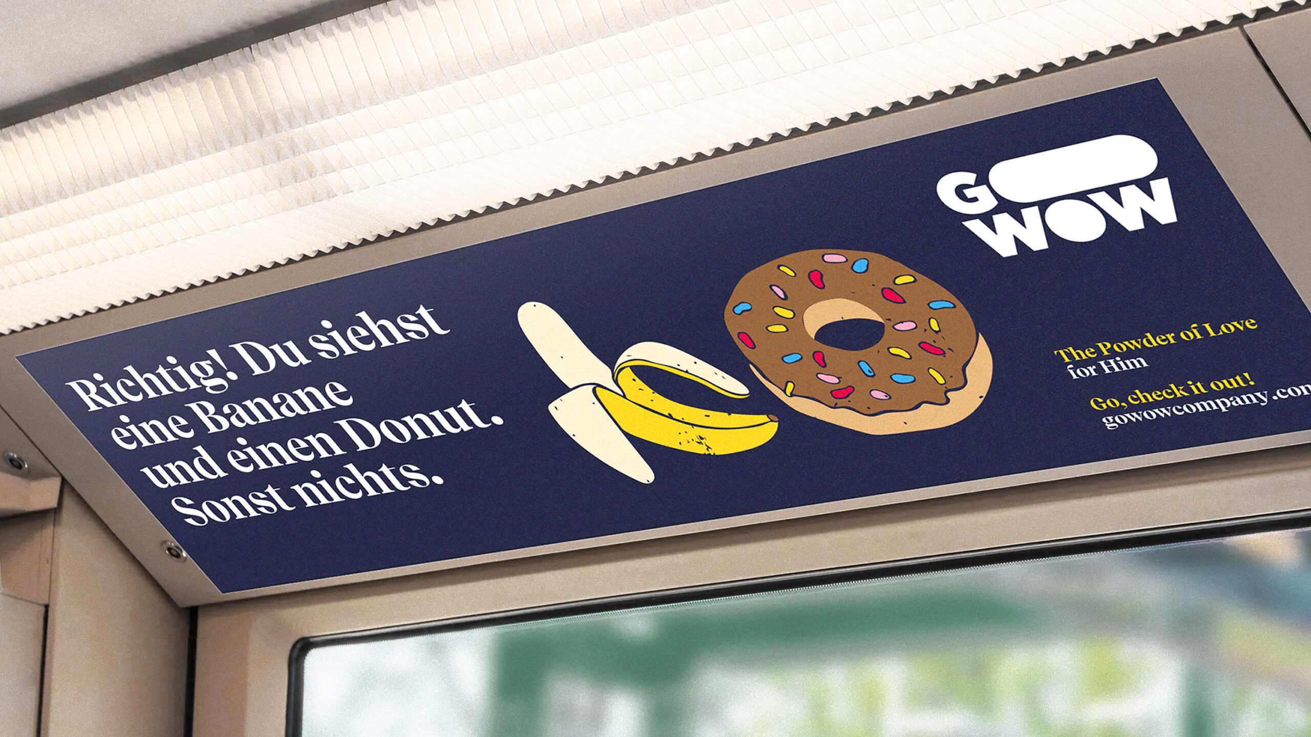
It’s not about fruits and vegetables, or hot dogs, or donuts, or ice cream, my friend.
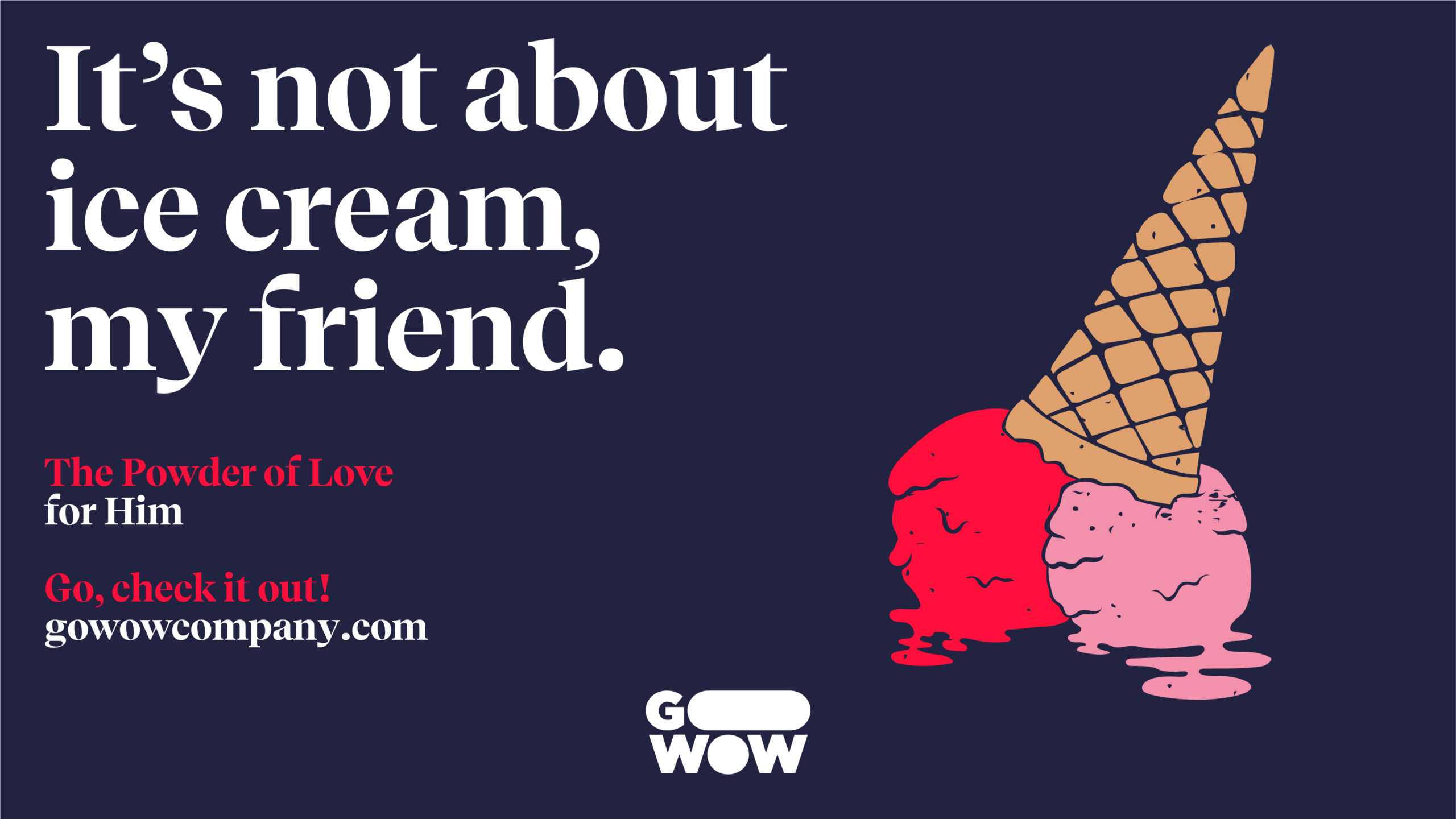
A copy with a wink, combined with a soft-colored illustration on plain background add up to Go Wow’s key visual.
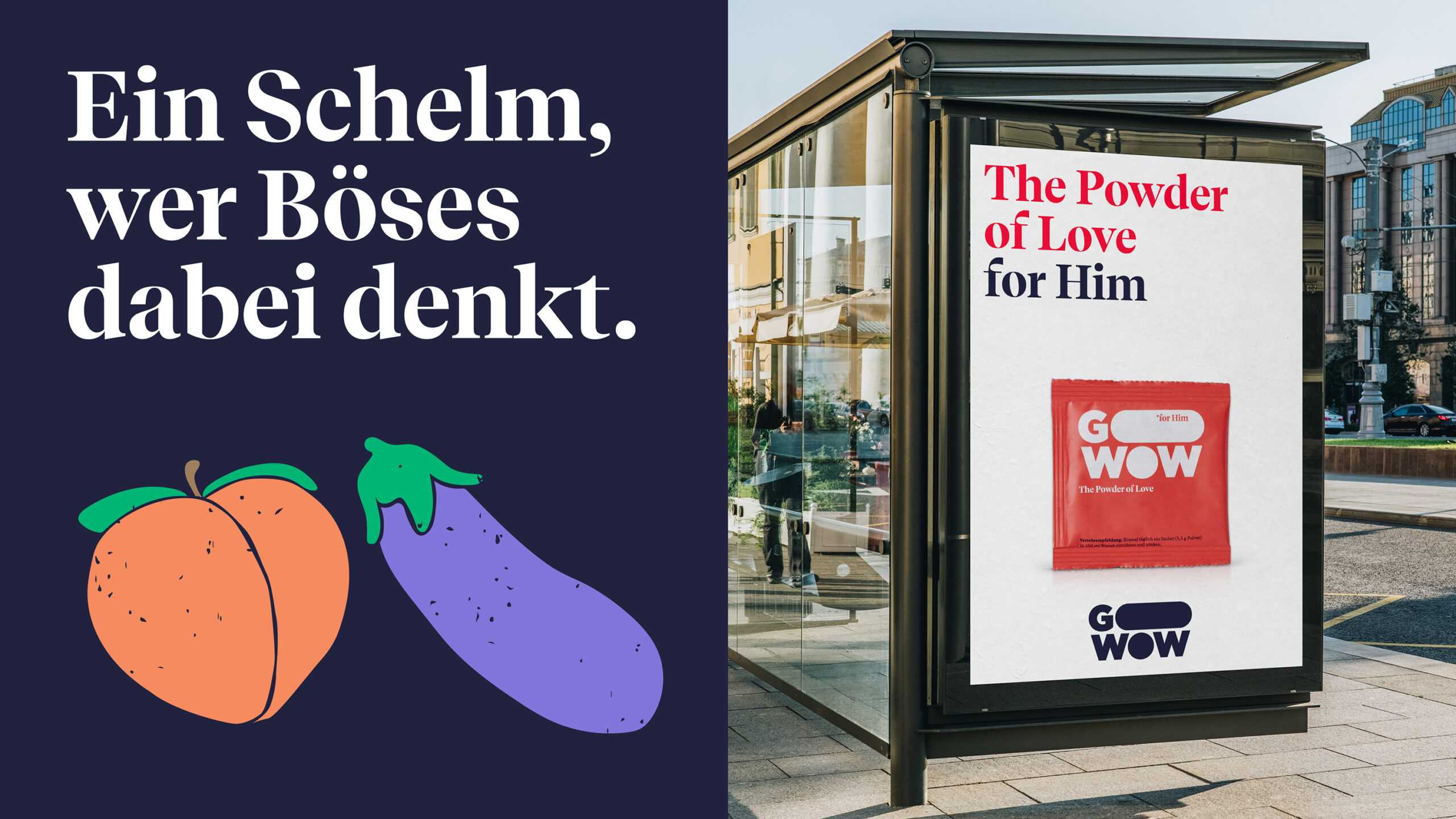
Suggestive illustrations and slogans that challenge the reader (while also sending a wink their way).
With the visual system in place, we turned our attention to the Go Wow store, where the product will be sold in the initial phase.
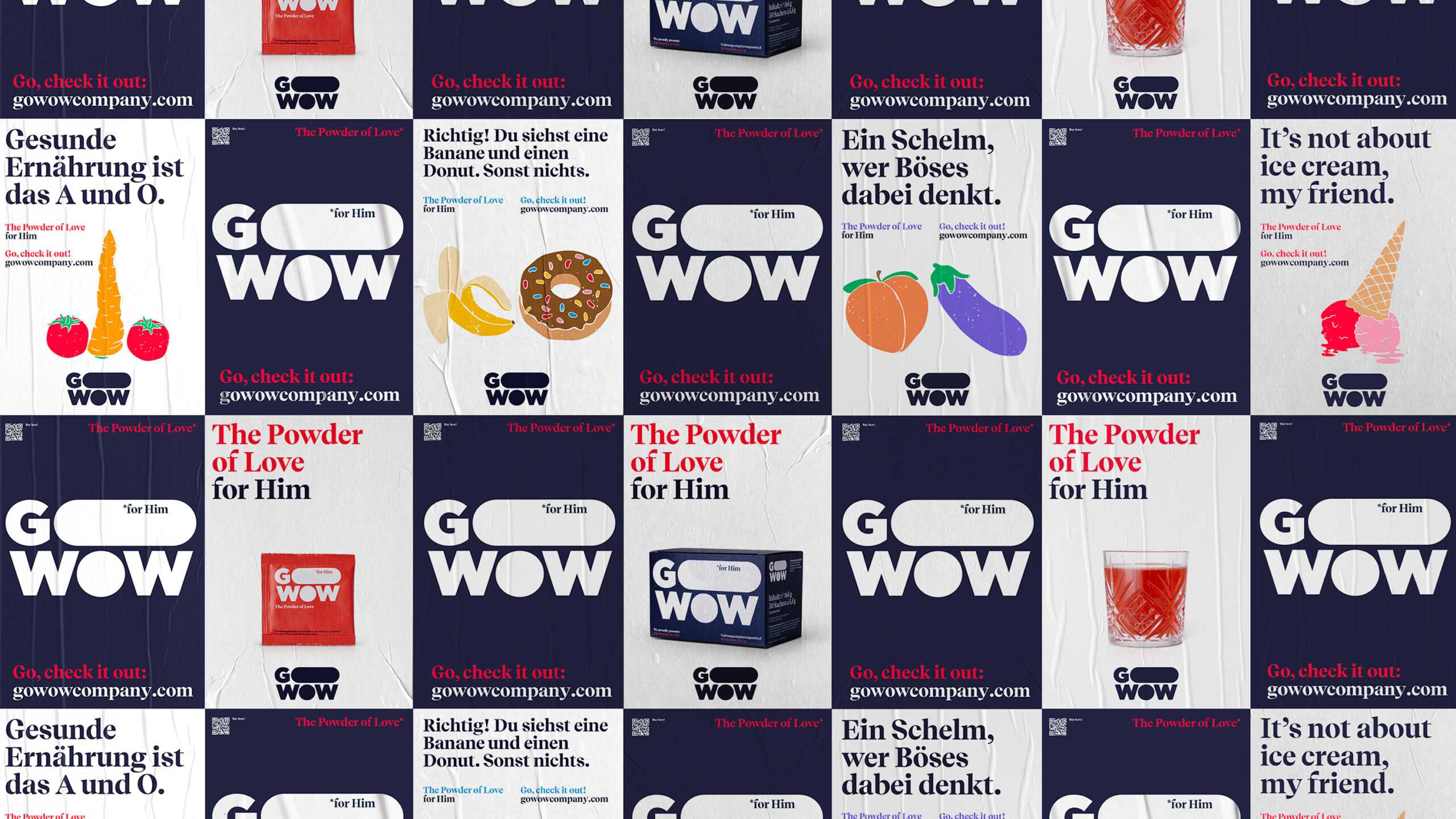
The campaign story continues offline in various outdoor formats.
Nobody likes to openly admit that they don't get it up. For us, in addition to the expertise in design, it was crucial that the chemistry between us and the agency was right. Only then could we find the right way to target our audience together. It turns out that we could tango with the team at Arndt Benedikt just fine.
