GreatVita
Creating balance for active lifestyles

Case Study
Overview
Our Client
A nutritious prospect in the health food world
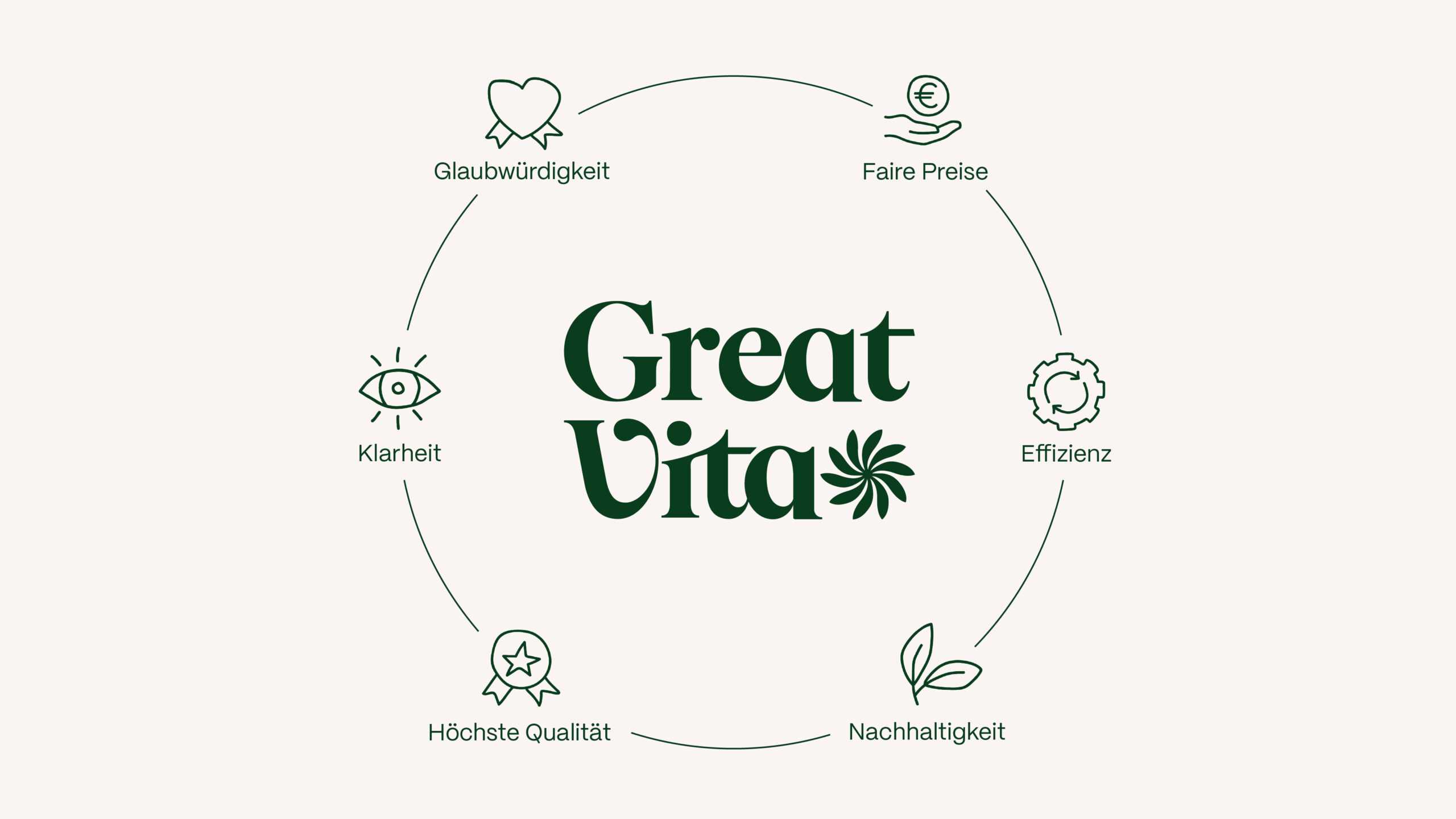
GreatVita offers a clear and well-balanced range of natural foods for everyday nutrition. The assortment includes cold-pressed oils, functional superfoods, plant-based supplements and natural cosmetics. All products are made in Germany from carefully selected ingredients and subject to strict quality controls. Transparent labelling and fair prices make GreatVita a reliable choice for health-conscious consumers.
The Challenge
A brand in need of a fresh shake-up
The market for natural products is as packed as a blueberry has antioxidants. Although GreatVita had strong products, the brand had never managed to capture that spirit in its look and feel. Quite the opposite, in fact: the identity lacked heart and did little to stand out from the pack. This left customers lukewarm in their loyalties and staff without a flag to rally around. GreatVita also hadn’t found a way to show the quality of its products – sustainably produced, regionally sourced and fully certified. From packaging to online and social media, the brand was ready for a real boost.
Our Solution
A fresh identity for a lighter, brighter lifestyle
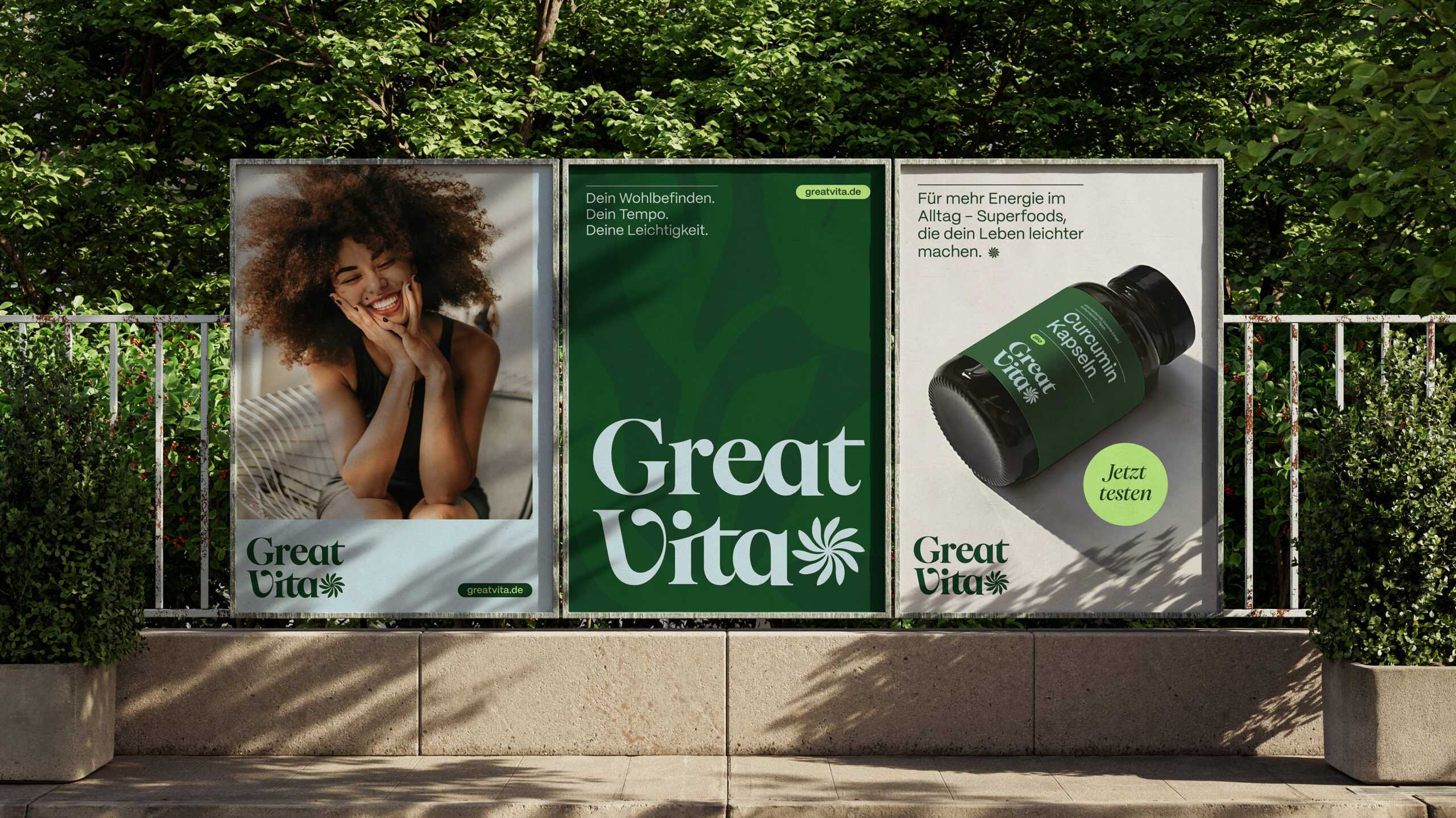
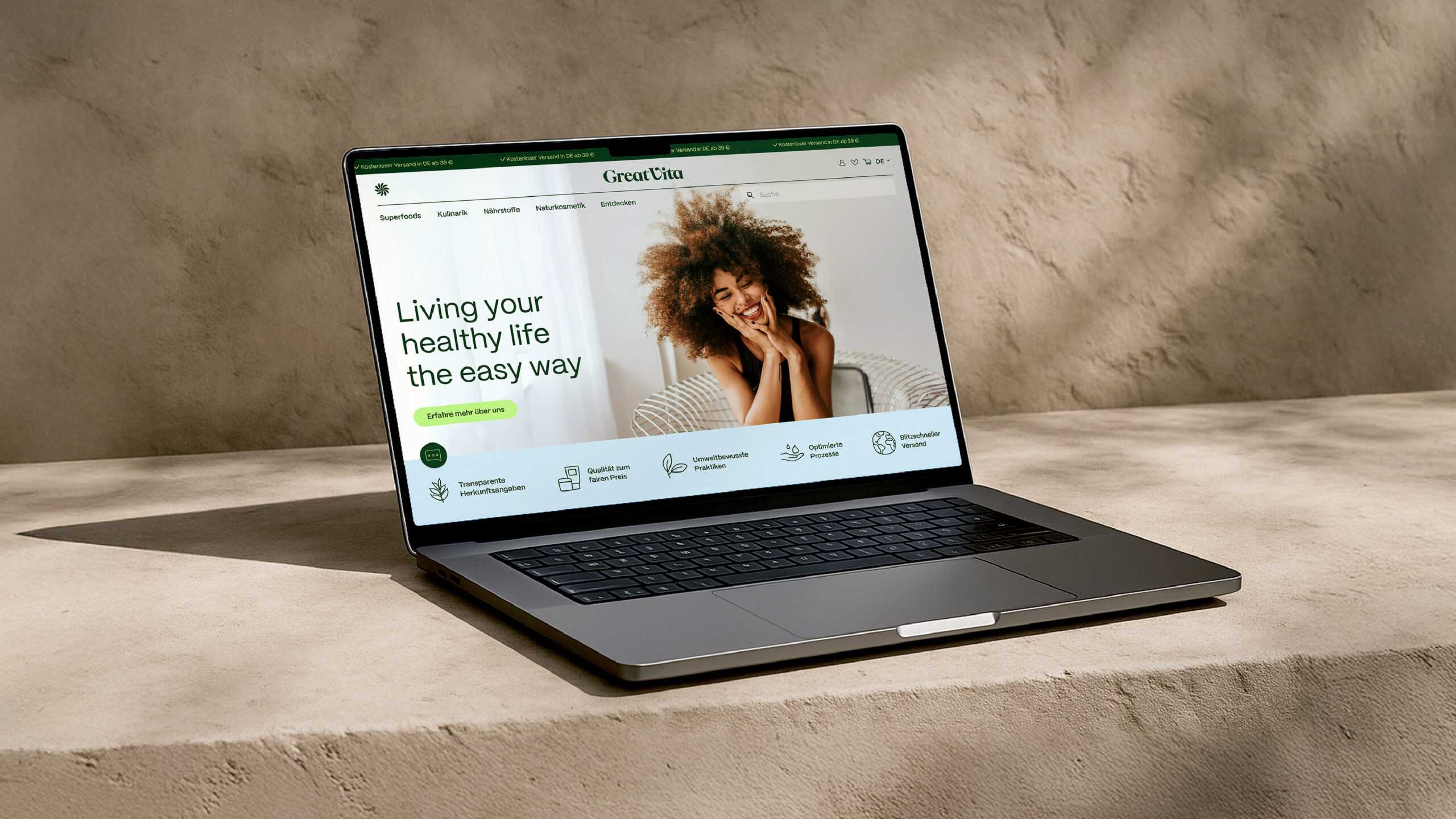
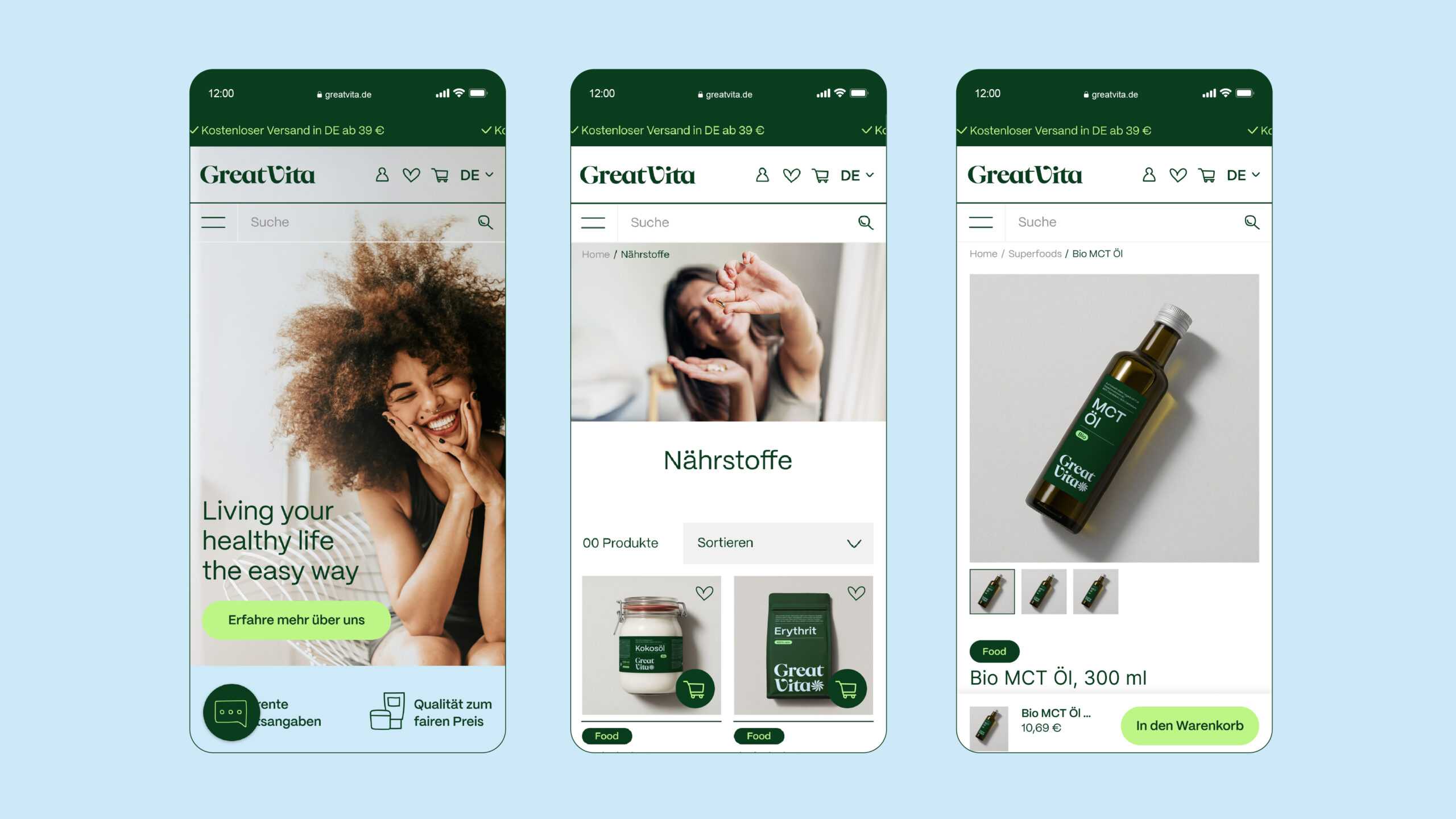
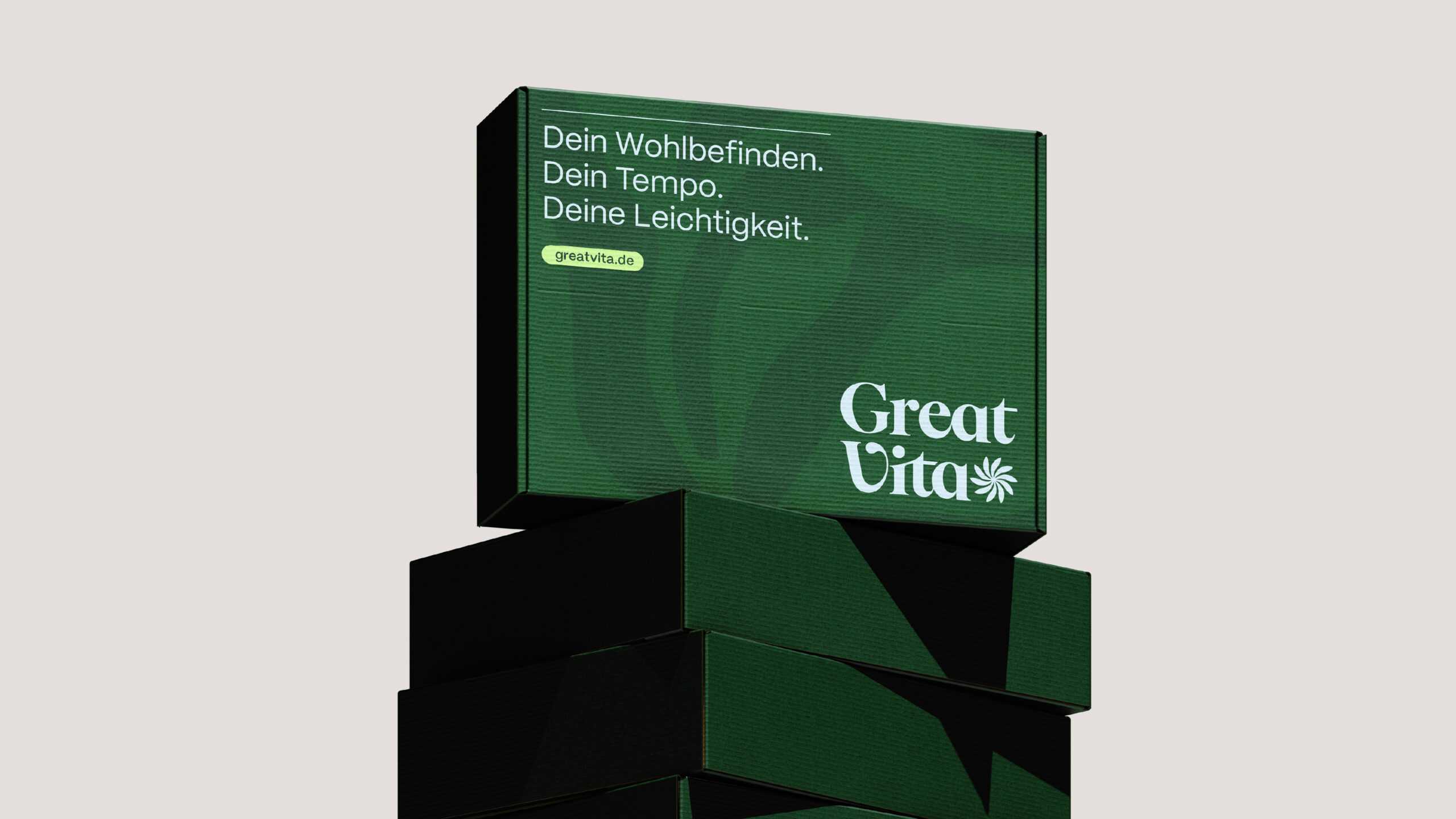
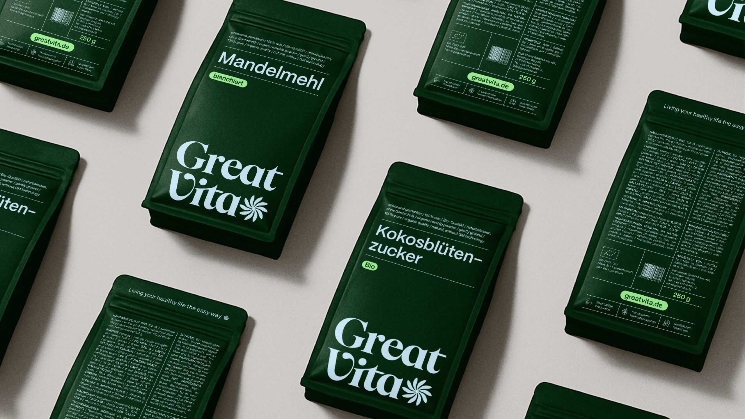
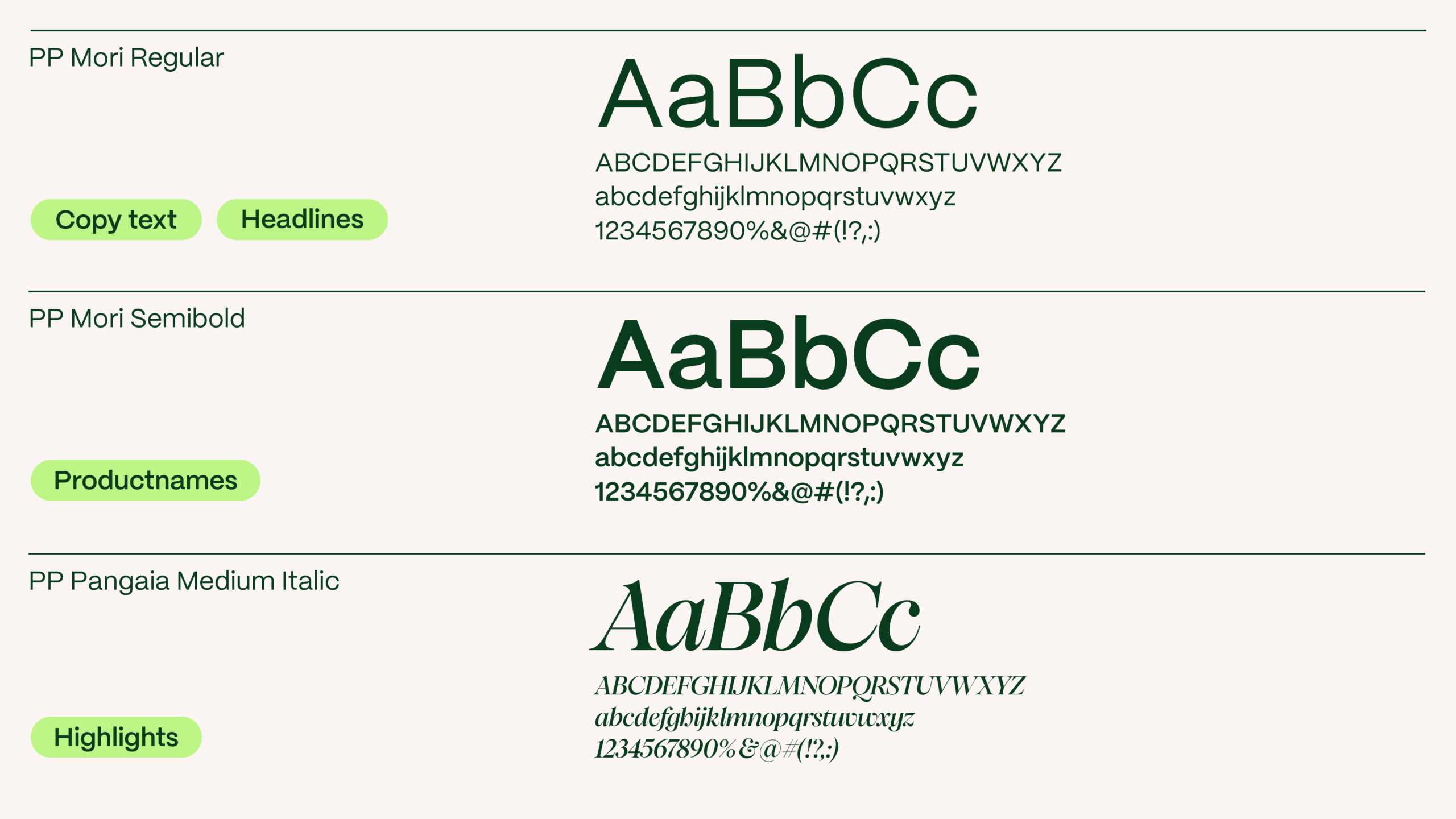
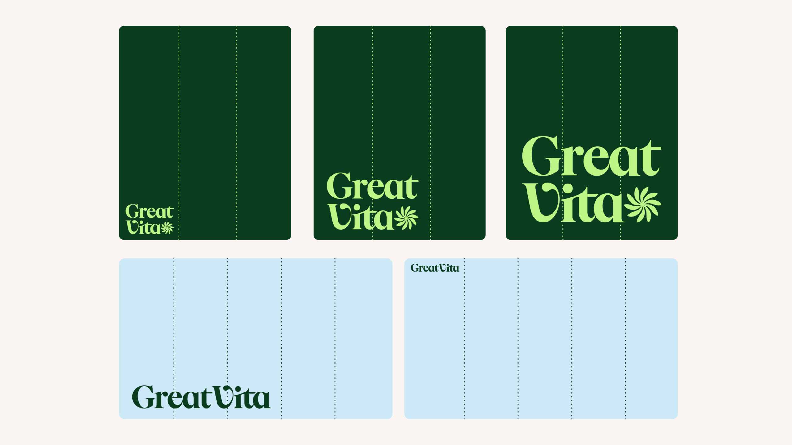
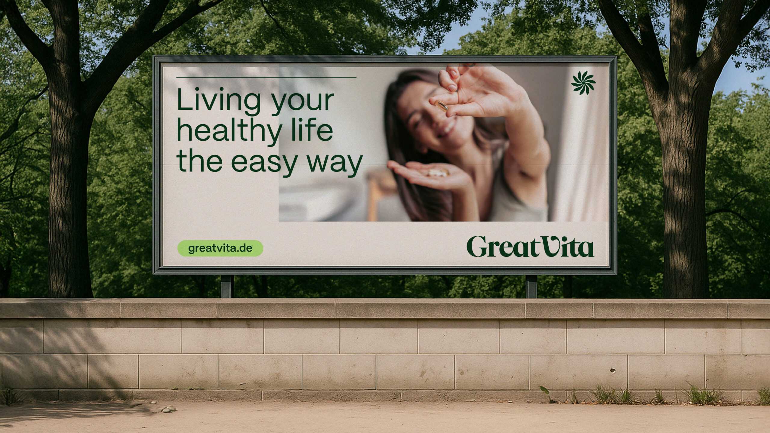
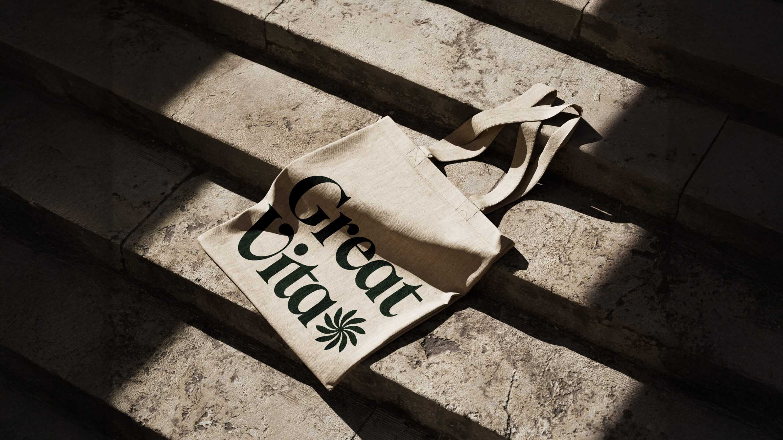
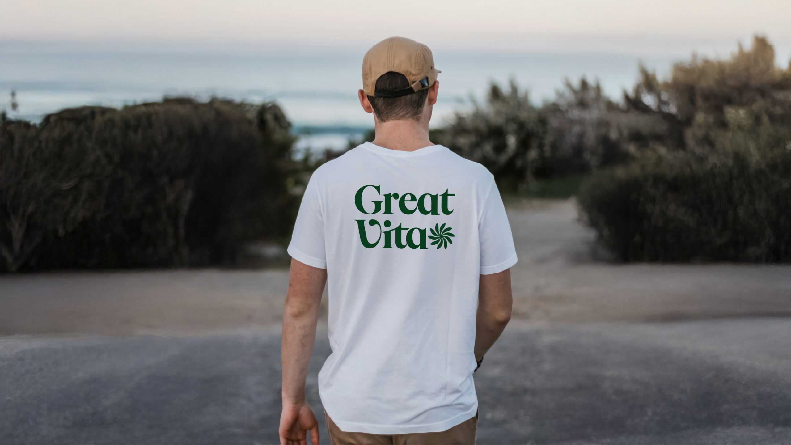
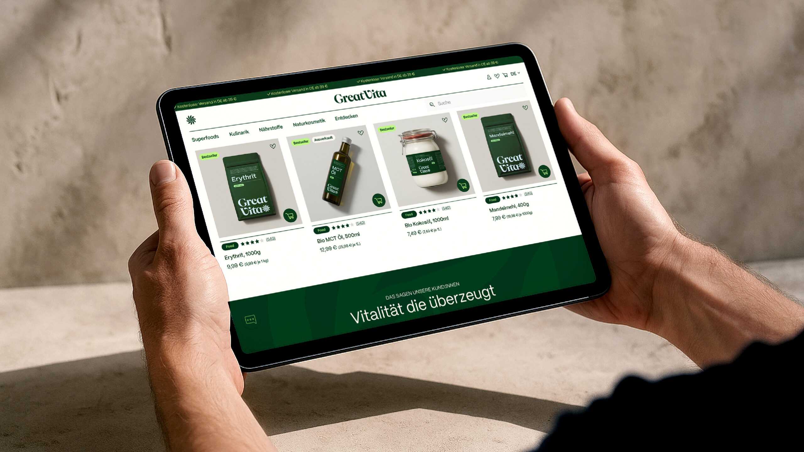
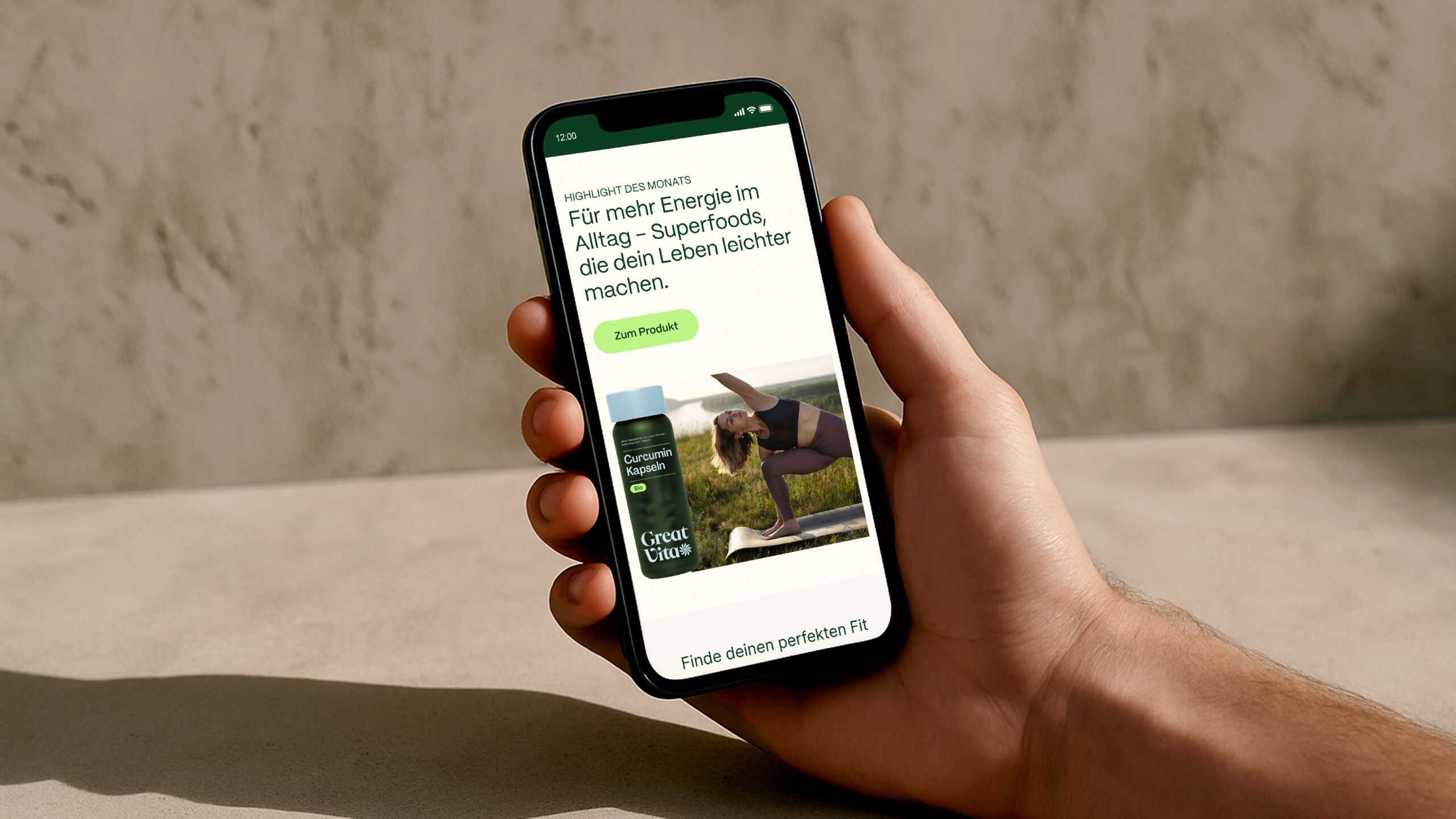
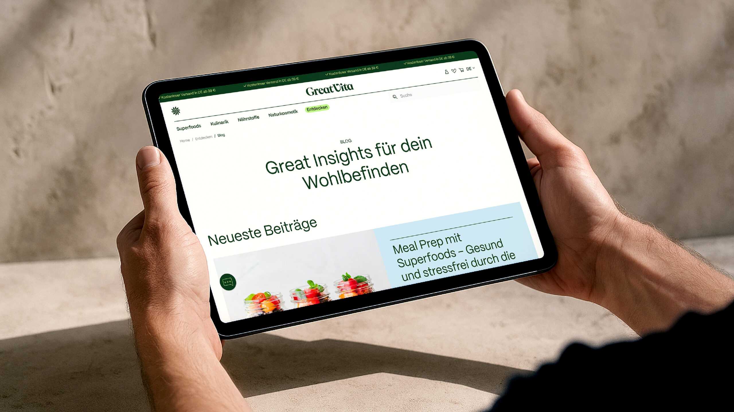
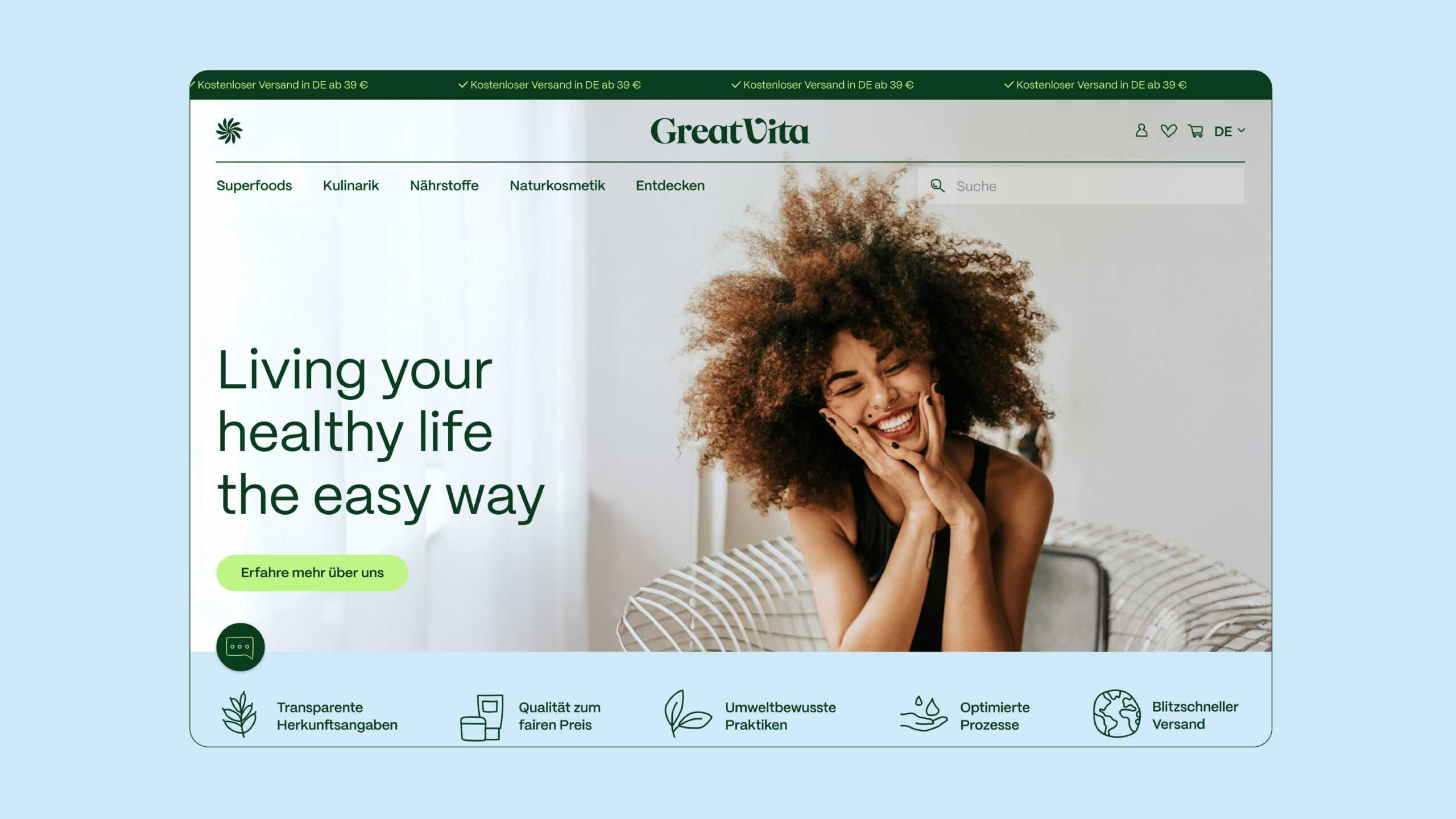
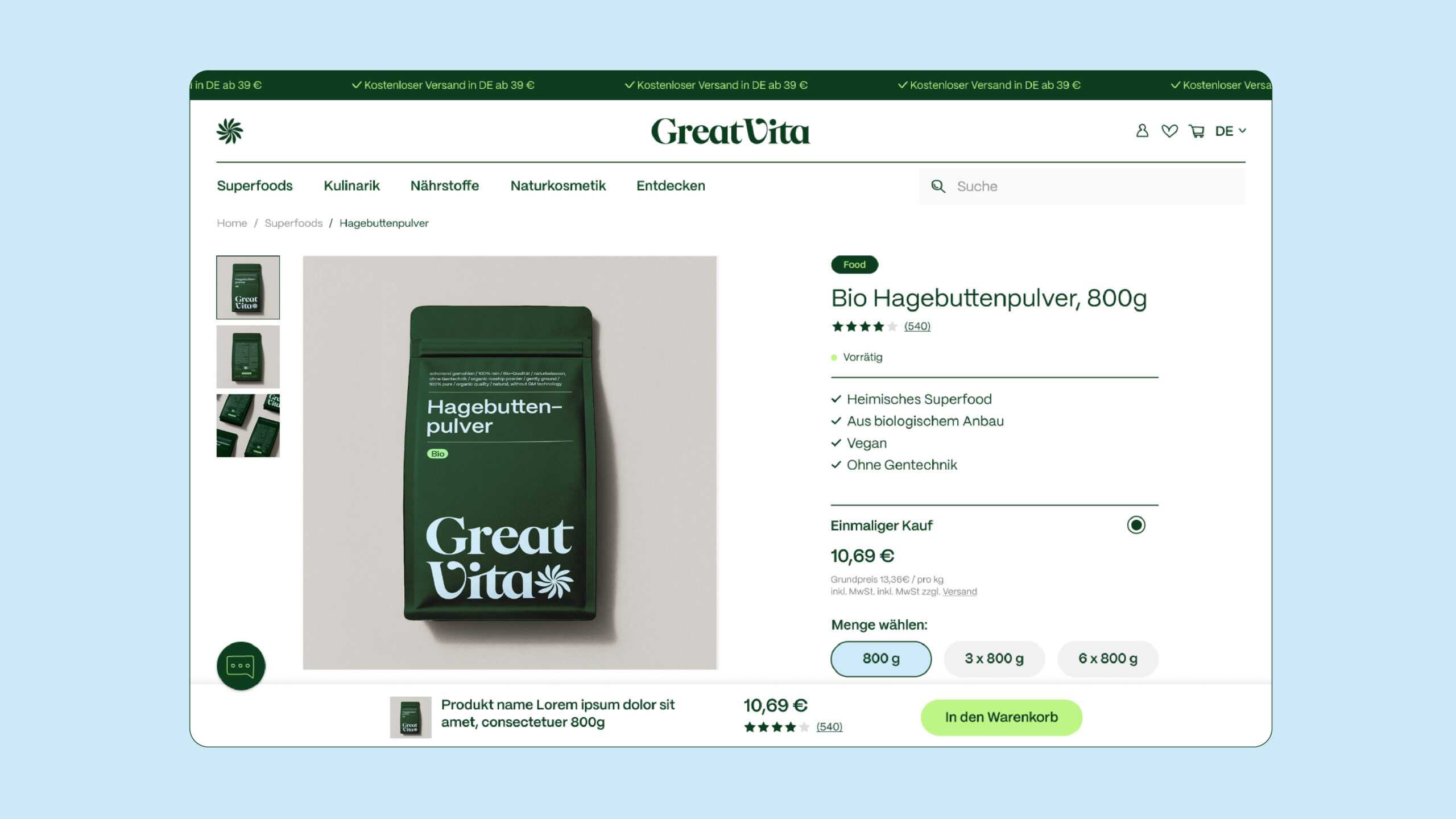
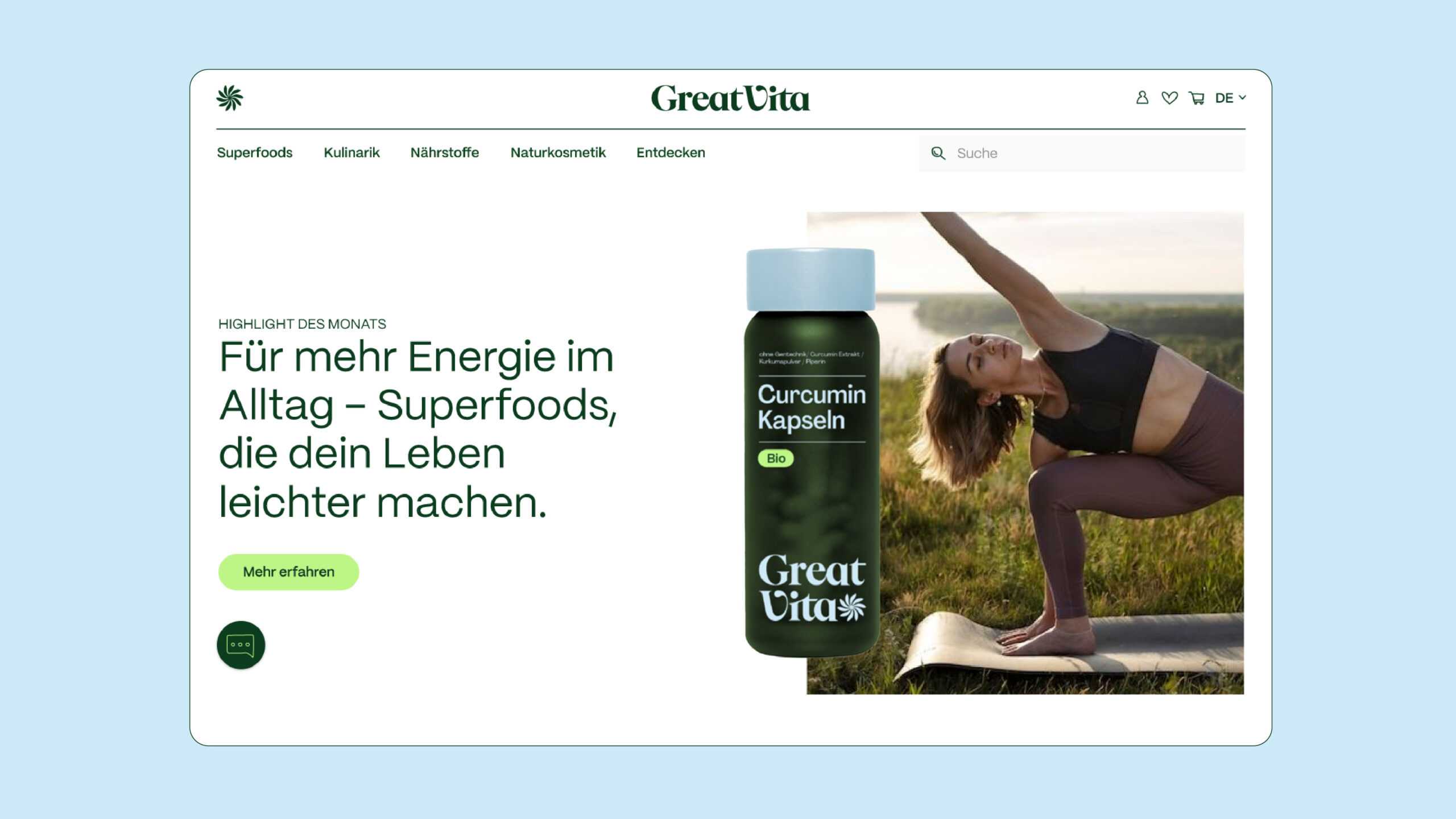
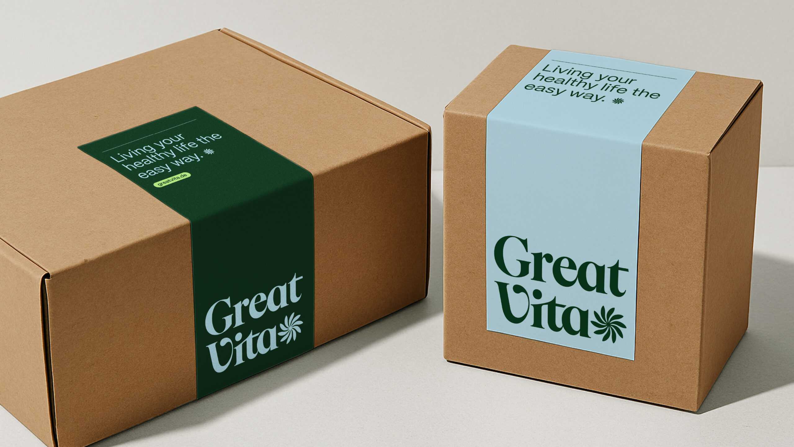
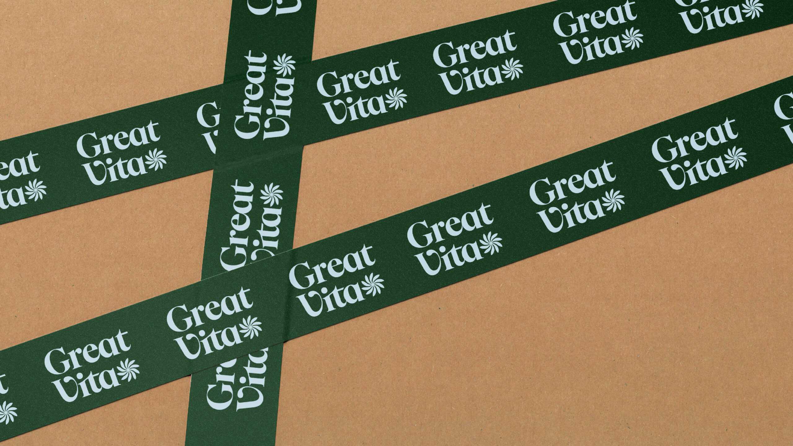
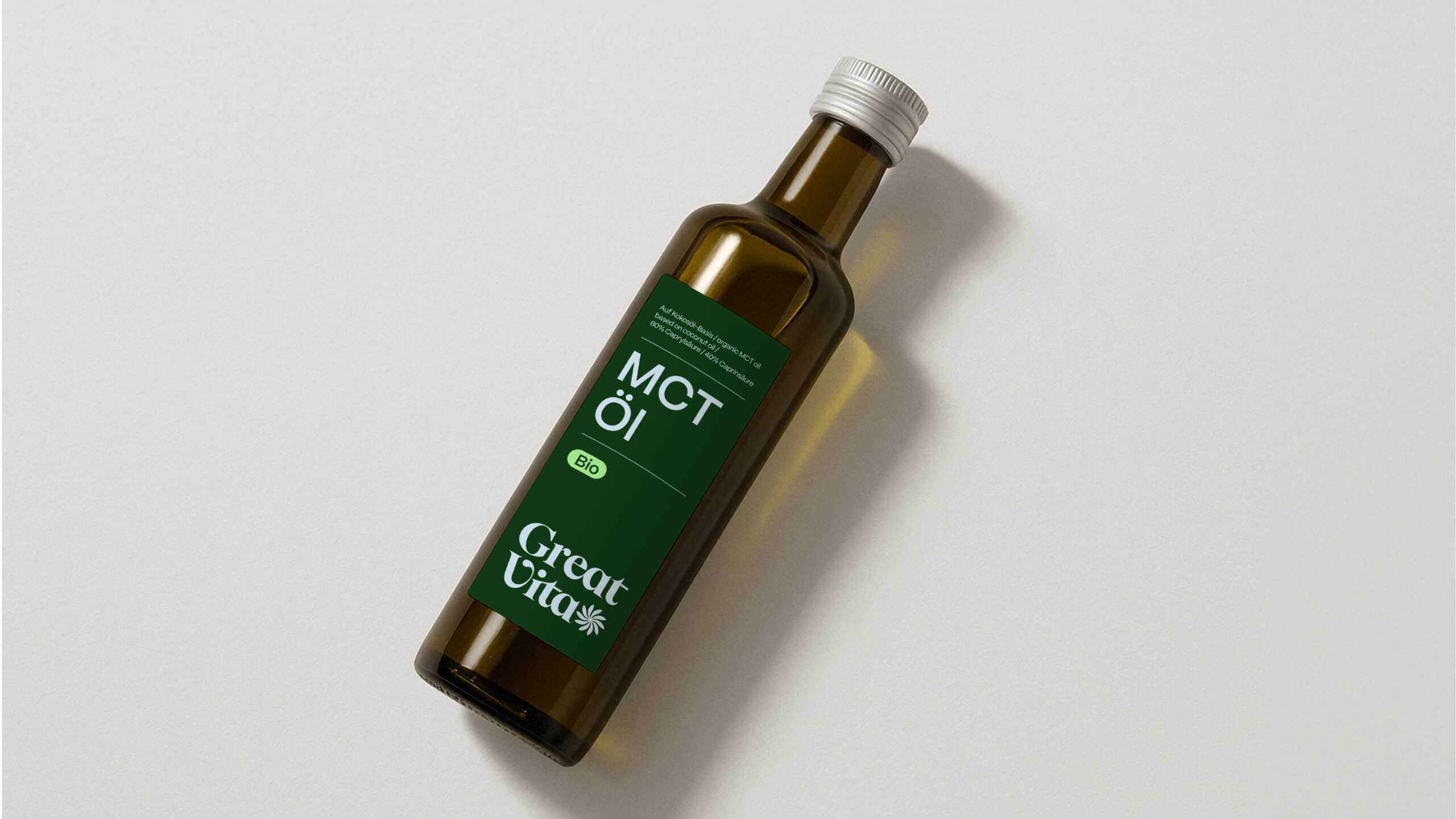
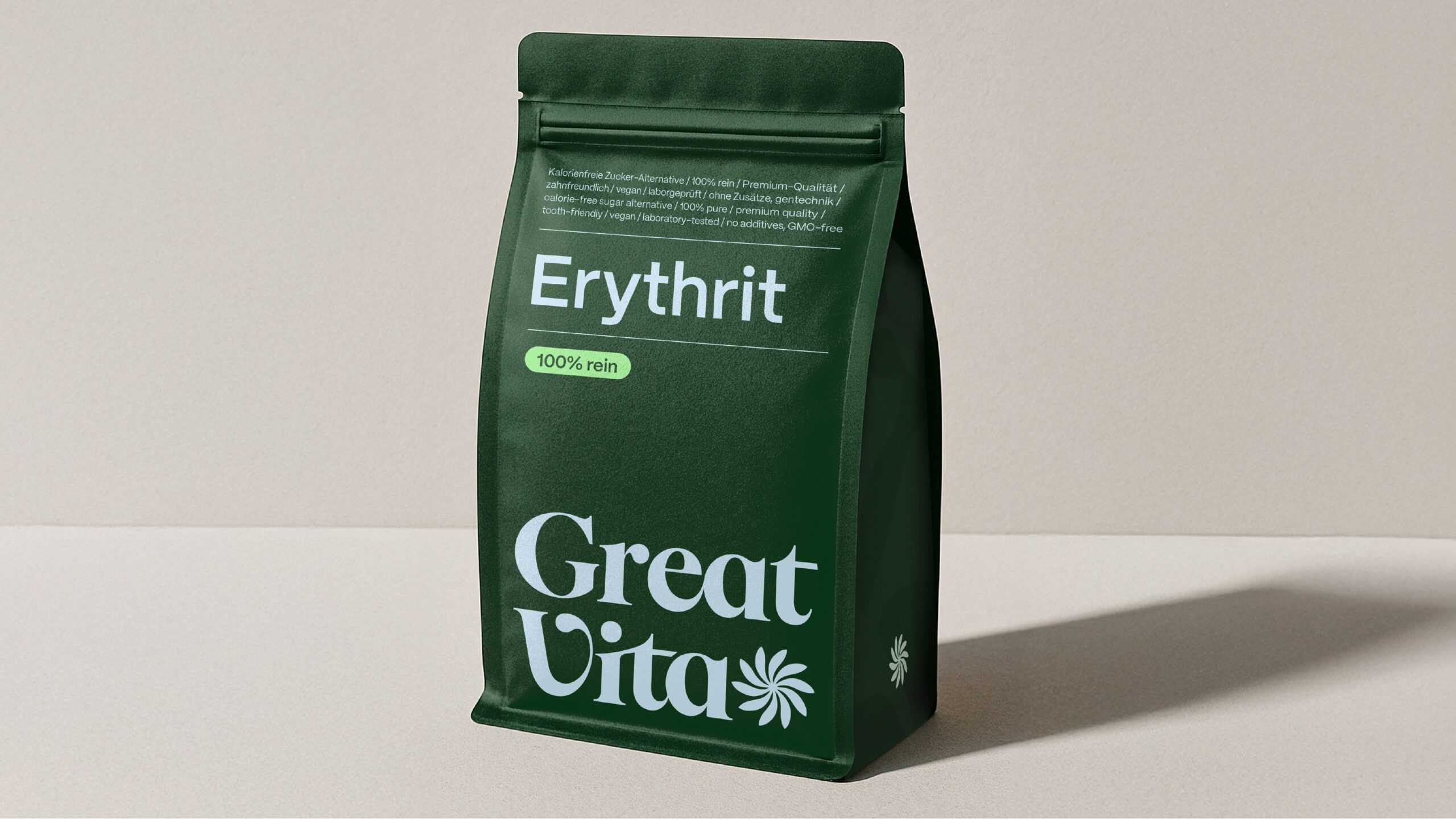
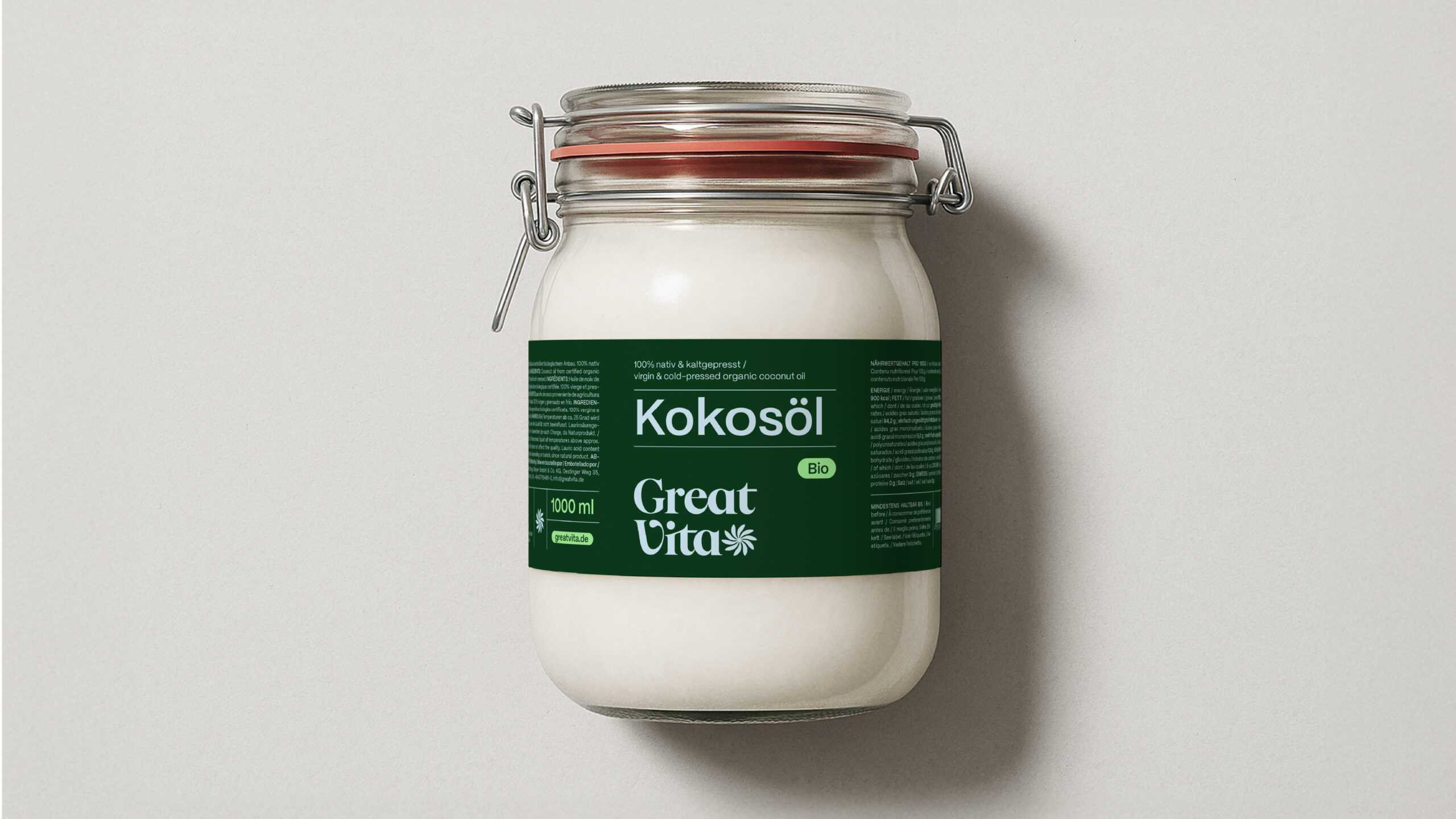
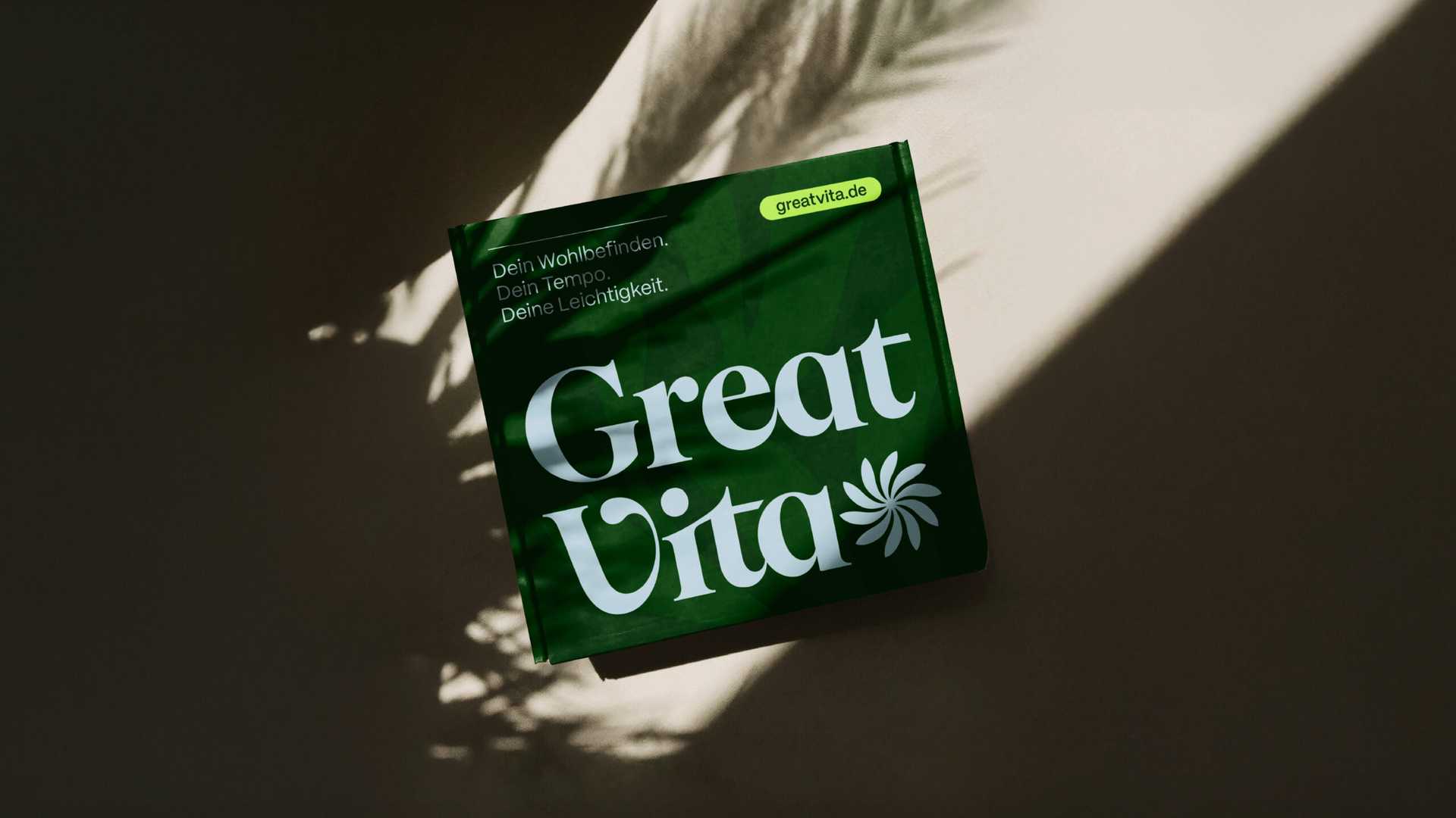
Together with GreatVita, we sharpened the brand positioning and defined a clear story: GreatVita brings lightness to active, healthy living – helping everyone become the best version of themselves at their own pace. This idea became the foundation of a new identity built on clarity, authenticity and quality. At its heart sits a stylised flower – a symbol of growth, lightness and potential. A deep, vibrant green anchors the palette, complemented by fresh shades of lime, light blue and beige to express vitality and balance. Modern, characterful typography radiates trust and confidence, while soft gradients, subtle textures and modular layouts add flexibility and freshness across all formats. Natural imagery, botanical illustrations and hand-drawn icons bring warmth, honesty and a human touch. Generous white space and clear structuring give the brand calm and recognisability across every medium – from packaging and social media to the online store.
The result is a cohesive brand experience that brings GreatVita’s purpose to life and makes healthy living feel simple, natural and inspiring. And so the health-conscious heroes teamed up with the brand-believers to put the vitality back in GreatVita. Now we’re off for a spirulina smoothie.
The clear brand positioning has taken us to the next level. It structures our communication, aligns the team, and gives the brand a distinct voice. The new design makes this precision visible; our brand now appears even clearer and more vibrant.
