Novoky
A fintech that doesn’t feel like a fintech
Case Study
Overview
Our Client
Charging to the aid of online merchants
Starts tend to want to shake up traditional mindsets. Novoky is no exception: Founded by two financial entrepreneurs, the fintech firm uses smart digitals solutions to disrupt how online merchants manage payment disputes and handle chargebacks, so their bottom line stays firmly in the black. The idea is to make the process smoother for both Novoky’s clients and their end customers – who doesn’t prefer plain sailing to choppy seas?
The Challenge
Finding a firm footing in fintech territory
Initially nameless, the startup had to move fast in order to make inroads in the financial industry and secure its own future. That meant targeting prominent online merchants and making plain the disruptive nature of its solutions through a strong visual identity. The first step? Finding a name fit for a financial iconoclast.
Our Solution
Making a name for itself – literally
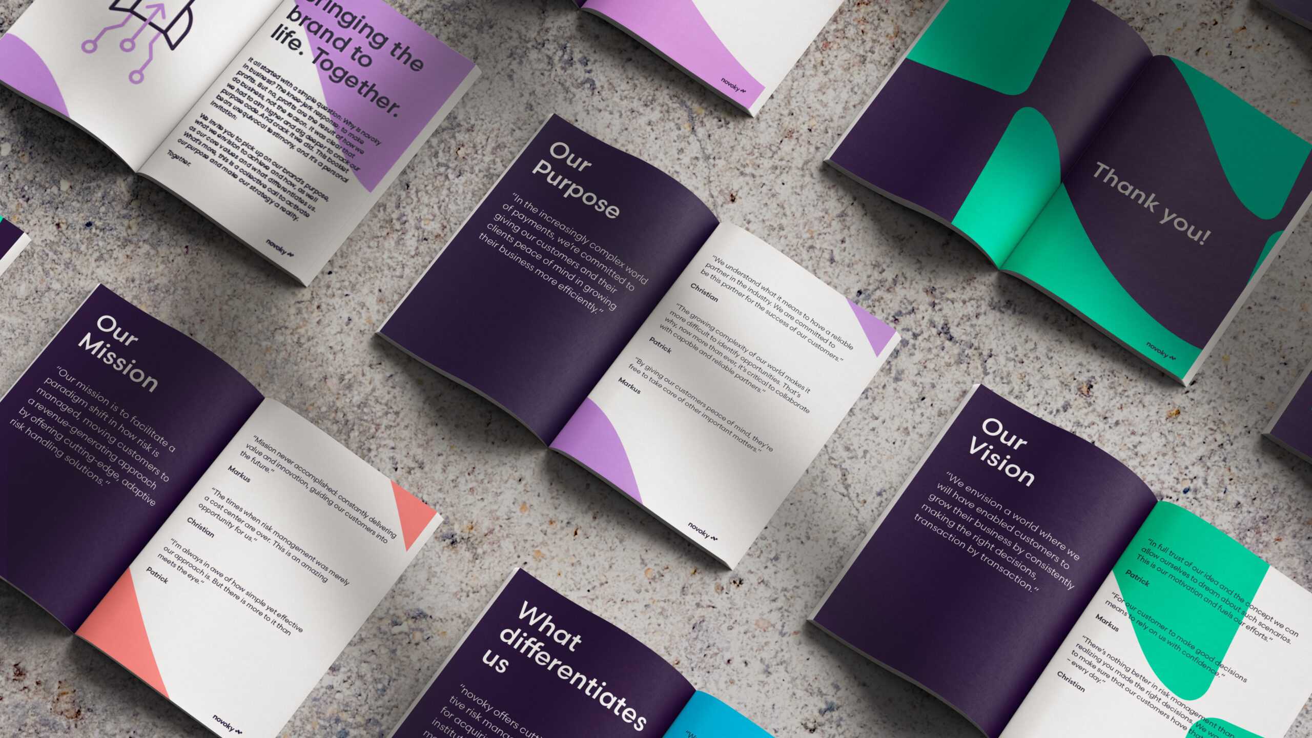
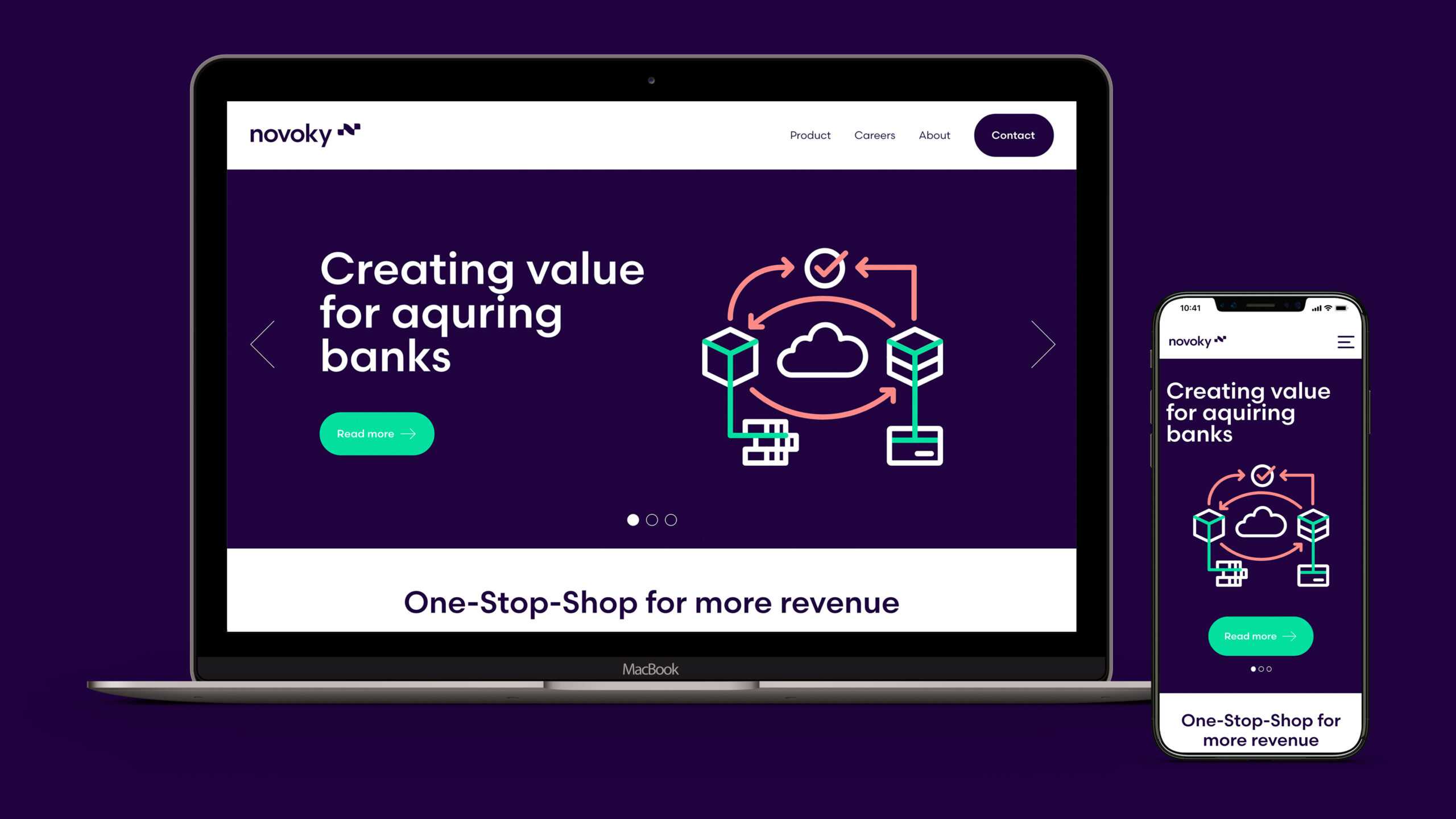
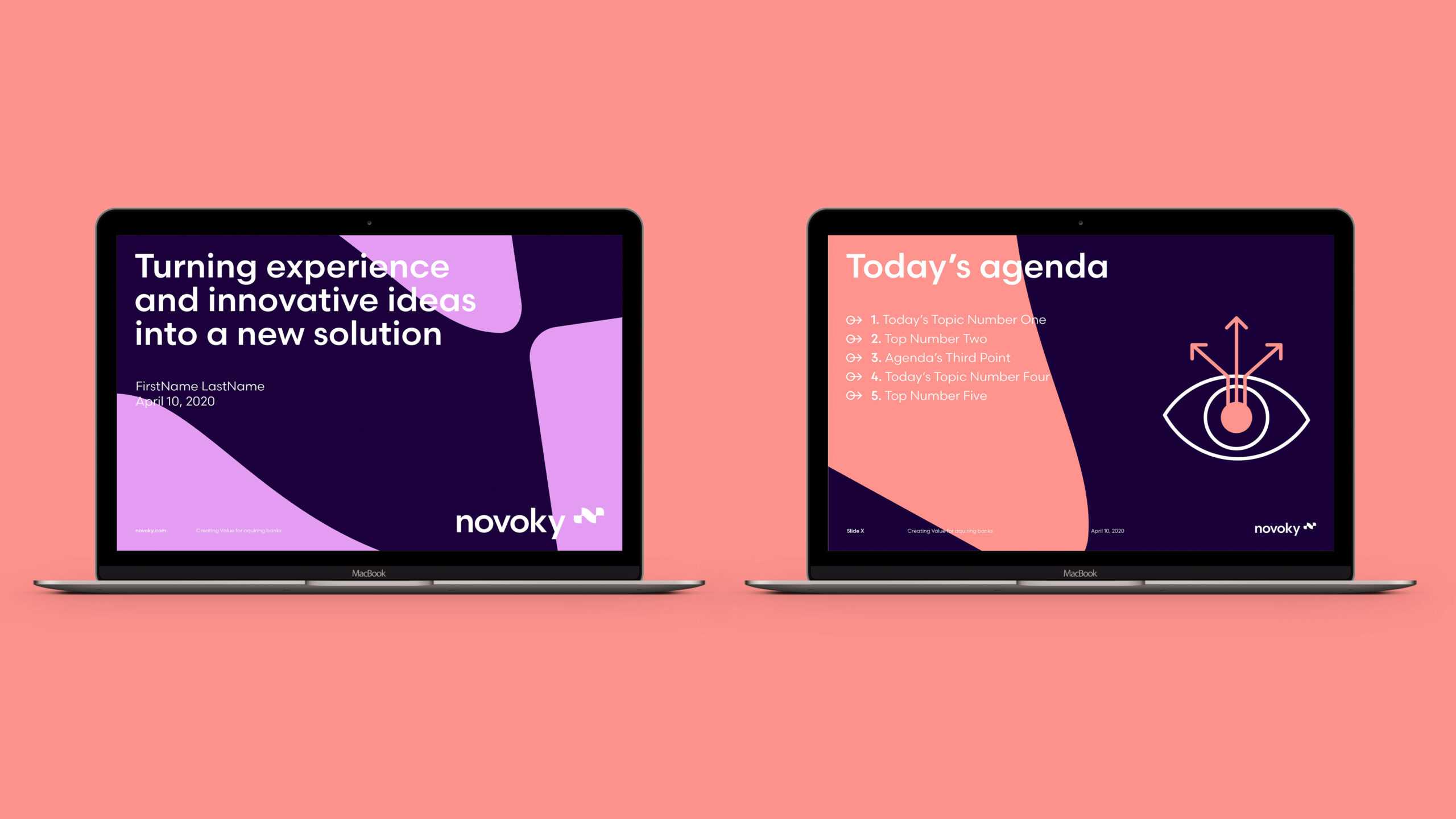
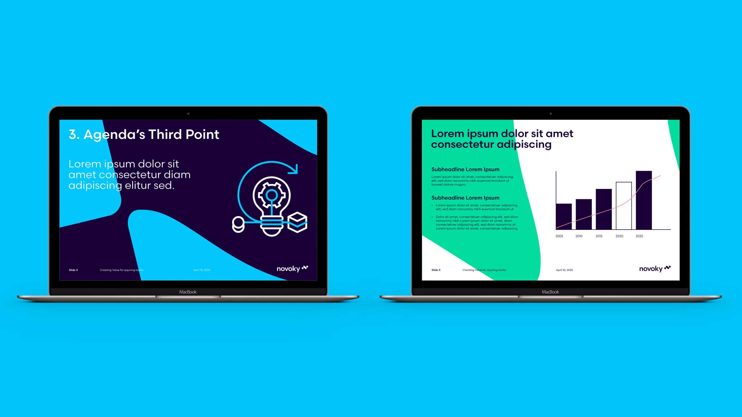
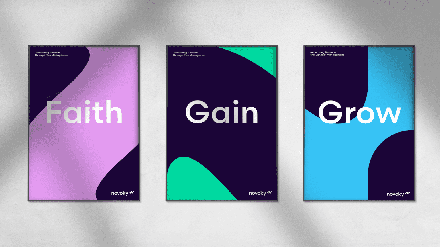
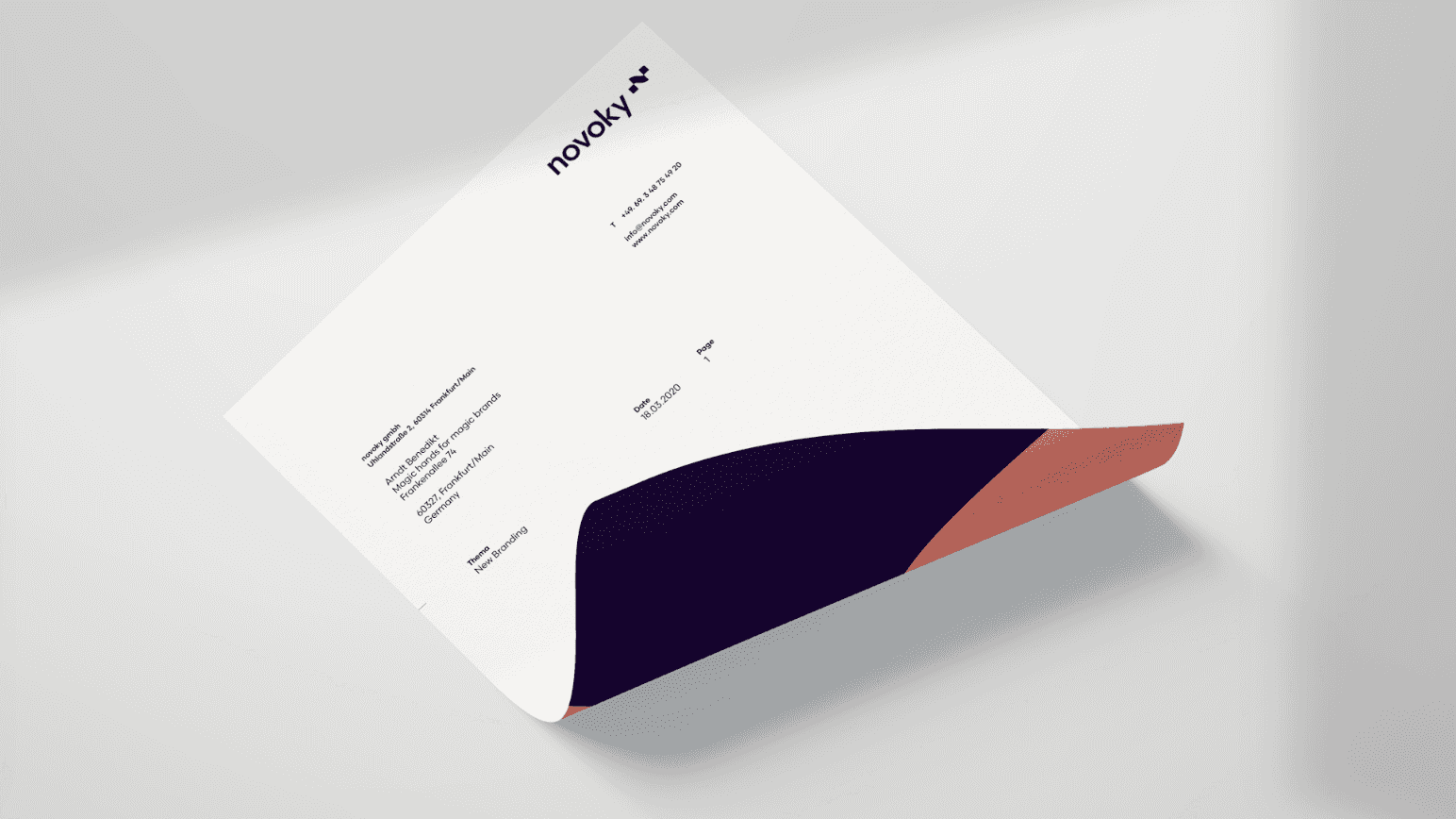
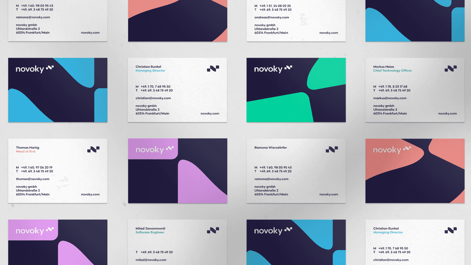
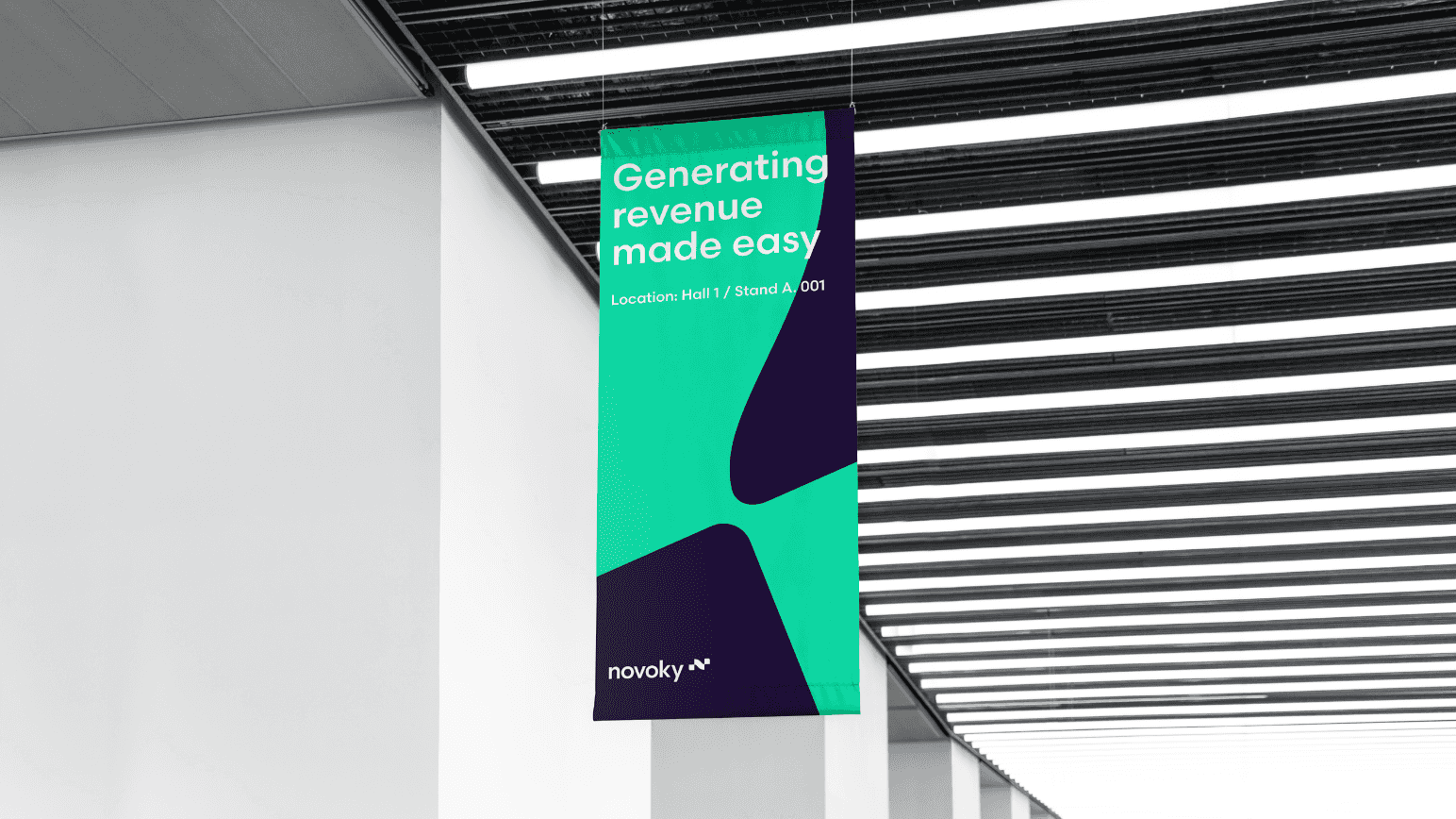
Handling chargebacks and disputes is more complex than putting coins in a piggybank, which is why we conducted workshops with the founders to understand the concepts and distil the future brand’ essence: a disruptive force that unlocks financial value for its clients. Next up: the name. It had to be vibrant and veer from the script, which led us to NOVOKY. It combines the Latin for ‘new beginning’ with the idea of a ‘key’ to unlock financial value. We then channelled our energy into Novoky’s corporate design, eschewing the stuffy pantone blue of its counterparts in favour of a bright, four-colour palette complemented by elaborate, yet crystal-clear illustrations. This was part of a wider design hierarchy that runs the gamut from animated forms to static suggestions. The final stage was to compile an intuitive style guide on how to roll out the corporate design system online and offline – from trade fairs to Twitter.
We’ll admit it: We rather enjoyed being a disruptive influence for Novoky. If only our teachers could see us now.
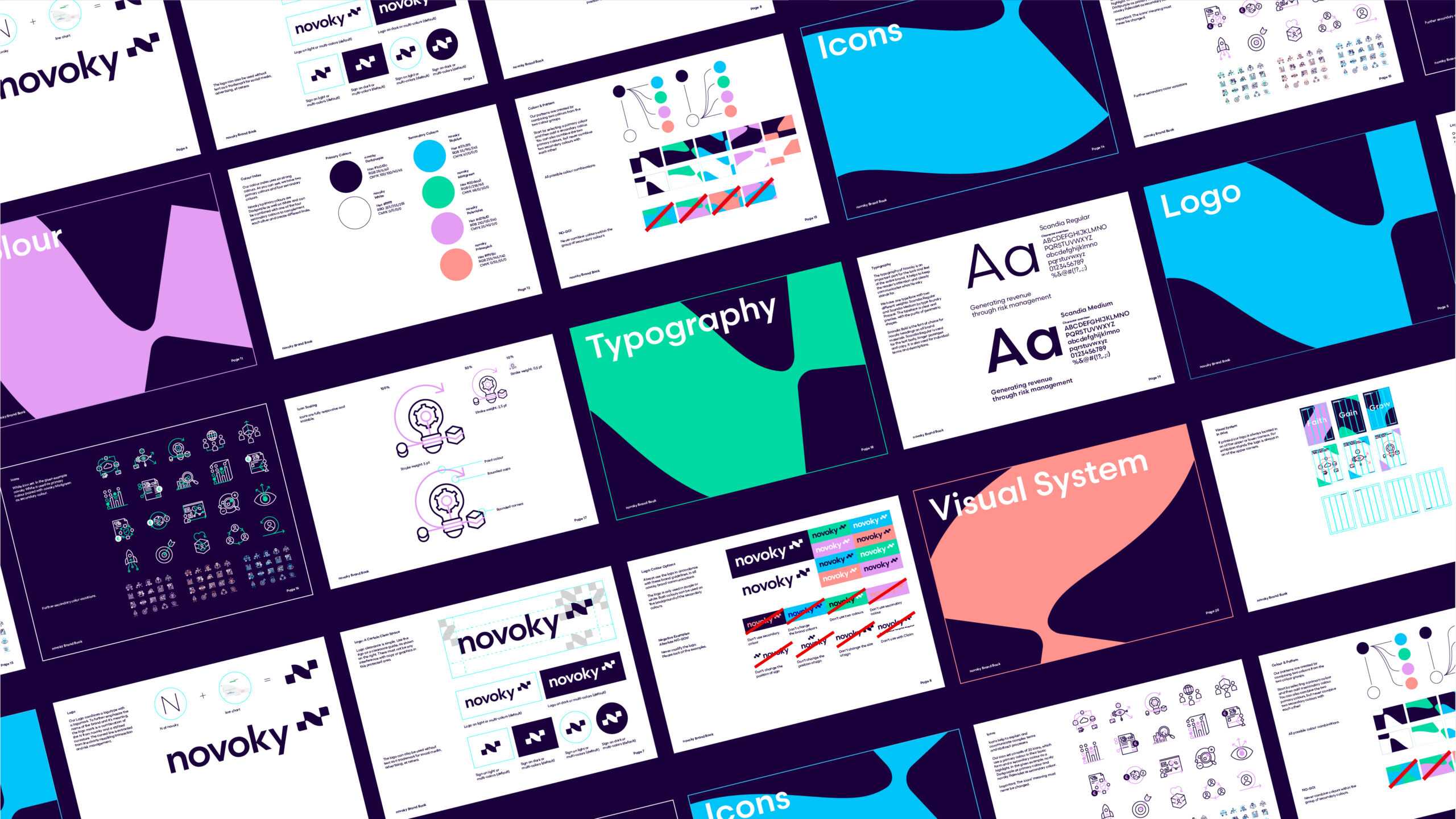
Fintechs are in danger of looking dull, which is why we sought something stylish from Arndt Benedikt. They have managed to capture the dynamics of this market in a modern and recognizable design.
