Podstars by OMR
Tuning in to the right brand frequency

Case Study
Overview
Our Client
Putting brands on the air
Podcasts have long been big business, but Podstars was one of the first to use the format to make businesses bigger. As an offshoot of the digital heavyweight OMR, the 90-strong agency is a full-service provider of podcasts that give brands a voice worth listening to in the audio arena. From conceptualization to series production and marketing, Podstars has already built an impeccable reputation for delivering a quality product – even getting sports and TV personalities to feature on the shows it produces – and is redefining the world of podcasting in Germany and beyond.
The Challenge
A member of the family with its own identity
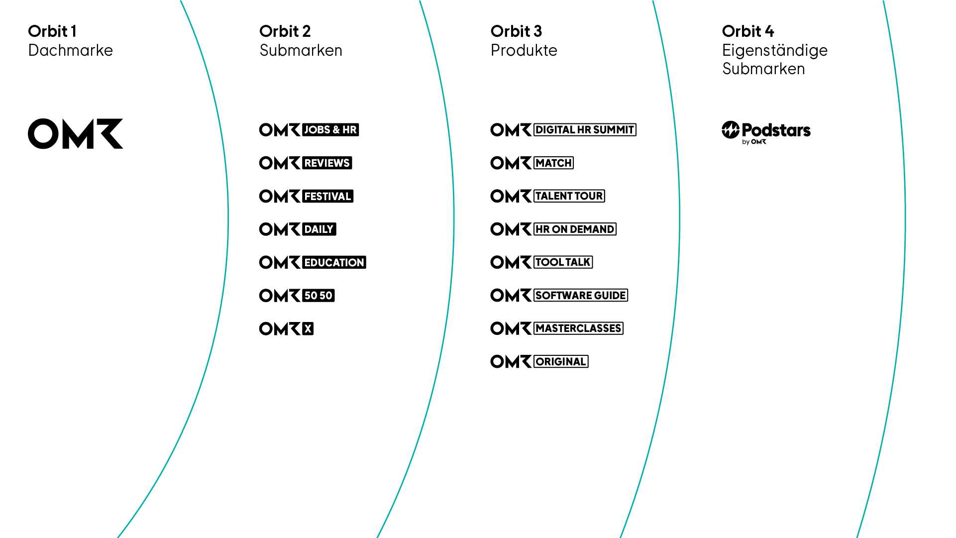
While the USP was strong, Podstars was having a slight identity crisis: its look & feel was too closely connected to its parent brand, OMR, leaving the podcasting specialist feeling like a studio sidekick rather than the main event. What it needed was a character distinctive enough to be instantly recognizable as Podstars, yet one that would fit seamlessly into the wider world of OMR. The design also needed to be used across different formats (website, social media, streaming, etc.).
Our Solution
Getting on the right wavelength
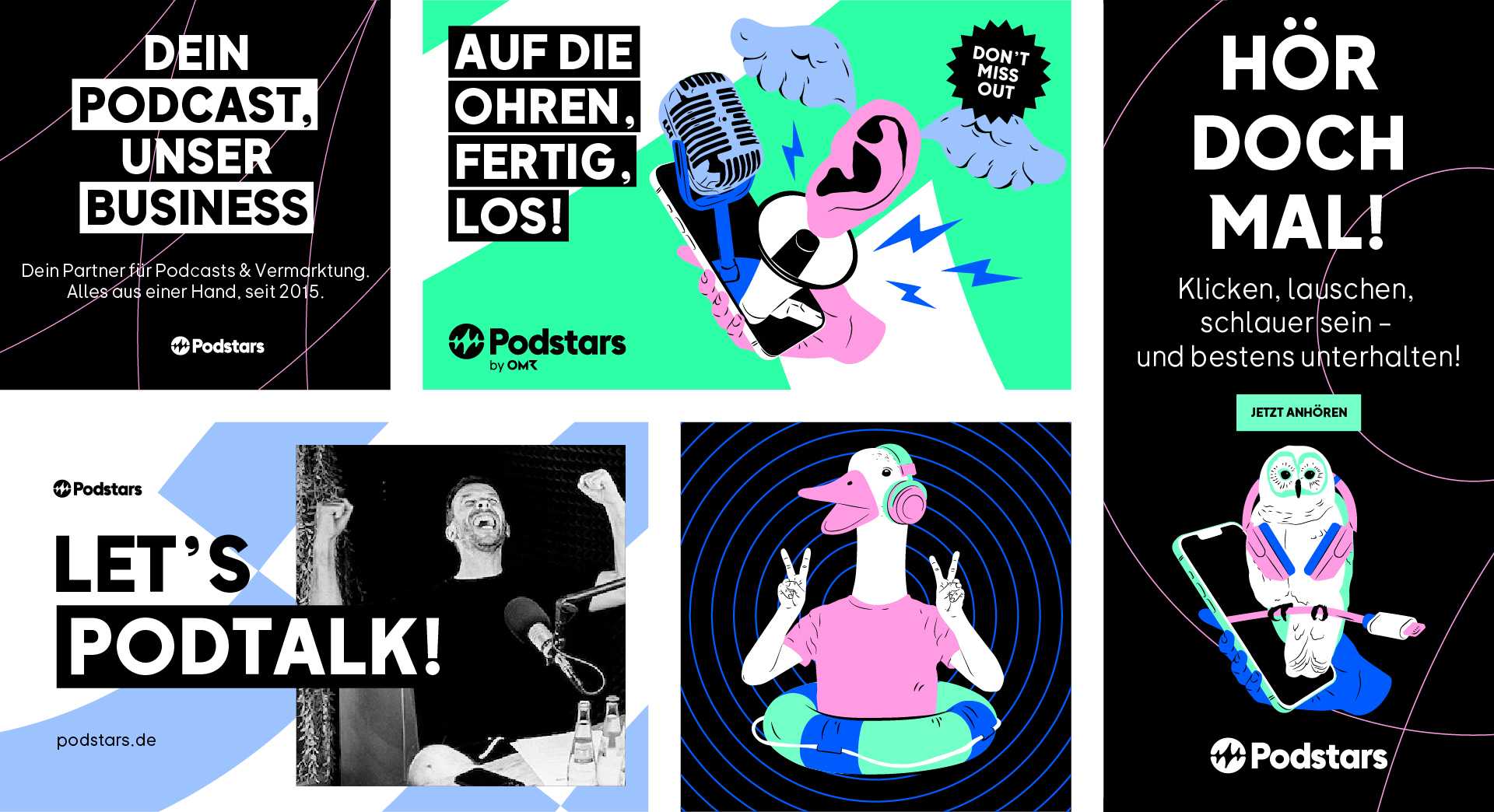
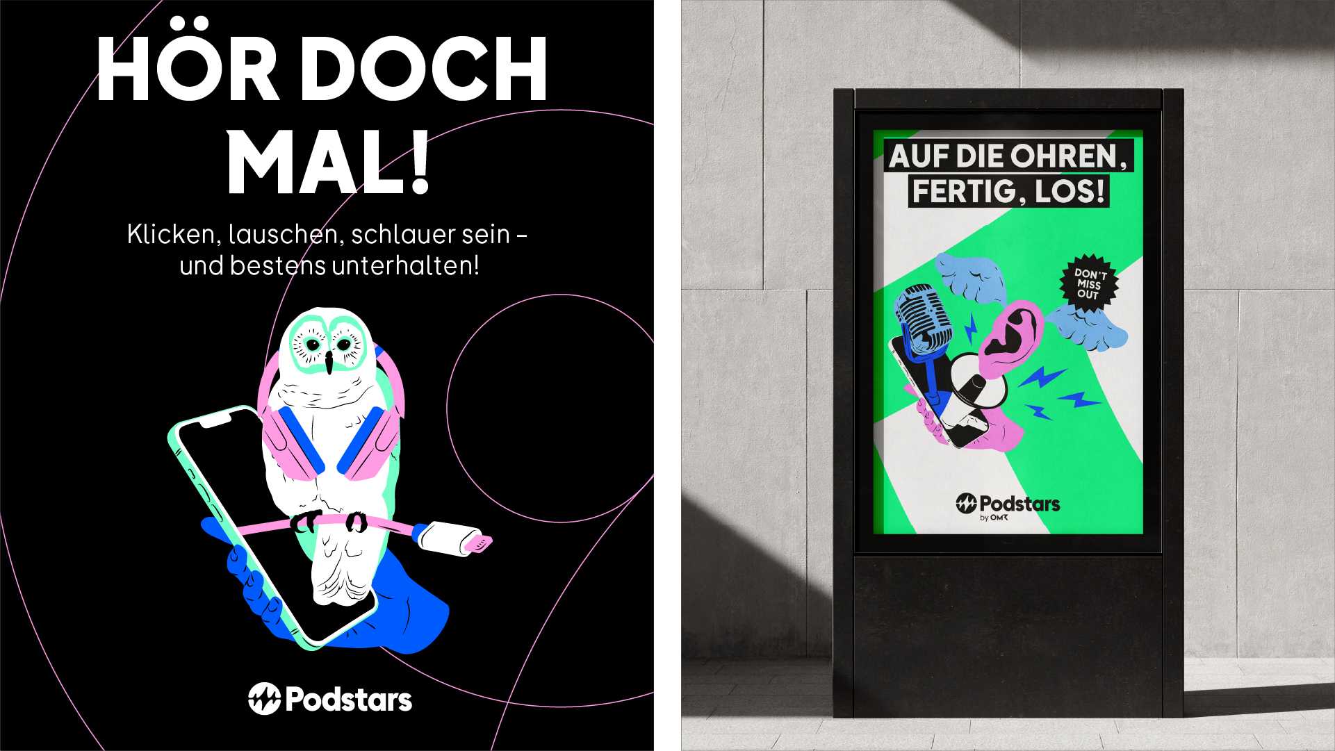
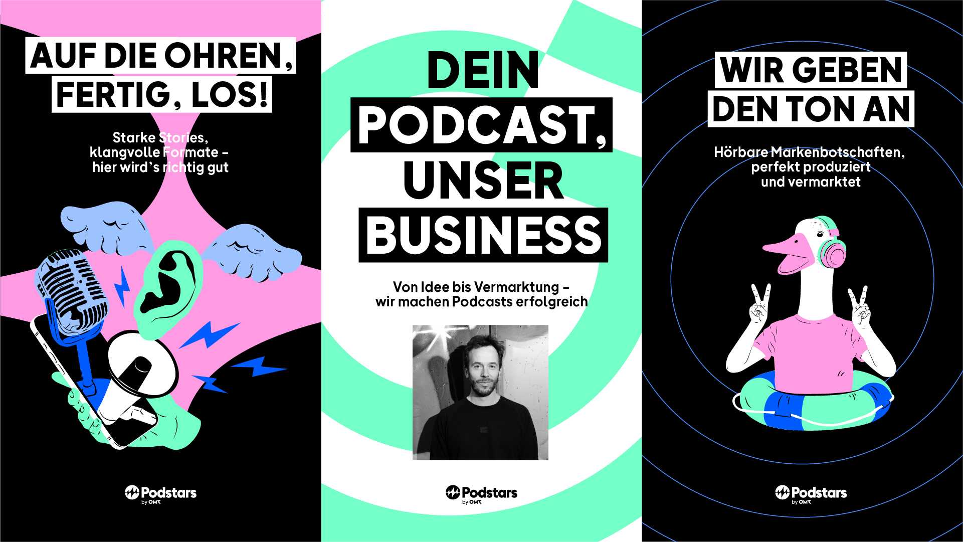
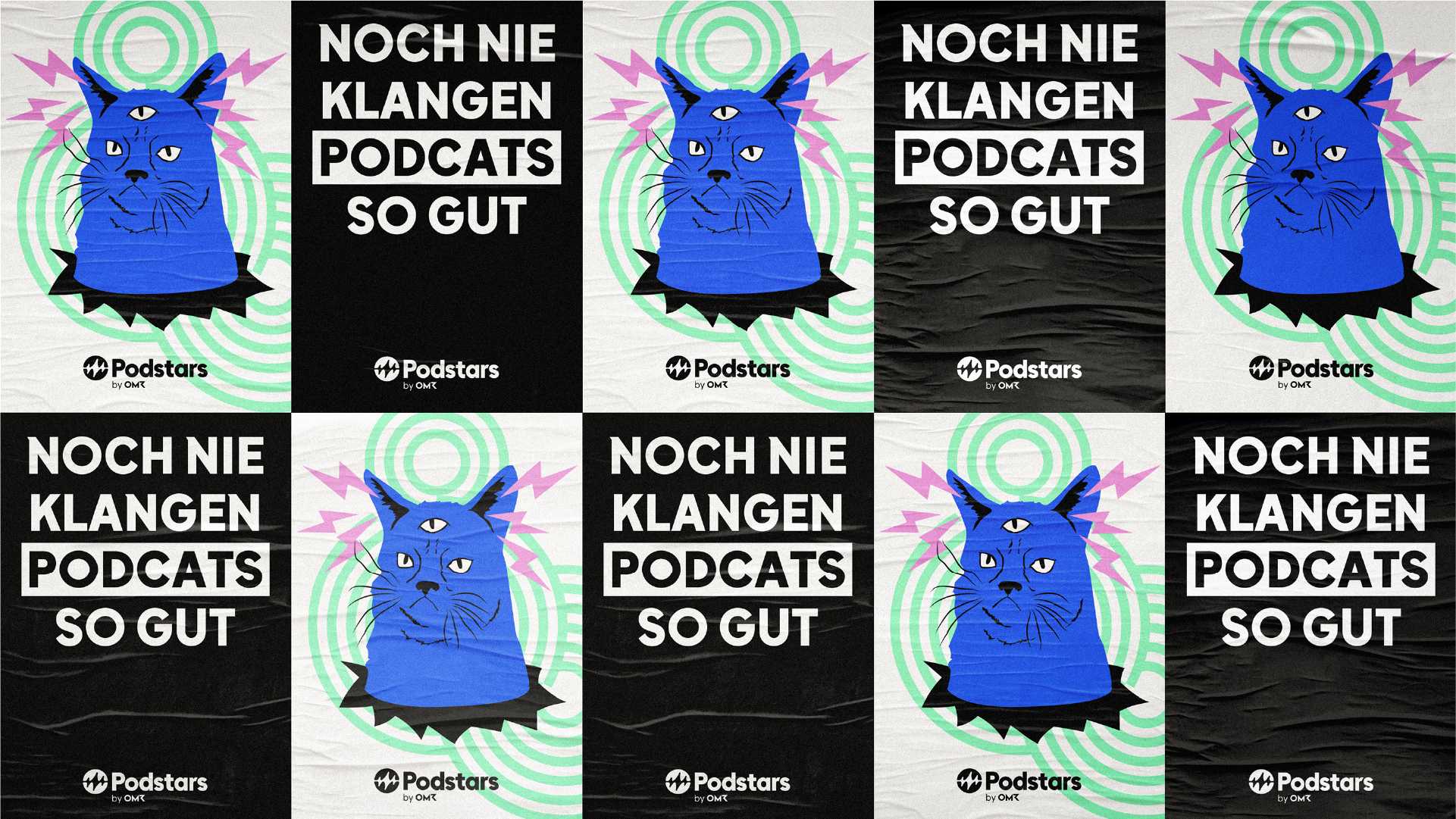
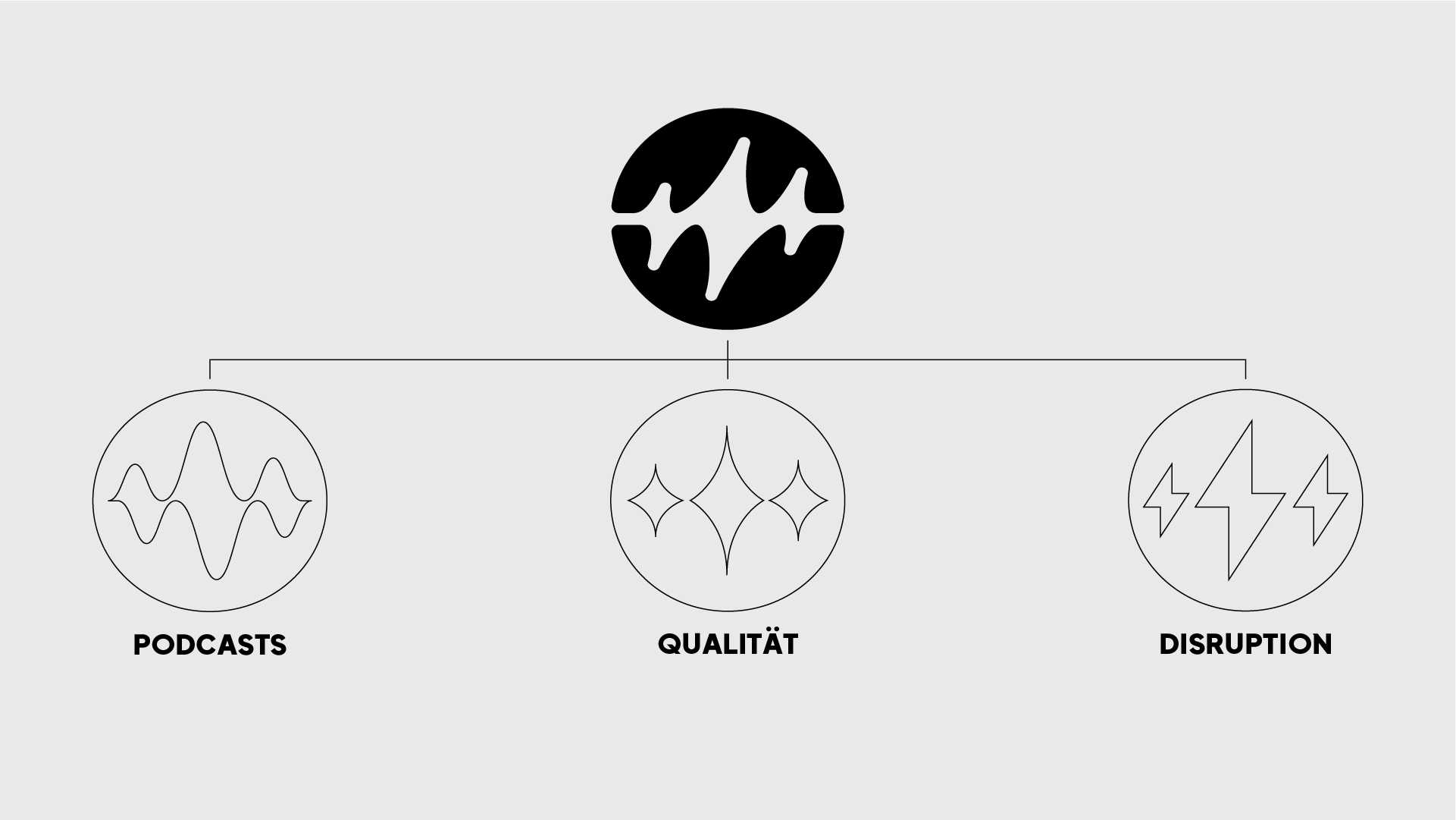
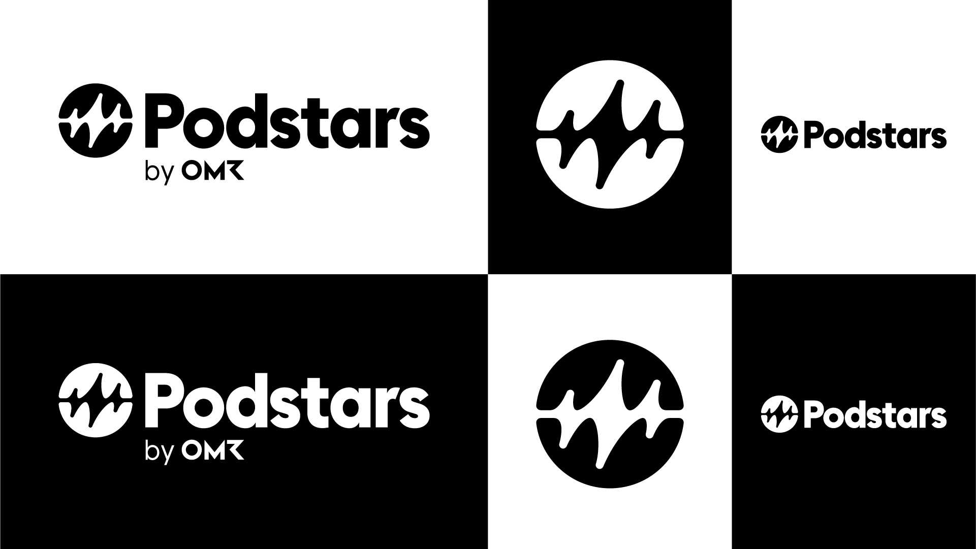
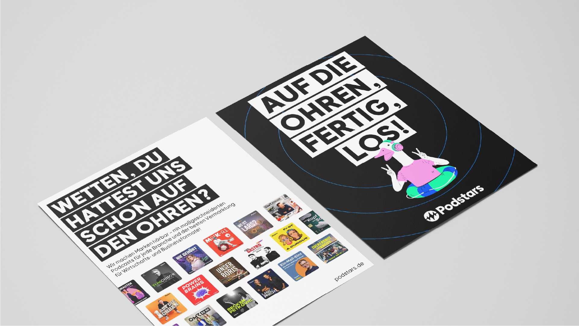
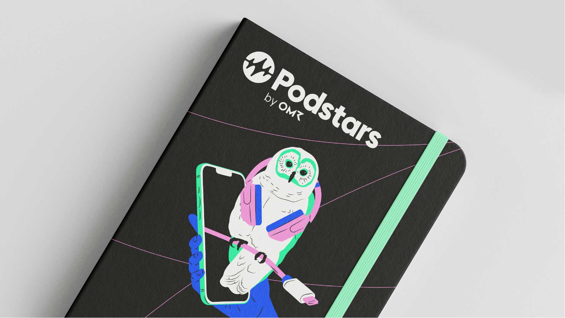
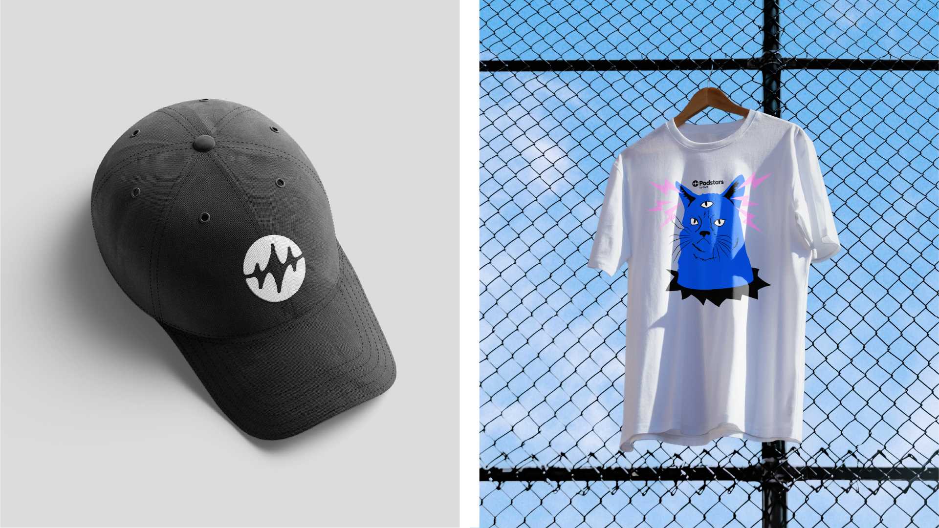
Working closely with our by now familiar OMR counterparts, we fleshed out a redesign proposal that would set Podstars apart as a 360° podcast agency while still placing it firmly within OMR’s digital landscape. Step one was the logo: we drafted a wordmark in OMR Sans typography as a nod to the parent company, but augmented it with a stylized soundwave surrounded by a circle to serve as a visual shorthand for Podstars’ market niche. It encompasses three philosophies: a wave to indicate the power of brand communication, stars to signify quality, and lightning bolts in recognition of the agency’s disruptive spirit. Step two was to settle on a color palette: we opted for a classic black/white foundation that would send out a serious tone and dovetail with the OMR color system, and added illustrative elements to take the brand’s audio DNA into the visual realm – where it can be rolled out across online and offline channels with ease. We turned to OMR once more for the design and layout guidelines, yet spun the creative dial just enough to tune in to Podstars’ own frequency. The result: an instantly recognizable brand with a voice that cuts sonorously through the background noise while declaring its allegiance to the house of OMR.
Podstars is now well positioned to further expand its influence in the podcasting world and broadcast a story of success. Arndt Benedikt signing off again until next time.
We are thrilled with the collaboration and the results of the new Podstars brand identity and our new visual appearance by Arndt Benedikt. The design is highly recognizable and perfectly reflects what Podstars stands for: high-quality marketing and production of podcasts and podcast media. We would particularly like to emphasize the great and extremely professional cooperation with the Arndt Benedikt team – efficient, creative and at eye level.
