SV98
Gilding the lily in the digital age


Case Study
Overview
Our Client
124 years of history, 7,600 members and a whole lot of sweat
With football, basketball, futsal, judo, table tennis and even hiking on its books, there isn’t much that SV Darmstadt 98 doesn’t know about sport. Founded—as the name indicates—back in 1898, the Lilies are one of the strongest teams in the Bundesliga’s second tier, and even competed in its premier division from 2015-2017.
The Challenge
Too many branches with no clear root
With a club as old and varied in focus as SV98, it stands to reason that the management was finding it hard to pin down a consistent identity both in the stands and online. What SV98 needed above all? A unique visual cue to make it stand out and cement the name in the minds of sports fans up and down the land—and beyond.
Our Solution
History and innovation, a top strike partnership
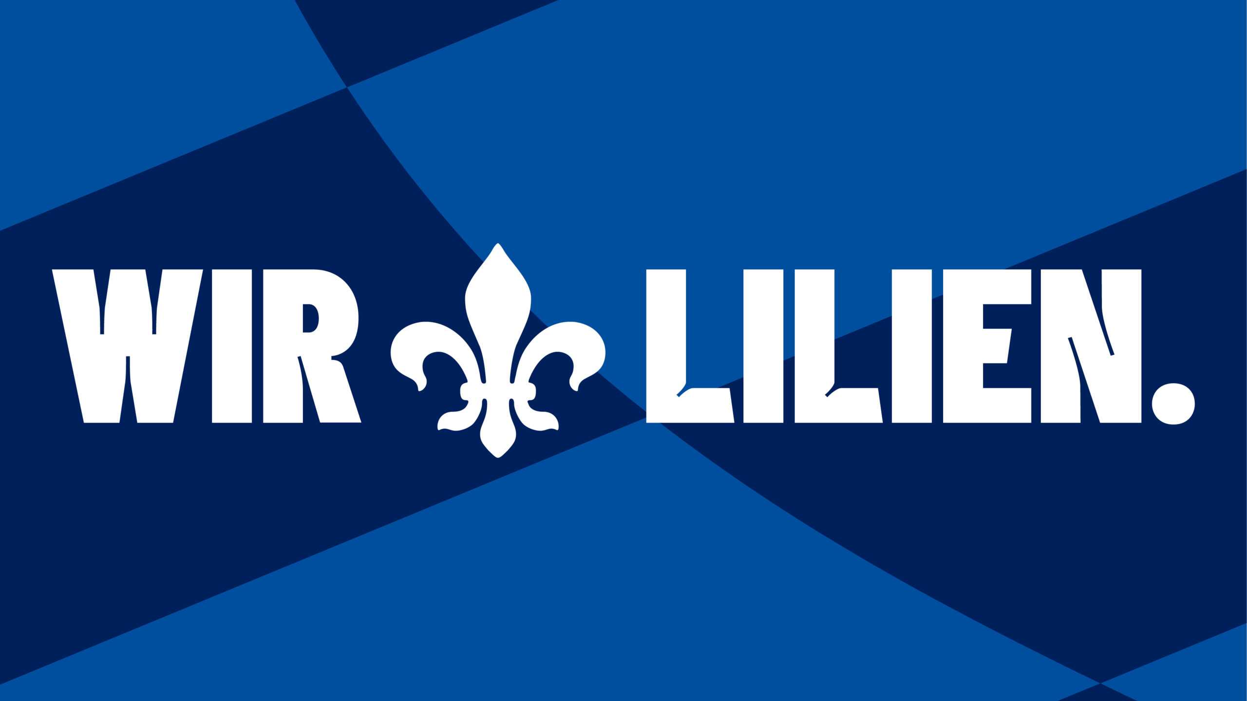
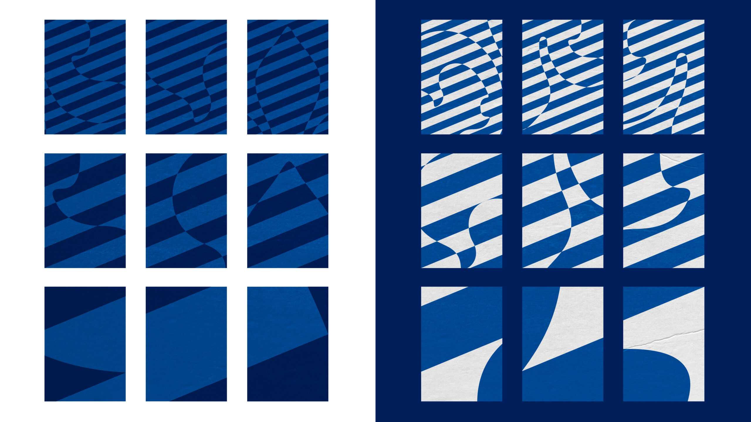
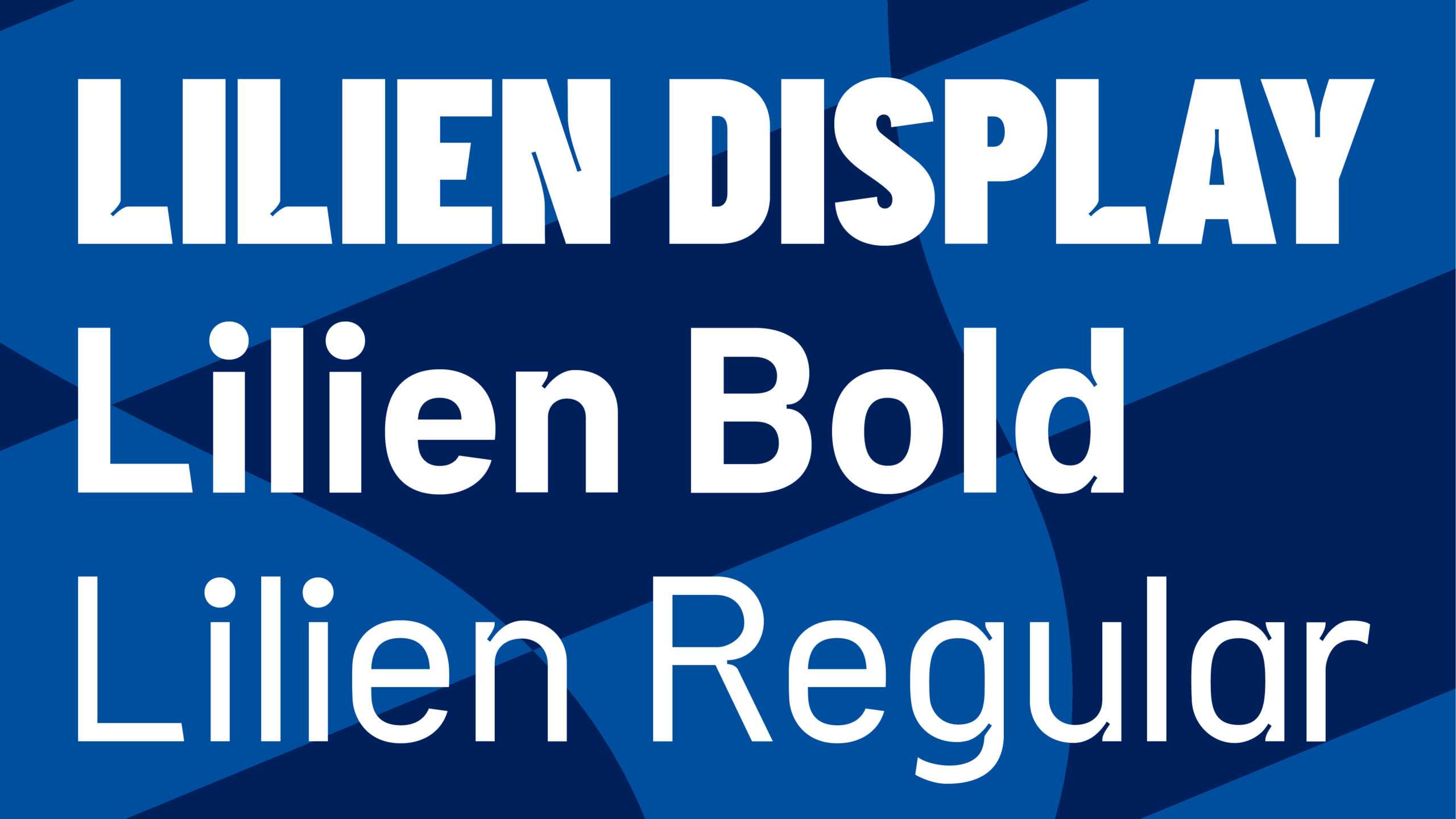
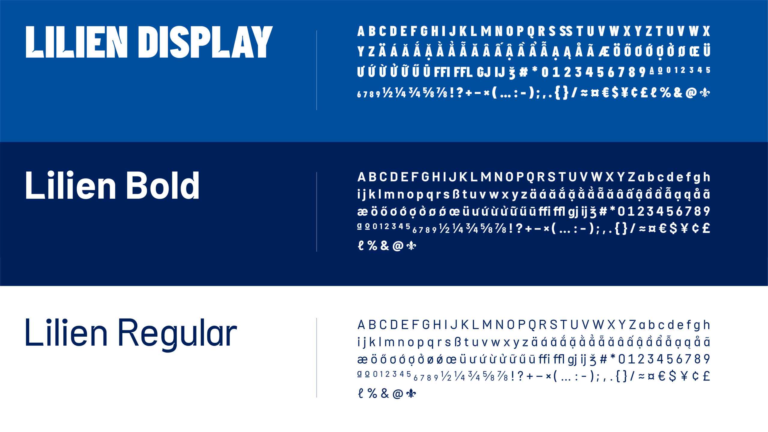
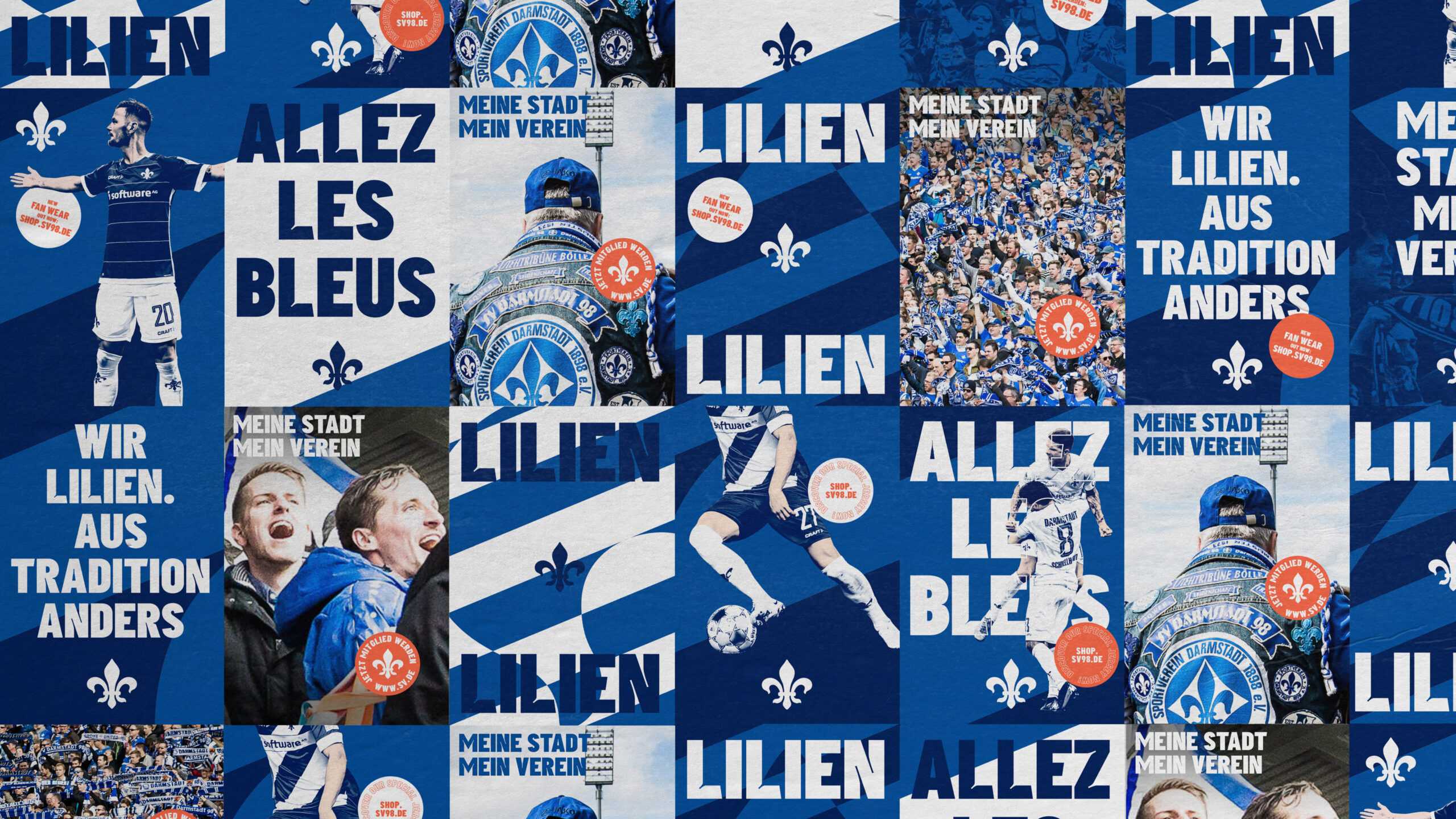
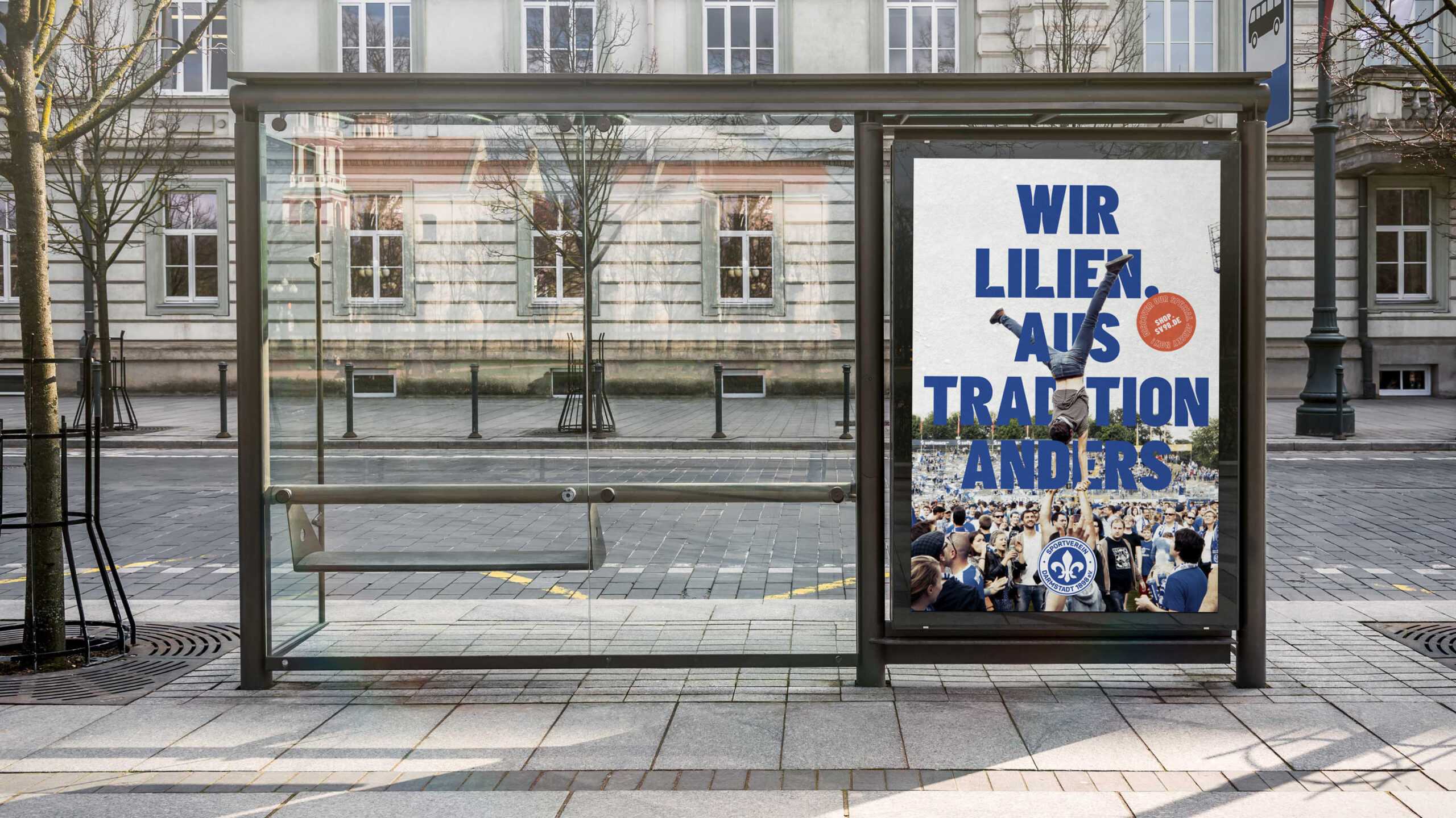
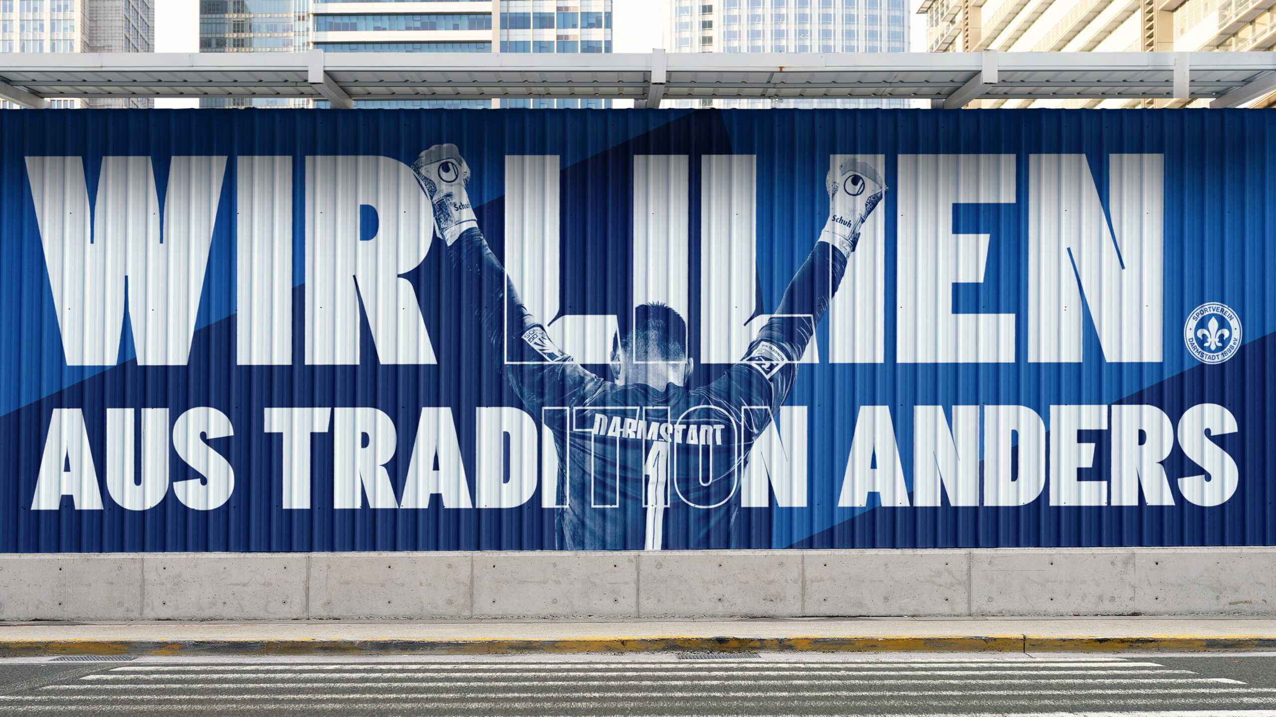
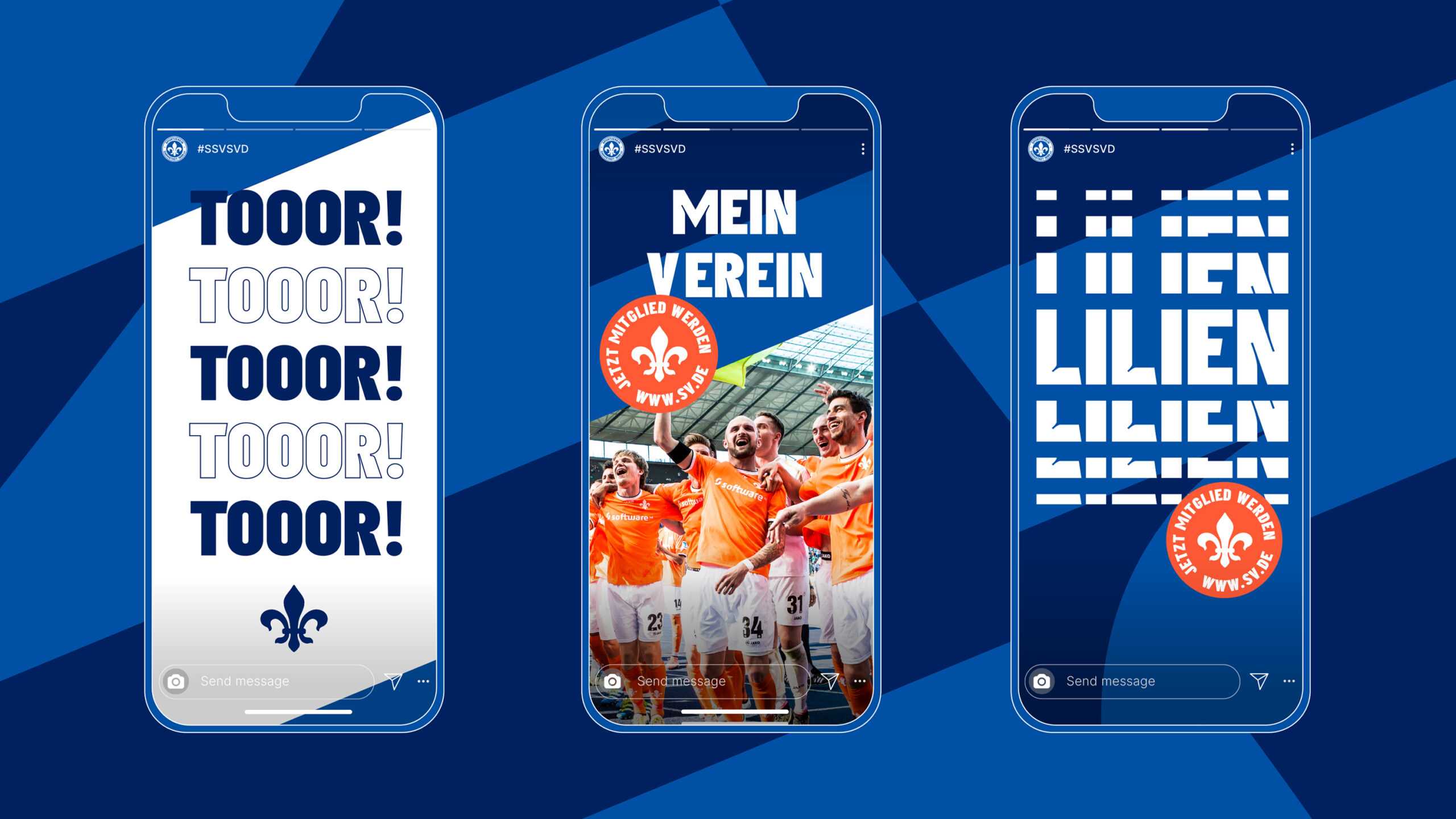
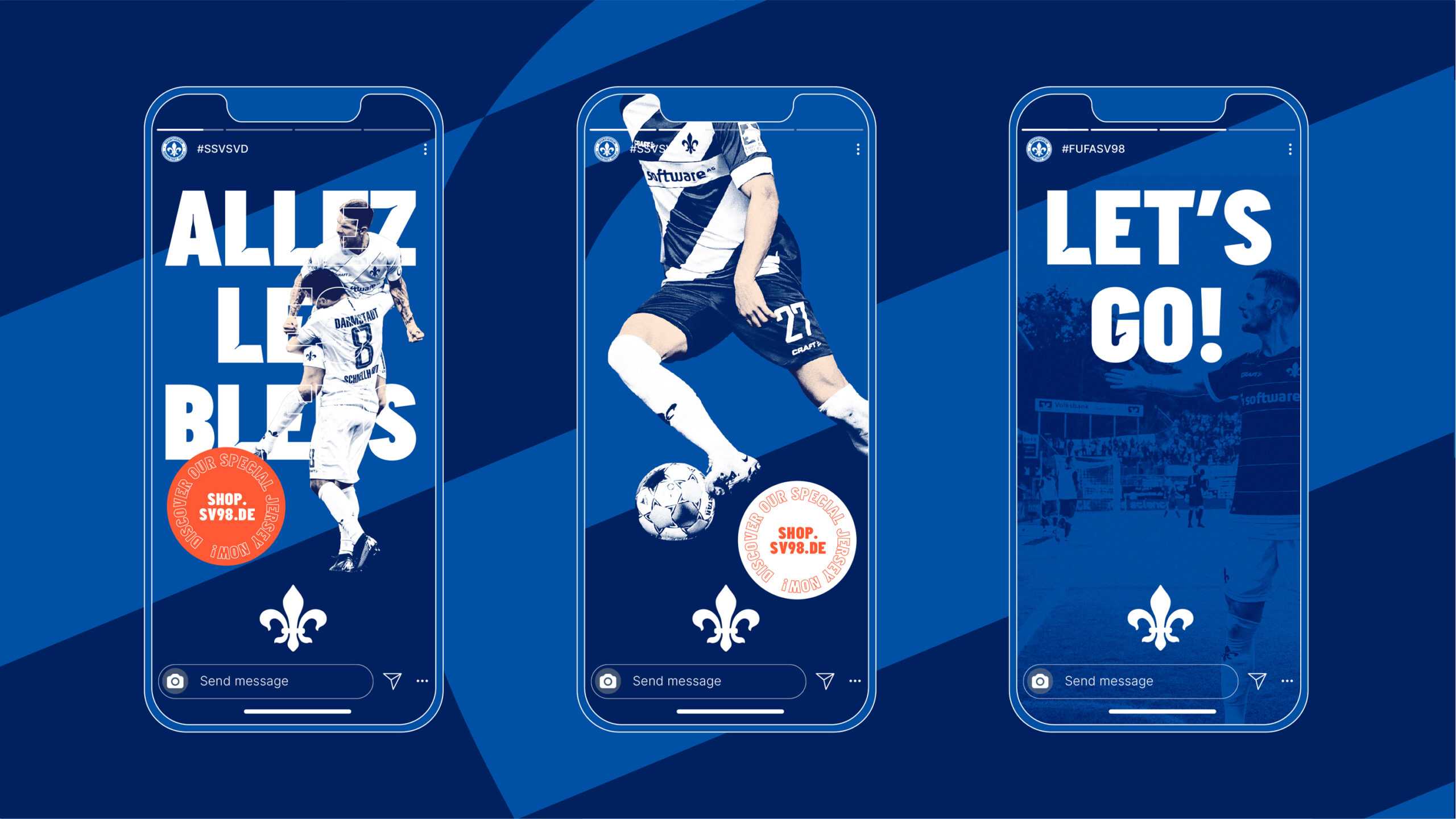
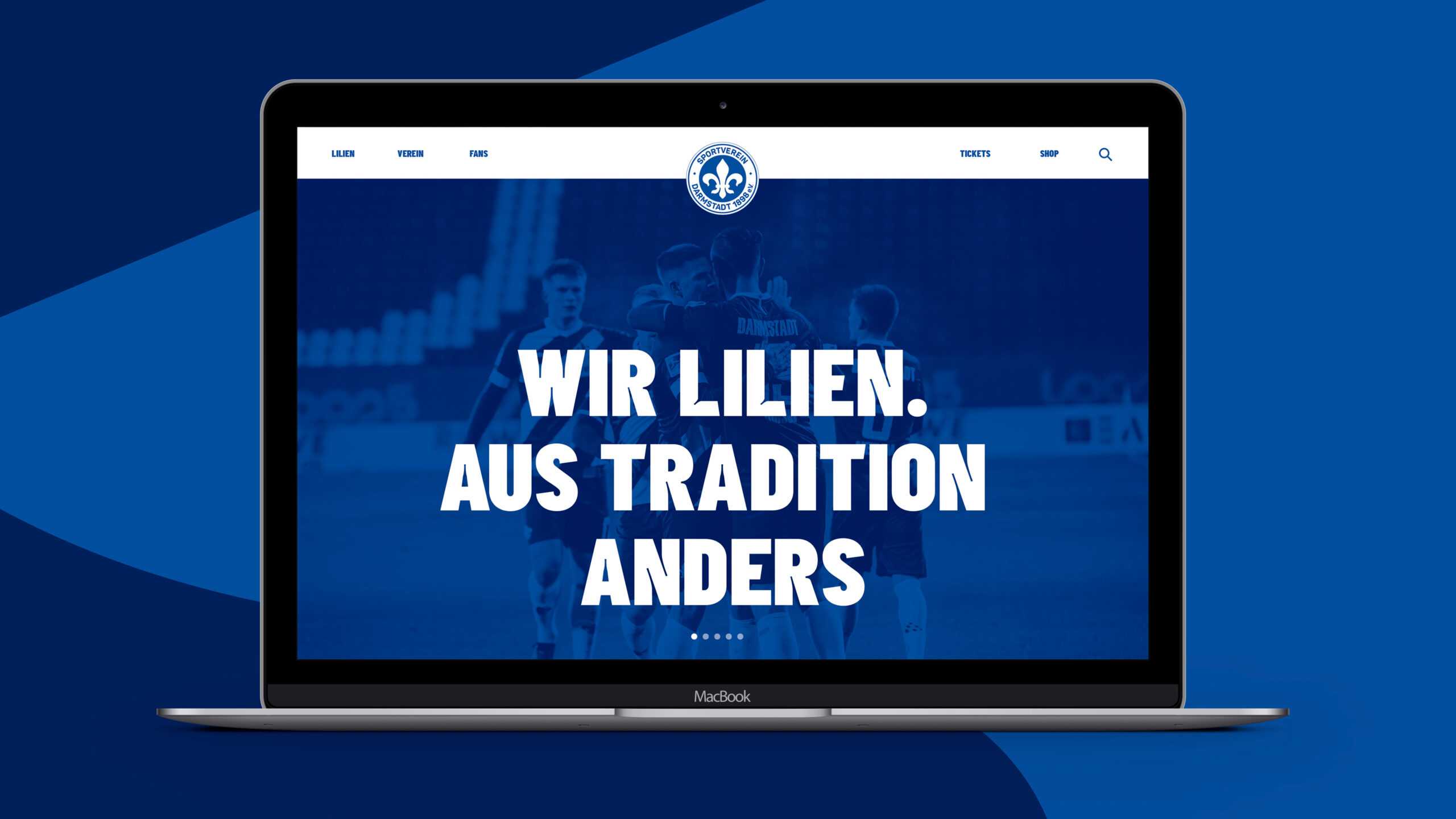
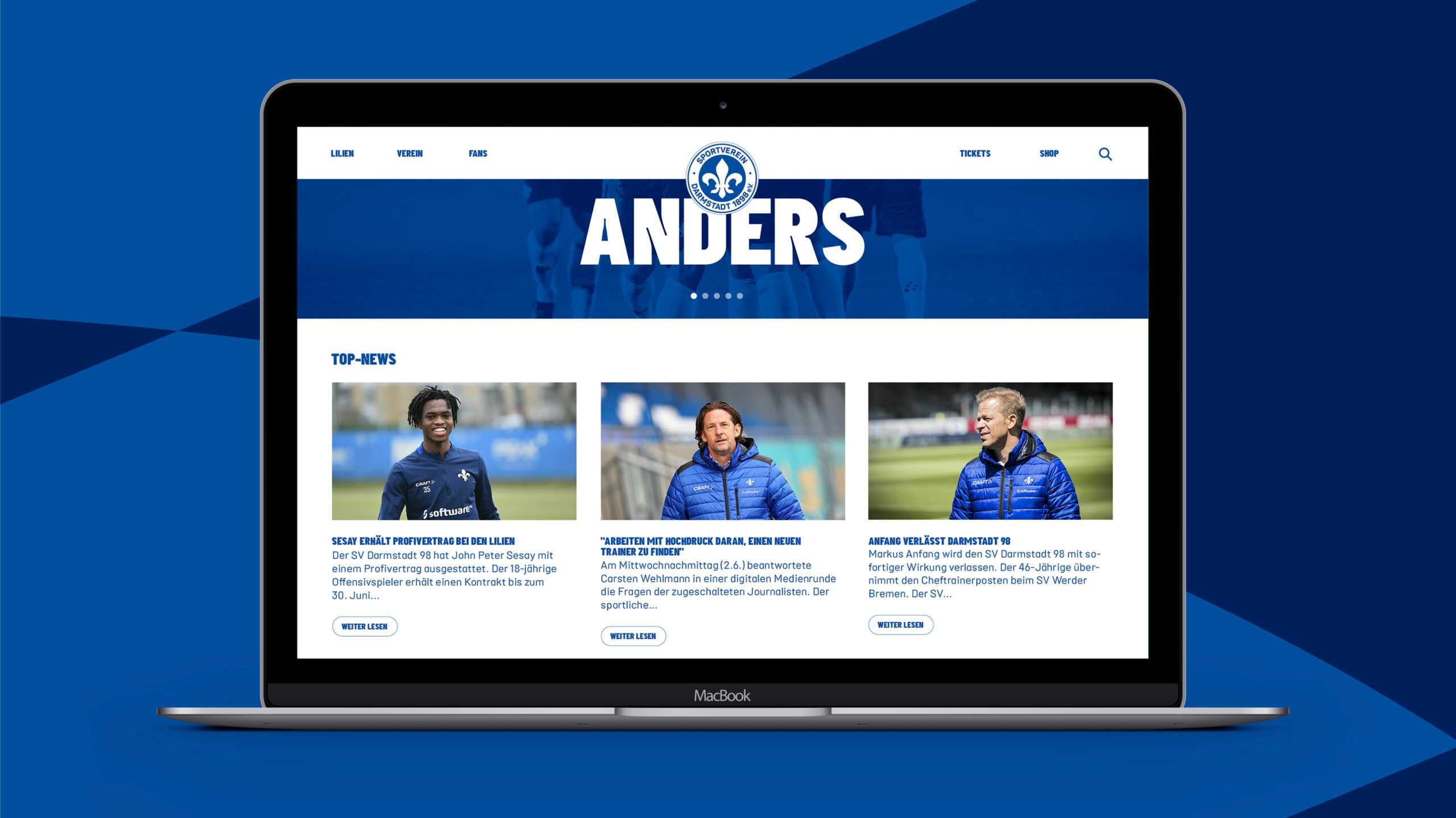
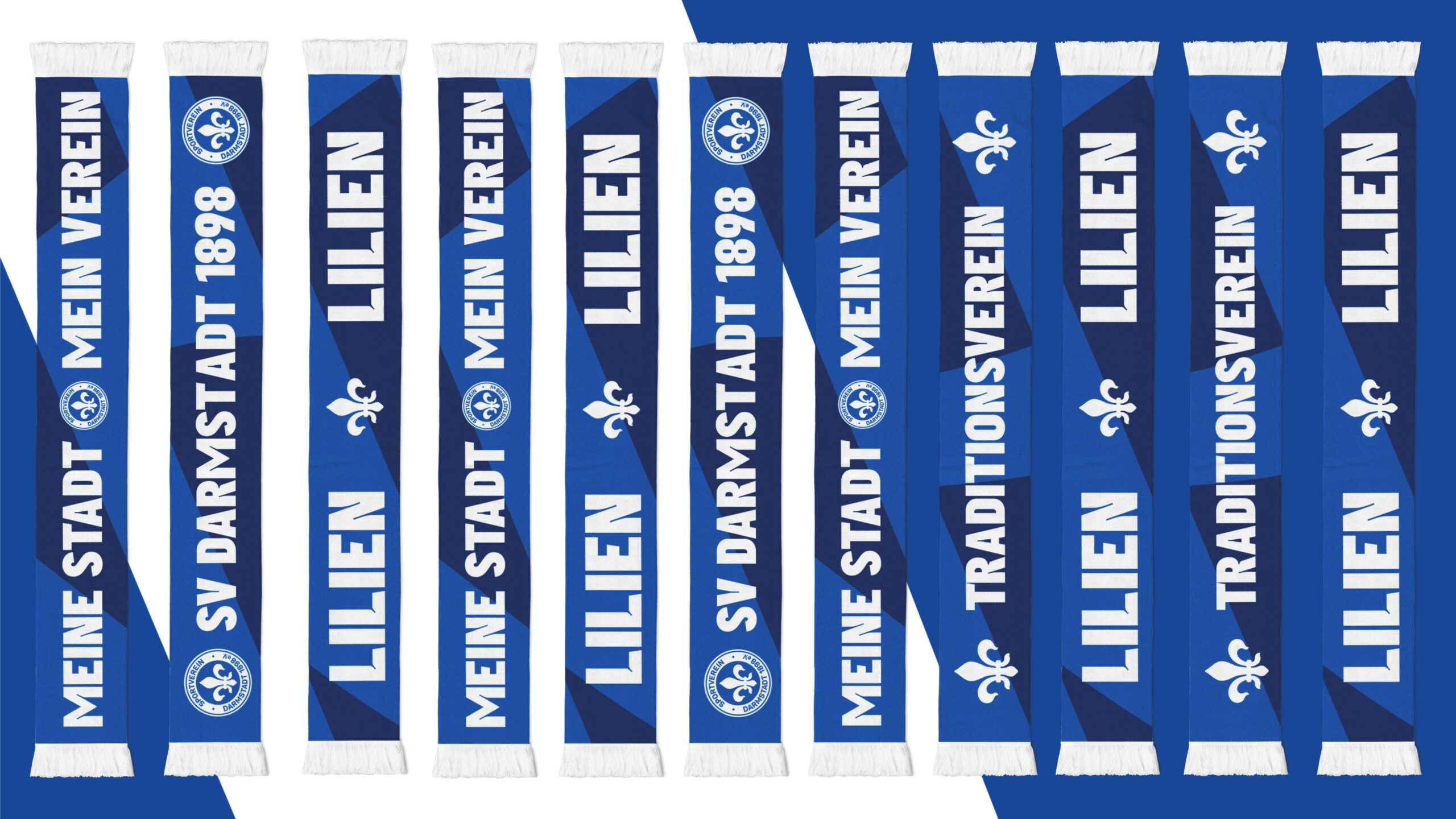
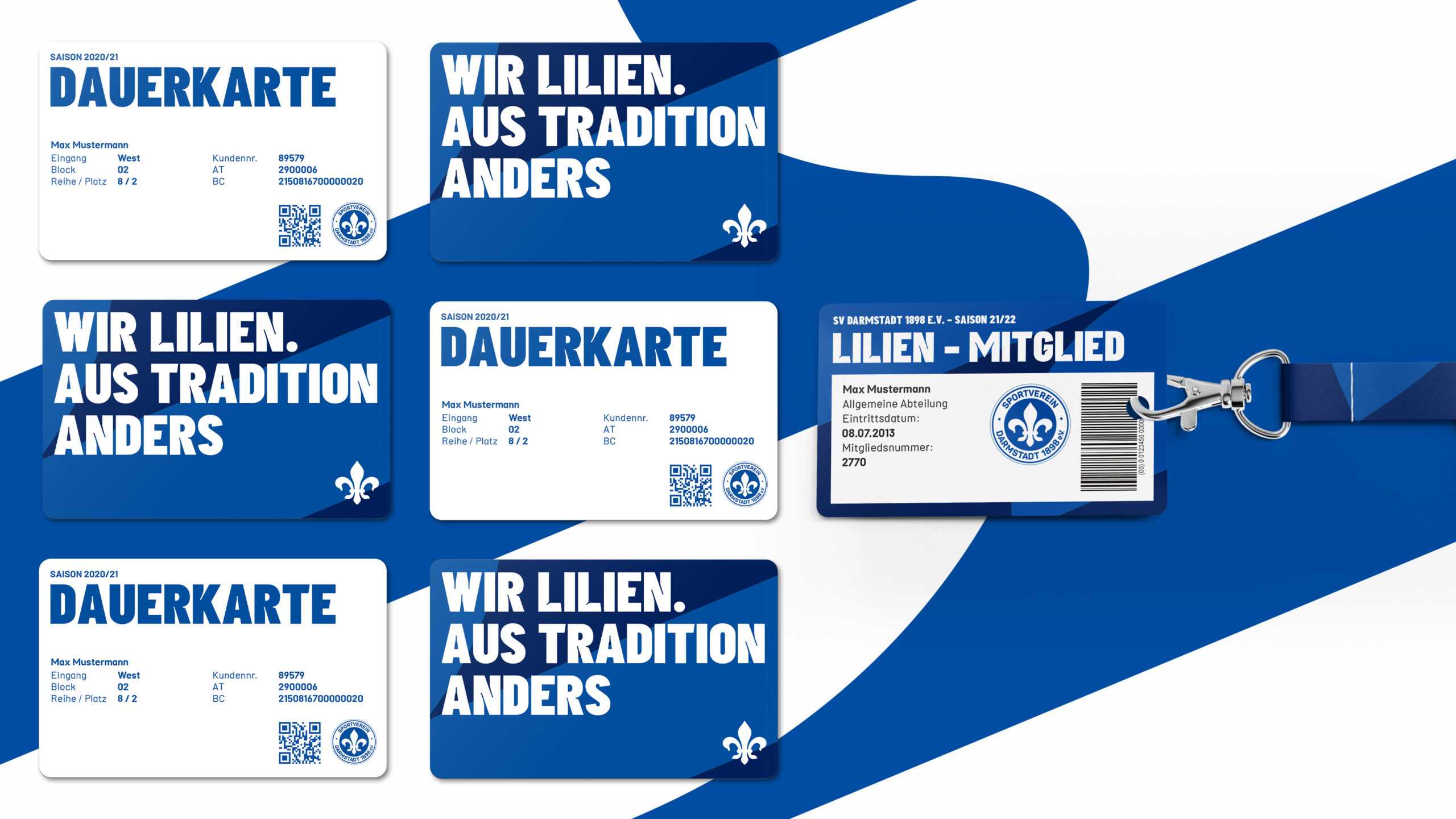
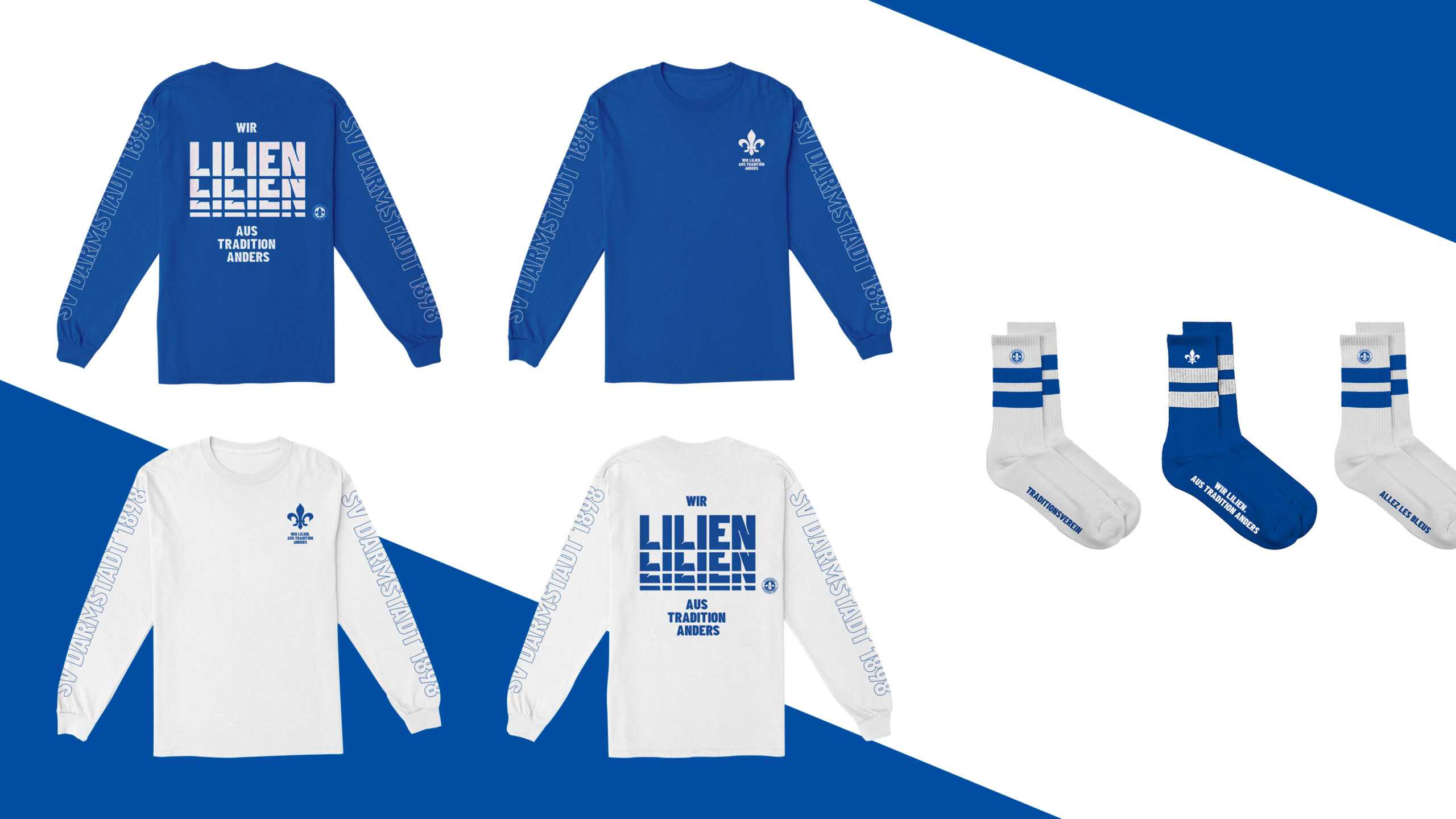
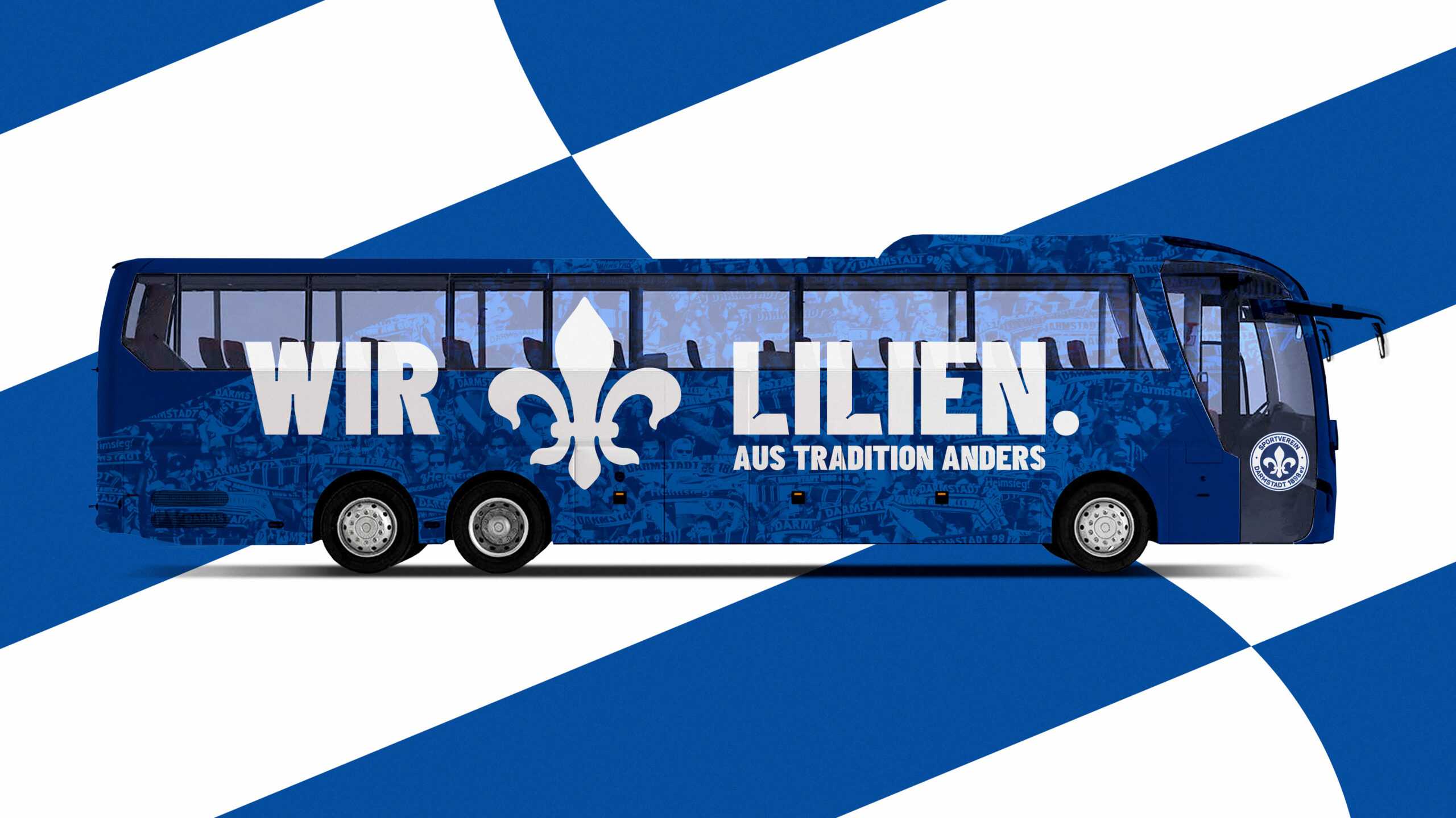
A new mission statement SV98 was the perfect starting point from which to develop a club-wide design. And what better place to look for inspiration than the fleur-de-lis on SV98’s crest? Regal, curving and steeped in history, we used its shape as the basis for creating the club’s very own font family. Called—what else?—“Lilies”, it represents an innovative take on a decades-old symbol, helping to create a unified visual identity that can be rolled out throughout the club. Next up, we wanted to come up with a pattern that would reference the club’s sporting history while being sufficiently dynamic to be used across all media. And we found one: the blue-and-white flags flown by SV98’s loyal supporters on game day ripple like waves, creating intricate patterns that deserve a wider audience. For the colour palette, we looked no further than the club’s home and away football shirts: a combination of rich blues and eye-catching orange. These three elements—the fonts, design templates and tones—make up the club’s new modular visual system that can be consistently applied everywhere from the stadium to matchday scarves to the website. Quite the winning formation.
When SV98 passed the ball to us, we knew exactly what to do with it. A jinking run, a few stepovers and a beautiful finish. That’s what we call teamwork.
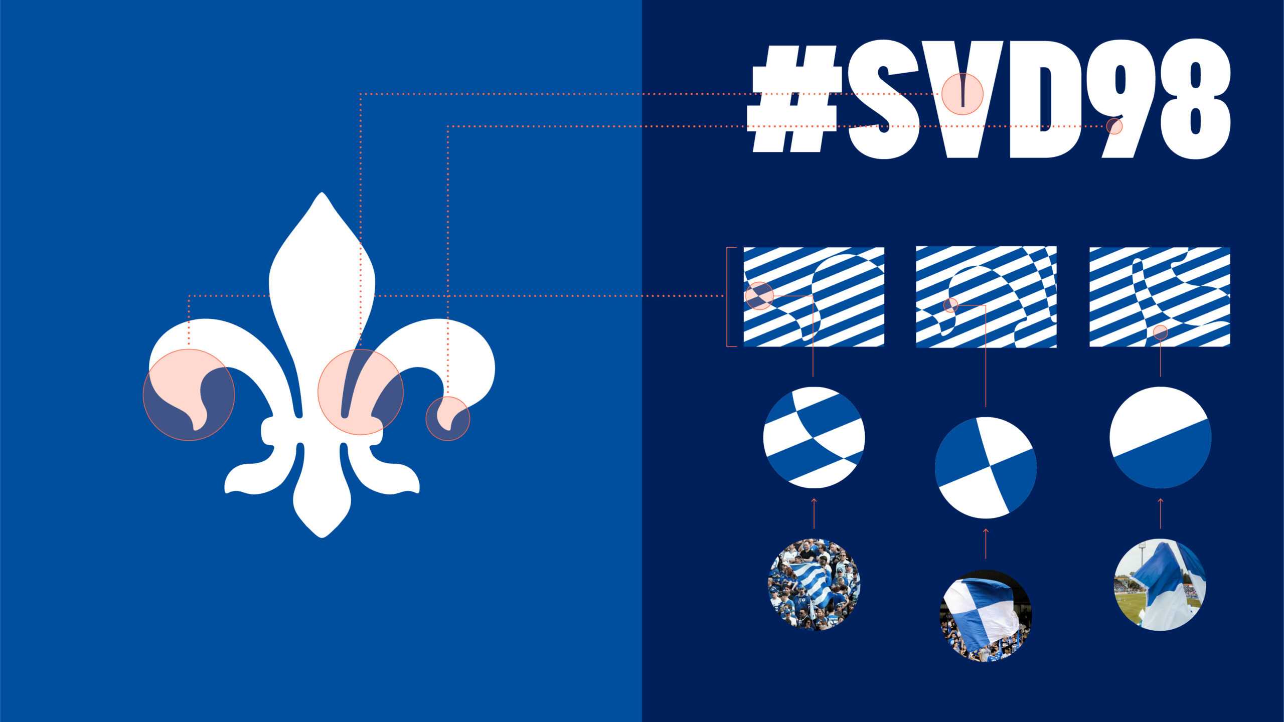
The lily is traditionally the club symbol of SV Darmstadt 98 and thus a strong visual anchor. The lily itself was therefore not changed, but its shape was subtly interwoven with the brand design.
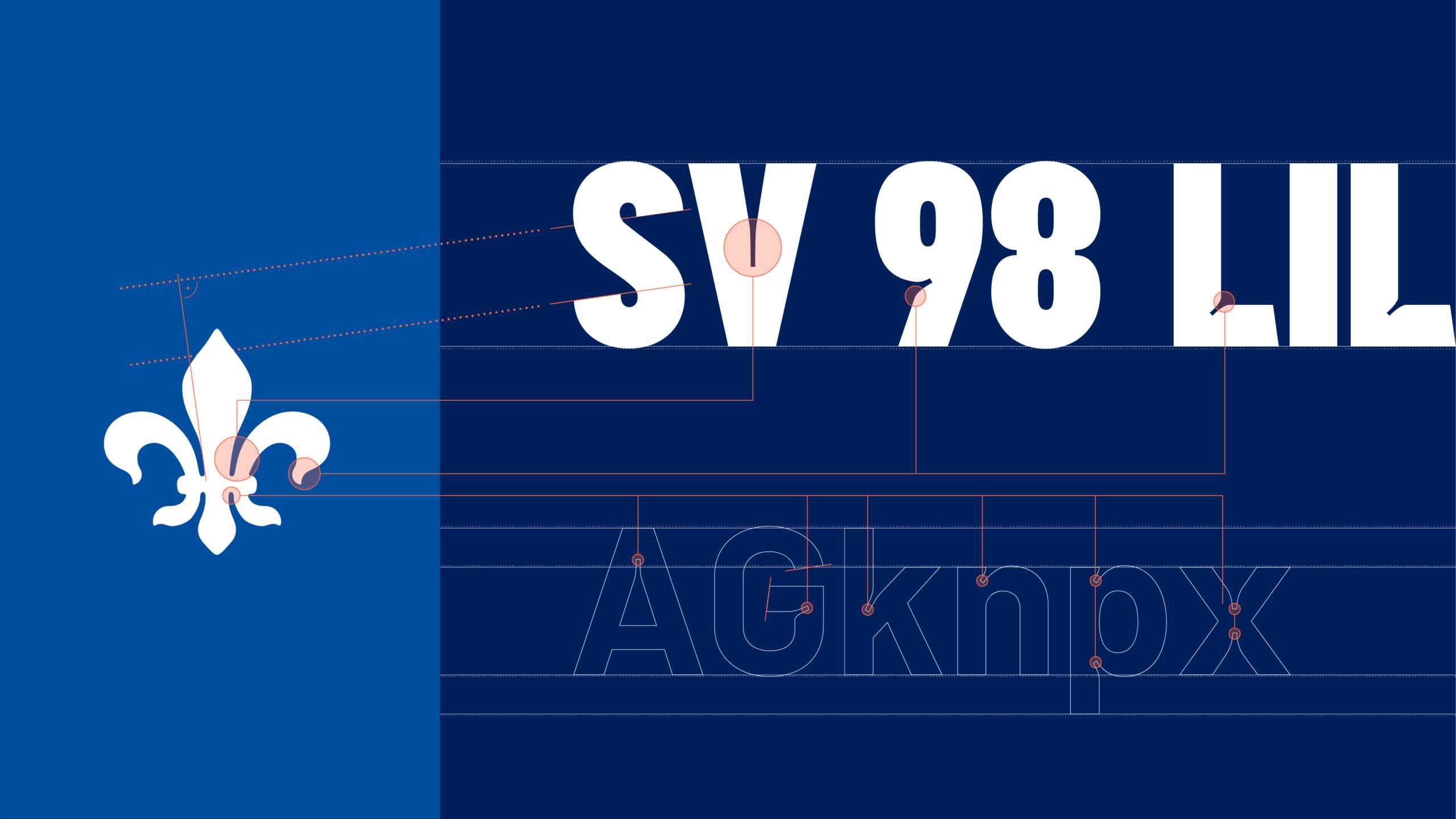
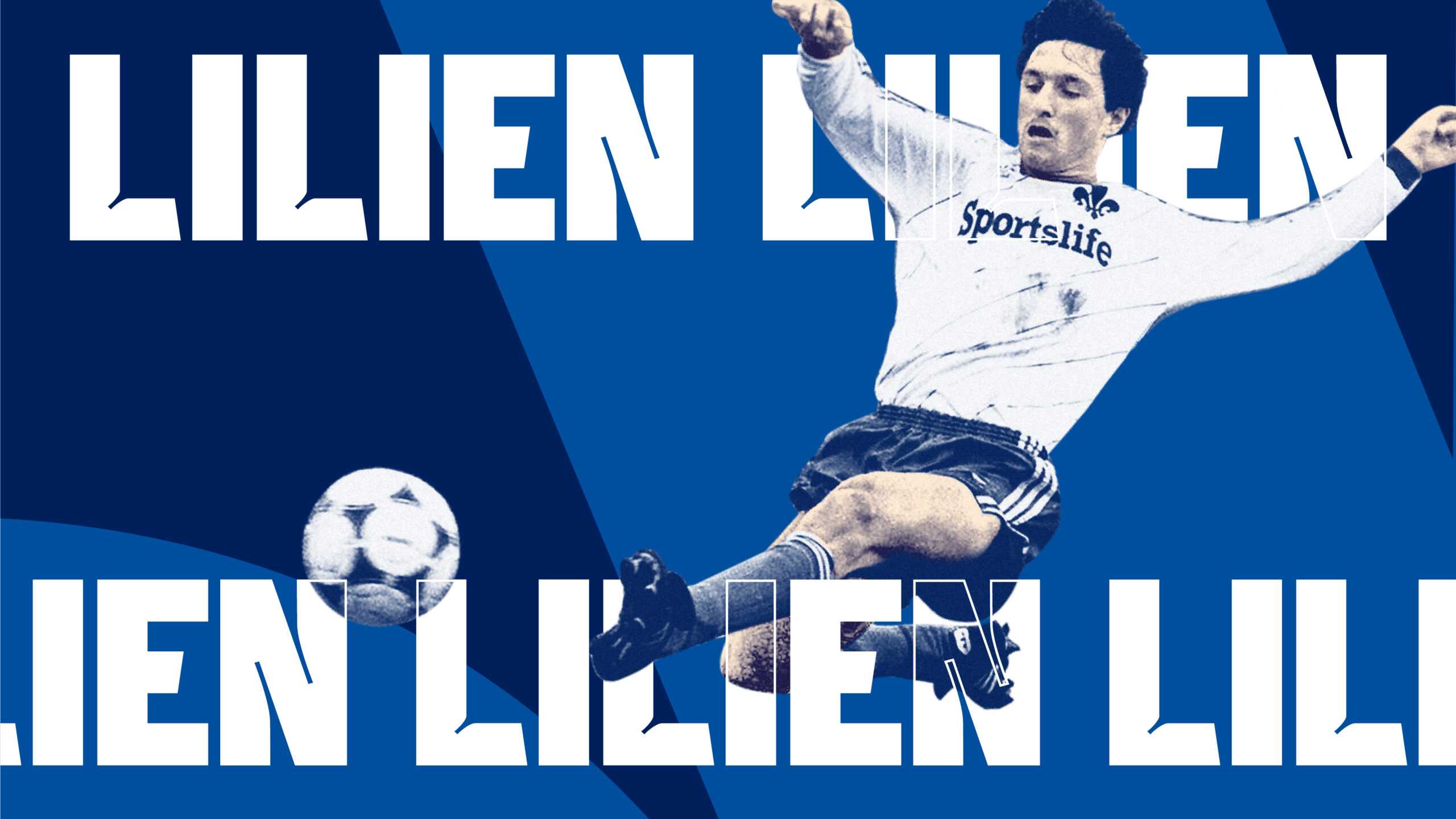
An important element of the new brand design is the „Lilien“ typeface family developed especially for the club. It picks up on the most distinctive features of the club’s emblem and thus creates a strong visual link to the tradition of Darmstadt 98.
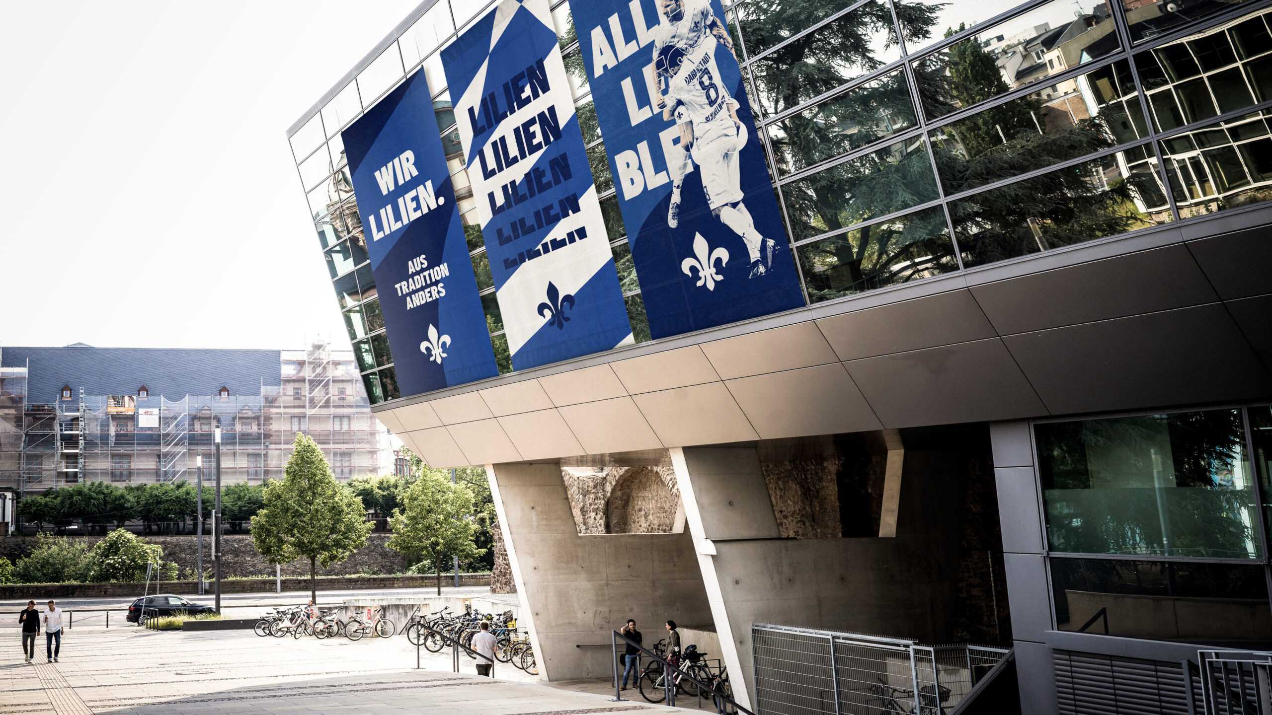
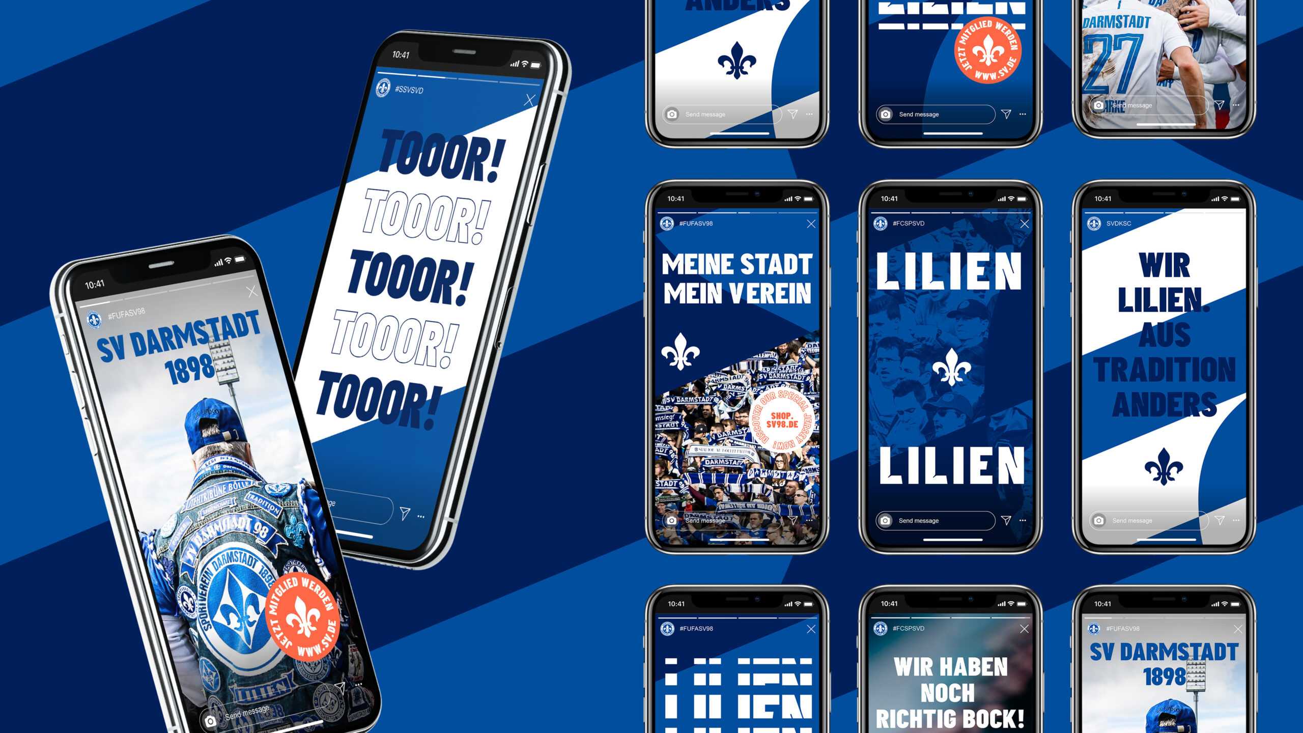
SV Darmstadt 98 wants to challenge the TOP 20 in Germany in everything the Club does – and we wanted to wake it up. Part of this meant giving our image a makeover fit to compete in the 21st century. Arndt Benedikt more than delivered on all fronts. The result is a total game-changer for us. Thanks!
