Viridium
Shaping a character that offers trust

Case Study
Overview
Our Client
Polishing policies, fostering futures
What do a make-up artist and a life insurance consolidator have in common? They both make life (insurance) more attractive. Founded in 2014, the over 900-strong Viridium Group has flourished rapidly to become one of the top five industry leaders in Germany: to date, the company has put pen to paper for more than 3.2 million life insurance policies, amassing over 68 billion euros in assets under management in the process. Focusing on consolidating fragmented life insurance portfolios on a single, centralised modern business platform, its customer base benefits from minimal admin fees, higher returns and watertight life insurance policies that are more attractive than Ryan Gosling.
The Challenge
Leading the industry, lacking an identity
Having grown so big so quickly, Viridium’s corporate identity couldn’t keep pace. The brand lacked a visual cutting edge and was overlooking the USPs that make Viridium such a key partner in the life insurance segment. What the Group needed was a corporate identity that consolidated its customer-centric, trustworthy brand philosophy while being consistent across all touchpoints. The website in particular was in need of a new lease of life, with the outdated appearance not doing justice to Viridium’s very attractive market services. Like all leading names, the company has a story to tell – but the world needs to see it to understand it.
Our Solution
Sculpting the presence to secure the future
We put our heads together with the Viridium bods to sketch out what the rebrand would entail: everything from pinning down the corporate philosophy to honing the various facets of the brand to exploring a new visual language. The key was to determine exactly what Viridium stands for in clear, simple terms, namely: trust, reliability and a focus on making life insurance policies as attractive as possible for customers. From here, we rebuilt the brand strategy from the ground up in order to place the focus firmly on the company’s principles – making it clear to employees and customers alike what they can expect from Viridium.
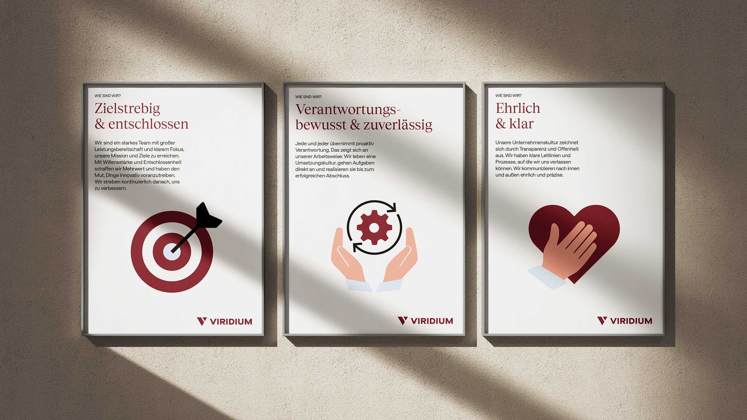
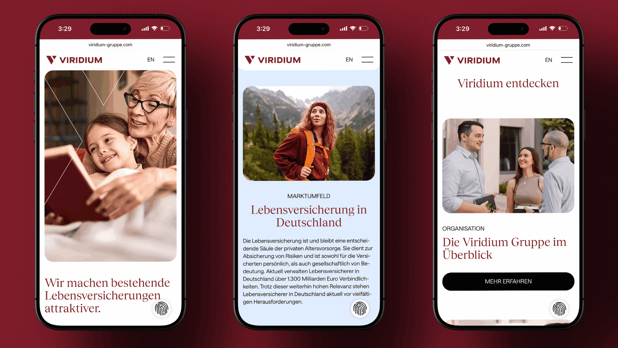
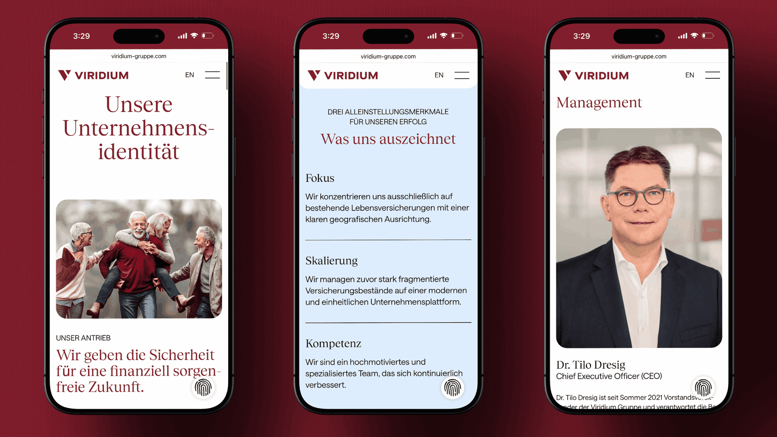
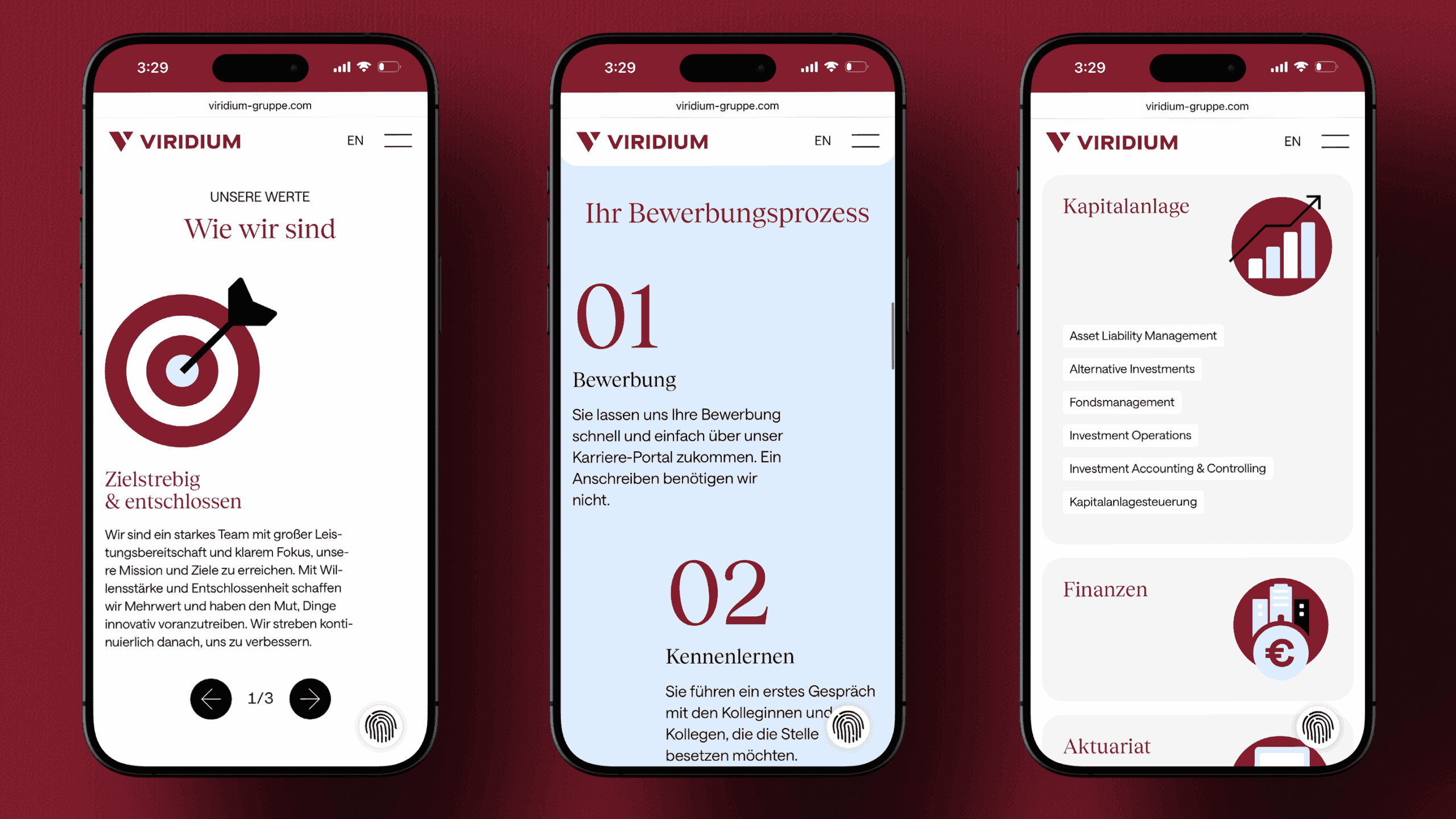
As it states on the attractive new website, Viridium offers three key advantages over the competition: it focuses exclusively on improving existing life insurance policies; it scales portfolios, consolidating them on a centralized, innovative platform; and it relies on a dedicated workforce of experts that is always honest, clear, reliable and determined. We made sure that these qualities were front and centre of every aspect of the rebrand, with the result that customers now understand exactly how they will benefit from partnering with Viridium. At the same time, these USPs serve as a reference point for the company’s employees, enabling every member of the team to wear the Group’s identity like a favourite jacket.
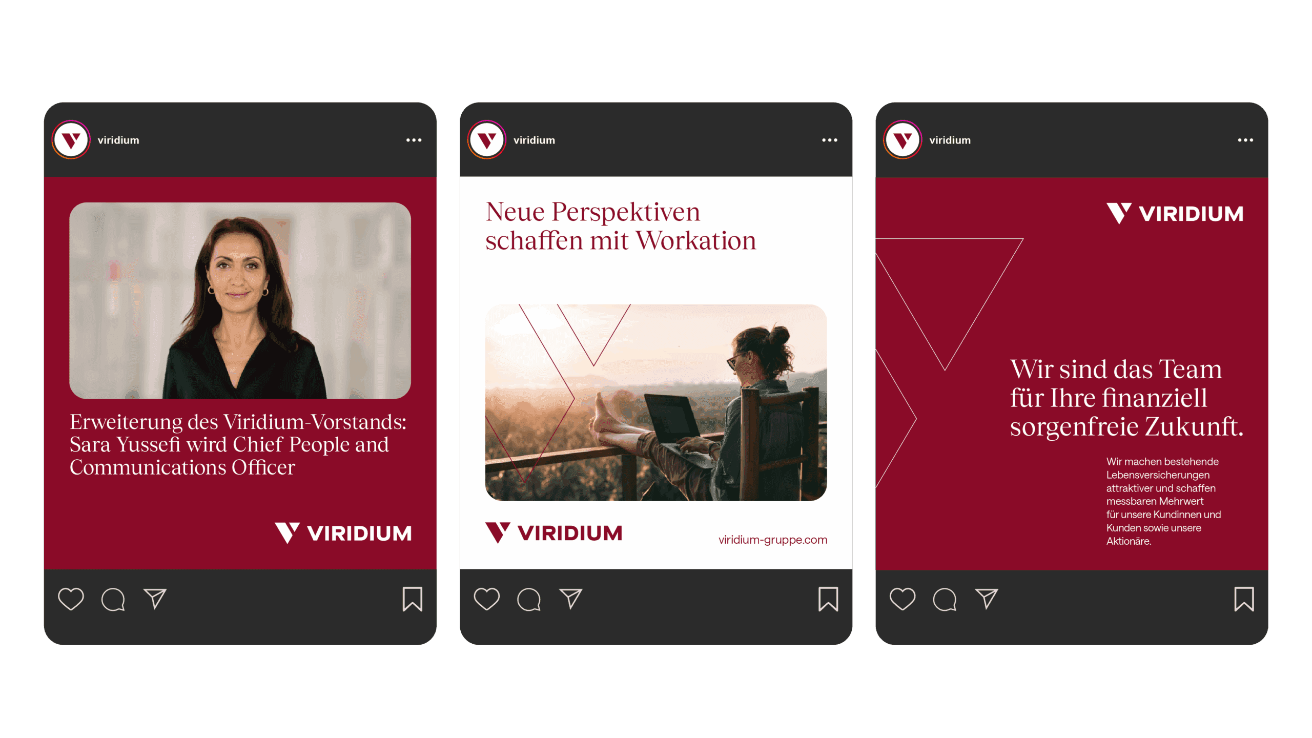
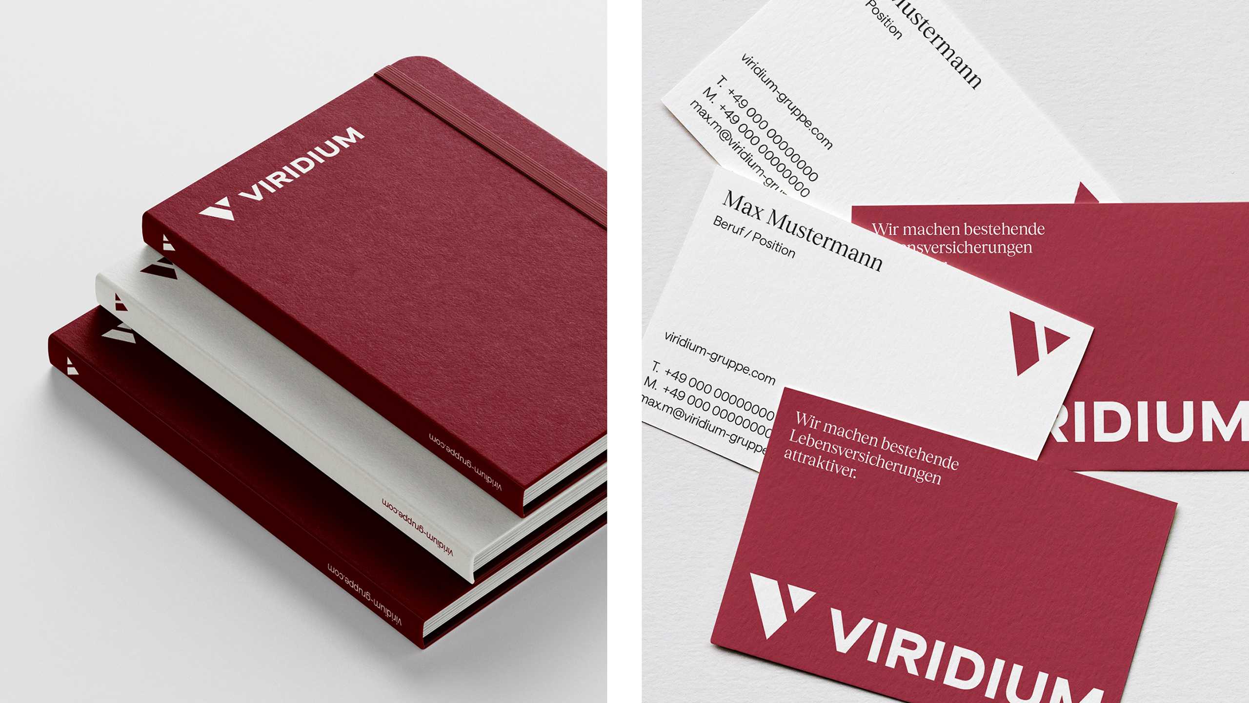
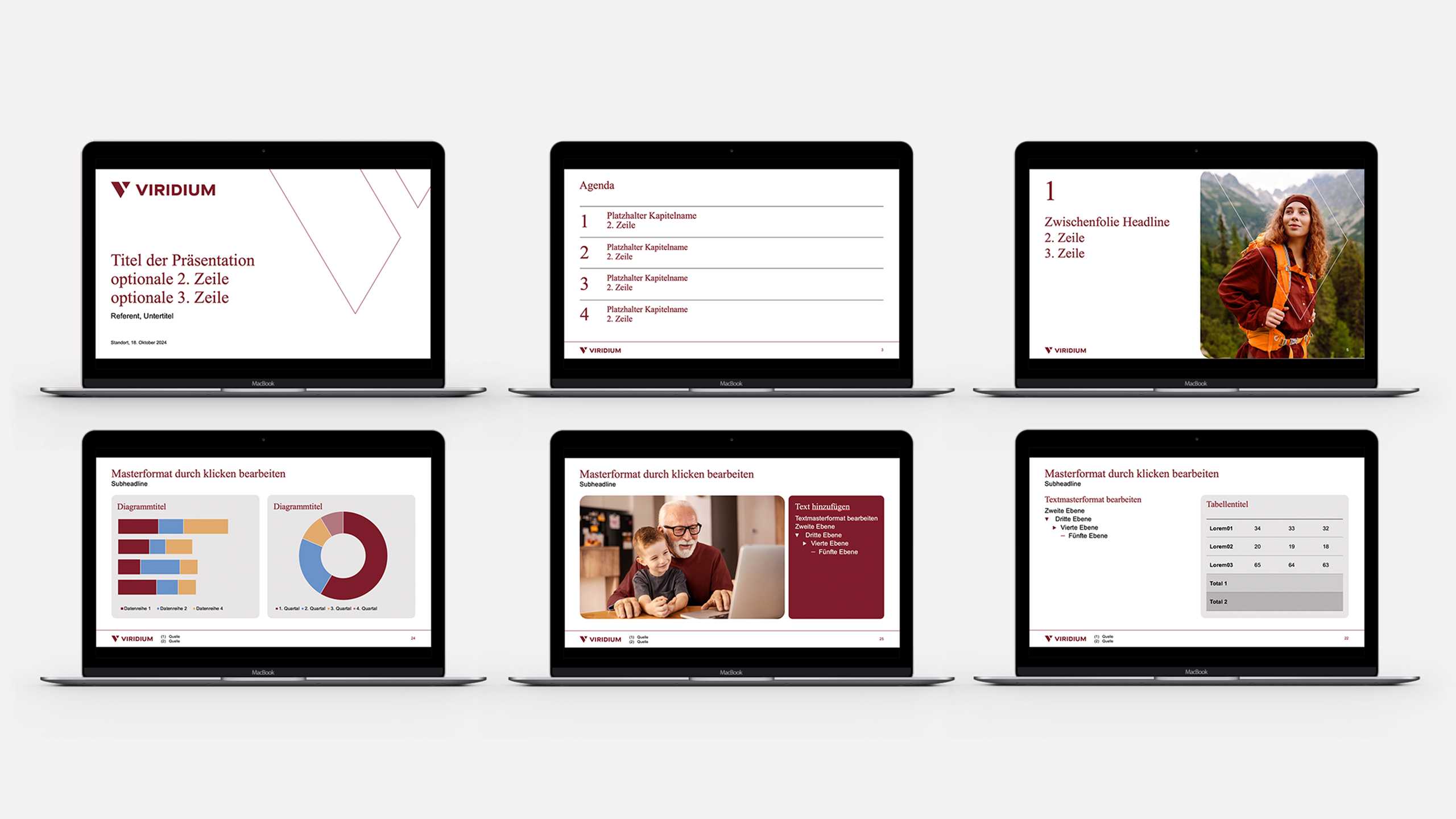
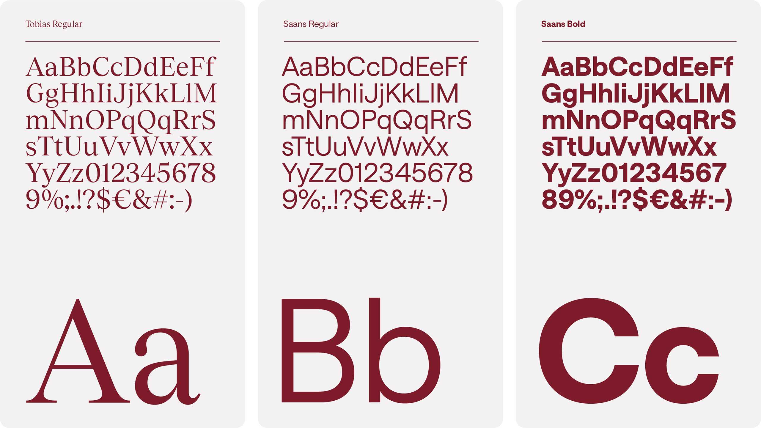
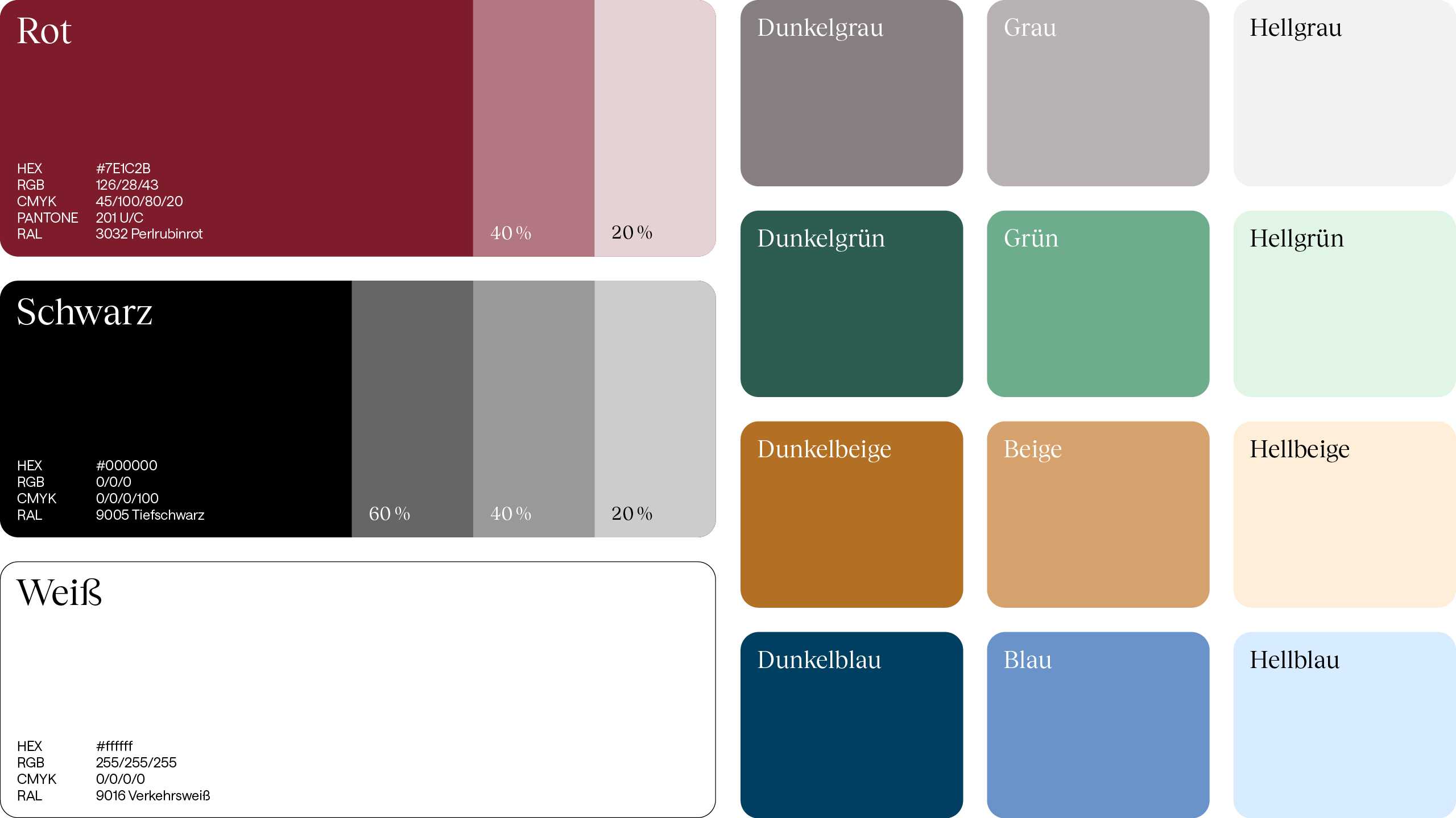
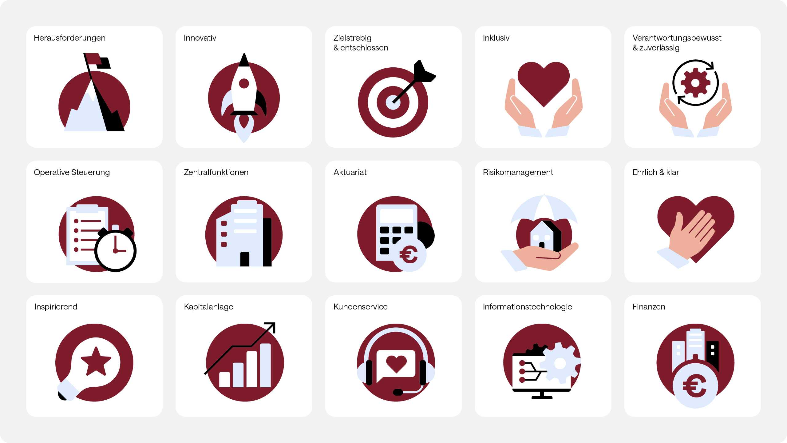
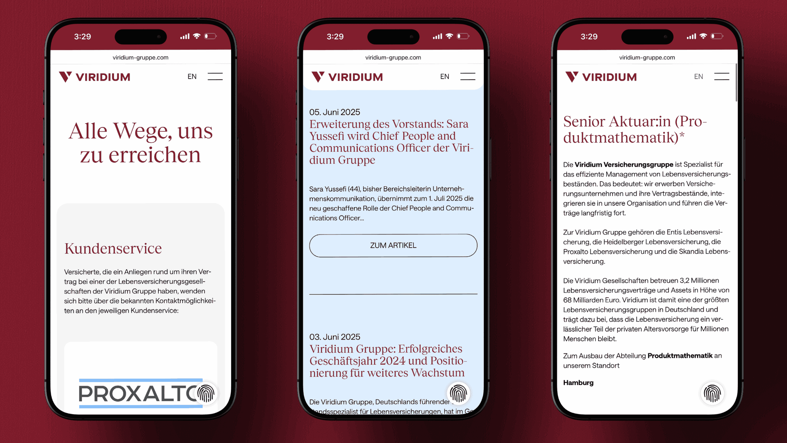
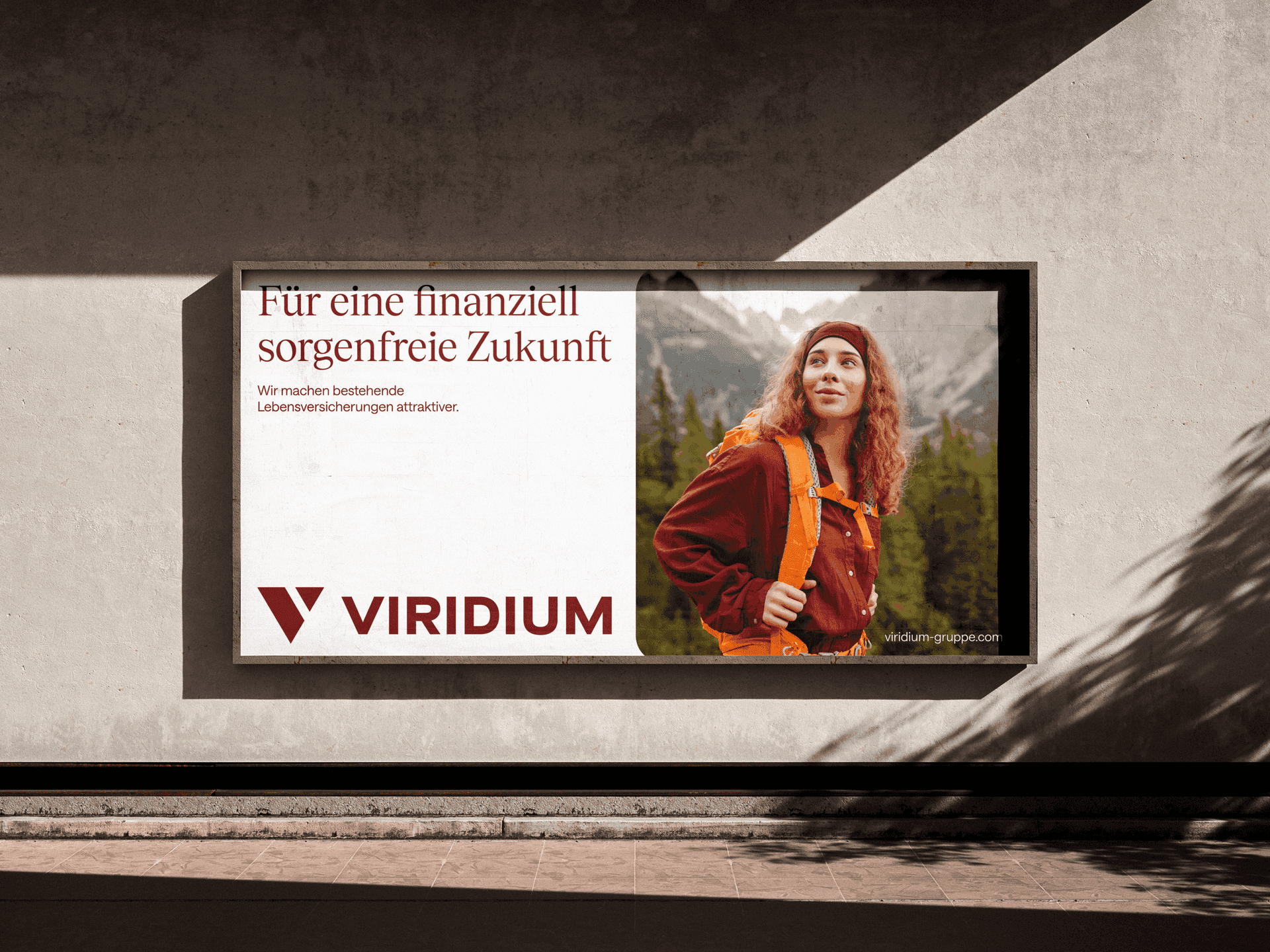
In terms of cosmetics, we gave the logo a facelift to bring it firmly into the digital age, embraced a new, clearer typography, expanded the color palette for more depth, devised unique illustrations and leaned on human-centred photography to show that this is a company with heart. The result is an elegant, streamlined visual package that ties everything – philosophy, services and USPs – together neatly. This is best represented by the website, which is now cheerful and engaging while clearly presenting the Group’s strengths with pinpoint accuracy.
So there goes Viridium, the most good-looking firm in the insurance sector. Now there’s a sentence we never thought we’d write.
After more than a decade since the launch of our business model and as Germany's leading life insurance consolidator, it was time to refresh our branding. Our market position, organisation and corporate culture have developed accordingly. This is reflected in the evolution of our corporate identity and the redesigned look of our brand.
