Yababa
Enticing all audiences with the taste of home
Case Study
Overview
Our Client
Bringing a taste of home, home
Gorillas, Flink, Getir: The ultrafast grocery home delivery market is a crowded one, so it takes a real innovator to stand out from the crowd. Yababa is exactly that: the Berlin-based online supermarket delivers speciality Turkish and Arabic products to kitchens all over the falafel-obsessed capital. With a promise of same-day delivery by its highly diverse team, Yababa’s appetite for expansion is ravenous: it is aiming to start delivering in various other cities in Germany and neighbouring countries in 2022.
The Challenge
The good kind of emotional eating
Turkish, Arabic, German, European: Yababa’s target market is almost as varied as the products at its depot. To appeal to all these groups on an emotional level while standing out from the crowd, Yababa was on the hunt for an identity that would create trust in the brand, send out a clear message – and be cool as a cucumber, naturally.
Our Solution
Swift recognition, instant trust
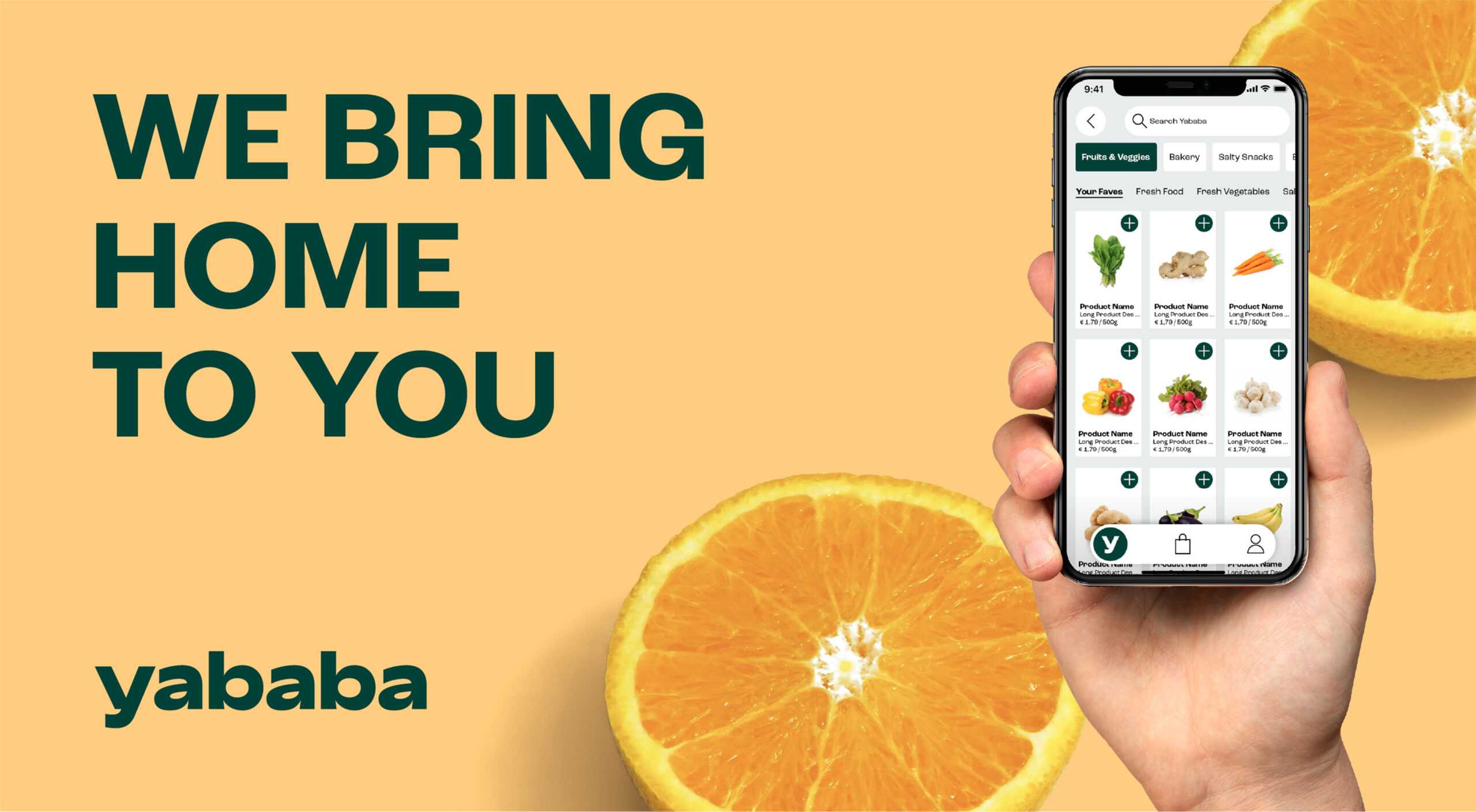
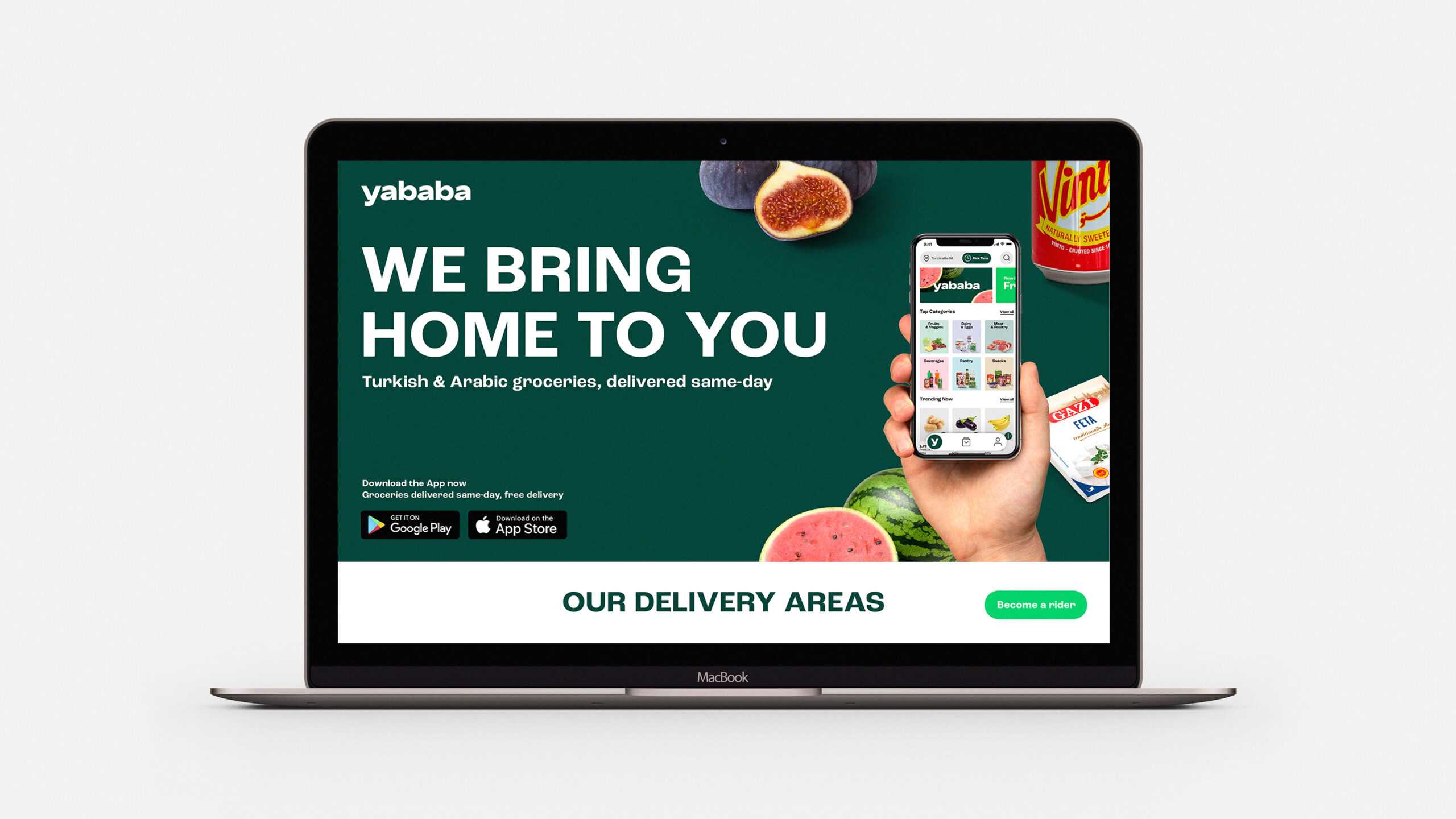
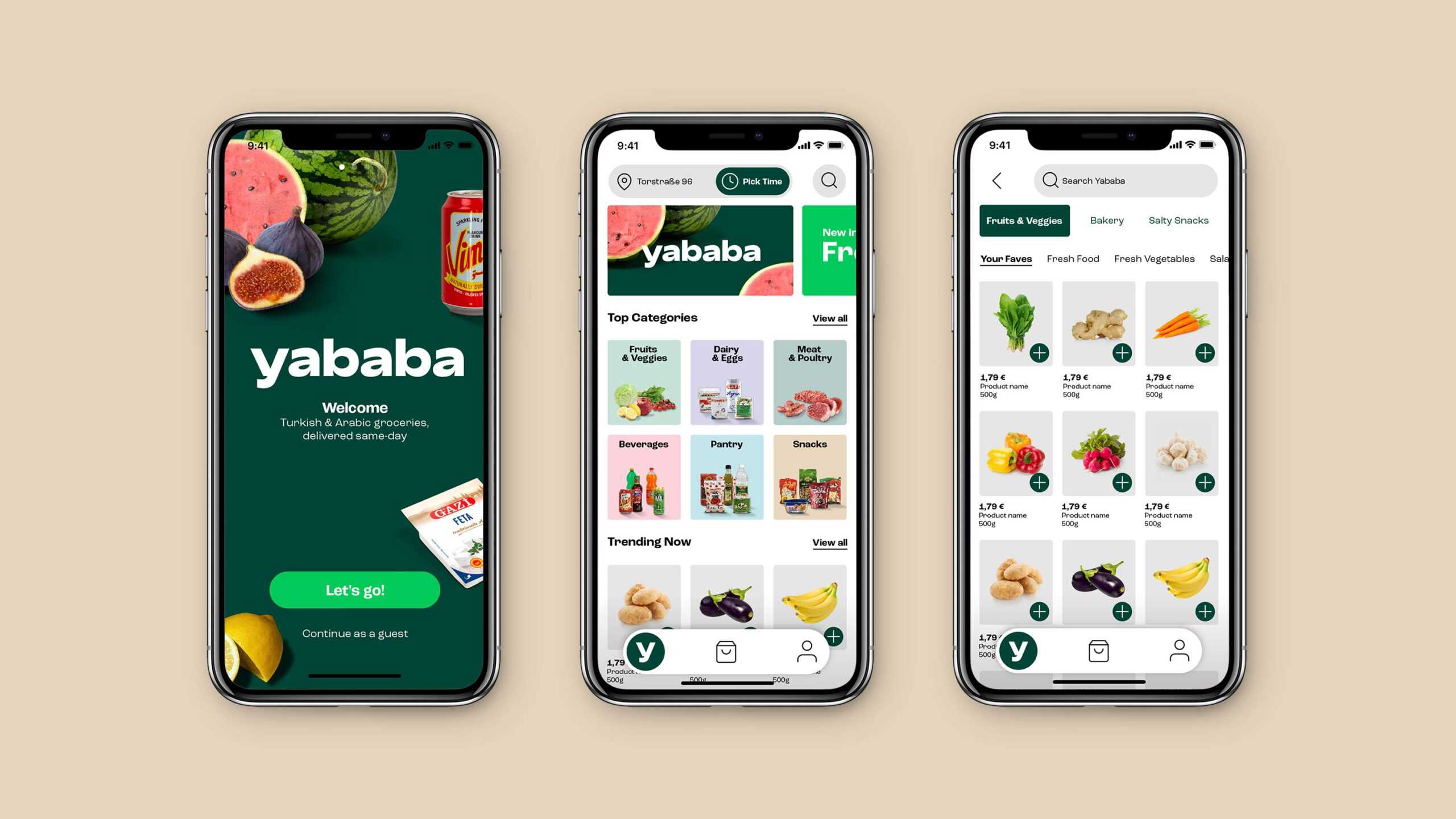
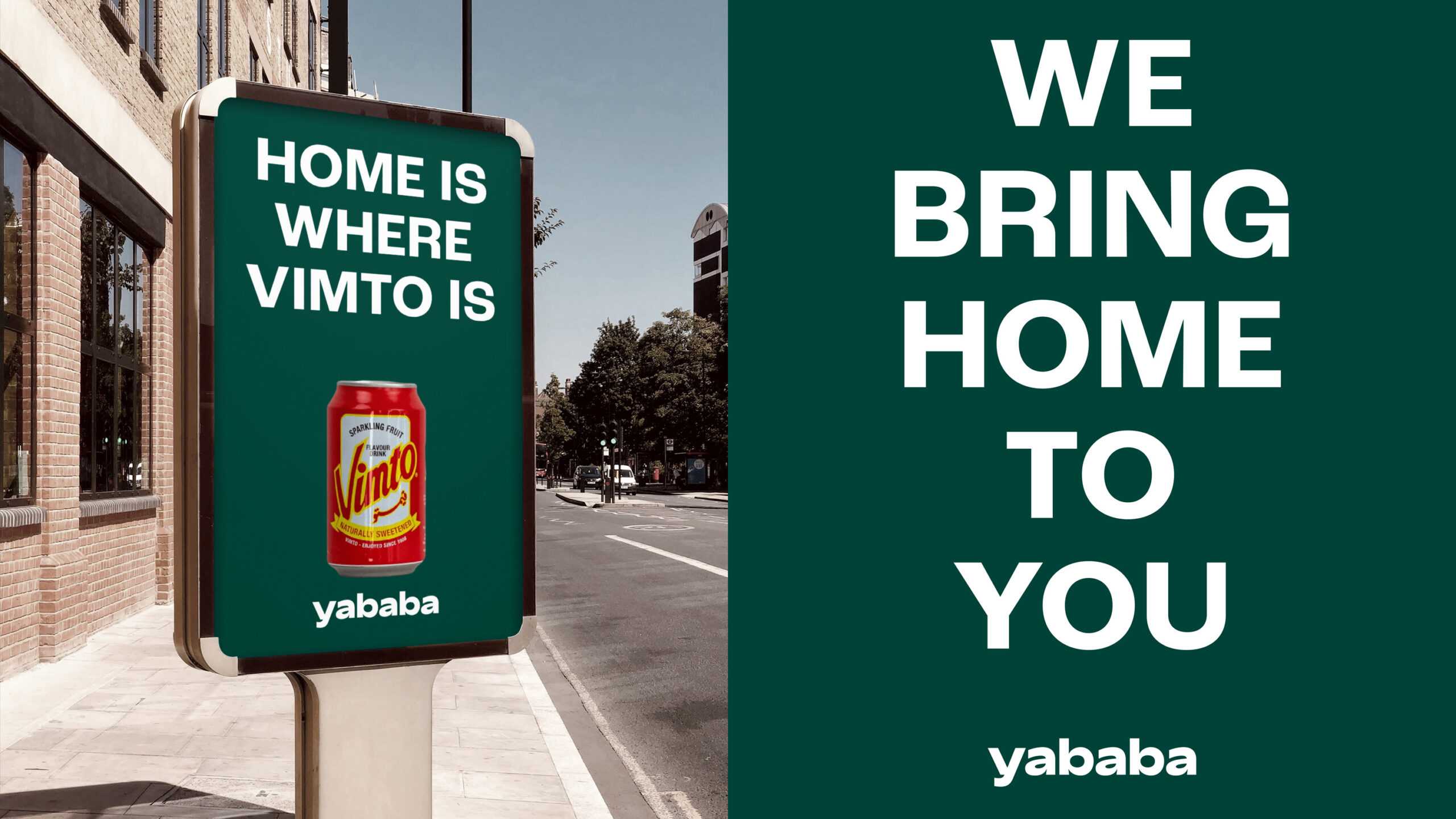
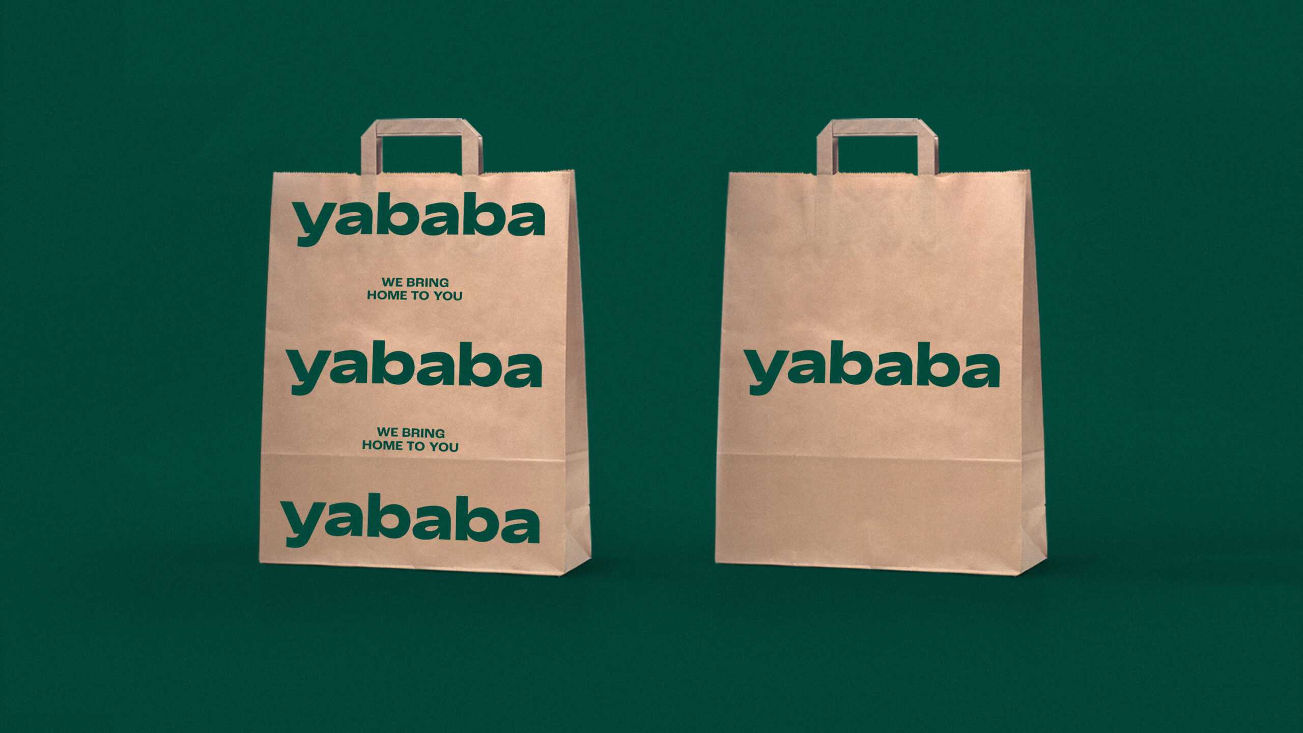
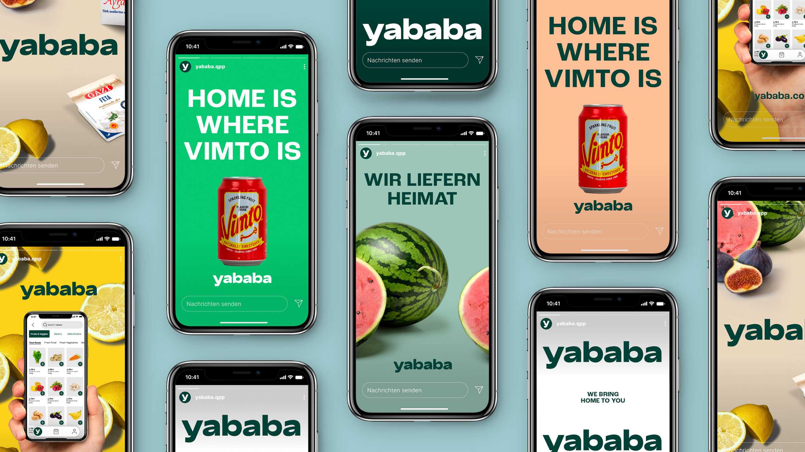
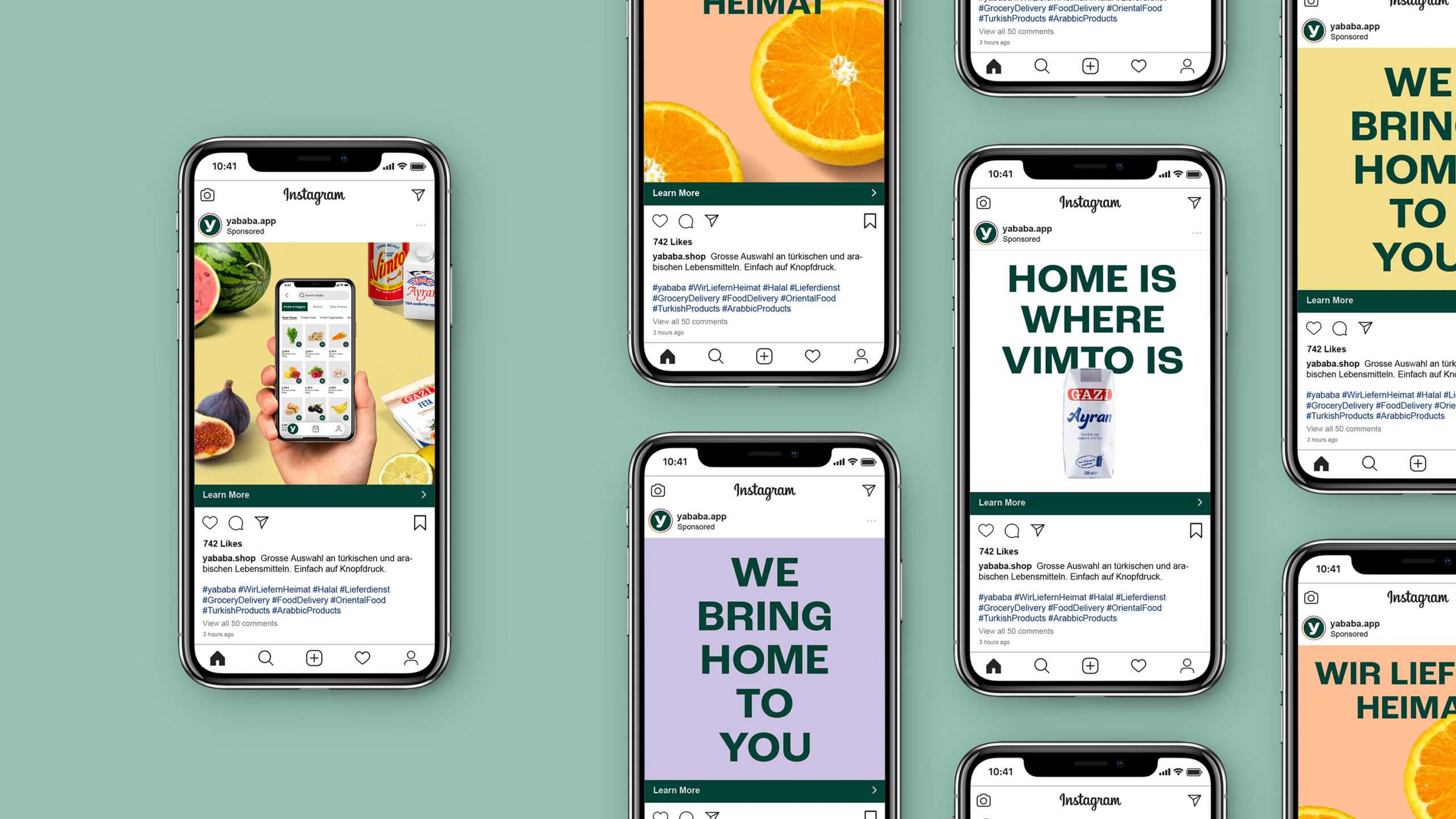
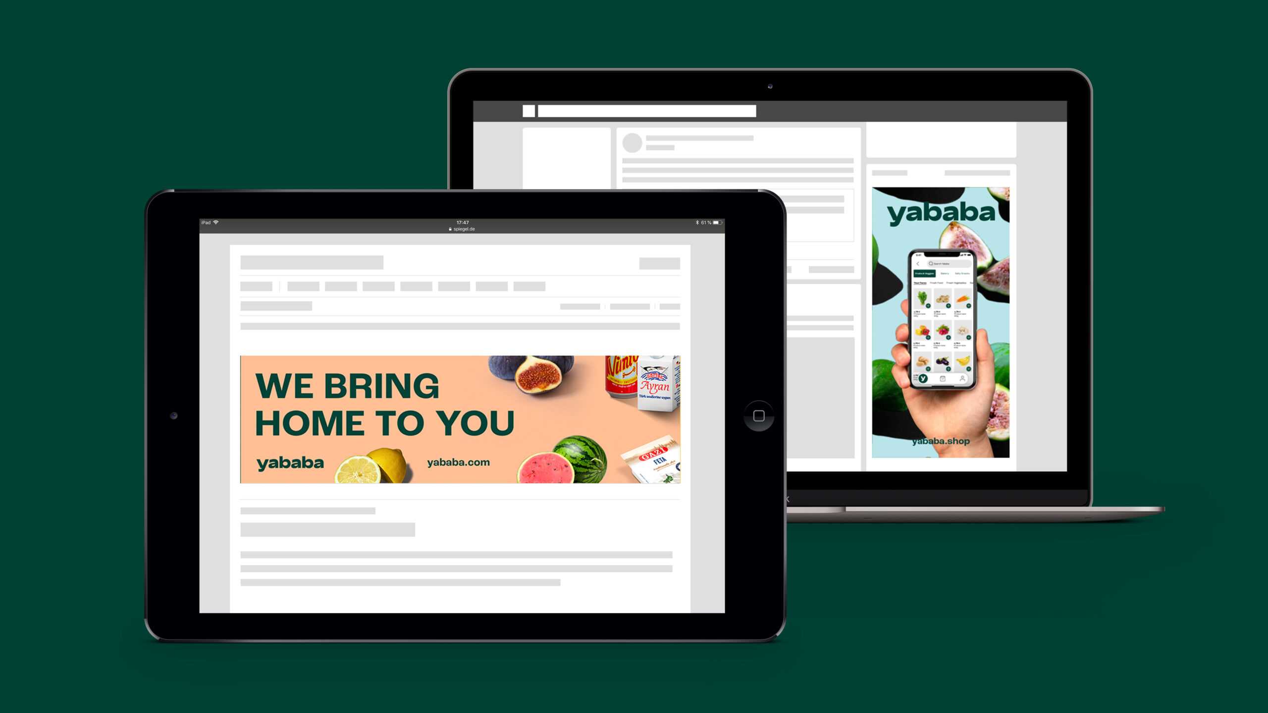
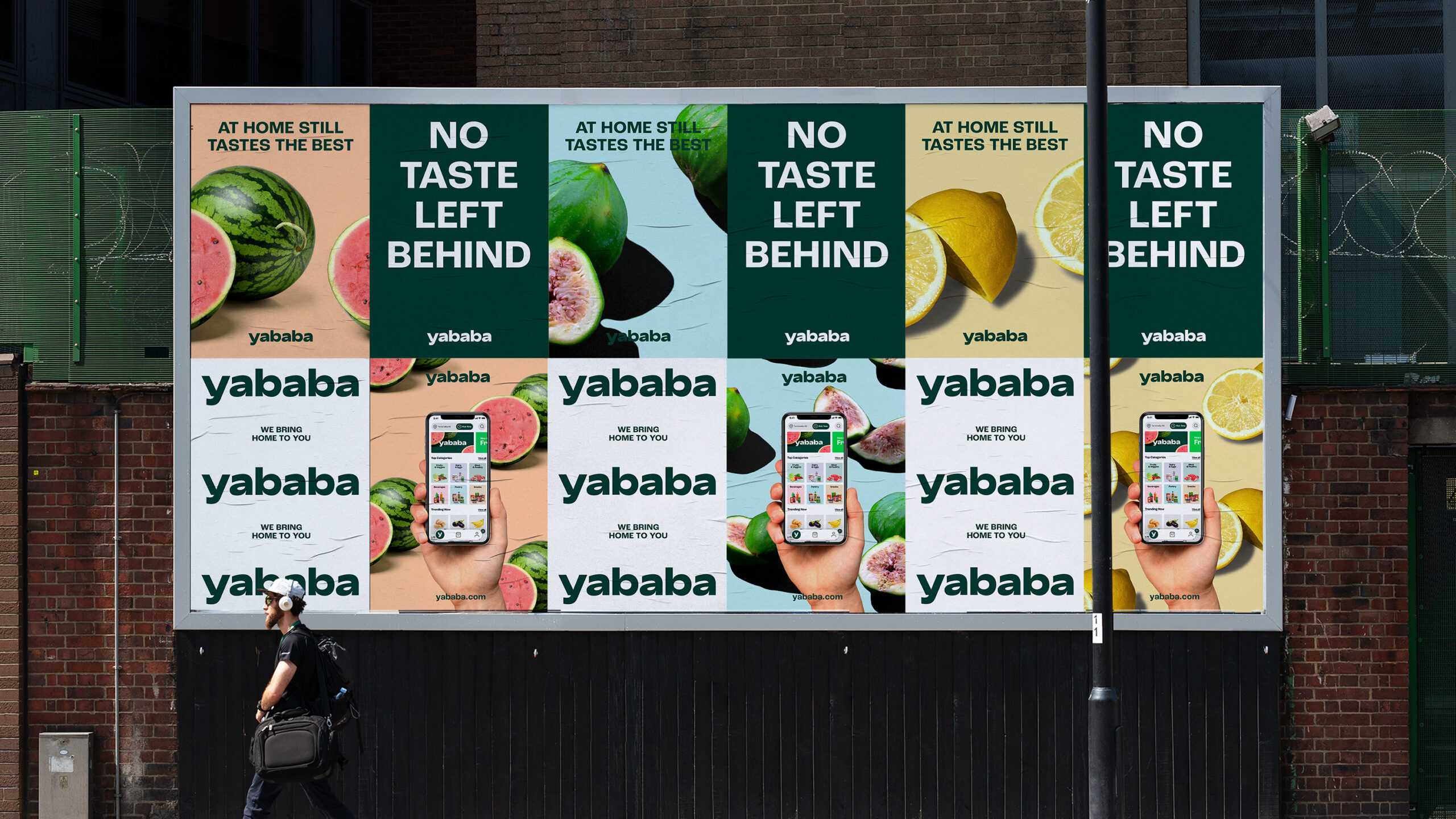
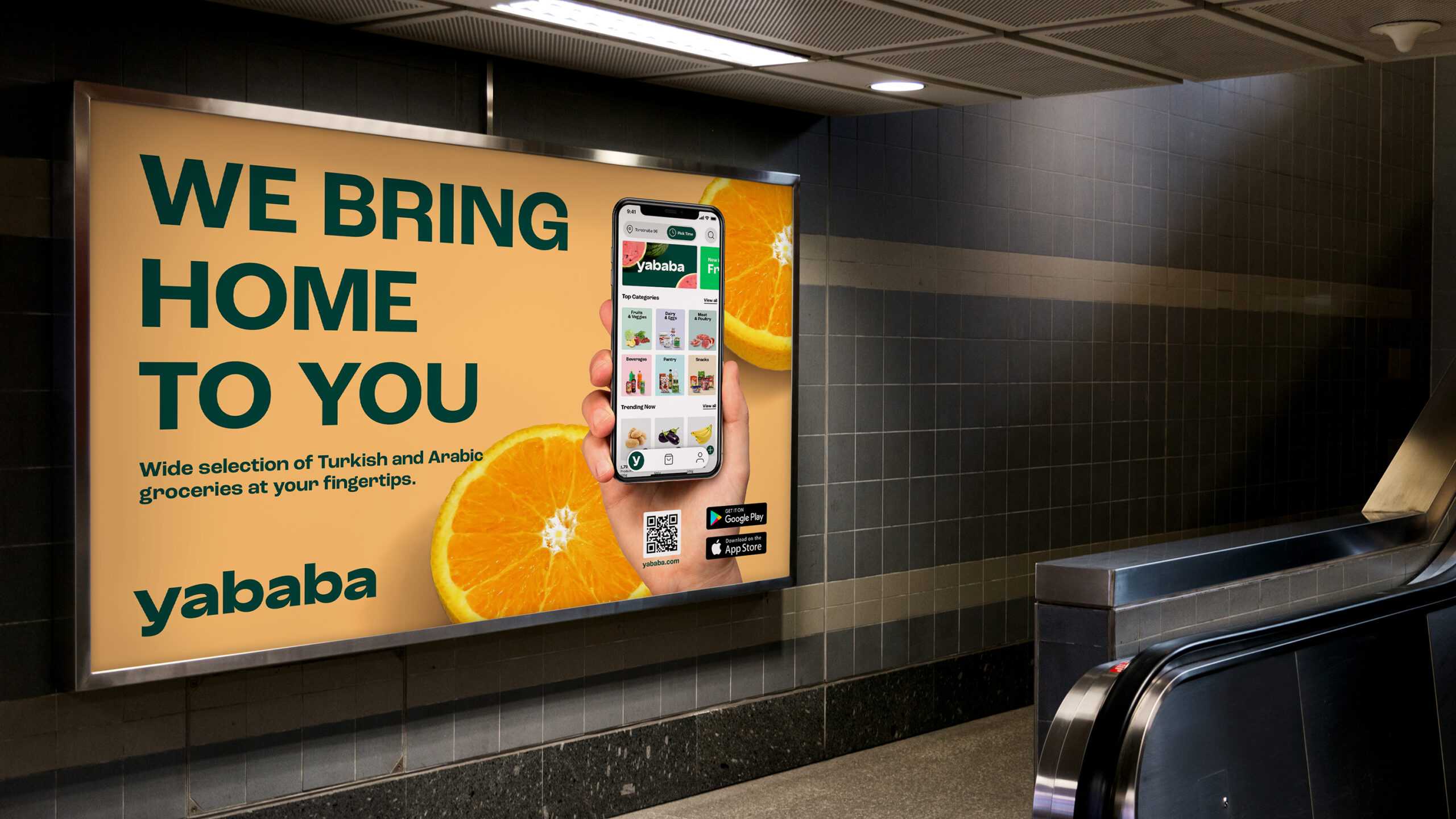
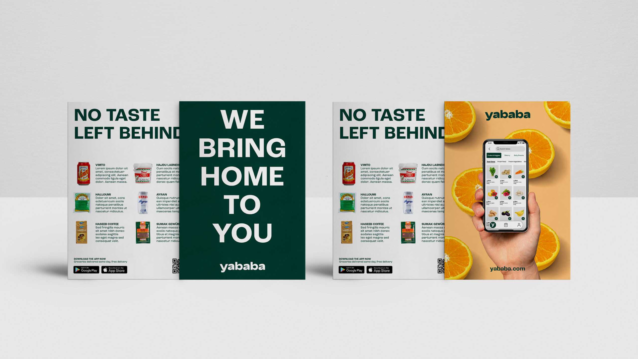
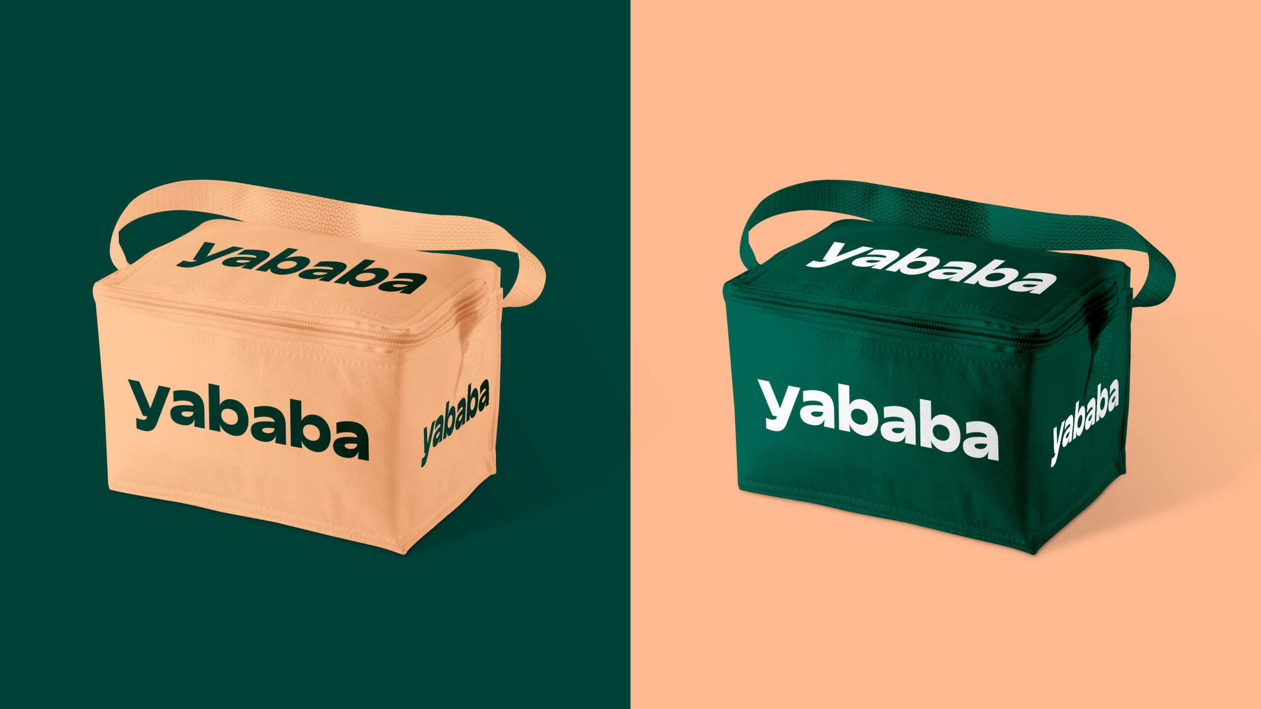
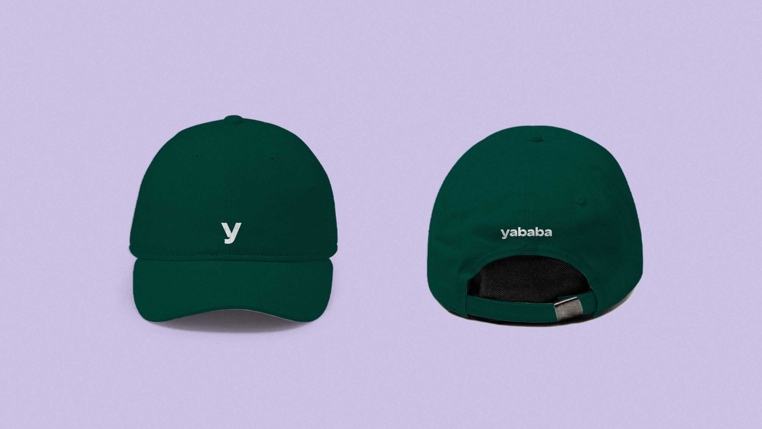
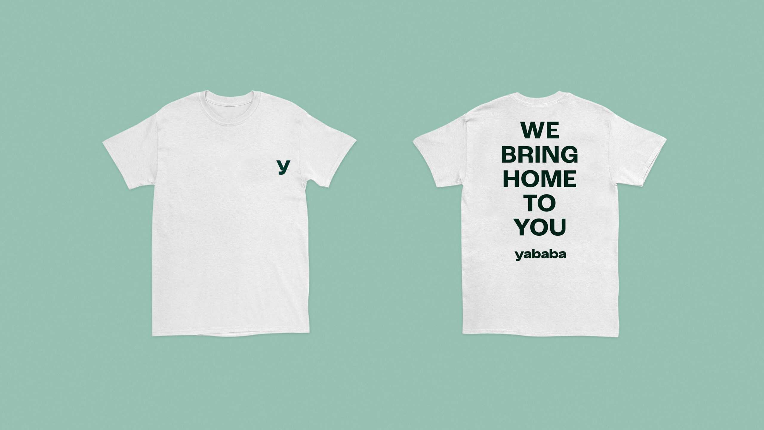
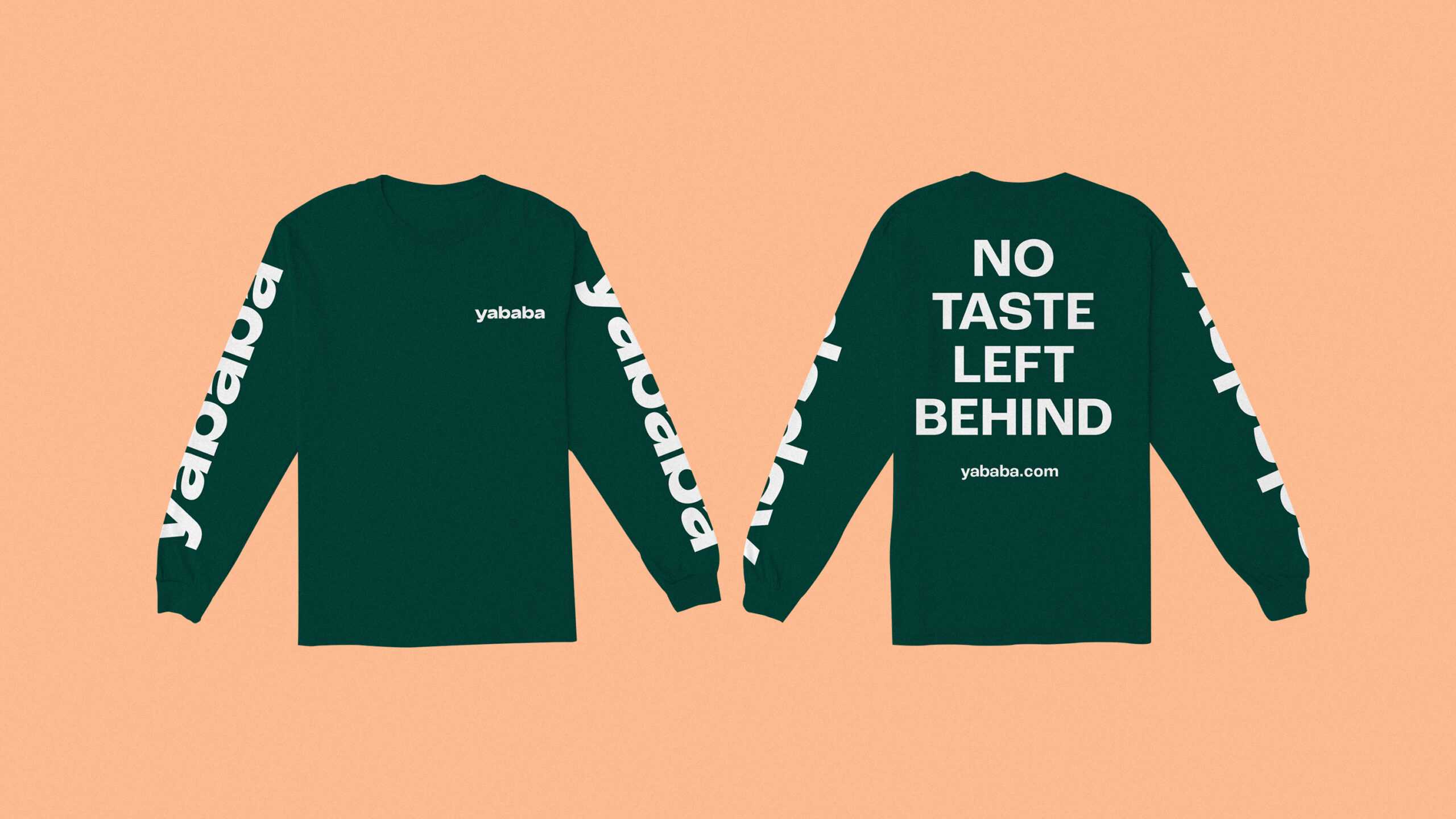
The initial workshops we held with the Yababa team gave us food for thought about the purpose of the business: to bring the taste of home to its customers and make Turkish and Arabic products available to everyone as part of a same-day delivery model. This called for an emotional connection, a basis of trust in the brand and familiarity across target groups – by developing a brand image that speaks to multiple target groups while being instantly recognisable, and channelling this into a design system that can be rolled out across all of Yababa’s online and offline touchpoints. First, we devised a strong claim: We bring home to you. This was our foundation on which all else followed. In designing a logo, we settled on a customised wordmark: the Yababa name conjures up images of Middle Eastern souks and sun-kissed marketplaces, while the soft, curving wordmark itself was specifically designed to prompt comparisons to the products stocked by the home delivery service . The colour palette was inspired directly by the fruit and vegetables found at a typical market stall, with the dark, soothing green offset by polar white to create a clear connection to Yababa’s fresh, healthy produce. We followed up on the notion of home with a focus on quality photographs spotlighting fresh produce and unique Turkish and Arabic products, and celebrated the people who make up the diverse world of Yababa – both its own workforce and its customers – in a series of vibrant, Pop-Art-esque illustrations. Together, the photographs and illustrations enable the brand to position itself more broadly and add variation to its visual language. The complete design system found their way into all aspects of the business: from the delivery drivers’ clothing through to online ads, social media channels and the easy-to-use app. The latter is especially important: as the entry point to Yababa for most customers, this was our chance to catch their eye and create an emotional connection with the business. Quality photographs, unique illustrations, absorbing colours and that appealing wordmark: they all made their way into the app for the complete brand experience each time the customer logs in.
And there you have it. A fully fledged brand identity for one of the rising stars in the home delivery sector. Piece of cake. Or maybe make that a piece of baklava.
