Found
Empowering talent to take charge

Case Study
Overview
Our Client
Weighing in on the war for talent
The best ideas are simple, yet revolutionary. Take Found, for instance. After reflecting on how we apply for jobs, this up-and-coming tech company thought: Let’s turn the process on its head. Instead of forcing professionals to wade through endless vacancies in the hunt for a job, why not have employers pitch directly to the talent? The result: an online platform where individuals from all backgrounds and areas of expertise can upload their profile, which top companies can then search through to find the crème de la crème.
The Challenge
Turning talented heads
Who wouldn’t welcome an alternative to the traditional “search > apply > interview” grind? Even so, professionals need to know this alternative actually exists. Our task was to boost Found’s forward-looking profile among its talented target audience by creating a corporate design that sends out all the right signals – so Found can be found.
Our Solution
Pitch perfect for the perfect pitch
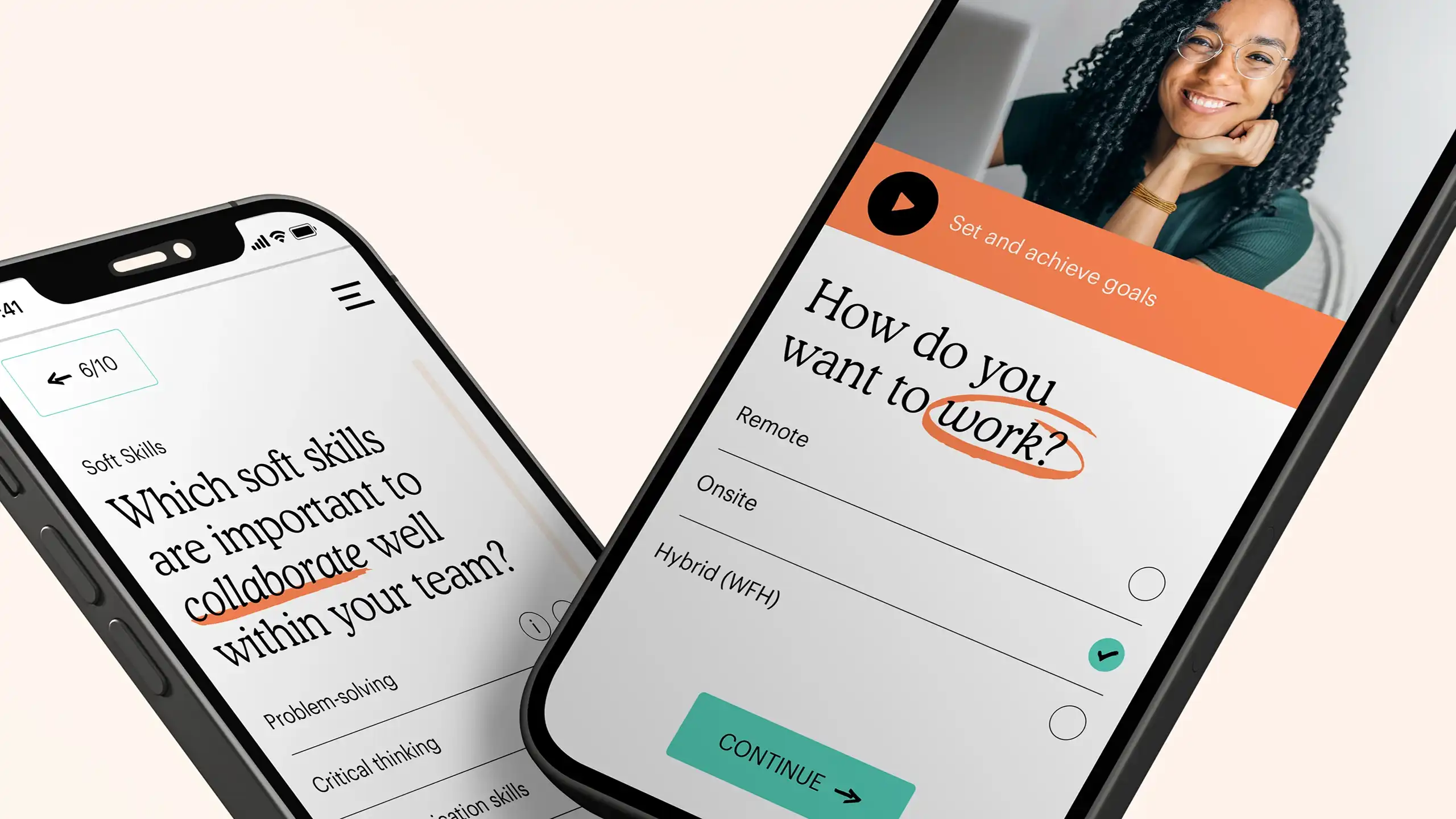
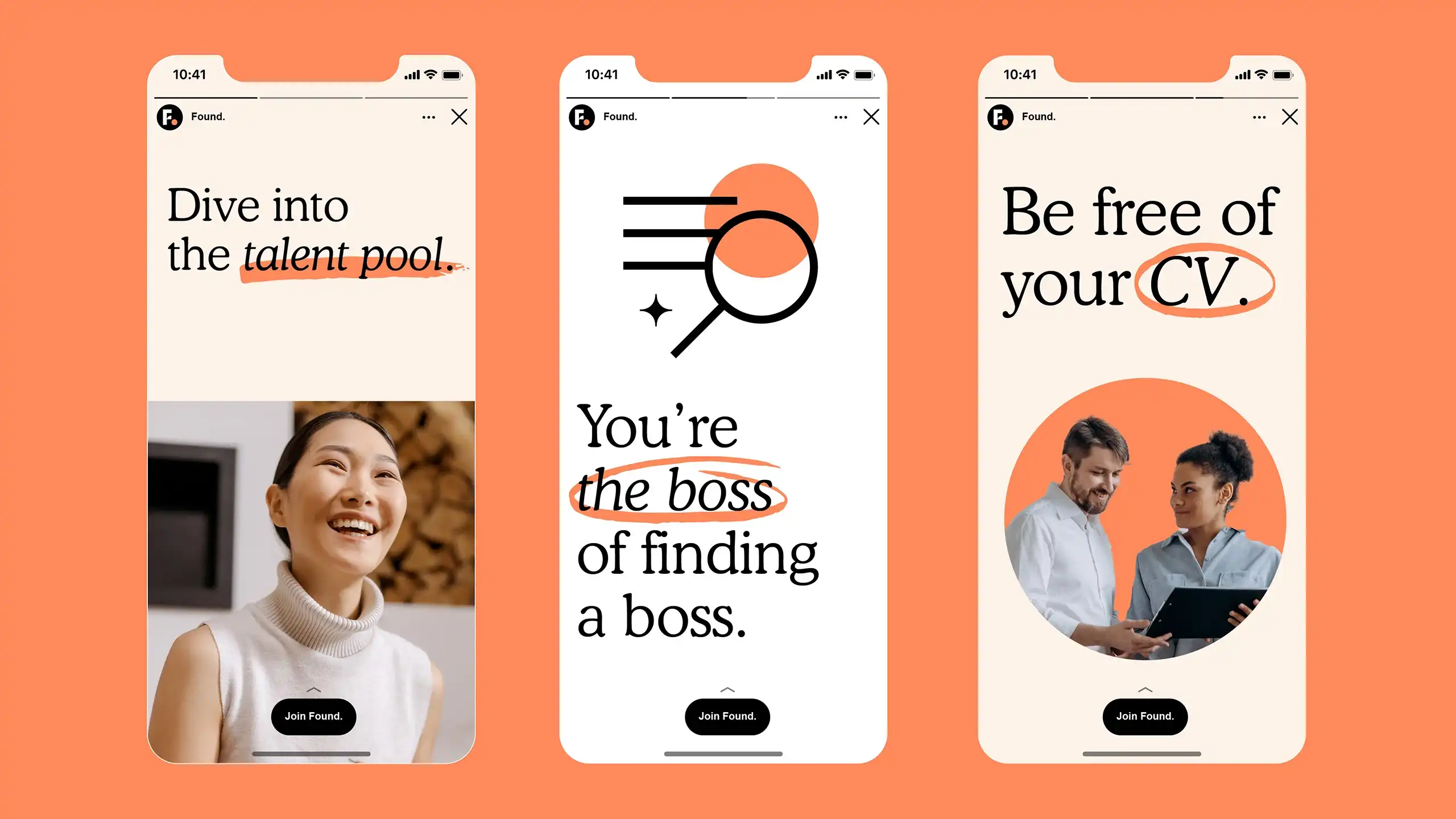
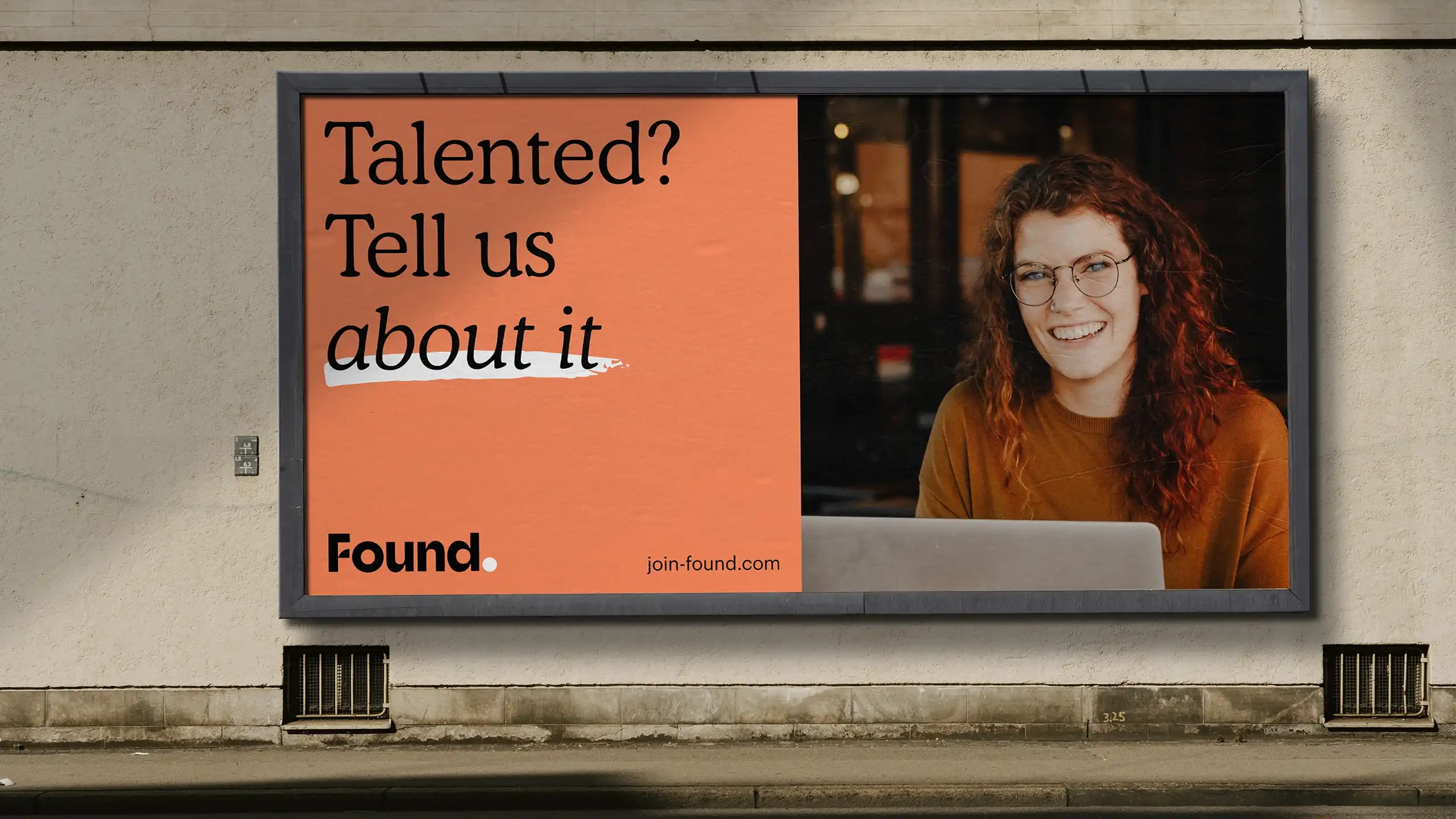
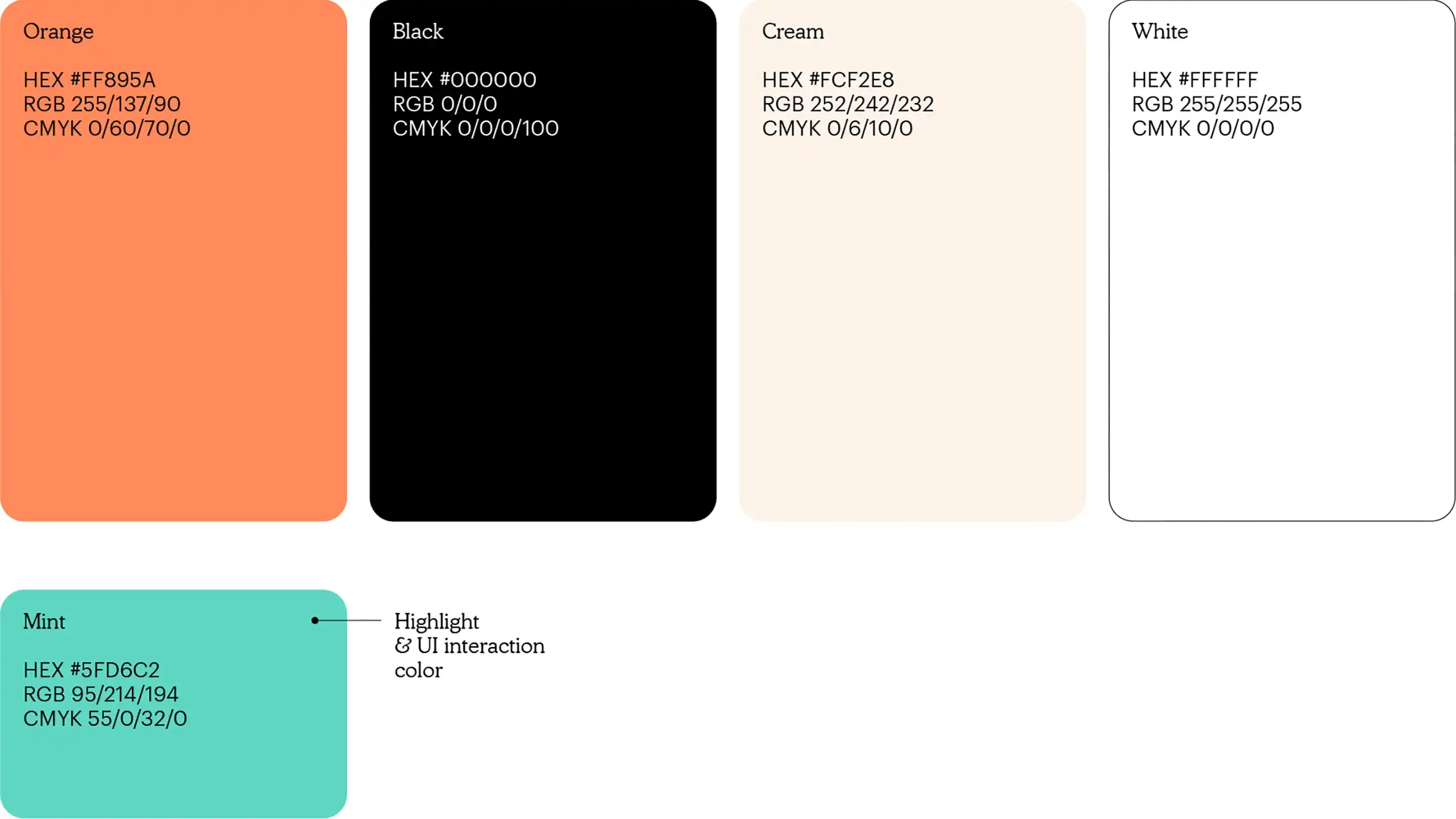
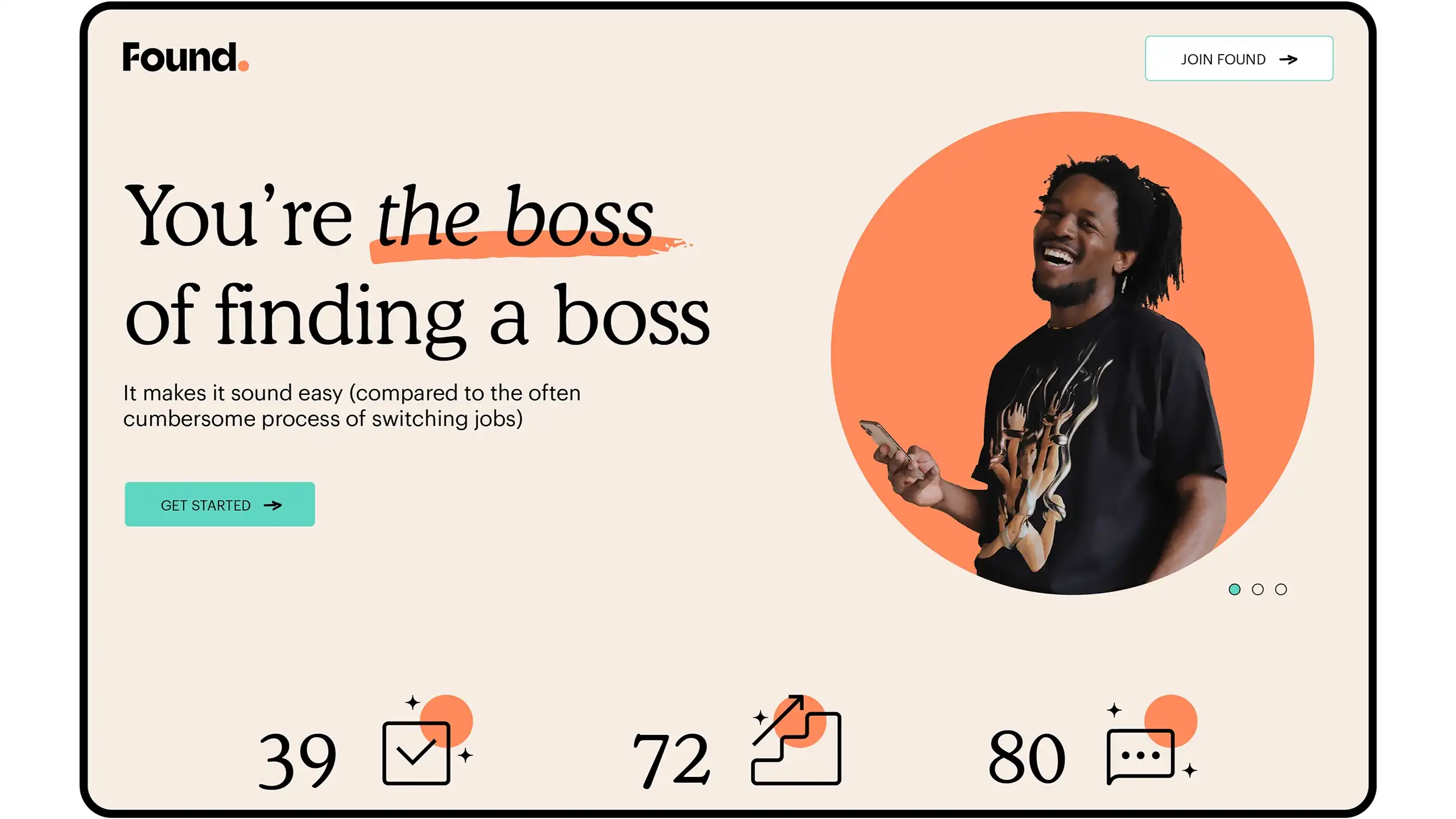
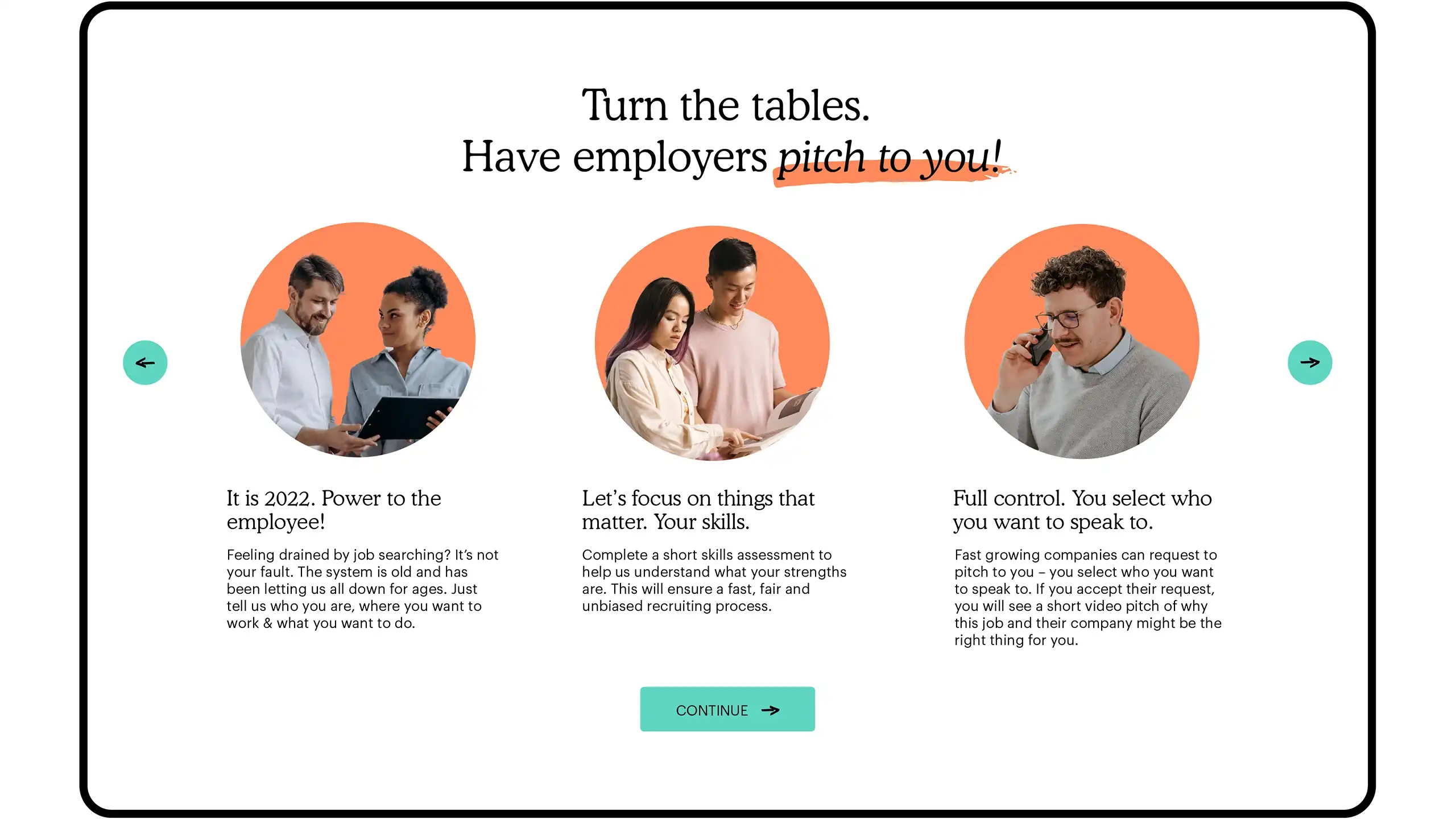
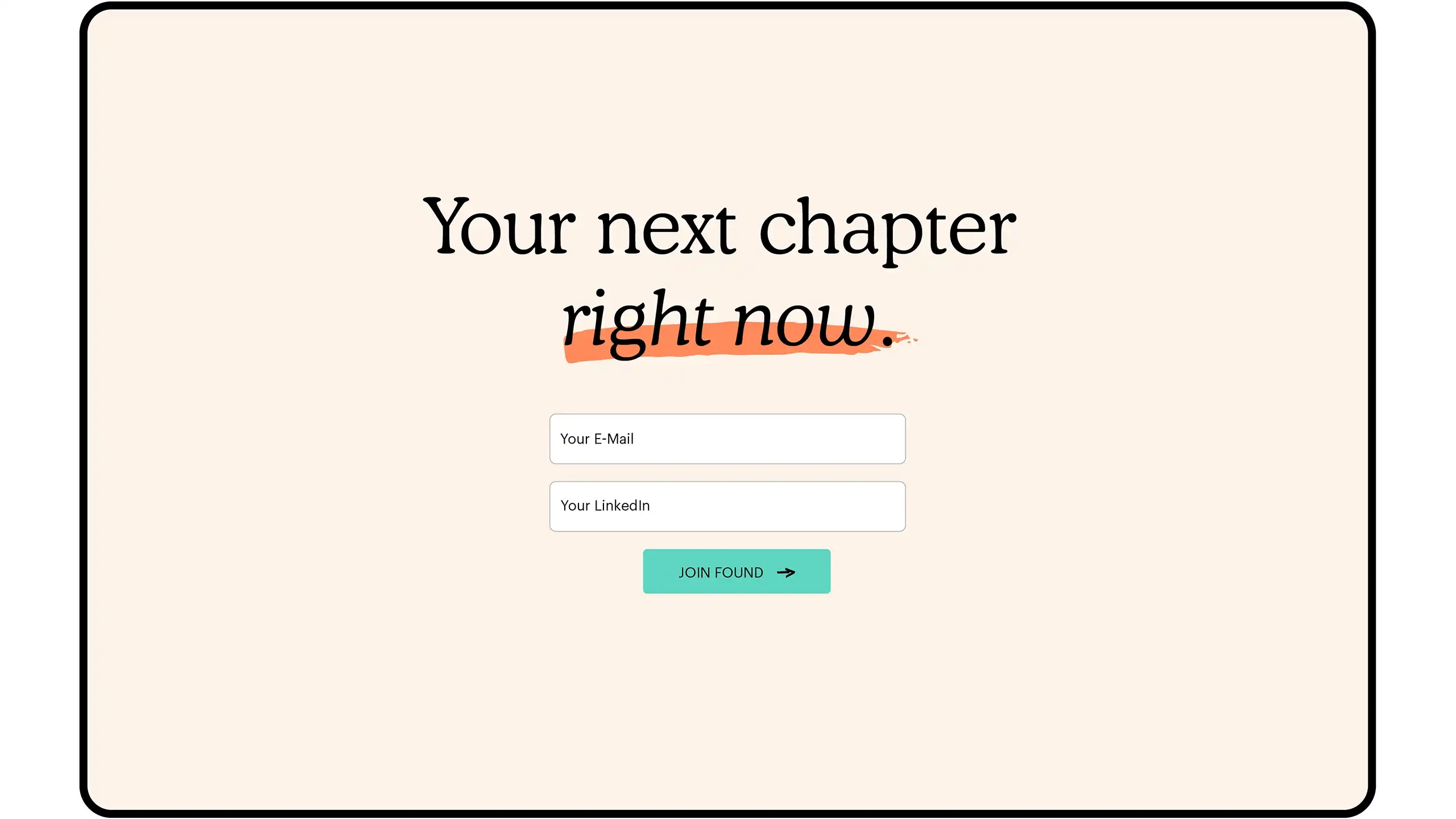
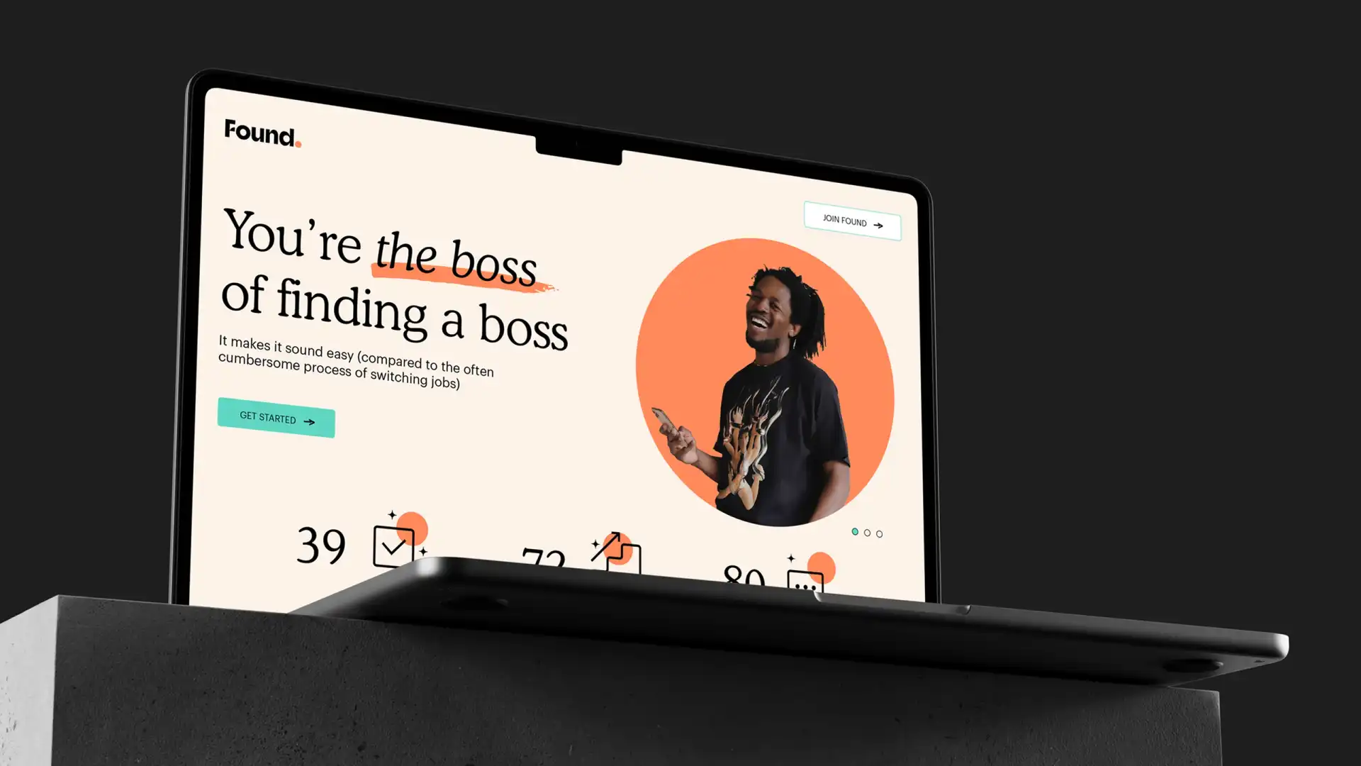
The findings from an initial workshop told us two key things: Found’s corporate design needed to be just as enterprising and dynamic as the talent whom it would be representing. After all, quality begets quality. The best place to start? The logo: We settled on a customized wordmark with a signature ‘F’ – indicating both the company’s disruptive character and the arc of success of those who use the platform – and complemented this with a warm, reddish tone to draw the eye and show that Found isn’t afraid of standing out from the crowd. Then, to highlight the hands-on nature of the platform and lend a dash of human creativity to an otherwise techno-centric package, we underlined certain words and phrases with sweeping. We rounded out the wider design with a streamlined iconography and high-impact photographs in a slightly muted colour palette to channel Found’s modern aesthetic and down-to-earth disposition. No smoke and mirrors, just talented individuals front and centre. Finally, we crafted a compact UI asset catalogue detailing how to roll out the corporate design across the company’s desktop website, social media channels, advertising outlets, and – most importantly for the talent base – the handy-dandy Found app.
With its shiny new design in place, Found is now poised to bring together talent and top companies globally. Come to think of it, that’s what we do at Arndt Benedikt, too.
As a startup working on completely changing how hiring works, it was essential for us to have a distinctive, appealing brand right from the start. Arndt Benedikt worked with us to build an identity tied to our key values of bringing cutting edge tech and human support together, and a unique design system that sends out all the right messages – both to top talent and innovative employers.
