sparks
Getting future skills future-ready

Case Study
Overview
Our Client
Honing the future workforce
The Haufe Akademie is in the business of making people better for business. Through sparks, its sleek and slick microlearning tool, employees from companies far and wide have access to a wealth of text, audio, video and quiz-based microlearning courses designed to equip them with key skills essential for the future. From AI in the workplace and digital transformation to hybrid teams and customer excellence, sparks provides personalised learning trajectories for every user based on their interests and learning goals – while the user-friendly analytics dashboard allows HR staff and managers to view progress, select training modules and track the ROI over the long term. Quick to roll out, simple to use and with full customer-facing support, sparks is firing on all cylinders.
The Challenge
A spark struggling for a spotlight
The Haufe Akademie had a glittering prospect on its hands, but only the bare essentials were in place as far as the brand was concerned. The assets weren’t suitable for digital integration (fairly essential for an online platform, we’d say), the overarching USP – the microlearning tool’s usability factor – was hidden from the spotlight, and the flashy, splashy visuals only worked on the broadest level, with no room for nuance or evolution. What’s more, for a platform that’s all about helping people, the emotional connection simply wasn’t there. In short, sparks lacked its own spark. They needed a branding firestarter.
Our Solution
An identity worthy of an innovator
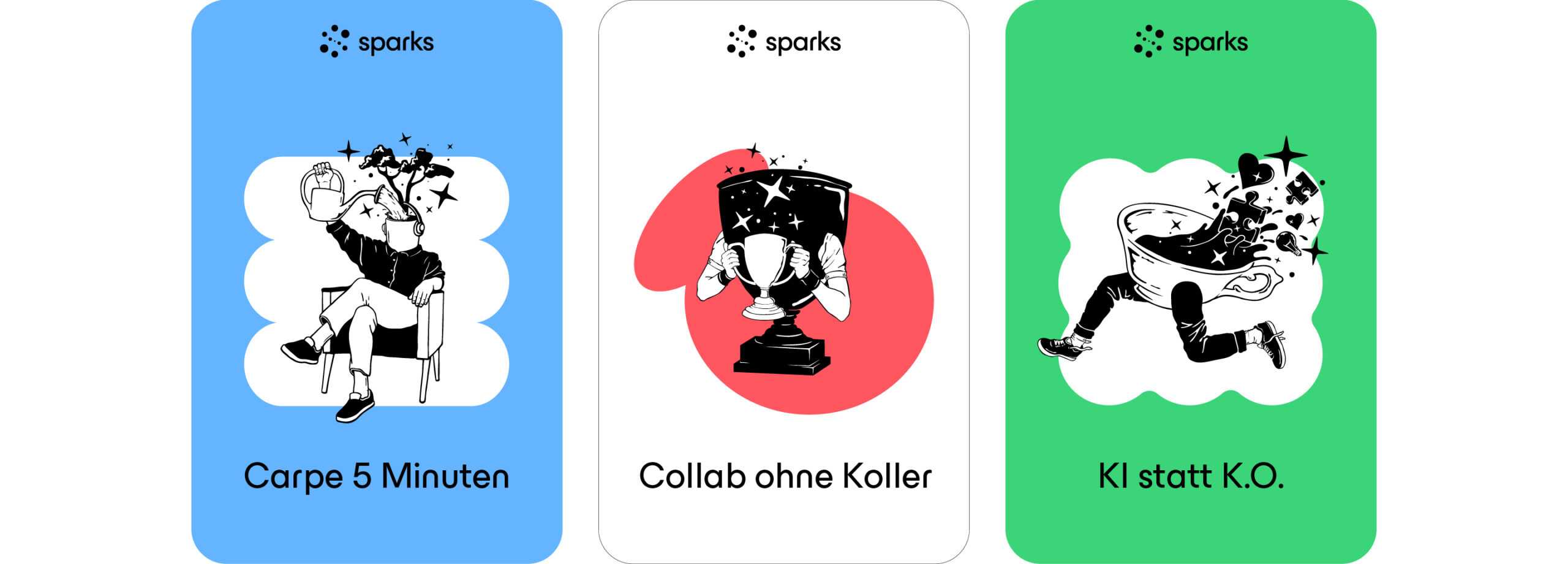
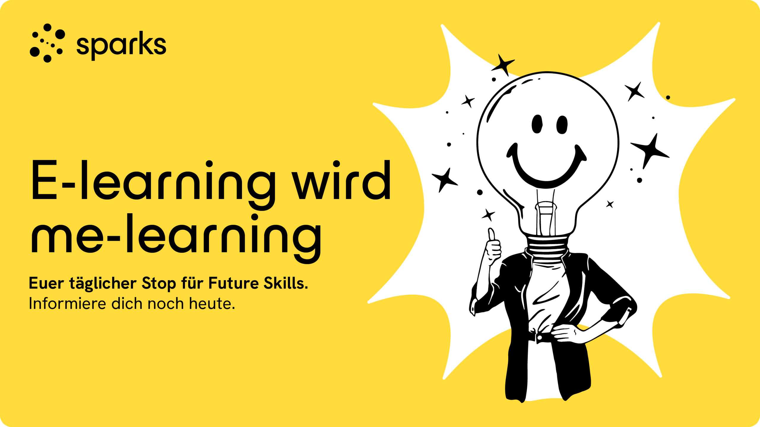
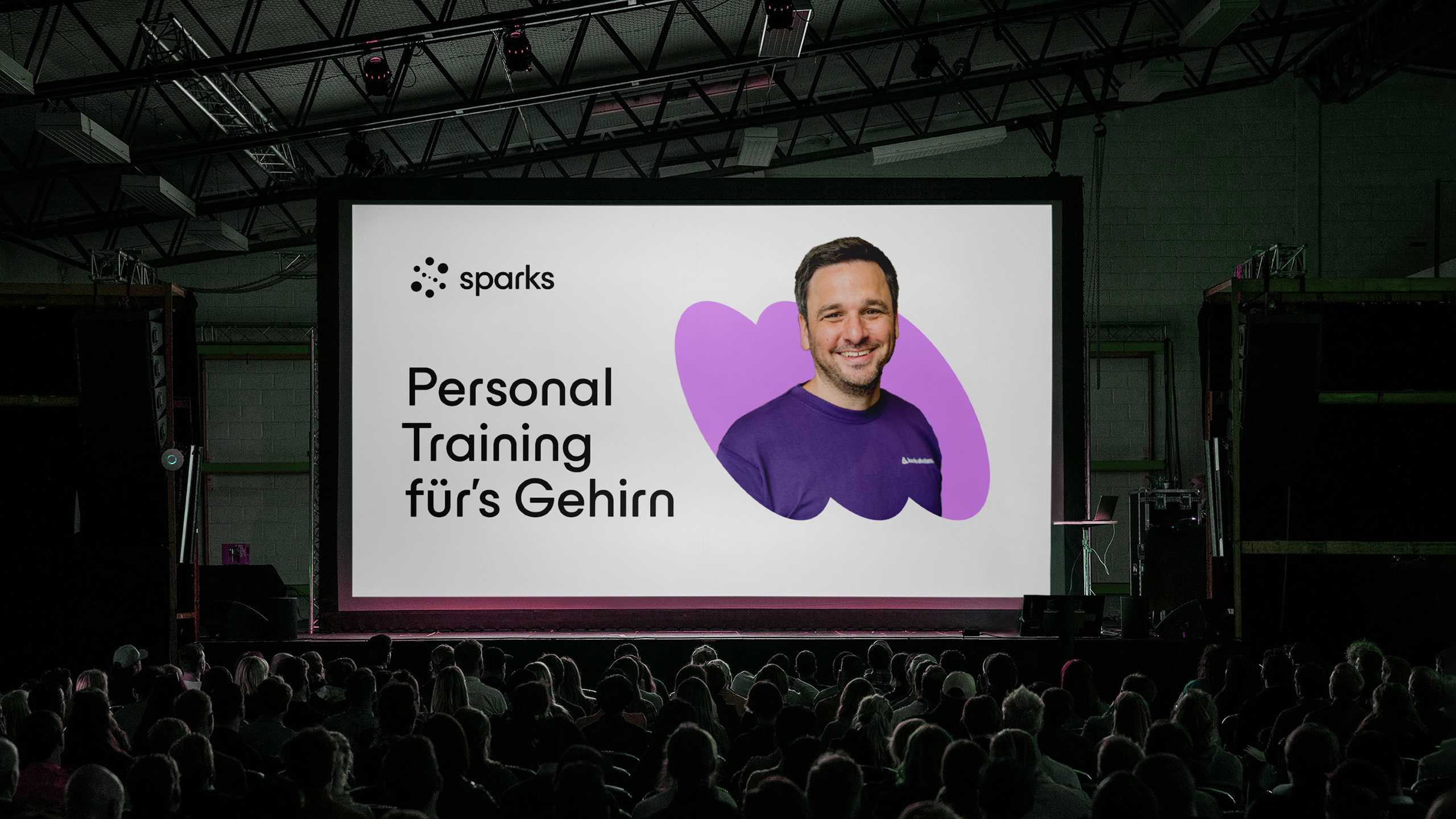
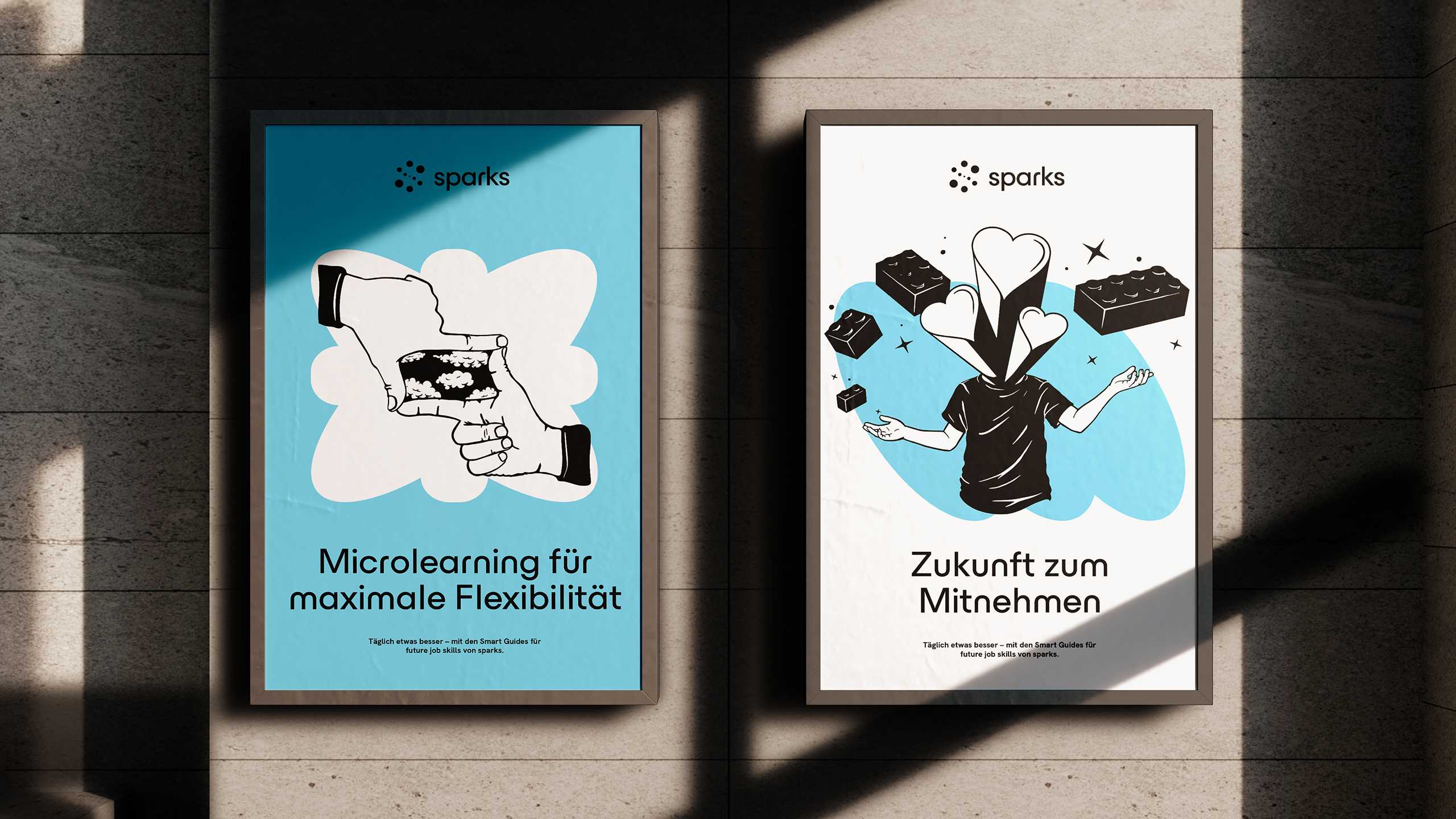
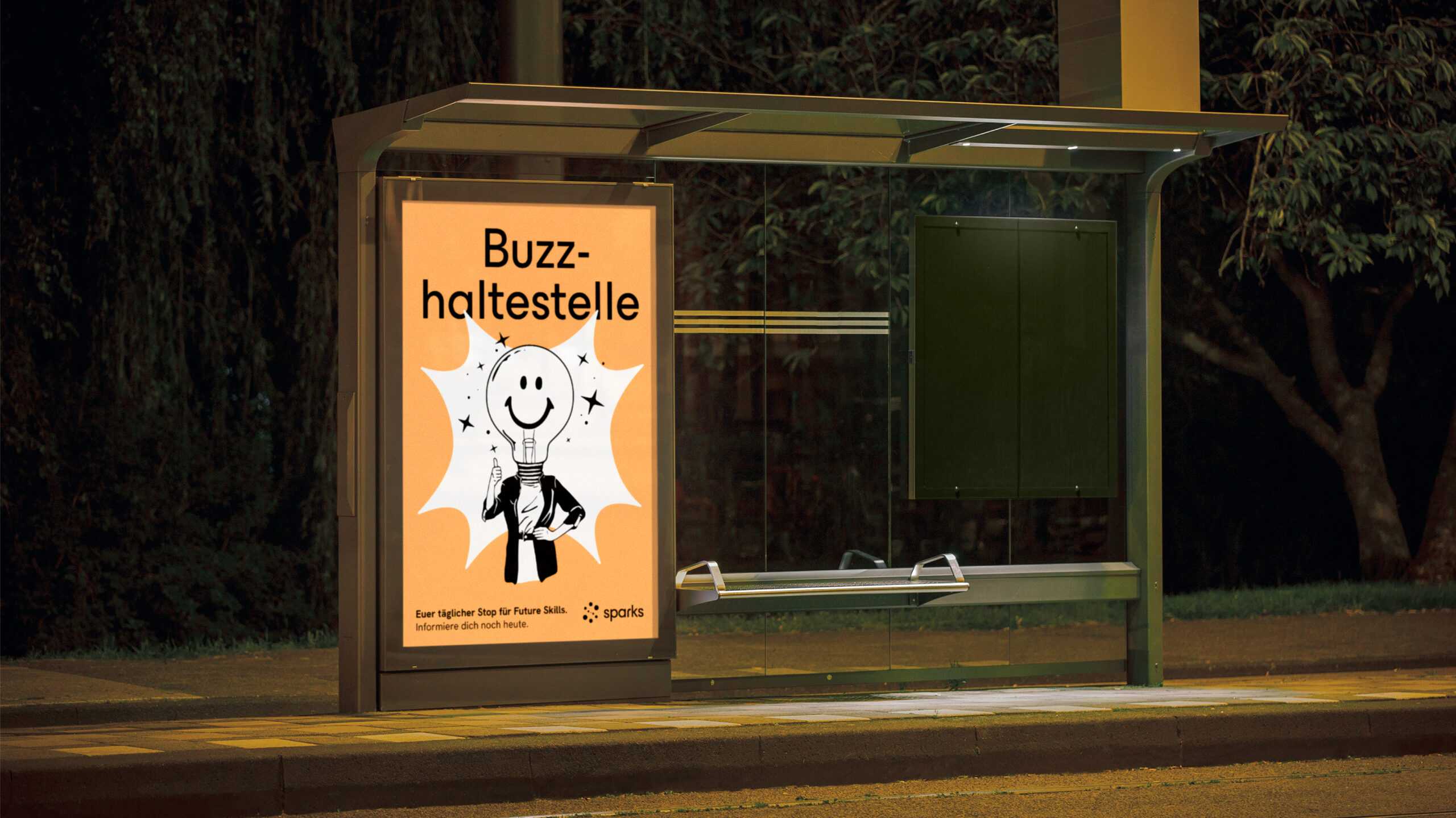
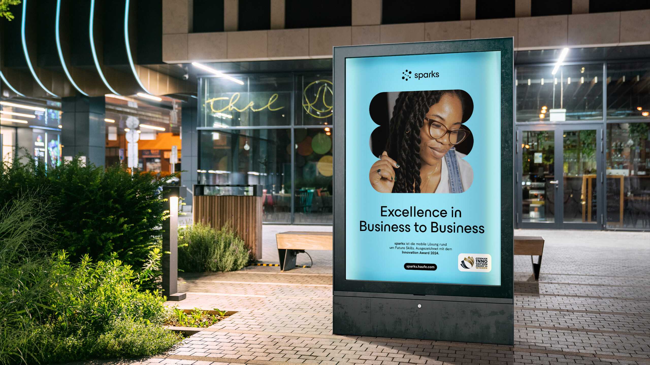
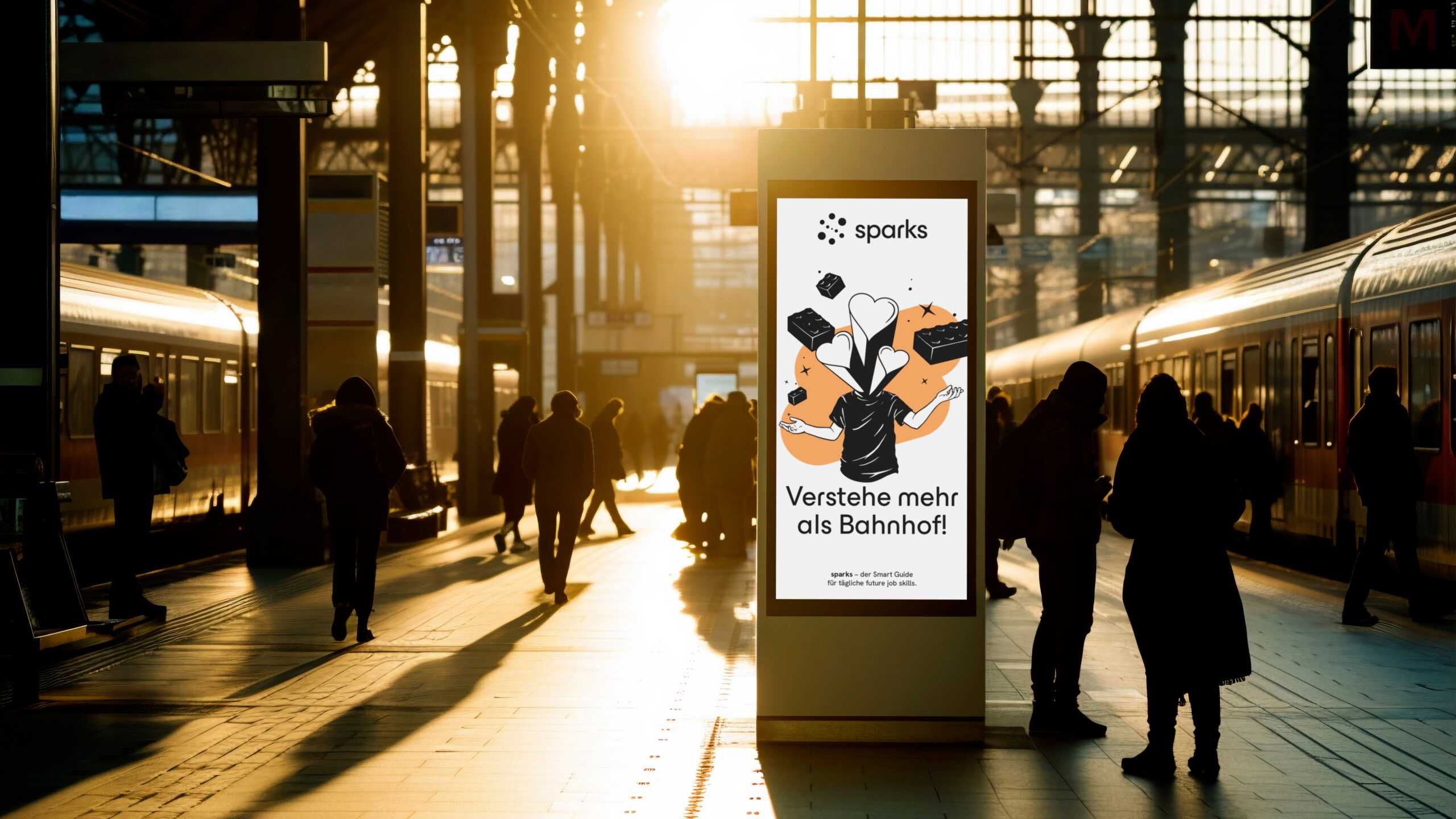
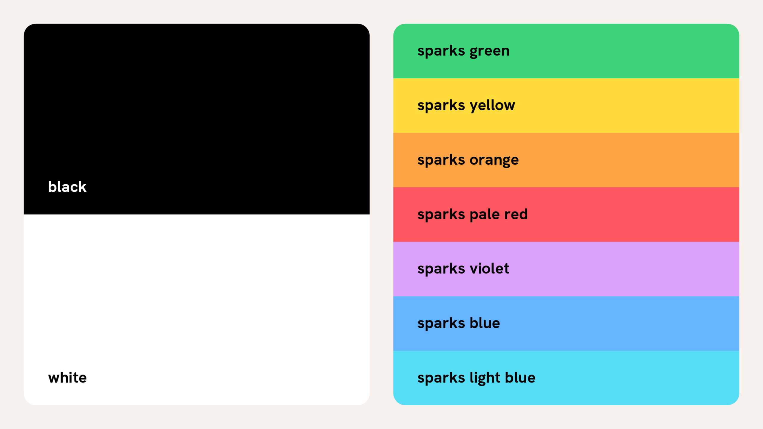
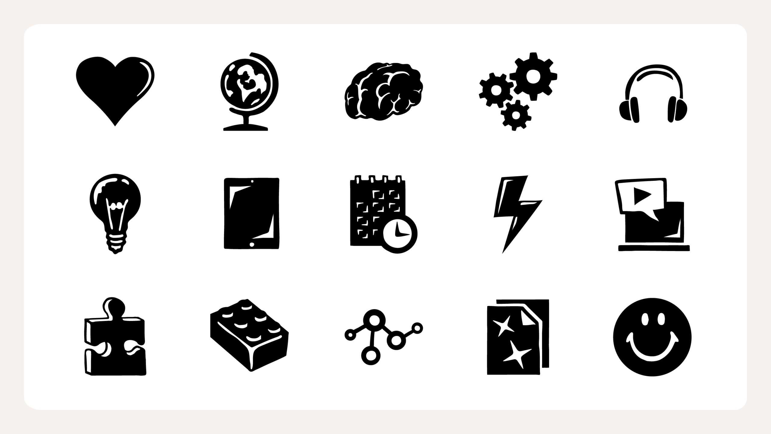
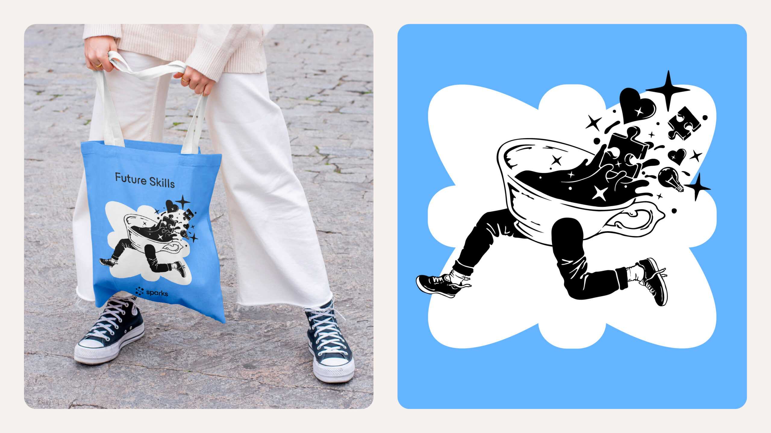
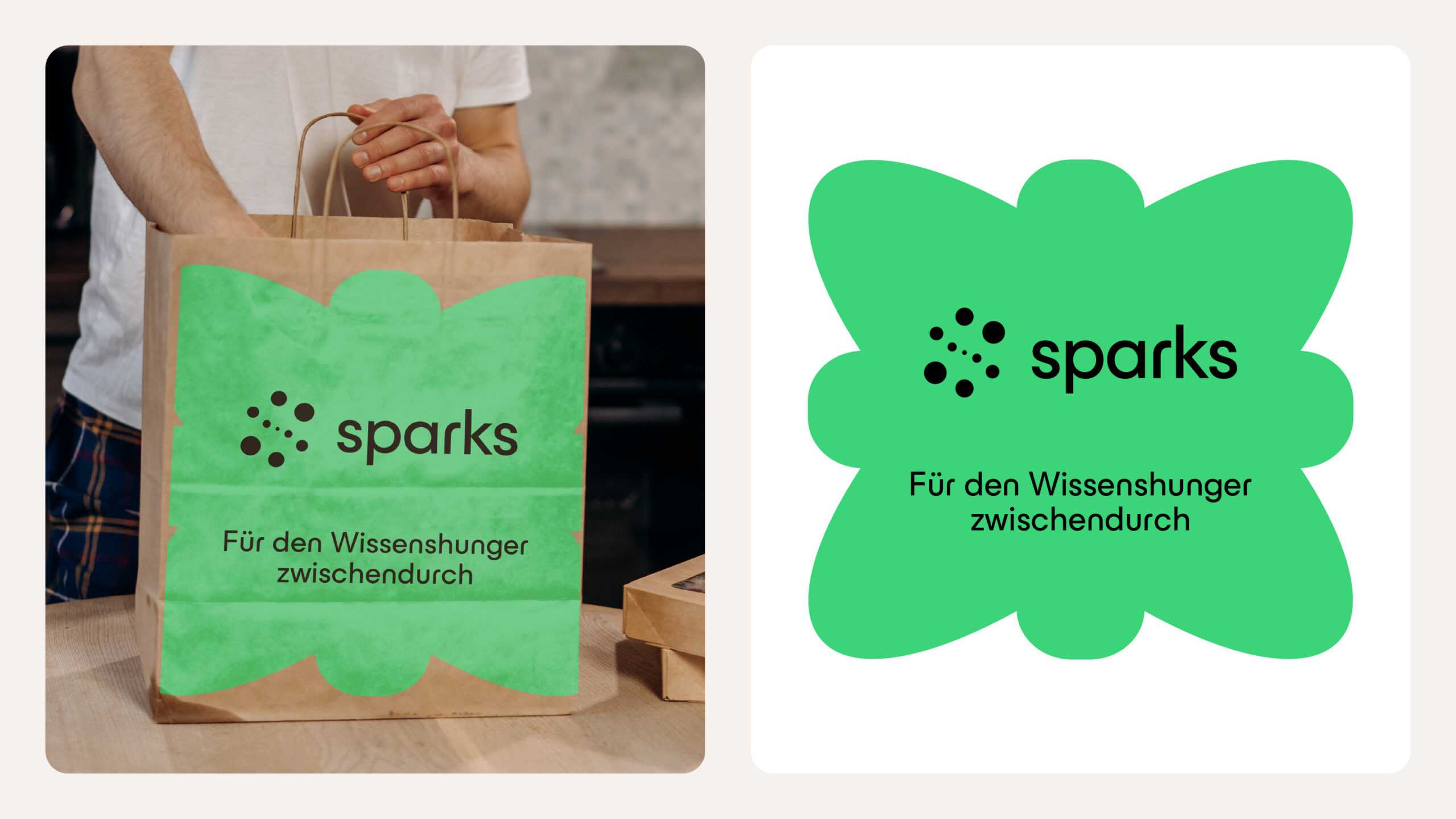
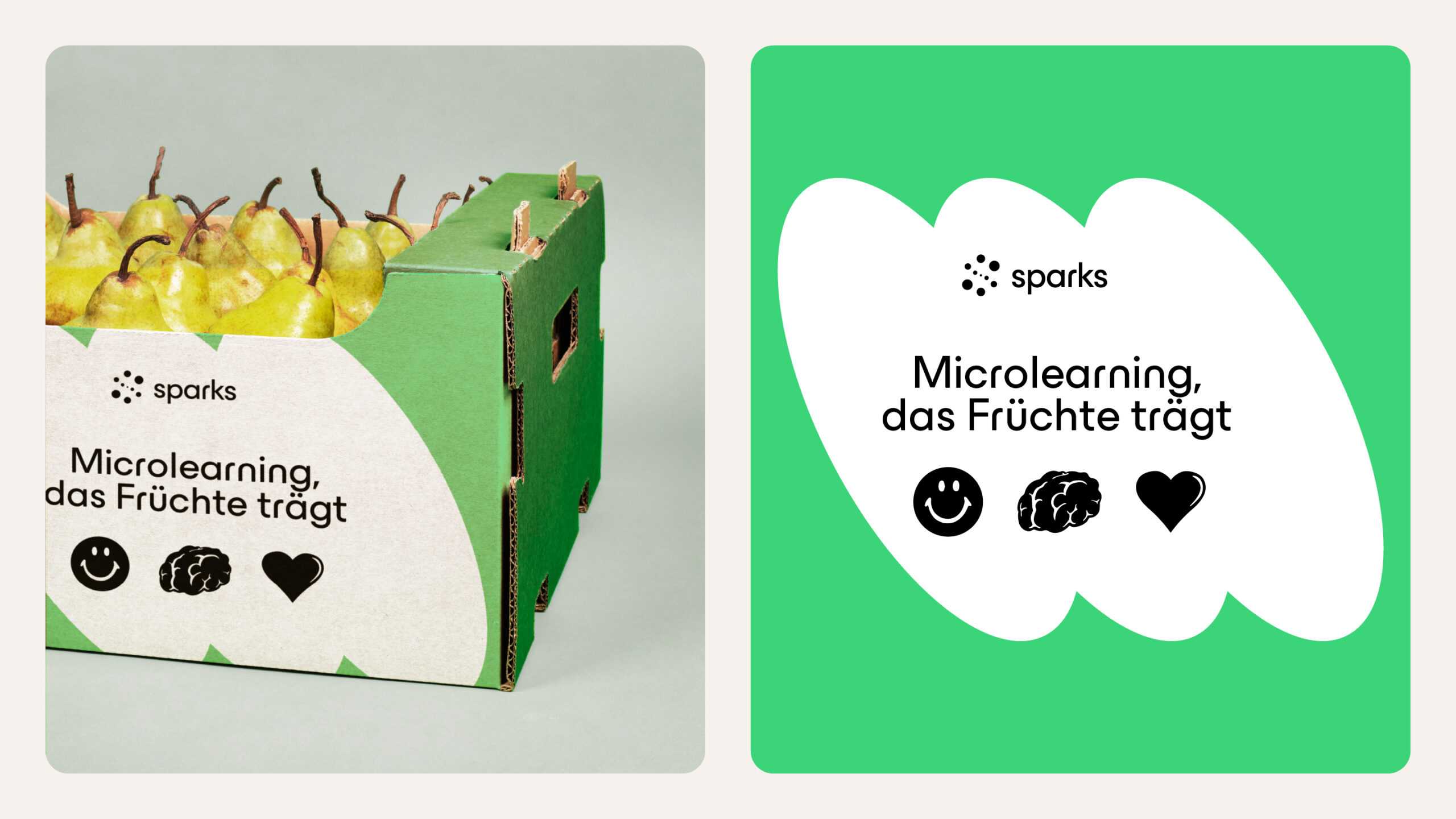
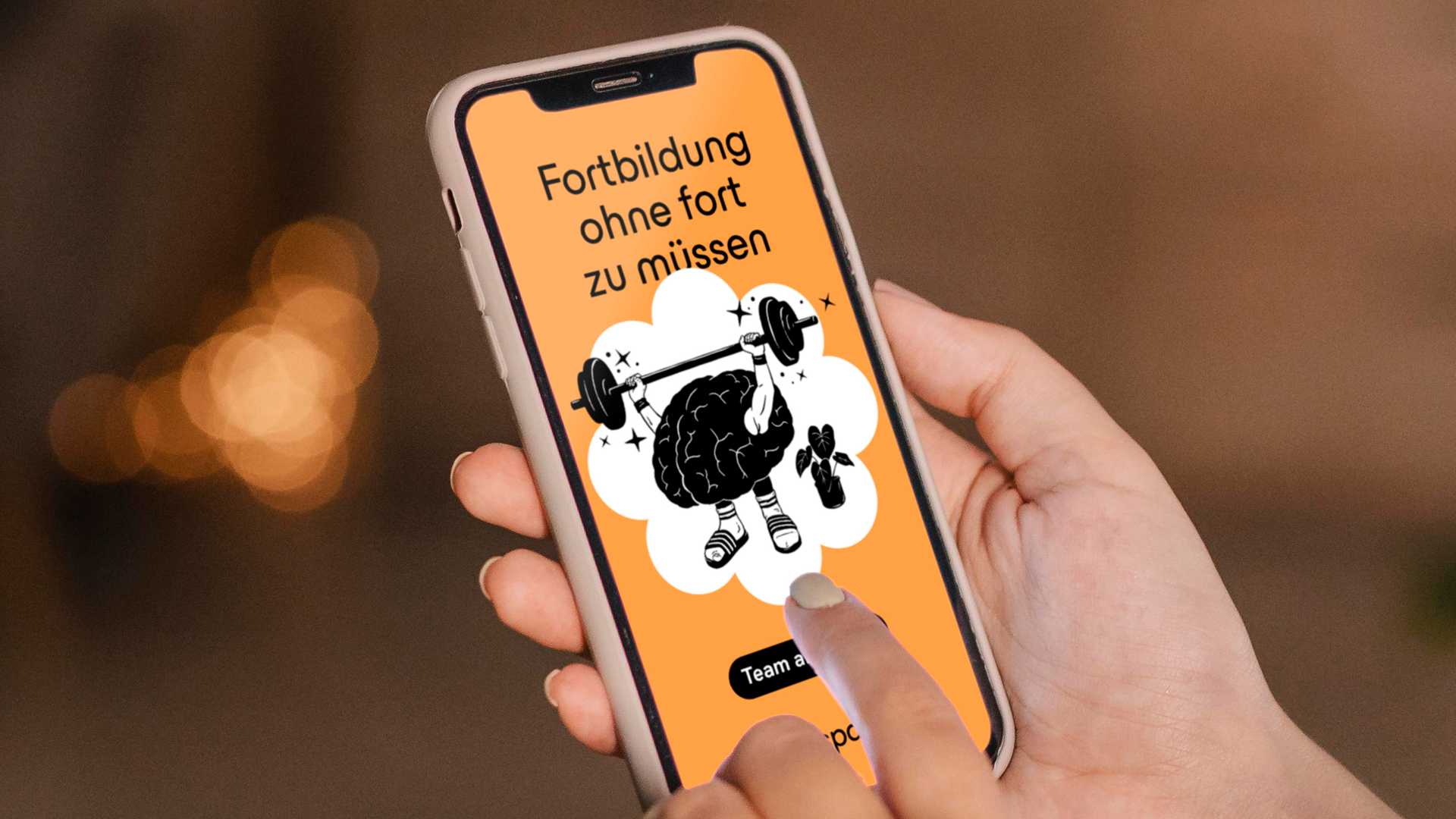
After reviewing the existing assets, we got to work. First up was the logo: we added fuel to the fire by improving its legibility and adapting the design for use across online and offline channels, big or small, subtle or obvious. Refreshing the typeface had the same effect, with the added benefit that the microlearning content is now structured much more clearly. We followed this up with an overhaul of the colour palette, opting for a seamless blend of tones that stand out without being flashy, and settled on eye-catching illustrations that underscore sparks’ disruptive ethos while imbuing the user experience with emotional resonance. This was complemented by a brand-new set of icons as shorthand for innovation, creativity and efficiency throughout the learning environment. After settling on a strong key message and crystallising the core benefits, we honed the tone of voice to make it consistent for users across all touchpoints. Then we wrapped it all up in a brand book and asset catalogue – critical for keeping everything aligned internally and externally. An online and offline awareness campaign made sure sparks flew in the right directions, with the benefits clear to the target audience. From the digital presence through to communication, sparks now has a streamlined, flexible design system that creates an emotional bond, showcases the tool’s many advantages and establishes a brand identity with the longevity of the future skills it teaches.
This one was a match made in heaven: sparks meets the bright sparks. Now we know where to build our skills even further, there’s no stopping us.
We knew sparks had something special. Arndt Benedikt helped us unlock its full potential. Now we have a brand that’s consistent across all channels, gives us clear direction for the future and makes our daily work a whole lot easier. We’re ready to give employees the skills to burn bright in the business landscape of the future.
